


In today’s digitally evolving landscape, where most netizens access the internet through various devices, your online business cannot afford to miss out on this opportunity! Your online business should use responsive web design to ensure a seamless and responsive user experience across all devices. Therefore, this is where you must ponder what is the purpose of responsive web design?
But before getting started, you must know the responsive web design meaning and how the tech works.
What does responsive web design mean? In its essence, web responsive design is a design method that ensures a website responds and adapts to various devices and screen sizes. It gives the website an excellent viewing and interaction experience across all devices, including desktops, smartphones, tablets, and laptops. Well, that was the definition, but what exactly is in this technology for you? Let us assure you, much more than what you can imagine. So, without further ado, let’s dive deeper into the importance of responsive web design for your prospects and conversions.
Looking to Create a Responsive Website?

Take a look at the graph below. Do you notice anything?
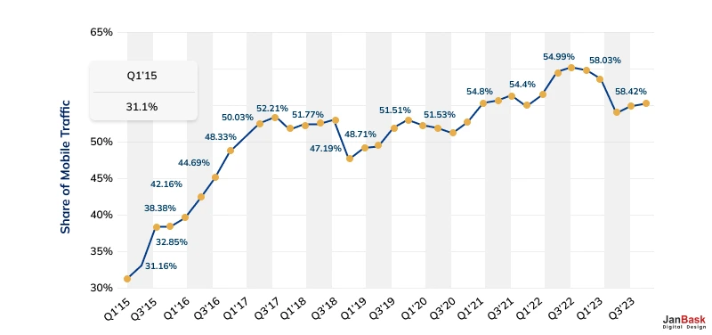
It’s apparent that the number of mobile users has increased over the years, stabilizing at nearly 53% as of last year. Are you sure your business website is available for intuitive mobile viewing? If not, we suggest you revamp your web design strategy to include responsive web design ASAP before it gets too late!
But what is responsive design for websites in the first place? Responsive web design removes the need to zoom in, pan out, scroll, or resize the website contents according to the screen size of the device it is being viewed on. Additionally, developers need not create a dedicated website for each device since the website can auto-adjust to the visible screen’s dimensions.
If you have still not caught up with the practice of responsive web design or are confused about how to get started, JanBask’s expertise is here for your help! Their decade’s long experience can surely guide your online presence to surpass all your expectations and concerns regarding advanced responsive web design solutions.
Responsive web design is a win-win technological intervention for your business and customers. Your customers get what they want from your business through a click or a touch.
On the other hand, by providing an enjoyable experience to your users, you obtain short- to long-term brand ambassadors, even die-hard loyalists!
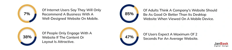
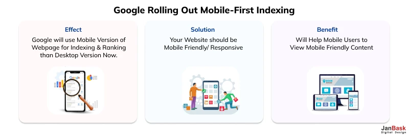
After "Mobilegeddon" on April 21st, 2015, Google started using responsive web design as a ranking factor. This means that any business with a responsive website will find this is adding to their higher search rankings on Google and fetch the benefits of responsive design. Here are some interesting facts on the advantages of responsive web design.
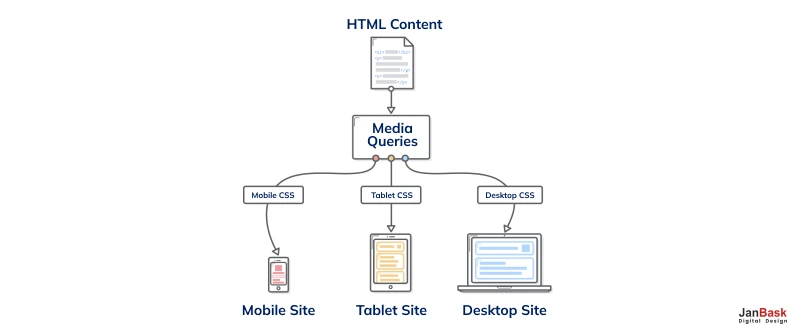
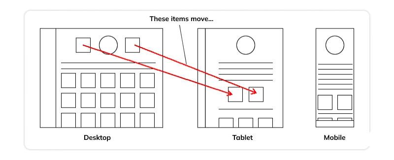
From a technical point of view of responsive web design meaning, the design setup uses a server which always sends the same HTML code to all devices, and CSS is used to alter the page's rendering. Check out the diagram below to understand this concept.
Google's algorithms should be able to detect this setup if all Googlebot user agents are allowed to crawl the page. Do you have a website that users need to pinch and zoom on their mobile devices to view? That user is as good as gone. Web responsive design is Google's ultimate recommended design pattern. This is one of the benefits of responsive website design, should Google be your preferred destination (which it must be!)
For responsive web design pages, a single Googlebot user agent only needs to crawl your page once, rather than crawling multiple times with different Googlebot user agents to retrieve all versions of the content.
When considering why responsive web design is important, UX plays a prominent role. One of the advantages of responsive web design is that the users will have a much easier time navigating through your website and a good user experience overall. If your site has a top-notch user experience, you will have repeat visitors and more converted users, leading to positive reviews, traffic, and branded searches.
Responsive web design lets designers show content based on the browser space available. This encompasses everything from the placement of buttons and icons to the colors and fonts you use. Check out the infographic below to get what we mean.
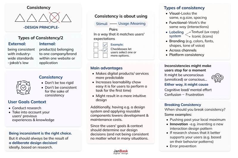
This allows synchronization between what a site displays on a desktop and what it shows on a handheld device, enabling straightforward user navigability.
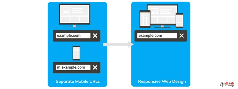
One of the benefits of responsive website design is that it makes it easier for users to share and link to your content with a single URL. It helps Google's algorithms accurately assign indexing properties to the page rather than needing to signal the existence of corresponding desktop/mobile pages.
A mobile responsive design will make it easier for your visitors to share your content/pages on social media, which could help you gain more visitors. Having more visitors will help Google understand that your website can be trusted and has content liked by the users – which is good.
The critical advantage of responsive web design is that it affects your SEO through positive user behavior signals. You have Google's approval if you move toward a more mobile-optimized website. A mobile-optimized website often comes with a mobile responsive design and a Google responsive web design.
When considering responsive web design and SEO, creating a consistent user experience across all devices is critical to converting new customers. Having a single secure website that looks professional on all platforms makes users less likely to get frustrated or turn to a competitor, one of the benefits of responsive website design. When users decide whether to subscribe to a service, they want to avoid being redirected to device-specific websites because the process often takes longer.
Google reduces the site loading time of a responsive website by optimizing images and excluding unnecessary page elements. Check out the diagram below to understand this key concept:
Low Bounce Rate:
A Google responsive website provides visitors with a much better user experience. Therefore, they are much more likely to stick around for longer and explore different areas of your site.
Considering responsive web design and SEO, you can create powerful and flexible websites that convert. Using some fancy HTML and CSS, web responsive design automatically changes your website's layout based on the visitor's screen size. This means you can have optimized user experiences across desktops, tablets, and smartphones. Building a responsive site takes a bit of skill, but it resolves the issues you would typically encounter with mobile dedicated sites. There's only one version of the site to maintain, and there are no funky redirects to worry about.
Eliminating duplicate content helps your rankings by signaling which website pages are more vital to Google. If you fix the content, your rankings will be higher. Incorporate a mobile-responsive design on your website. It will help you with your duplicate content issues because you will only use a single URL regardless of device usage, which is one of the benefits of responsive website design.
Maintaining separate sites for mobile and non-mobile audiences can be expensive. By using web responsive design, you can save money by eliminating the cost of paying for a mobile site. You will only need to invest in a single site design to appeal to all visitors and all devices. Moreover, responsive websites remain competitive since no new technological interventions can diminish the relevance of websites across devices.
Another one of the responsive web design benefits for businesses is its lower maintenance cost compared to running different versions of the same website. Although it is relatively expensive in the beginning, the reduced price of maintaining two separate websites does add up.
Now that you have understood what does responsive web design mean and what responsive web design benefits are, you must learn the framework to proceed. Here are some essential tips to consider when designing your site to achieve this.
There are numerous responsive frameworks available that you can use to avail responsive web design benefits. Bootstrap, Foundation, and Materialize CSS are some popular frameworks that you can use to make your website mobile-friendly. These frameworks provide a set of pre-designed elements that you can use to create a website that adapts to any screen size.
Making your website responsive is not just about resizing the elements on the page. It's about optimizing the overall user experience across different devices. To achieve this, you need to focus on the design of your website. Ensure that your website's navigation is easy to use across all devices. Also, ensure your website's content is easily readable on all devices including mobile- to avail responsive web design benefits.
You must optimize your images and media to reduce their size without compromising quality. Compress large files and use lazy loading to load images asynchronously, enhancing your website's performance according to web responsive design standard practices.
Use customizable CSS media queries to accommodate your content per the viewing requirements of the device it is to be used on. For instance, if the screen shrinks by 768px, every column should be reduced by 95% as designed through the code below.

During web responsive design development, you as a business owner might be tempted to foray into adaptive web design too. However, this is where you must pause, reflect, and strengthen your priorities, which can only be done through sufficient knowledge demarcating responsive vs adaptive design.
For instance, you might benefit by knowing that a web responsive design involves the adjustment of the layout based on the screen on which it is being viewed. On the other hand, adaptive design involves creating a different layout for each device. Therefore, while responsive design is less intensive for a UX developer, adaptive design is far more labor-intensive, considering the different design formats involved. Peep the diagram below for a ready reckoner of adaptive vs responsive design.
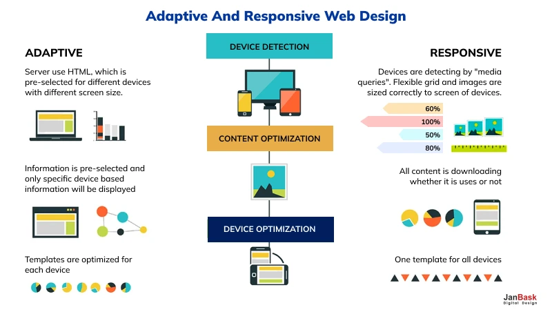
So if your project involves creating a big website from scratch, consider responsive web design. On the other hand, if you need to refurbish your existing website for cross-device usage, then adaptive design is good to go! JanBask’s seasoned experts specializing in responsive and adaptive website design can guide you with their responsive web design services.
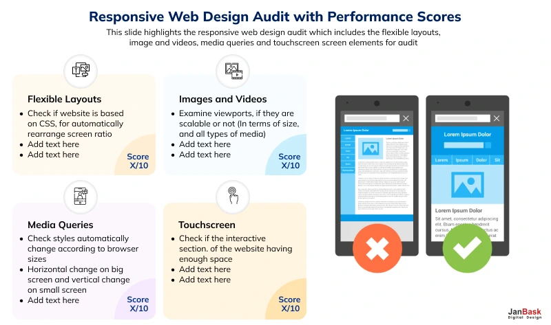
By now, you must have understood the importance of responsive web design for succeeding in the modern digital marketplace. By knowing and implementing responsive web design best practices, you, too, can create a visually appealing and enjoyable user experience across varying devices. Moreover, you must remain ahead of the competition through all the latest evolving trends in the niche. With your responsive website up and running, you can refer to the diagram below to audit it for best practices.
1. Does responsive web design improve user retention?
One of the advantages of responsive web design is that users, regardless of device, can easily browse, read, and engage with your website’s content. As a result, the user has a favorable experience. Responsive web design is critical because it gives a uniform and user-friendly experience across several platforms, increasing user happiness and engagement.
2. Does mobile responsive web design improve user experience?
The best responsive website greatly influences mobile user engagement by providing an optimized mobile experience, encouraging prolonged site visits and greater interaction. Since it offers a smooth and accessible experience across all platforms, responsive web design can increase website traffic, particularly from mobile visitors.
3. Can responsive web design improve brand identity?
Indeed! One of the responsive website advantages is that it guarantees that your business's messaging, visual identity, and user experience are uniform across devices, increasing brand awareness and loyalty. The best responsive website streamlines content management by allowing you to maintain a single website that adapts to multiple devices automatically, saving you time and effort in content generation and updates.
4. How does social media integrations in responsive web design reduce bounce rates?
When consumers access your website via social networking sites on their mobile devices, they will have a smooth and pleasurable experience, enhancing engagement and sharing possibilities. Responsive website advantages include lowering bounce rates by giving consumers a simple and aesthetically attractive experience that motivates them to stay on your website longer.
5. Does responsive design help with content management?
One of the best responsive website advantages is maintaining a single website that automatically modifies its layout and content depending on the device using responsive design. This reduces the requirement to design and manage your website's distinct mobile and desktop versions. You only need to edit and publish information once, and it will be shown correctly across all devices, simplifying content management to reap responsive web design benefits.
6. Can responsive web design be used for updating existing content?
One of the benefits of a responsive website is that existing websites can be frequently enhanced to integrate responsive design elements. While the effort necessary varies depending on the website's complexity and underpinning technology, a competent web design company such as JanBask’s responsive web design services- may examine your present site and offer the best method to make it responsive. In today's mobile-centric digital market, changing your website to one of the best responsive websites is a good investment, whether it includes a total redesign or gradual changes over time.
Now that you know more than required to the question of “what is responsive web design,” you must consider investing fully in: rather than allocating limited budgets to your responsive web design efforts. The first thing you need to check for increased conversion and user retention rates is how responsive your web design is, per an objective checklist. Spend time checking every feature, page, or element the user engages on your website to understand where to improve. Therefore, you must invest in a professional web design agency that can:
Following the tips outlined above, you can avail the benefits of a responsive website that provides a seamless user experience. To analyze why responsive web design is important, you must consider user experience that boosts your website's SEO performance that can reach a wider audience. These are some of the responsive web design benefits that JanBask’s responsive web design services can help you with.
Interested in our Responsive Web Design Services?


A
Nice read, do you share a framework of your process of designing a responsive website.
S
What kind of tools can be used to check the responsiveness of each element and page?
S
Great deals of important information and the article is great.
I am bookmarking it for future reference and consultation. Many thanks for sharing! ?
A
Conversion and optimization do not happen instantly, it needs a lot of dedication.
G
I agree that planning the layout first, saves a lot of time and one can easily implement changes at any stage.
J
I completely agree that Google prefers a well-optimized and responsive site. Too much information without clear formatting and incorrect placement will make the users go away and thereby reduce the ranking.
H
Can you share more details on reducing the loading time of a website?
M
Any recommendation for a website design company that can recreate my current website and provide a 360-degree solution.
P
With the world going mobile-friendly, the mobile experience you provide to a user is prominent. Constant testing, analysis, and implementation are required.