
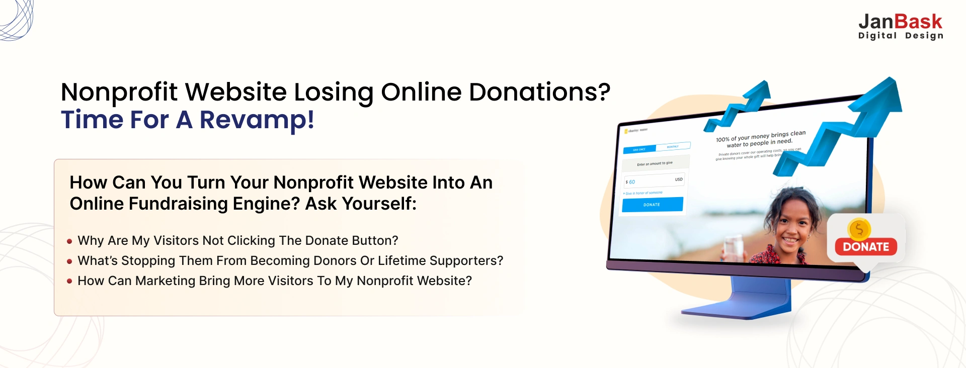
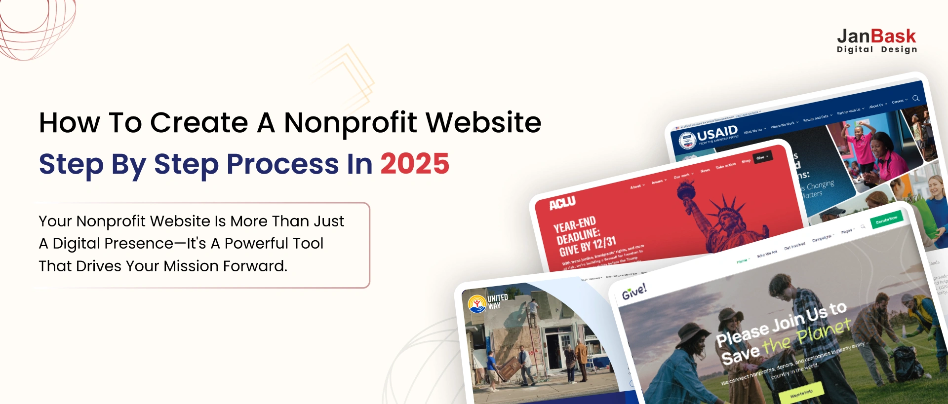
Have you ever wondered why some nonprofits effortlessly attract donors, volunteers, and supporters online while others cannot? Let me share a secret: it's not just luck, nor is it necessarily a significant budget. The key is having a website that matches the effort to build it.
Understandably, you must be too busy changing the world to care more about your website.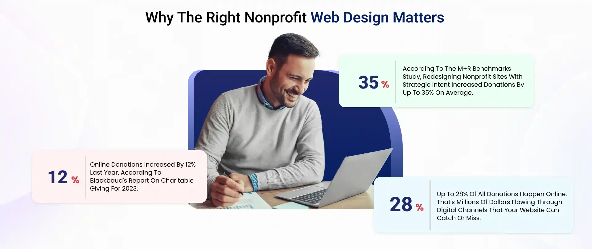
Having spent a few years, 12 of them working with nonprofits of all shapes and sizes, I know precisely what separates digital champions from mere wallflower nonprofit organization websites. But don't get disheartened because creating the best nonprofit websites isn't rocket science. The even better part? I'm now going to tell you just how easy it is.
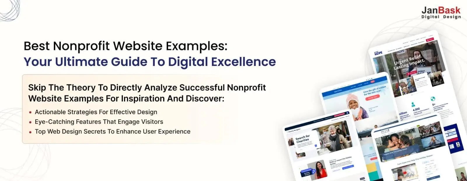
In this nonprofit website design guide, we will skip the theory of site design and get straight down to actual, proven non profit organization website examples. We'll have websites that aren't just beautiful but strong engines producing real impact. Think:
Is your nonprofit website enough to convince anyone to support your mission, or is it just a vanity project? First, you must identify your nonprofit niche to shortlist examples of a nonprofit organization that best represents you. Ready to learn why nonprofit web design matters and how it can transform your position in your niche?

Let us now delve into something intriguing. Have you ever visited a website and thought, "I just wish mine looked that elegant?" I have found a few that are more than impressive designs. Today, we will see much more about what made these sites amazing, both on the surface and strategically.
I have spent my time analyzing all these platforms and talking to their teams, and I even donated some money (for research purposes, of course). The eye-opening discovery? It is not even about having big bucks or fancy technology. Instead, innovative, strategic choices are what any nonprofit can apply.
Once you thoroughly understand the niche/category in which your nonprofit operates, you can zero in on the examples of a nonprofit organization in that niche from which you can take inspiration.
"Regarding nonprofit organization websites, excellence isn't random – it's methodical. After analyzing hundreds of best nonprofit sites, I carefully curated these best nonprofit website examples into distinct categories that reflect the mission focus and digital innovation patterns. Here are some of the categorizations that are considered:
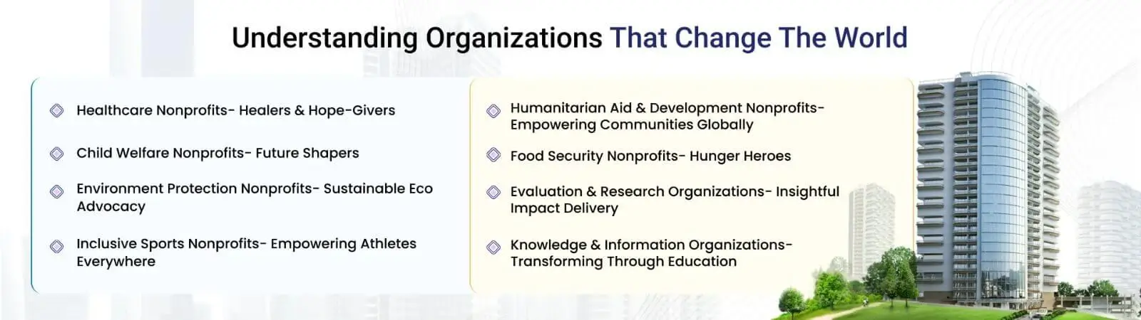
As part of the nonprofit sector, health and medical organizations are integral to public consciousness and impactful advocacy. Their websites become the first contact points for donors, patients, and volunteers. What makes these websites better than others? It's not just about offering medical information but how visitors are engaged, how trust is conveyed, and how action inspires them.
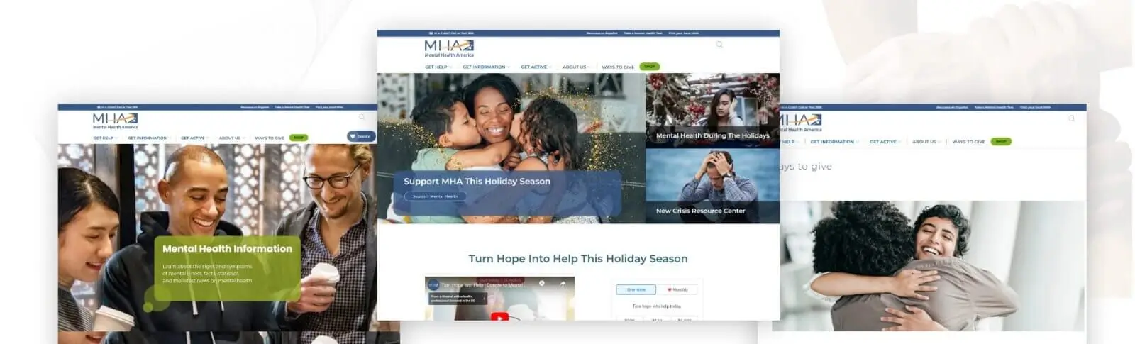
Mental Health America, established in 1909, is the United States’ arguably largest nonprofit mental health organization. For over 115 years, this premier nonprofit has championed mental health promotion, well-being, and treatment across the Country.
The platform is a comprehensive resource hub for mental health advocacy, education, and support services, focusing on prevention and early intervention strategies.
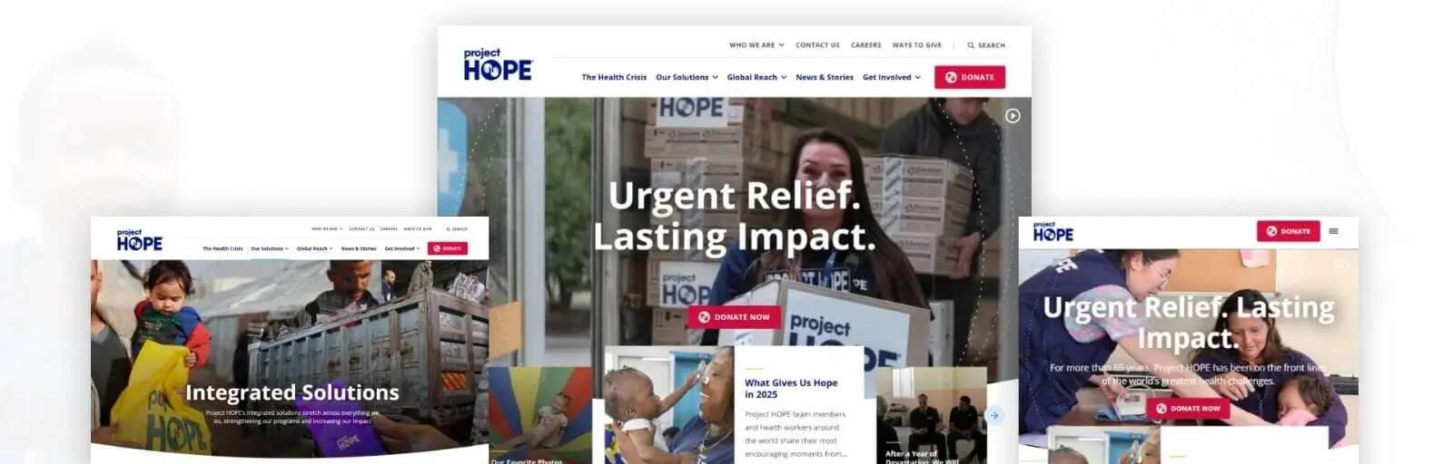
By empowering local healthcare workers aged 65 and older, Project HOPE has addressed global health challenges and provided urgent relief worldwide.
The platform is a comprehensive hub for global health initiatives, combining emergency response capabilities with sustainable healthcare development programs across cultures and communities.
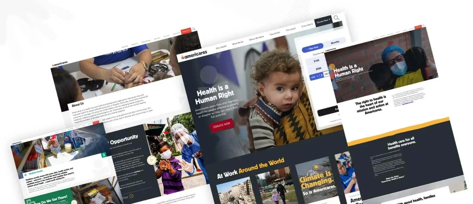
Americares is a health-focused relief and development organization responding to emergencies and humanitarian crises worldwide.
The website maintains an active emergency response system, responding to over 35 natural disasters and humanitarian crises annually while establishing long-term recovery projects in vulnerable communities.
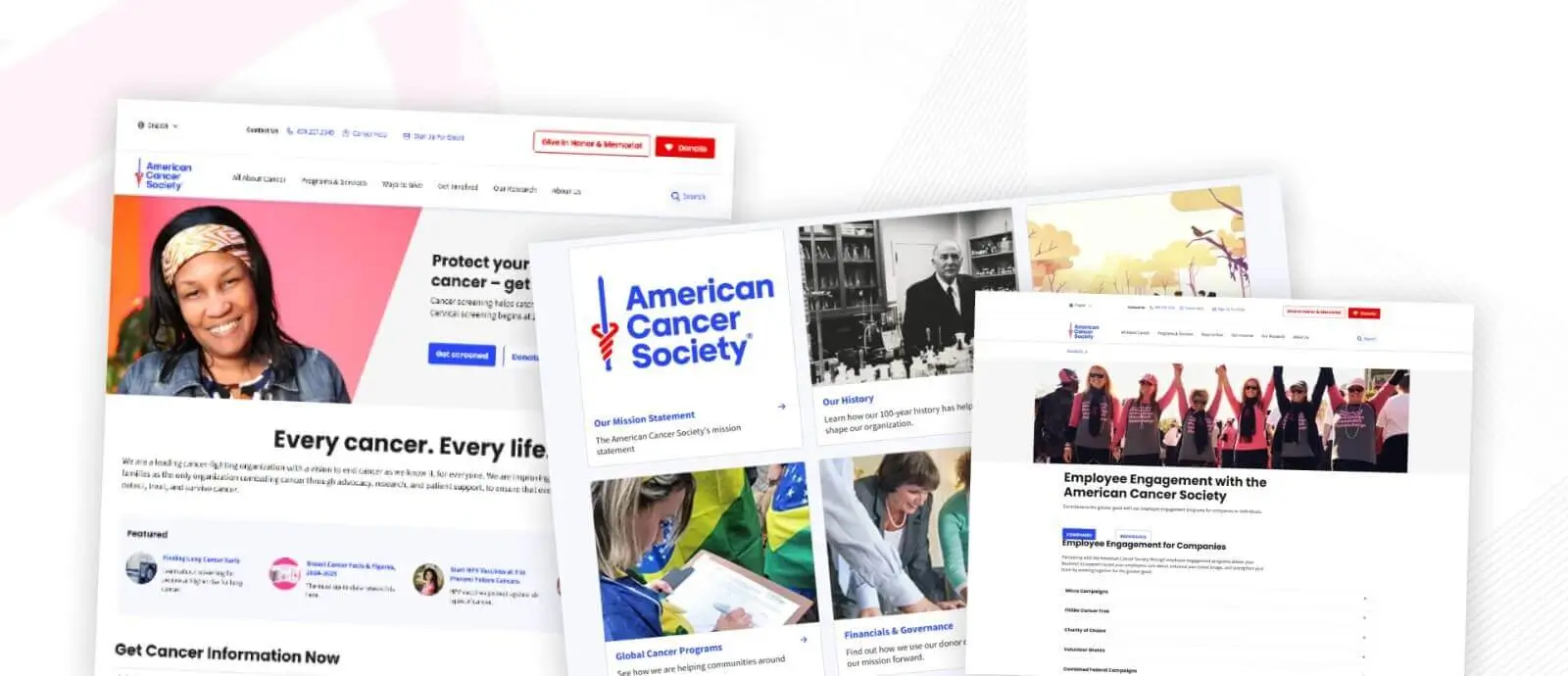
The American Cancer Society’s site is wonderfully accessible. It uses informational resources effectively and uses empathetic messaging to promote its mission. Thus, visitors can be engaged and inspired to donate or support themselves or their loved ones.
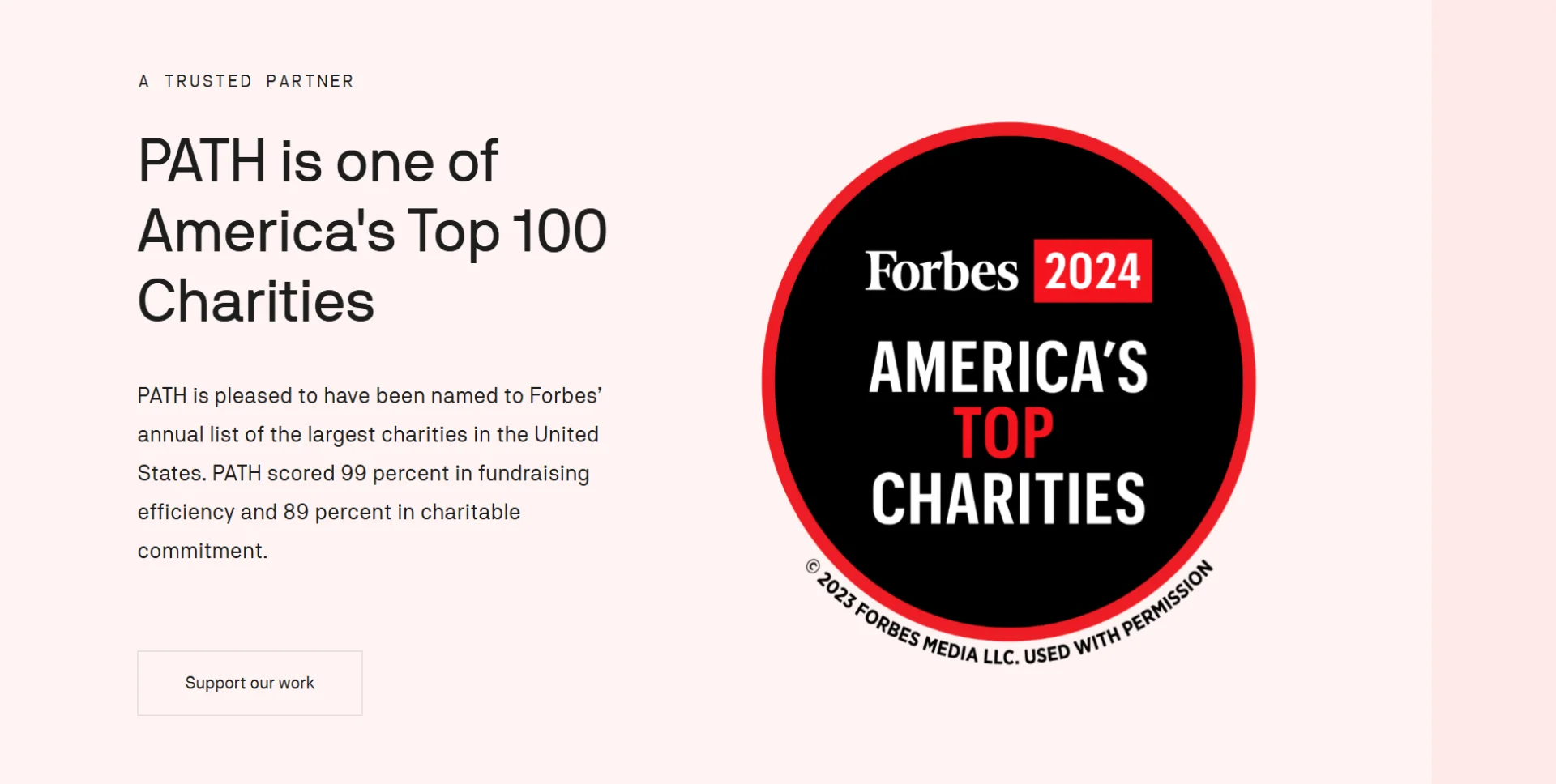
PATH now has a website that showcases its creative international work in global health. The website highlights infectious diseases and their vaccine requirements. Its structure is intended to impact and provide a pathway for global health advocates.
Nonprofits dedicated to children's well-being build some of the best non-profit sites, providing exquisitely visual but quite functional sites. They can illuminate a screen with a rich color palette, using child-friendly graphics that draw visitors into the site’s funnels. Straightforward navigation is central, where easy access to sections specifying programs, resources, and donations is essential so that users can quickly find what they need. These often use one more aspect, an organization's storytelling program, to convey the importance of their cause and personally connect with the audience.
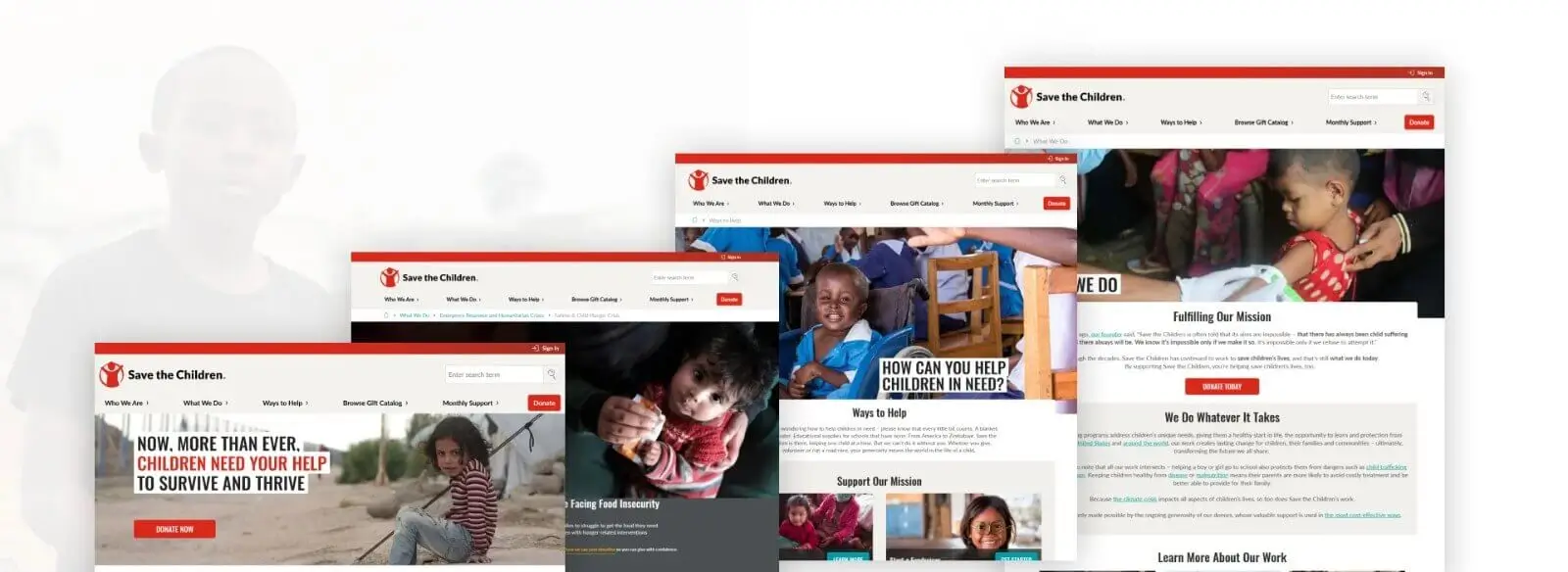
Save the Children operates in the world's most challenging regions, dedicating 85% of every donated dollar directly to their mission of providing lifesaving relief to children.
The platform serves as a comprehensive hub for child-focused humanitarian aid. It combines immediate relief efforts with long-term educational and health initiatives while maintaining transparency in resource utilization.
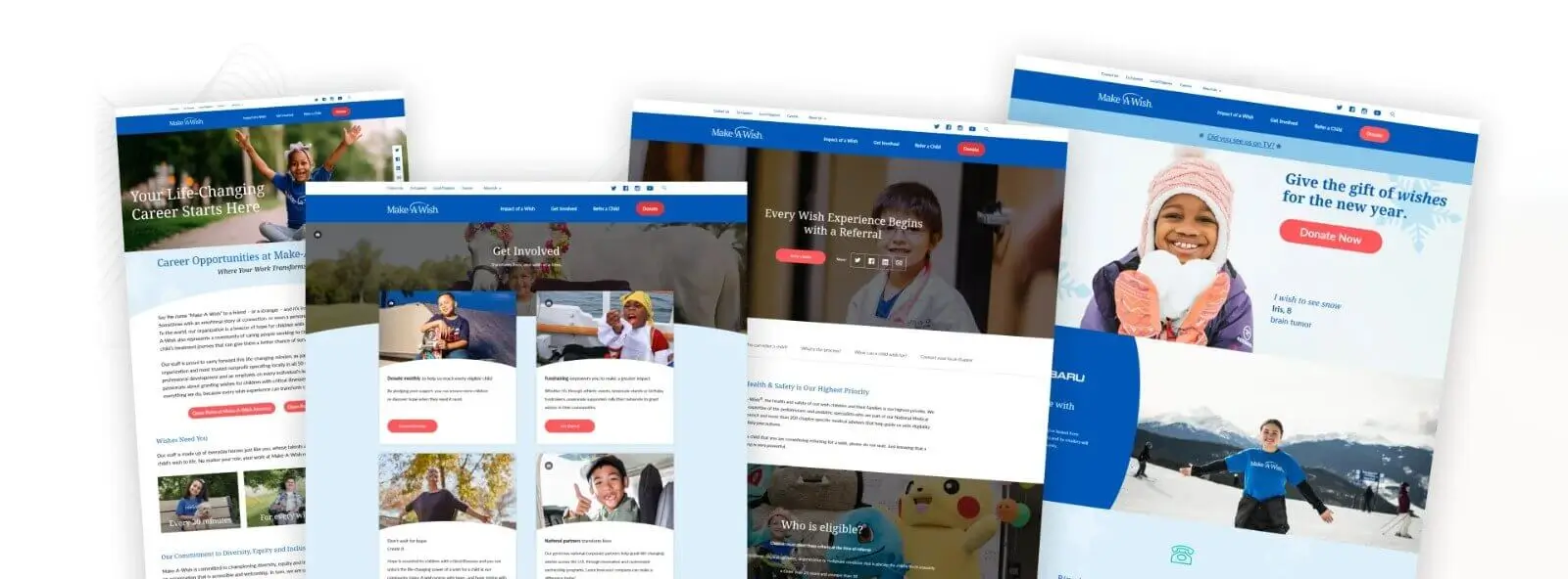
Make-A-Wish America is dedicated to granting life-changing wishes for children with critical illnesses.
The website is a central hub for coordinating wish-granting activities, connecting donors with opportunities to help, and sharing the impact of granted wishes across America.
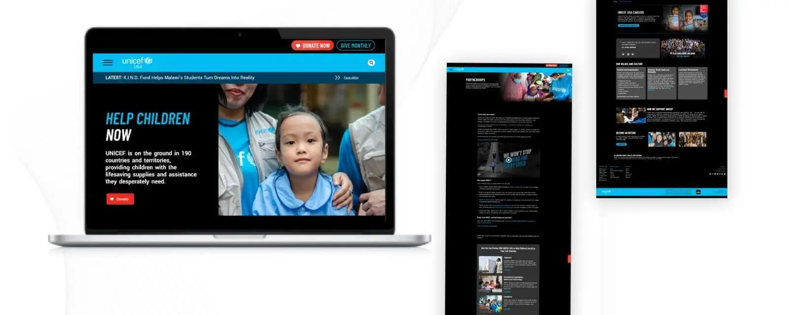
UNICEF USA supports UNICEF in advocating and fundraising for emergency relief services to children of all nations. It provides healthcare services, education, and protection for children, focusing on marginalized communities.
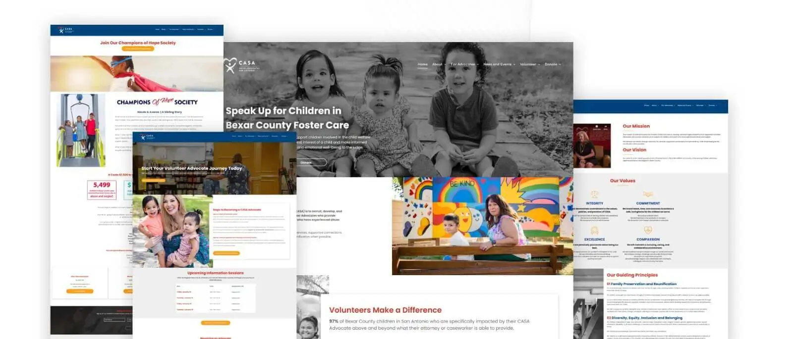
Child Advocates San Antonio (CASA) recruits and develops court-appointed volunteer advocates who support children in the child welfare system, particularly those who have experienced abuse and neglect.
The platform is a hub for recruiting volunteers, coordinating advocacy, and engaging the community in supporting foster youth through the child welfare system.
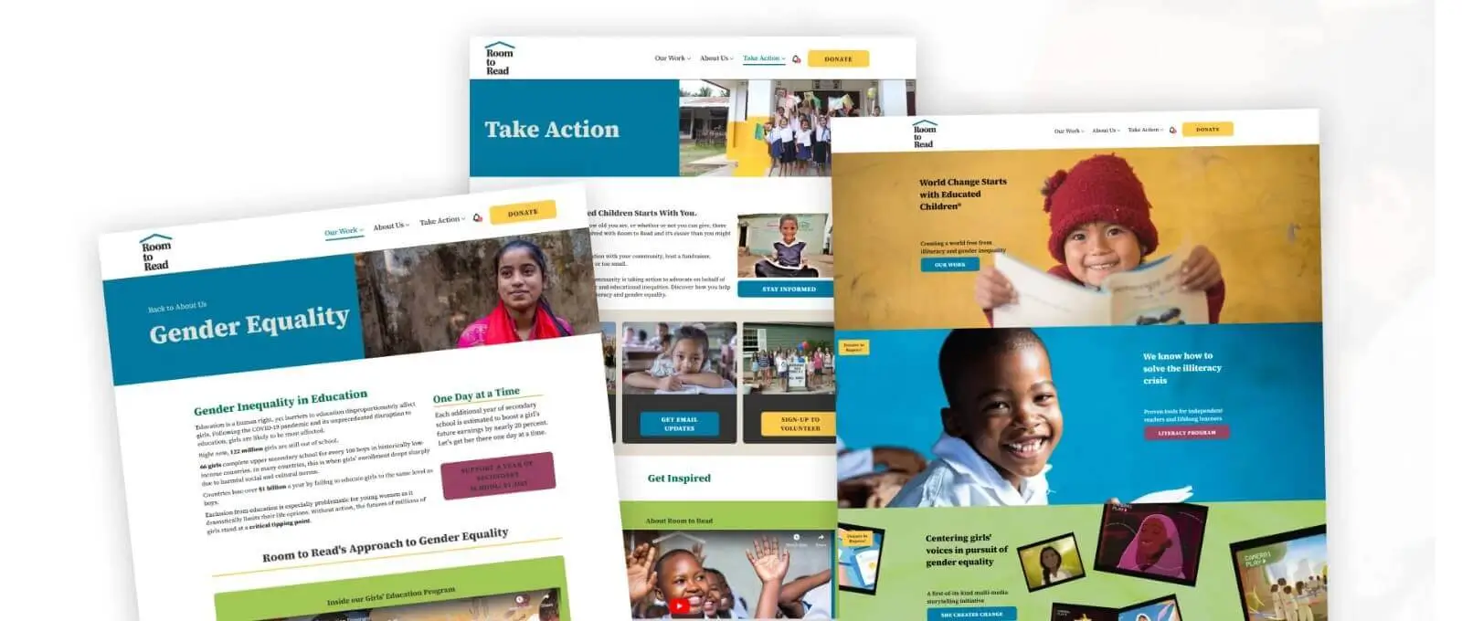
Room to Read is a nonprofit organization that promotes literacy and gender equality in education. It establishes scalable and sustainable programs that provide children with resources and the required skills for a brighter future.
Environment protection’s best nonprofit websites function mainly as educational channels, mobilizing action and sometimes raising funds for a particular project. This section will include non profit organization website examples that feature impressive advocacy work with environmental preservation.
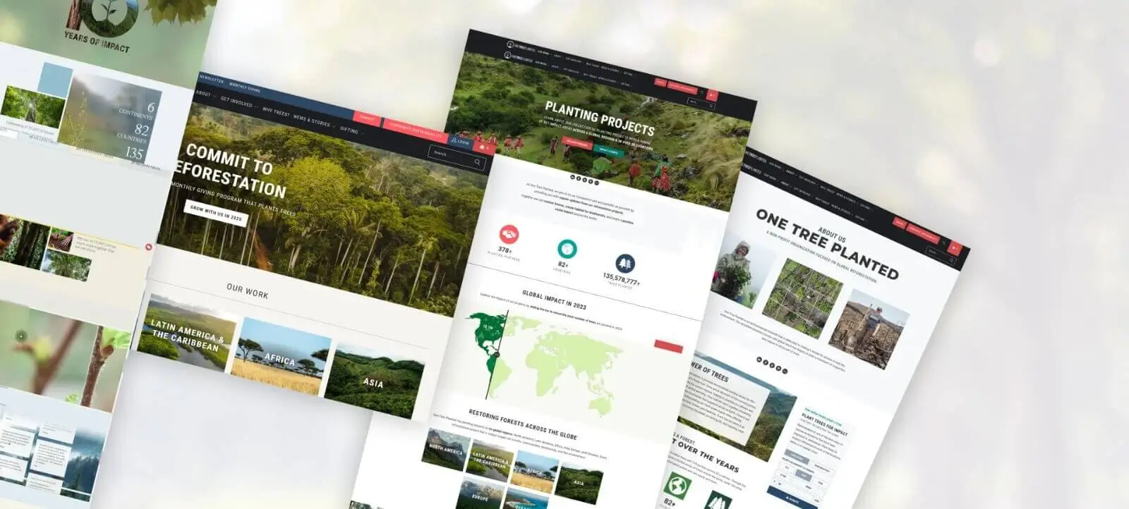
One Tree Planted is an environmental non-profit organization focused on global reforestation efforts. Here are the key aspects of the organization:
The organization's website typically serves as a platform for donations, project tracking, and environmental education. Its minimalist, user-friendly design focuses on simplicity and positive messaging to make tree planting accessible to everyone.
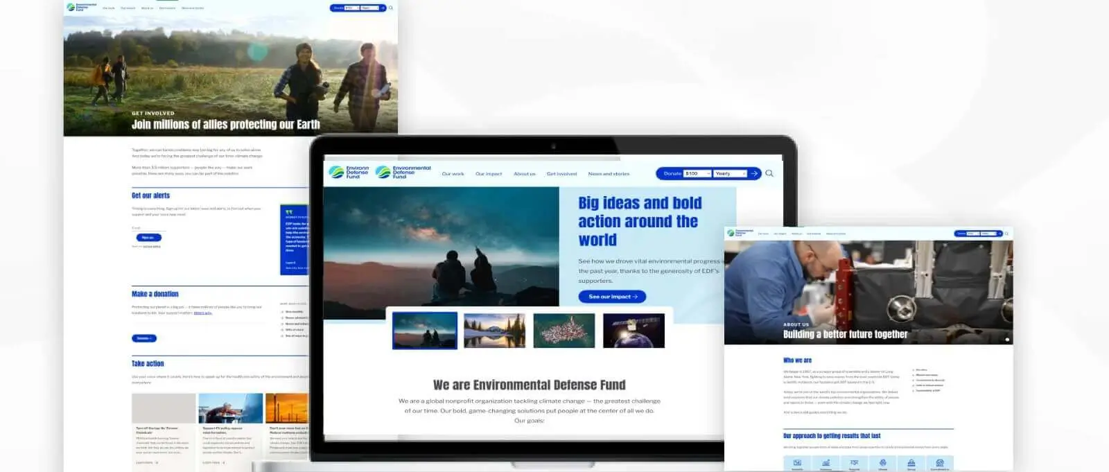
The Environmental Defense Fund is dedicated to advancing climate change issues, ecosystem conservation and protection, and sustainable policies through science, partnerships, and advocacy.
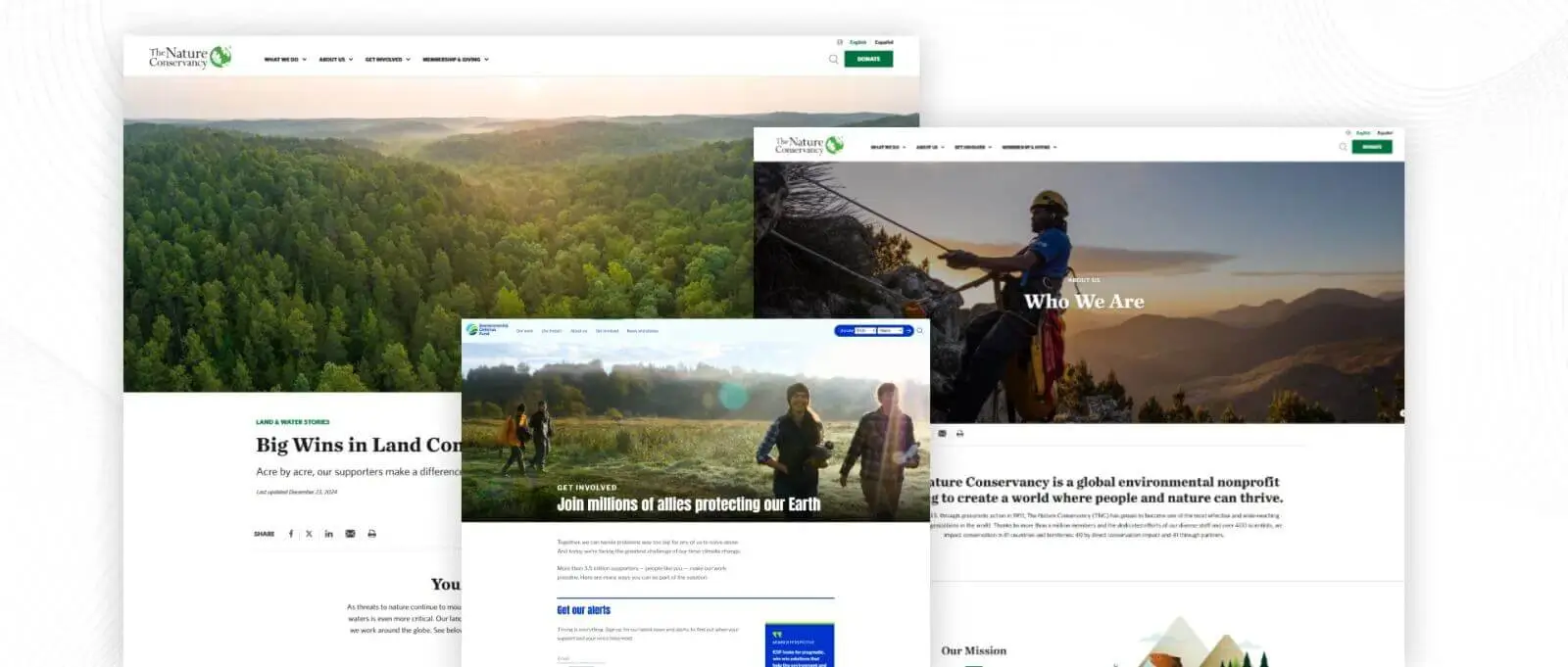
The Nature Conservancy is a large nonprofit environmental organization that seeks to conserve the lands and waters on which all life depends. Its primary focus is ecosystems and biodiversity. The organization collaborates with governments, communities, and businesses to address many pressing environmental challenges and advance sustainable development practices worldwide.
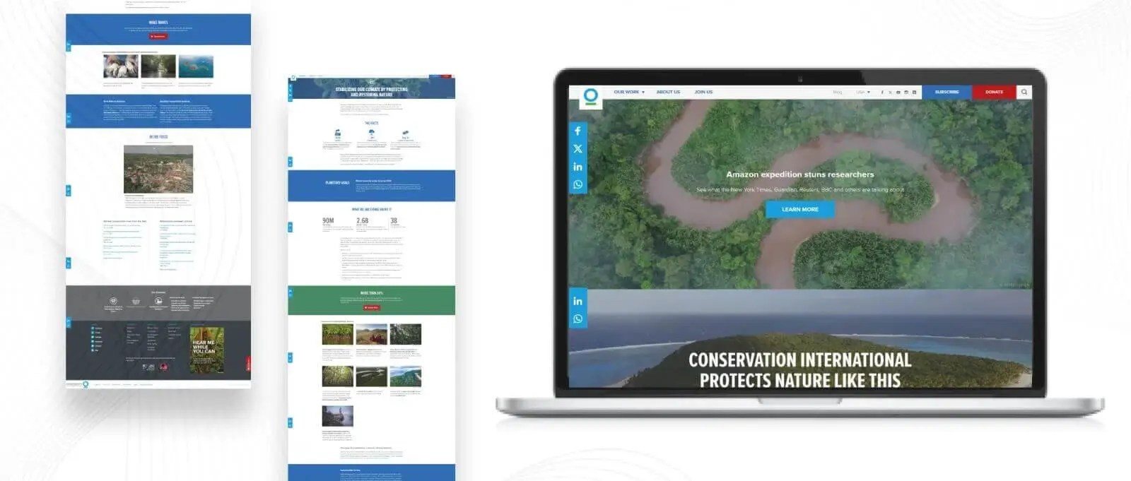
Conservation International's approach to science-based conservation incorporates innovative programs to reduce the impacts of climate change, biodiversity loss, and ecosystem degradation. Local partnerships, sustainable development, and international advocacy shape its strategies to make change happen over time. These unique strategies can improve ecology preservation by using technology and data in decision-making.
Humanitarian Aid and Development Nonprofits focus on addressing global challenges like poverty, hunger, and human rights violations. Their nonprofit organization websites facilitate donations, volunteering, advocacy, and transparency on the impact of their various projects. They emphasize immediate relief action, sustainable development solutions, and global solidarity in the endeavor to improve lives worldwide.
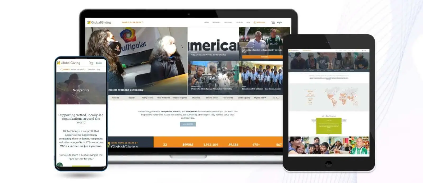 GlobalGiving is a non-profit organization that connects contributors with global grassroots projects. It also empowers local organizations by providing funding and resources for education, health care, disaster relief, and other major global development programs.
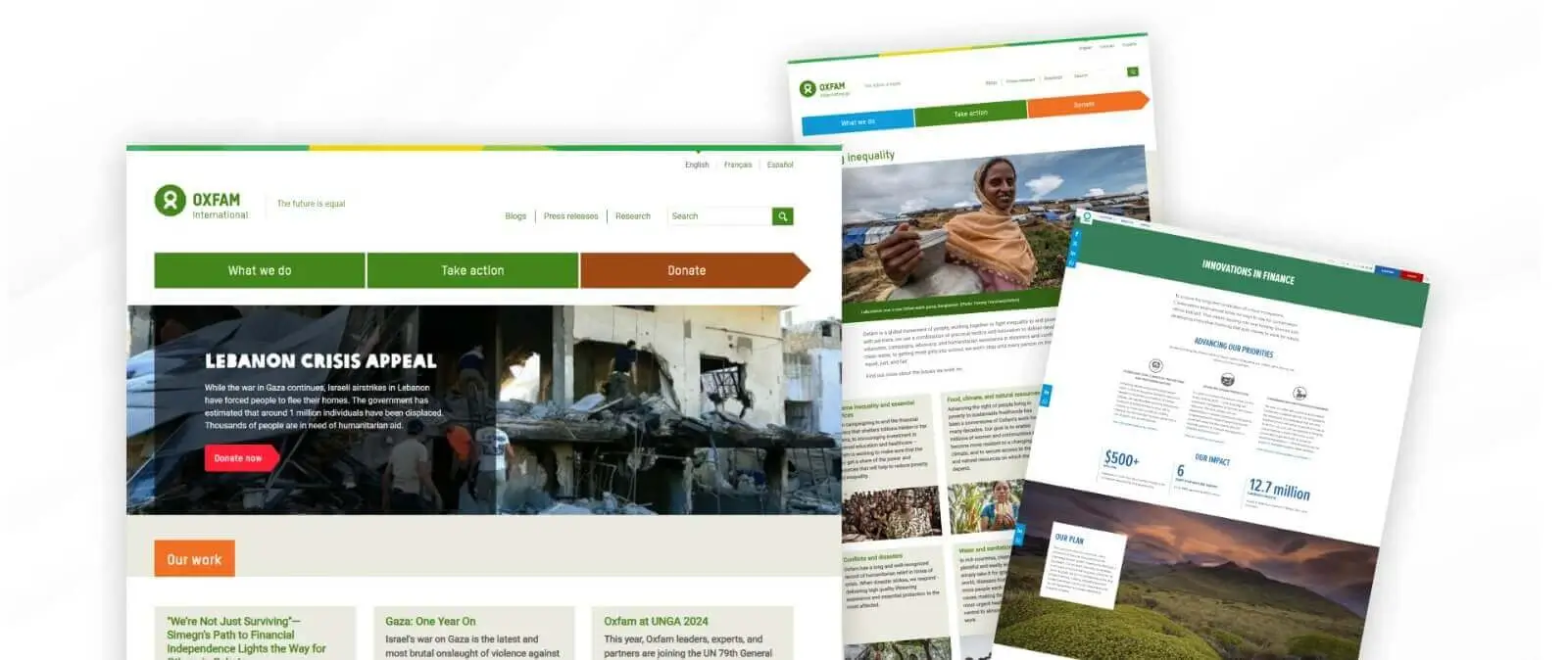
Oxfam International is a global nonprofit organization that fights poverty, inequality, and injustice. Operating in over 90 countries, it focuses on humanitarian aid, sustainable development, gender equality, and advocating for human rights and fair policies. Oxfam empowers communities through local partnerships and long-term solutions.
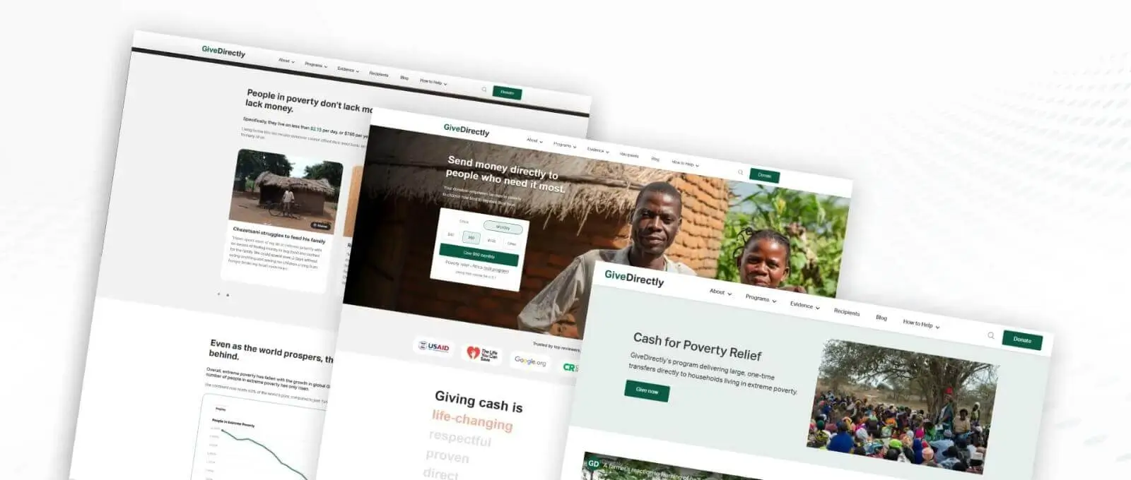
GiveDirectly facilitates direct cash transfers to people living in extreme poverty, empowering recipients to make their own choices about improving their lives.
The platform maintains a user-friendly interface focused on transparency and direct impact, allowing donors to see how their contributions transform lives through unconditional cash transfers.
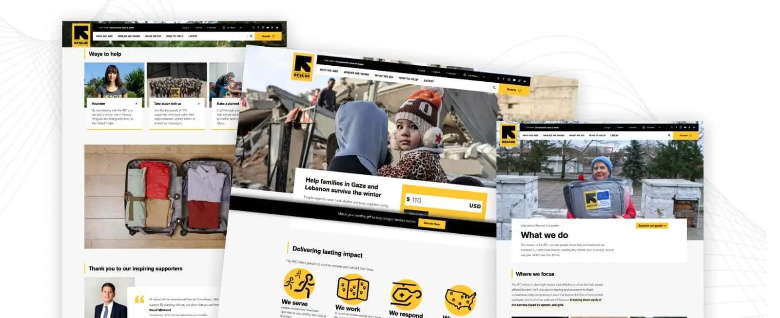
The International Rescue Committee provides emergency or humanitarian relief to persons devastate through conflicts and disasters and it also gives other types of services such as Health, Education, Protection, and Economic Support. It helps rebuild lives and communities.
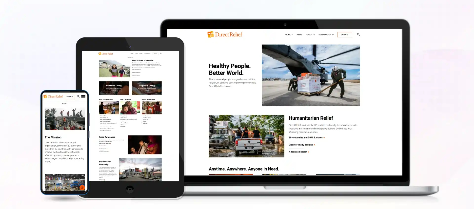
Direct Relief is an international nonprofit organization that delivers lifesaving medicines to health systems worldwide. It distributes essential medicines and supplies to health agencies, focusing on the possibility of rehabilitation after disasters and filling in health programs to mitigate suffering and strengthen health care.
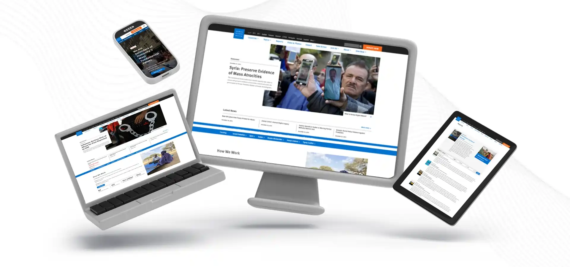 Human Rights Watch is a worldwide non-profit organization that safeguards human rights through research, advocacy, and action. This organization investigates and exposes different violations and reports to authorities anywhere demanded to stand by international human rights standards.
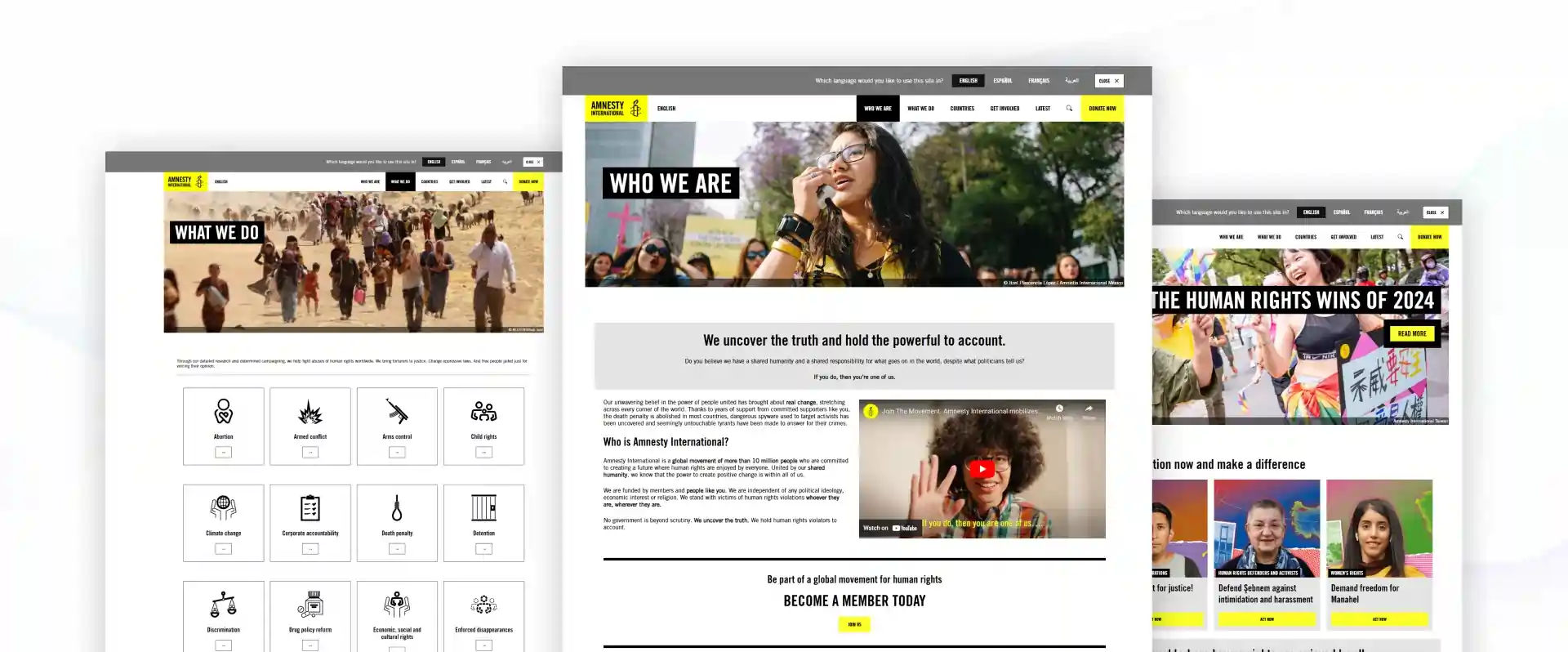
Amnesty International is a global non-governmental organization dedicated to defending human rights. Its campaigns aim to oppose injustice, uphold freedoms, and hold governments worldwide accountable for human rights violations.
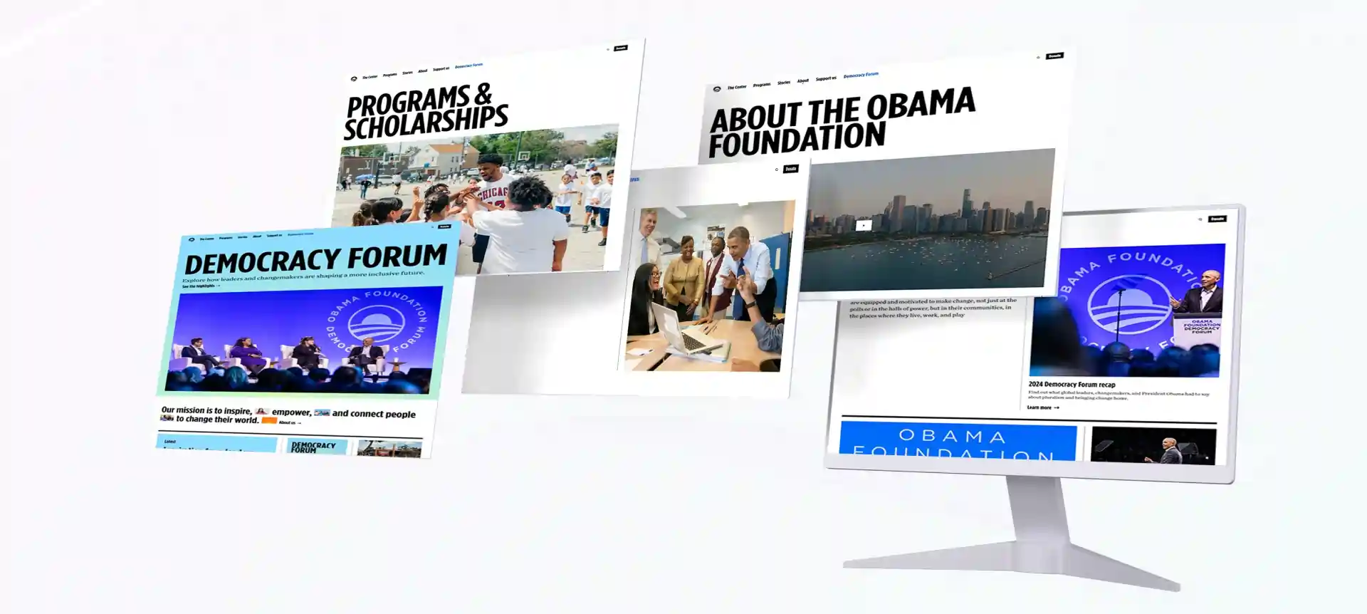
Undertaken in the public interest, the Obama Foundation empowers individuals and communities fostered by leadership development, civic engagement, and social impact initiatives to develop a new generation of leaders for positive change.
The website serves as a platform to fulfill its mission of inspiring, empowering, and connecting people to change their world.
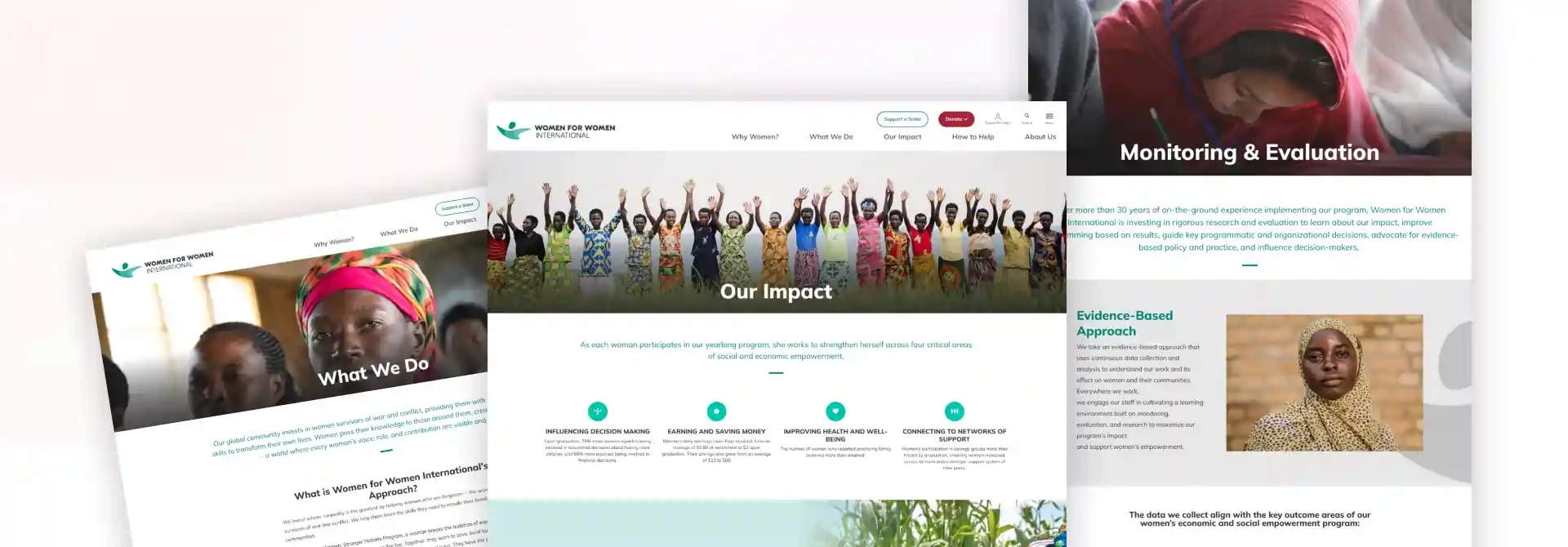
Women for Women International focuses on supporting female war survivors through comprehensive aid and empowerment programs in 17 conflict-affected countries.
The platform serves as a hub for connecting donors with women survivors of war. It provides immediate relief and long-term empowerment solutions while maintaining transparency in its humanitarian efforts.
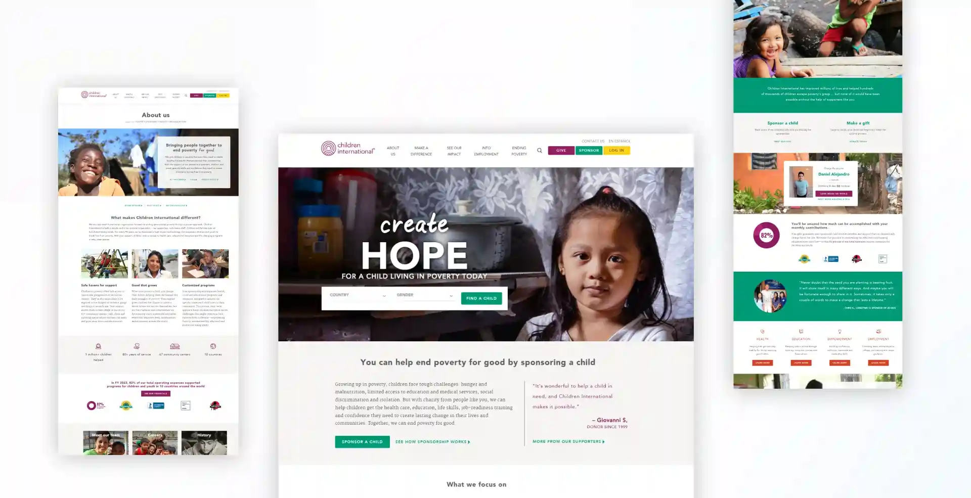
Children International focuses on breaking the cycle of poverty through comprehensive child sponsorship programs.
The platform facilitates direct connections between sponsors and children while providing comprehensive support for health, education, and future employment opportunities, thereby creating lasting change in impoverished communities.
Inclusive sports non-profits offer equal opportunity to individuals, irrespective of their abilities, in different sports and physical activities. They work towards removing barriers, promoting inclusiveness, and advocating for accessibility. These non-profits strive to create environments that are empowering for people with disabilities so that all have a chance to participate in sports.
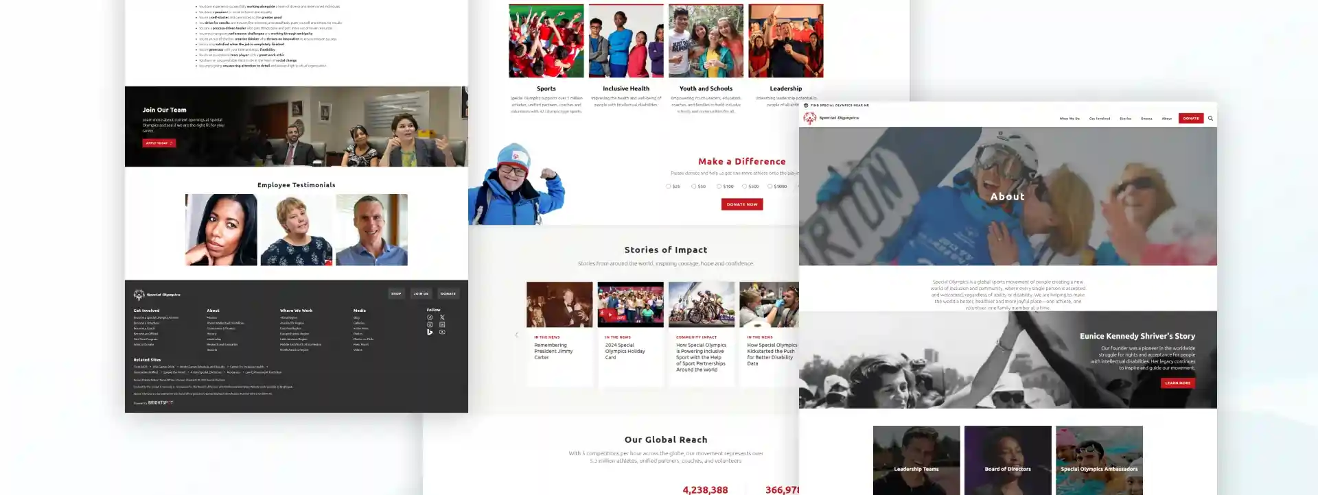
Special Olympics is a global sports movement dedicated to ending discrimination against people with intellectual disabilities through inclusive sports programs and events.
The platform maintains an active presence globally, with five competitions per hour, demonstrating its commitment to creating inclusive opportunities for athletes of all abilities.
Inclusive sports non-profits offer individuals equal opportunities to participate in different sports and physical activities regardless of their abilities. They work to remove barriers, promote inclusiveness, and advocate for accessibility. These non-profits strive to create environments that empower people with disabilities so that everyone has a chance to participate in sports.
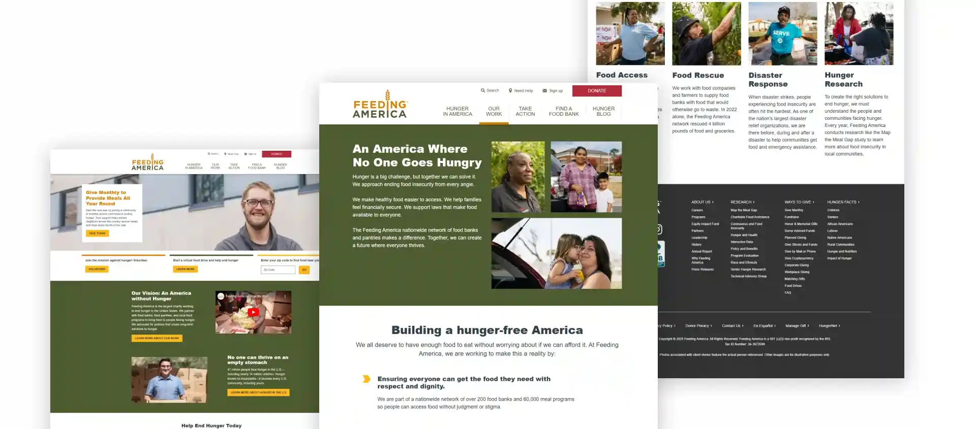
Feeding America is one of the nation's largest domestic hunger relief organizations.
Nonprofits that deal with knowledge and information dissemination will focus on access to educational resources, promotion of literacy, and support for opening knowledge sources. They narrow down information gaps and enable people to learn and innovate.
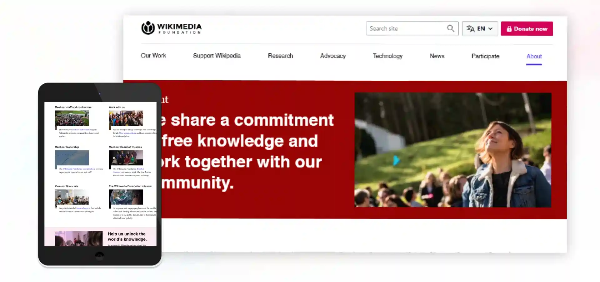
As a nonprofit, the Wikimedia Foundation sustains open knowledge projects like Wikipedia. Sharing free and reliable information should promote worldwide access to knowledge and education.
Research evaluation nonprofit organizations are involved in evaluations and assessments for improving programs, policies, and practices by conducting studies. They use such assessments to provide data-driven insights to improve effectiveness and inform sector decisions.
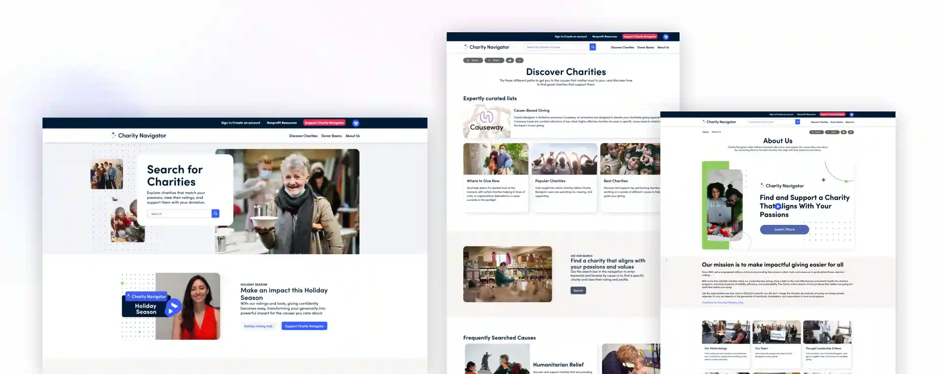 Charity Navigator is a non-profit organization through which charities are evaluated and rated based on financial health, accountability, and transparency, making it easier for donors to make informed decisions about donating.
Let's have a heart-to-heart about what we've just seen. These organizations aren't just getting lucky - they're following some brilliant patterns you can replicate. Here's what's cooking:
Listen, nobody – and I mean nobody – donates because of a pie chart. What these websites nail is turning statistics into stories that grab you by the heart. Notice how charity: water doesn't just tell you about water scarcity – they introduce you to Sarah, who walks 4 miles daily for clean water. That's not just information; that's motivation.
A mind-blowing statistic is that nonprofit organizations demonstrating real-time impact have garnered an average 47 percent hike in repeat donations. Why? People do not want to give these days but rather invest in change: "Show me the receipts, and I'll show you the money."
Remember how Amazon remembers what you like? These nonprofits are doing the same thing. When The Nature Conservancy shows different content to wildlife lovers versus climate activists, their engagement rates triple. This is not rocket science; it's just giving enough care to be relevant.
Rather than telling someone they can help, show them exactly how they can. Therefore, impact calculators and interactive maps aren't just cool features but engagement machines. Organizations employing such tools observed:
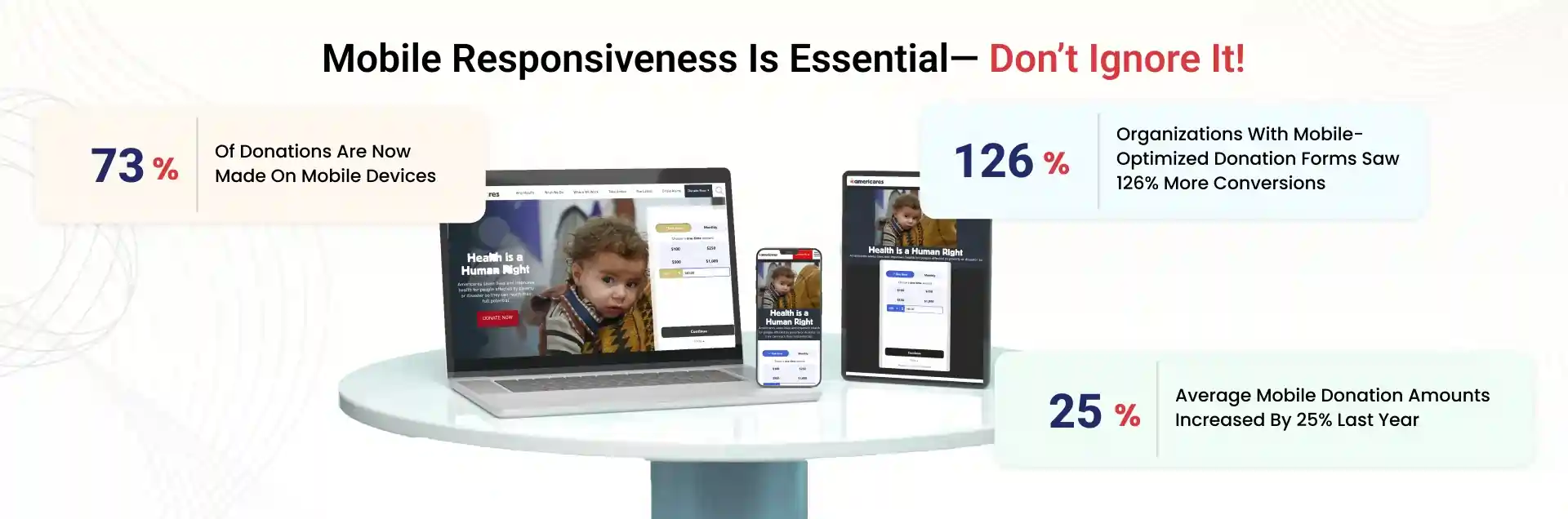
Read this shocking statistic: For every second your website takes to load, you lose 7% of potential donors. The most successful sites in our lineup kept their pages lightning-fast while still looking gorgeous. How? By being ruthlessly efficient with their design choices.
Look, I get it. These nonprofit website examples might feel like watching Olympic athletes while learning to jog. But here's the thing—every one of these organizations started somewhere. The real magic isn't in their budgets but in their approach.
You don't need to implement everything at once. Start with one thing – maybe it's telling better stories or making your donation form mobile-friendly. The key is to begin.
Consider this: Your cause deserves visibility, understanding, and support, and these websites aren't just a pretty presence. They prove that a well-crafted online destination can amplify your message in ways you never imagined.
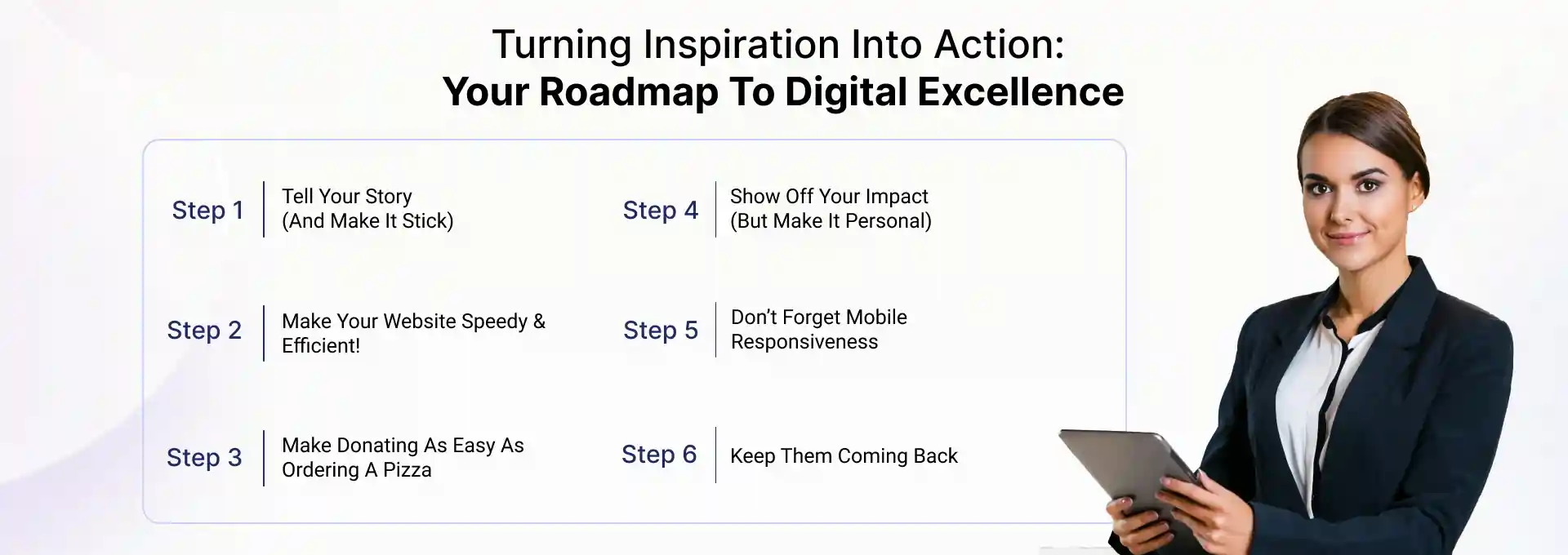
Are you ready to implement these insights? The following section will show you how to implement these strategies stepwise, regardless of size and budget.
Alright, let's dive into this with one of the real-world non profit organization website examples that's close to my heart. I spent several years working for this excellent food bank in Virginia, and believe me, I learned a lot about making a website work for something great. So get a cup of coffee (or tea; I don't judge) and come with me as I walk you through it.
You know what's wild? People don't donate because of statistics. They donate because of stories. At our food bank, we had impressive numbers of meals served, but they didn't move the needle much. Then we started sharing stories like Maria's:
"A single mother of three, Maria, found herself one day without a job due to the pandemic. The food bank provided her groceries and assured her of hope; today, she stands independently and volunteers with us monthly."
Boom! Donations started pouring in. Why? Because people could see themselves in Maria's story.
Find your "Maria" as quickly as possible. Interview a client, volunteer, or even a staff member. Strongly feature their story at the top of your home page. Go ahead and use real pictures, too (with permission). Trust me, they beat stock photos any day.
Fun fact: every second your website takes to load, you lose 7% of potential donors. Ouch! When we speeded up our food bank's site from 8 seconds to 3, guess what happened? Donations jumped by 25%!
How to Speed Things Up:
We had this donation form that was longer than a CVS receipt. It was ridiculous. So, we stripped it down to the bare essentials:
And then we added something magical: impact statements. Right next to the donation amounts, we put things like:

We created this interactive map of Virginia showing where our food distributions were happening. Visitors could type in their zip code and see how many families we were helping in their neighborhood. It was like magic – local donations increased by 52%! Learn how you can create such a nonprofit website in detail.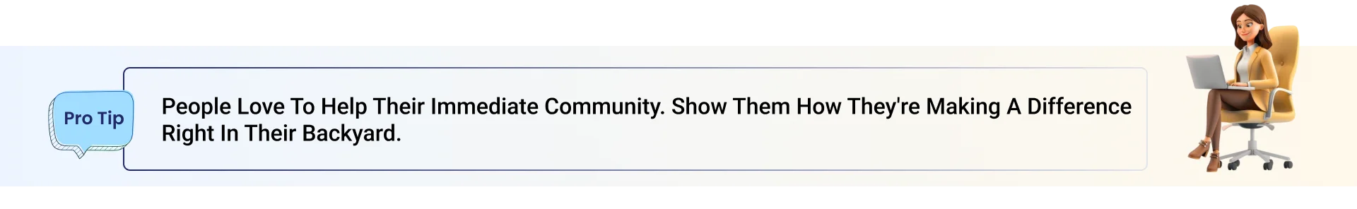
Here's a shocker: 65% of our donations came through mobile devices. So, we went all-in on mobile optimization. We ensured every button was big enough for thumbs, every image loaded quickly on 3G, and the donation process was smooth as butter on a smartphone.
Quick Test: Try donating to your organization on your phone right now. If you feel frustrated, your donors will probably feel frustrated, too.
We started sending personalized impact reports to our donors. Nothing fancy – just a monthly email showing:
Our recurring donation rate shot up by 40%. Why? Because people could see their ongoing impact.
Remember, your website isn't just a digital brochure. It's your 24/7 fundraiser, storyteller, and mission ambassador. Every tweak you make, and every story you tell brings you one step closer to changing more lives.
So, start small. Pick one thing from this list and implement it this week. Then, next week, tackle another. Before you know it, you'll have a website that's not just pretty but a powerful tool fueling your mission.
We have come a long way together, finding that small web design ideas can significantly impact a nonprofit website. Every successful nonprofit website has evolved, such as Mental Health America, One Tree Planted, and Save the Children. They all began with a single step to make their digital presence work harder.
Your cause is too important for a "good enough" website. Every day, donors, volunteers, and supporters search for your nonprofit's offerings. The question is: "Can you afford not to improve?" The best part is that despite any nonprofit website costs that may worry you, you can still find an excellent solution within your budget.
Start small: Make your donation button mobile-friendly, share an incredible story, or add impact metrics. One small change can bring about significant improvement.
Your mission, impact, and website do matter here. Ready for that first step? Let's create some digital magic!
Whether you're a nonprofit:
As a trusted nonprofit website design company, JanBask has been there, done that, and probably solved challenges you haven't even thought of yet. Here's what makes JanBask Digital Design different - we build relationships, not just websites. Imagine having a technology partner who:
Let's discuss your mission and how we can amplify it in the digital world. There is no pressure or obligation—just a chat about possibilities. Every day you wait is another day your mission isn't reaching its full potential online. Your cause deserves better, your supporters deserve better, and you deserve better.
Let's make it happen. Together.
"The best time to plant a tree was 20 years ago. The second best time is now."
The same goes for creating your perfect nonprofit website.
Limited Time! Get Your FREE Nonprofit Website Consultation Today!


A Specialized Team for custom web solutions for your business through Web Design, Web Development, Digital Marketing Services such as SEO, Social Media Marketing.

S
“Great compilation of nonprofit website examples! It’s inspiring to see how design and functionality can come together to create a positive impact. Thanks for sharing this!”
M
“Awesome article! These examples showcase how modern design can make a nonprofit’s mission more visible and engaging. I’m definitely taking notes for my own project.”
S
Inspiring collection of nonprofit website examples! A well-designed site is key to engagement, awareness, and donations. Loved the insights on design and functionality—looking forward to more expert tips! Definitely a must-read for nonprofits aiming to improve their online presence!
B
Really helpful! The examples were modern, clean, and gave us great design ideas for our own site.”