Nonprofit Website Redesign | +64% Online Donations
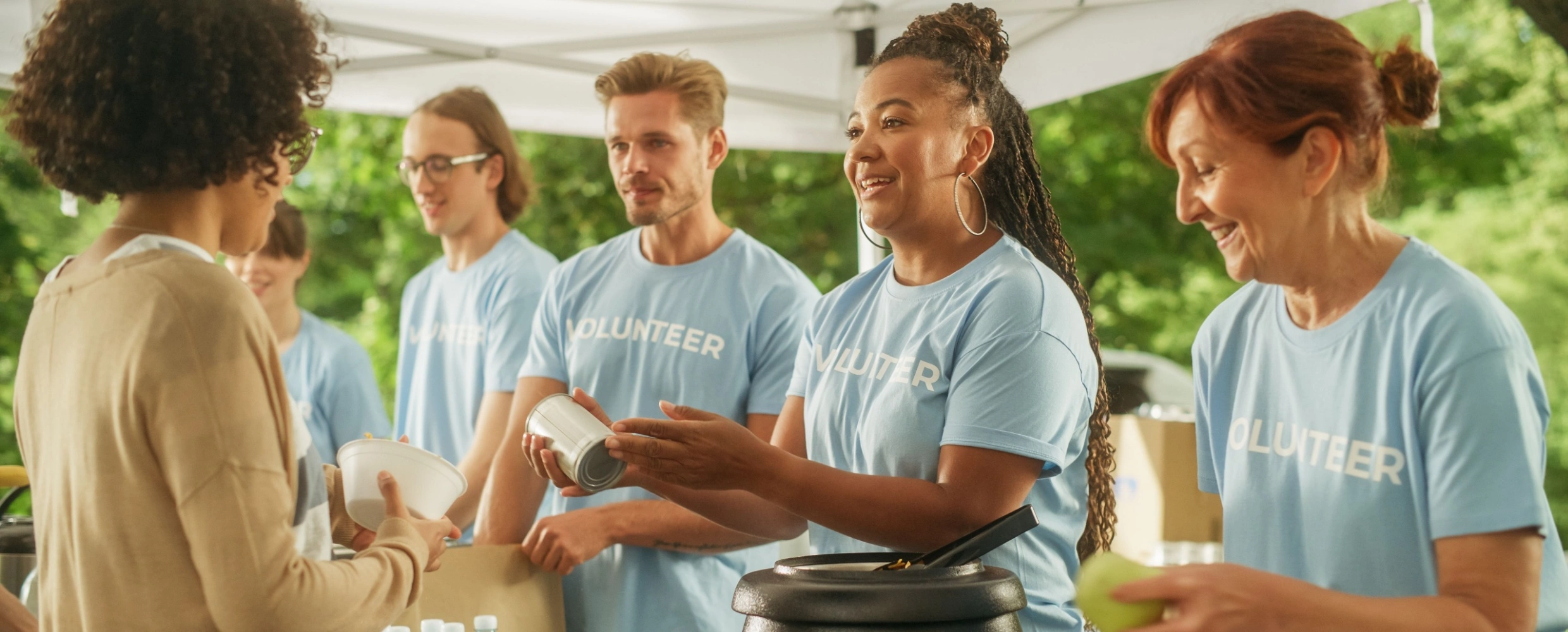
Volunteers working together on a community project outdoors
Case Study • Nonprofit Website Redesign

The mission was clear. The homepage buried it under four dropdown menus.

Northbridge Youth Alliance had a decade of real impact behind it, but the website still ran on a template from its first grant cycle, with a donate button nobody could find and impact stories buried in PDFs. Here’s what changed when we redesigned it around the person deciding whether to give.

+64%
online donations since launch
+50%
volunteer sign-ups
-37%
homepage bounce rate

Sound familiar?

If two or more of these are true, this case study is written for you.
!Your website looks like it hasn’t been touched since your first grant cycle.
!Visitors can’t find the donate button without hunting for it.
!Your impact stories are buried in PDFs and annual reports nobody opens.
!Program pages are outdated, inconsistent, or missing altogether.
!Volunteering means filling out a form and hoping someone follows up.
!The site looks fine on desktop and falls apart on a phone.
!There’s no clear answer to “where does my donation actually go?”
!You wince a little every time you send someone to your own homepage.

The Challenge

The website was undercutting a mission everyone already believed in.

Northbridge Youth Alliance had built a decade of real trust in the community, but the website still ran on a template from its first grant cycle, with impact stories buried in PDFs and a donate button nobody could find without hunting for it. Program pages were inconsistent, some missing entirely, and volunteering meant filling out a form and hoping someone followed up. For an organization whose entire case for support depends on people believing their gift matters, every one of those gaps was a reason to close the tab instead of giving. The redesign wasn’t about looking more polished. It was about making the mission impossible to miss.

ProblemWhat we didResult
Problem

Generic template that hadn’t changed since the organization’s first grant cycle.

What we did

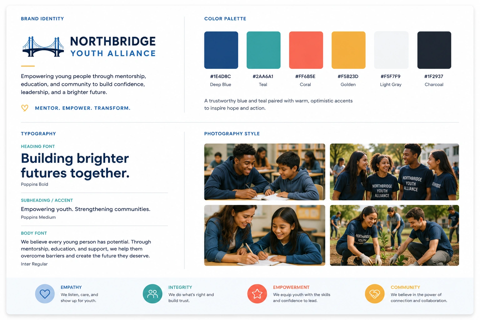
Built a complete visual identity around the organization’s actual story, not a shared nonprofit template.

Result

Site finally looks like an organization worth trusting with a gift.

Problem

Donate button buried, and inconsistent from page to page.

What we did

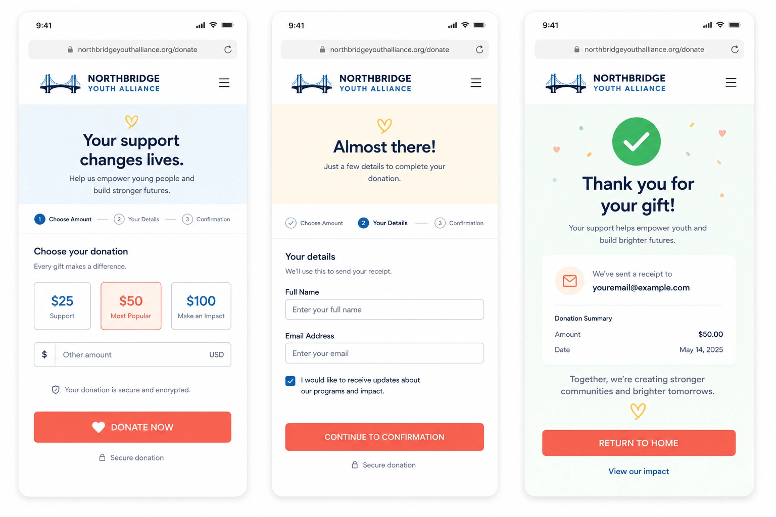
One clear, persistent donate path from every page on the site.

Result

Online donations up 64%.

Problem

Impact stories buried in PDFs and annual reports nobody opened.

What we did

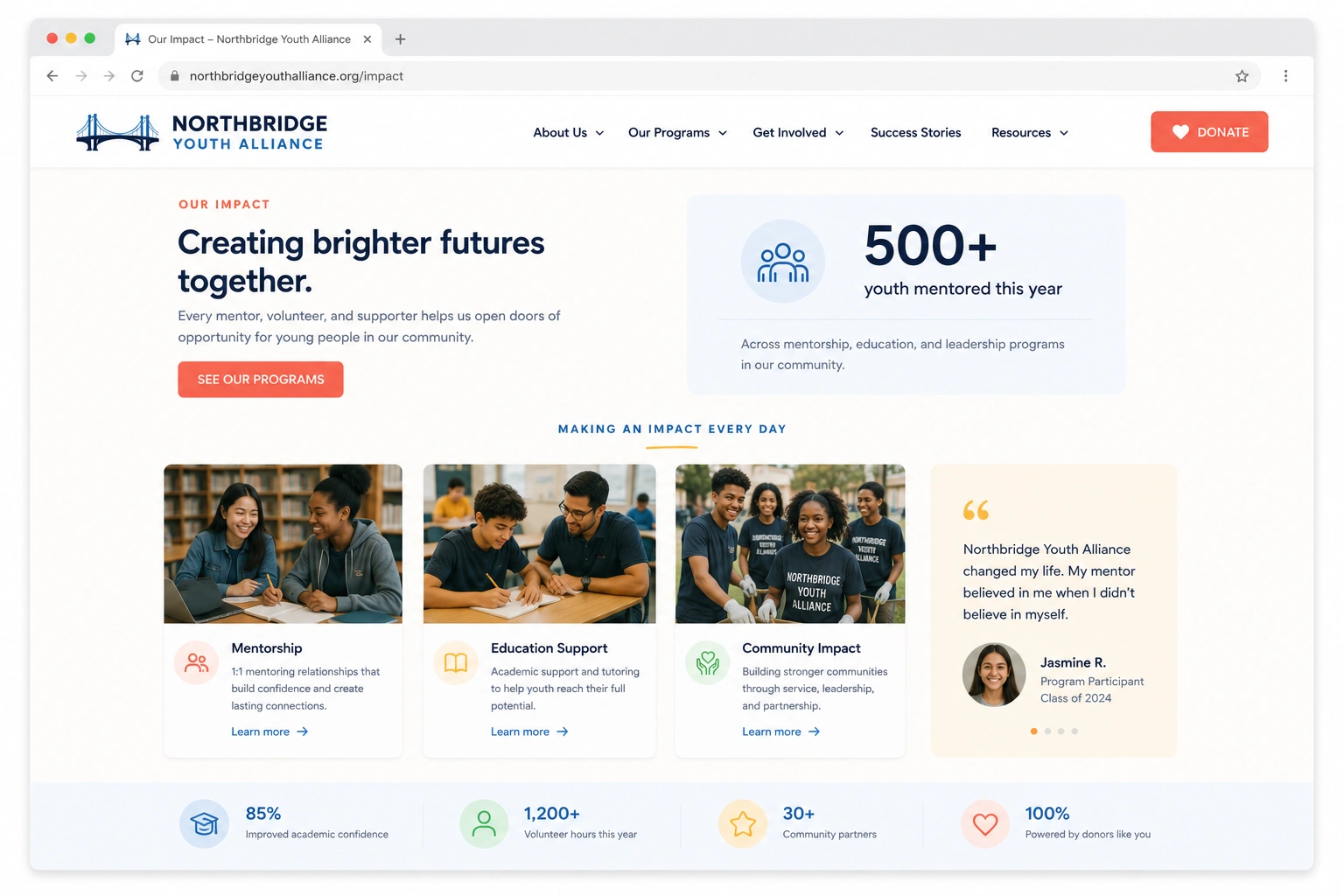
Built a scannable impact section with real stories and numbers right on the homepage.

Result

Time spent on impact pages up significantly.

Problem

Program pages outdated, inconsistent, or missing entirely.

What we did

Rebuilt every program page on one consistent, easy-to-maintain template.

Result

Program page bounce rate down noticeably.

Problem

Volunteering meant filling out a form and hoping for a follow-up.

What we did

Built a structured volunteer sign-up flow that routes to the right program automatically.

Result

Volunteer sign-ups up 50%.

Problem

Site looked fine on desktop, broke down on mobile.

What we did

Rebuilt every page mobile-first, since most donations start from a phone.

Result

Mobile bounce rate down 37%.

Problem

No clear answer to “where does my donation actually go?”

What we did

Added a transparent breakdown of how funds are used directly to the donate page.

Result

Fewer abandoned donation attempts.

“We had a decade of real impact to point to. The website made it look like we were guessing.”

The Approach

Five phases, redesigned around what actually makes someone give.

  1. Phase 01

    Discovery & content audit

    Reviewed every existing page and drop-off point, and talked to program staff about the stories the old site wasn’t telling.

  2. Phase 02

    Visual identity

    Built a distinct visual language (photography, color, and type) instead of the shared nonprofit template look.

  3. Phase 03

    UX & information architecture

    Restructured navigation and content around “why should I give” and “how do I help,” not the org’s internal program structure.

  4. Phase 04

    Mobile-first rebuild

    Rebuilt every page mobile-first and streamlined the donation and volunteer flows for a phone screen.

  5. Phase 05

    Launch & handoff

    Trained staff to update program pages and impact stories themselves: no developer needed for day-to-day updates.

The Work

Visual proof of the improvements we delivered.

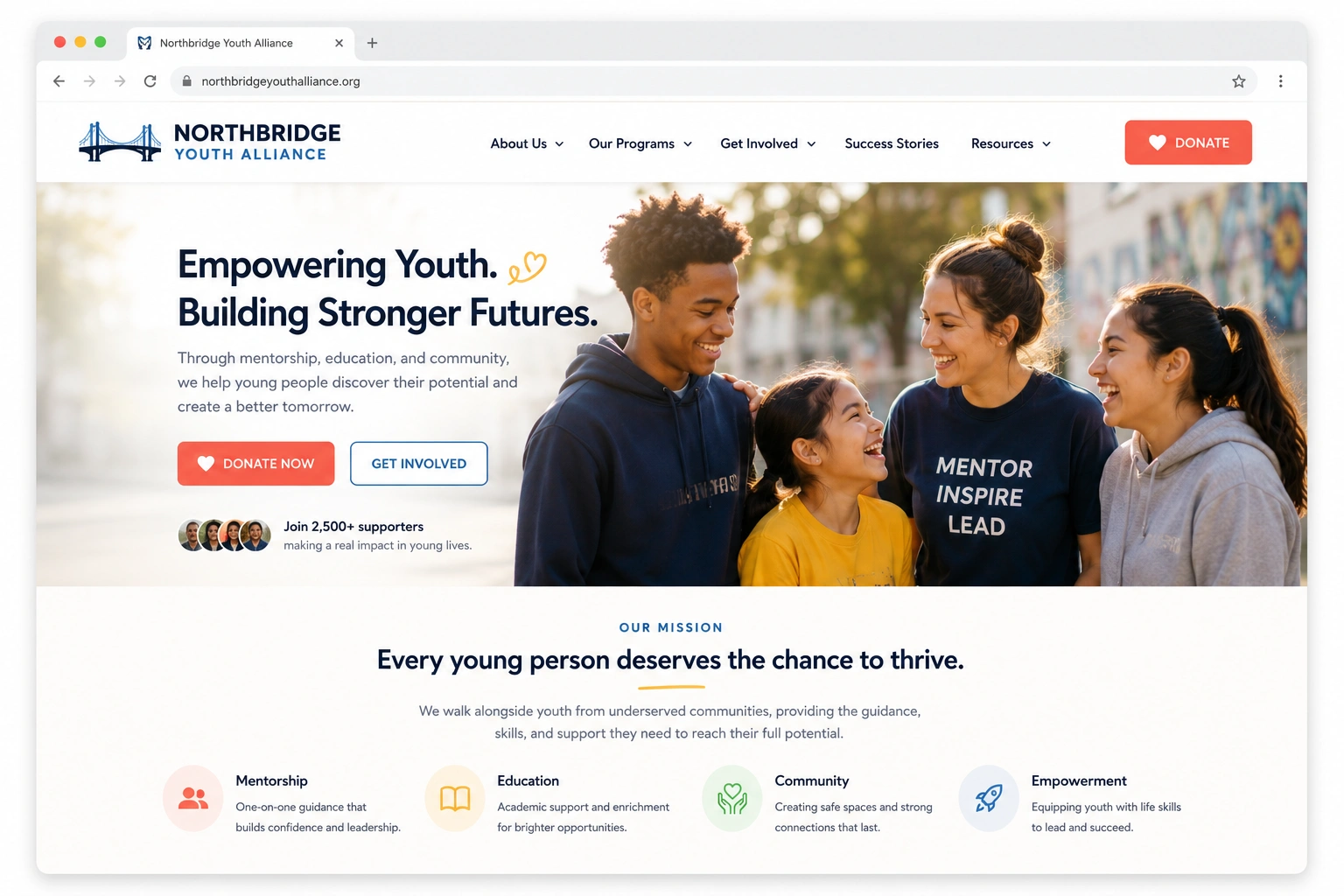
Redesigned nonprofit homepage shown in a browser mockup
Redesigned donation page with a clear, persistent donate path
Redesigned program page showcasing impact stories and outcomes
Responsive website layouts displayed on desktop and mobile devices

The Results

Measured against the same window a year prior.

Metric Before After Change
Online donationsone-time + recurring giving baseline +64% +64%
Volunteer sign-upsnew volunteer applications baseline +50% +50%
Homepage bounce ratevisitors leaving without exploring 59% 37% −37%
Clicks to donatehomepage to confirmed gift 4 clicks 1 click −75%
Average page load timeacross all devices 4.4s 1.7s −61%
Mobile session lengthtime spent on site, mobile only baseline ~1.9x +90%
Program page viewsvisitors exploring a specific program baseline 2x +100%

Built to earn the trust a donation actually requires

WCAG 2.1 AA Accessible
Mobile-First, Every Page
Transparent Fund Allocation
Designed With Program Staff Input

In Their Words

“Donors used to ask us questions the website should have already answered. Now the site tells our story better than we can in a meeting.”
Executive Director, Northbridge Youth Alliance

What's Included

What a Website Redesign & UX Overhaul engagement typically covers.

Full visual identity & design system
Custom homepage & program pages
Streamlined donation & volunteer flows
Mobile-first responsive rebuild
Accessible, WCAG-conscious components
Transparent impact & fund-allocation reporting

Considering Website Redesign & UX Overhaul for your own site?

Tell us where donors and volunteers are hesitating before they ever reach out and we'll tell you honestly whether a redesign is what fixes it.

  • Free homepage & donation-flow review
  • We’ll show you exactly where donors are dropping off
  • Built for nonprofits whose case for support depends on trust
  • Reply within one business day
Book a Strategy Call

Want more detail on this project?

Leave your details and we'll send over the full breakdown.

Talk to Marketing Expert!

Get Your Free Website Audit