
Education Website Redesign | +57% Online Applications Started
Prospective student reviewing college program options online
Case Study • Education Website Redesign

Prospective students couldn’t find the apply button. So they applied somewhere else.

Ashgrove Community College offered strong programs and real career outcomes but the website buried both behind a confusing menu and an application process nobody could find. Here’s what changed when we redesigned it around the one decision that actually matters: whether to apply.

+57%
online applications started since launch
+41%
program page engagement
-33%
homepage bounce rate

Sound familiar?

If two or more of these are true, this case study is written for you.
!Your website hasn’t changed since your last accreditation cycle.
!Prospective students dig through menus just to find the apply button.
!Program and course pages are outdated, inconsistent, or missing.
!There’s no clear answer to “what will I be qualified for after this program?”
!Admissions requirements are scattered across PDFs, not the page where people decide.
!The site looks fine on desktop and falls apart on the phone most students use.
!Every department’s page looks like it was built by a different team because it was.
!You wouldn’t want your homepage to be a student’s first impression of the school.

The Challenge

The website was the reason strong programs weren’t filling seats.

Ashgrove Community College had real outcomes to point to graduates moving into stable careers, transfer agreements with four-year schools, completion rates above the state average. None of it showed up on the website. Program pages were outdated or missing, admissions requirements were scattered across PDFs, and the apply button itself was buried behind a menu most visitors never opened. For a prospective student comparing three or four schools in one sitting, every one of those gaps was a reason to move on to the next tab instead of applying. The redesign wasn’t about looking more modern it was about making it obvious what to do next.

ProblemWhat we didResult
Problem

Generic, outdated design that hadn’t changed since the last accreditation cycle.

What we did

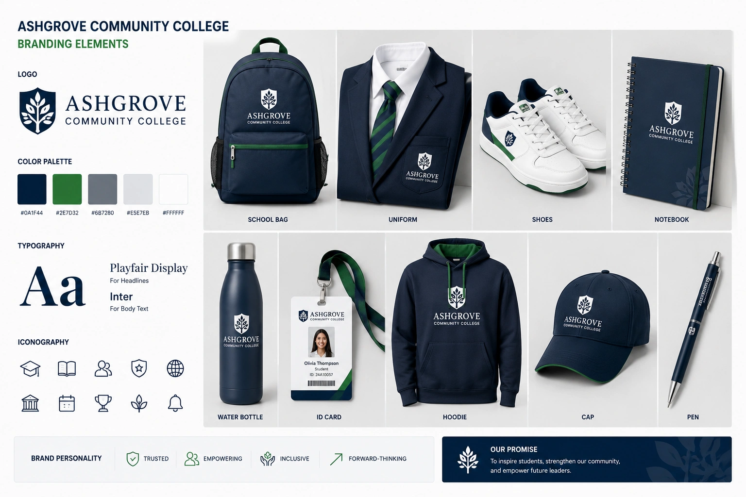
Built a complete visual identity around the college’s actual outcomes and campus life, not a shared template.

Result

Site finally looks like a school worth applying to.

Problem

Apply button buried, and inconsistent from page to page.

What we did

One clear, persistent apply path from every page on the site.

Result

Online applications started up 57%.

Problem

Program and course pages outdated, inconsistent, or missing entirely.

What we did

Rebuilt every program page on one consistent template, led with career outcomes.

Result

Program page engagement up 41%.

Problem

Admissions requirements scattered across PDFs instead of the page where people are deciding.

What we did

Brought requirements, deadlines, and costs directly onto each program page.

Result

Fewer admissions-office calls asking questions the site should already answer.

Problem

No clear answer to “what am I actually qualified for after this program?”

What we did

Added outcome data completion rates, transfer paths, career placement to every program page.

Result

Program pages became the most-visited pages on the site.

Problem

Site looked fine on desktop, broke down on mobile, where most prospective students actually browse.

What we did

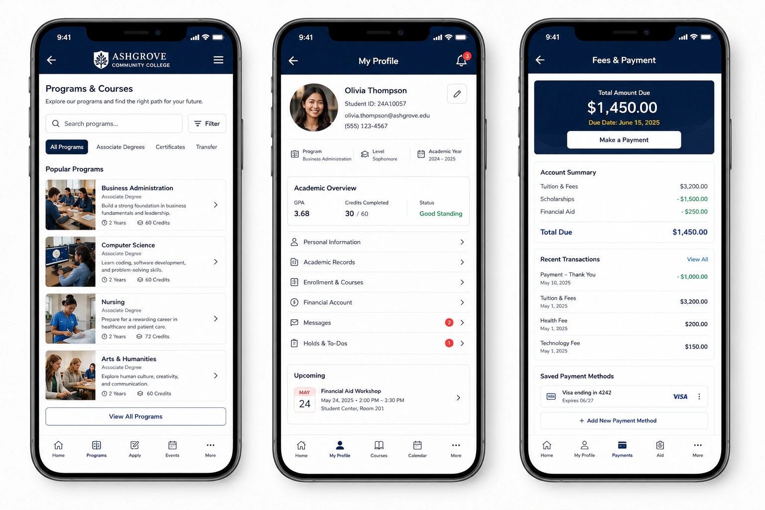
Rebuilt every page mobile-first, including the application flow itself.

Result

Mobile bounce rate down 33%.

Problem

Every department’s page looked like it was built by a different team.

What we did

Rolled out one unified design system across every department and program.

Result

One consistent, recognizable brand sitewide.

“We had the outcomes. We just didn’t have a website that got out of the way long enough to show them.”

The Approach

Five phases, redesigned around how a prospective student actually decides.

  1. Phase 01

    Discovery & content audit

    Reviewed every existing page and drop-off point, and talked to admissions and faculty about the outcomes the old site wasn’t showing.

  2. Phase 02

    Visual identity

    Built a distinct visual language photography, color, and type instead of the outdated, shared-template look.

  3. Phase 03

    UX & information architecture

    Restructured navigation and content around “which program is right for me” and “how do I apply,” not the college’s internal department structure.

  4. Phase 04

    Mobile-first rebuild

    Rebuilt every page mobile-first and streamlined the application flow for a phone screen.

  5. Phase 05

    Launch & handoff

    Trained admissions and department staff to update program pages themselves no developer needed for day-to-day updates.

The Work

Visual proof of the improvements we delivered.

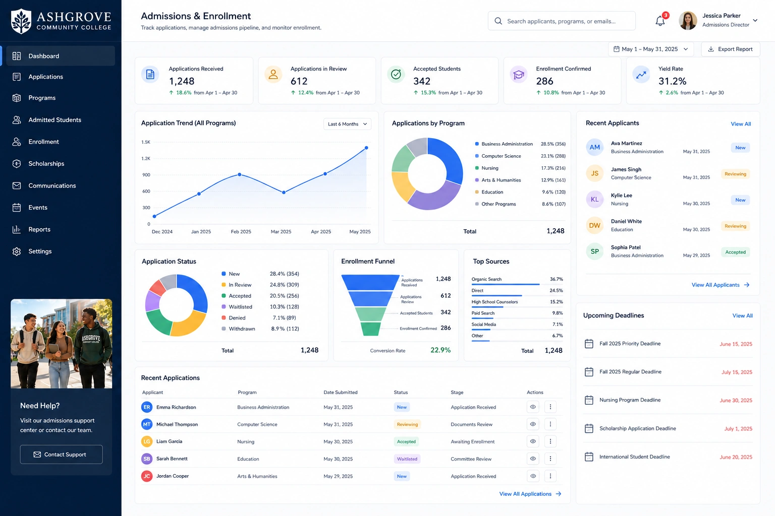
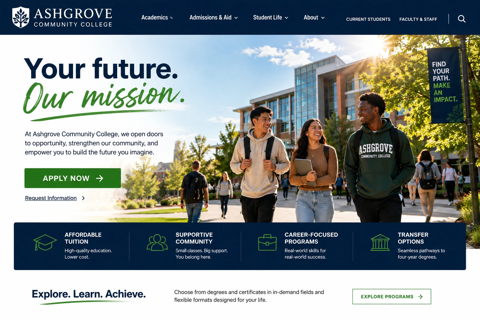
Redesigned education website homepage shown in a browser mockup
Program and course pages redesigned around prospective student search
Responsive website layouts displayed on desktop and mobile devices
Application and admissions flow redesigned for mobile

The Results

Measured against the same window a year prior.

Metric Before After Change
Online applications startednew applicant sessions baseline +57% +57%
Program page engagementtime spent on program pages baseline +41% +41%
Homepage bounce ratevisitors leaving without exploring 58% 39% −33%
Clicks to start an applicationhomepage to application form 5 clicks 2 clicks −60%
Average page load timeacross all devices 4.3s 1.7s −60%
Mobile session lengthtime spent on site, mobile only baseline ~1.7x +70%
Admissions-office phone inquiriesbasic questions the site now answers baseline −30% −30%

Built to earn the trust an application actually requires

WCAG 2.1 AA Accessible
Mobile-First, Every Page
Transparent Program Outcomes
Designed With Faculty & Admissions Input

In Their Words

“Prospective students used to ask us questions our own website should have answered. Now they show up to a tour already knowing they want to apply.”
Dean of Enrollment, Ashgrove Community College

What's Included

What a Website Redesign & UX Overhaul engagement typically covers.

Full visual identity & design system
Custom homepage & program pages
Streamlined application & admissions flow
Mobile-first responsive rebuild
Accessible, WCAG-conscious components
Program outcomes & career-placement reporting

Considering Website Redesign & UX Overhaul for your own site?

Tell us where prospective students are hesitating before they ever apply and we'll tell you honestly whether a redesign is what fixes it.

  • Free homepage & application-flow review
  • We’ll show you exactly where prospective students are dropping off
  • Built for schools whose enrollment depends on a clear next step
  • Reply within one business day
Book a Strategy Call

Want more detail on this project?

Leave your details and we'll send over the full breakdown.

Talk to Marketing Expert!

Get Your Free Website Audit