

Healthcare Website Redesign | +58% Online Appointment Requests
Confident doctor standing in a modern hospital hallway
Case Study • Healthcare Website Redesign

Patients trusted the doctors. The website gave them every reason not to.

Crestview Medical Group had grown to twelve locations and some of the best-reviewed providers in the region but the website still looked and worked like it had in year one. Here’s what changed when we rebuilt it around finding the right provider and booking a visit in under a minute.

+58%
online appointment requests since launch
+46%
new patient inquiries
-35%
homepage bounce rate

Sound familiar?

If two or more of these are true, this case study is written for you.
!Your website looks like it hasn’t changed since it first launched.
!The front desk fields calls asking questions the website should already answer.
!Finding the right provider or specialty takes more clicks than it should.
!Every location has a slightly different look, like they’re not part of the same network.
!Booking an appointment online isn’t actually possible or isn’t obvious.
!It looks fine on desktop and falls apart on a phone.
!Patients can’t tell what insurance you accept without calling.
!You wouldn’t want a first-time patient to judge your care by your homepage.

The Challenge

The website was the only part of the practice that hadn’t kept up.

Crestview Medical Group had grown from two clinics to twelve, added a dozen specialties, and consistently ranked among the best-reviewed providers in the region but the website hadn’t changed since the first location opened. Finding a provider meant scrolling an unsorted list. Booking a visit meant picking up the phone during office hours. And with every location carrying its own slightly different look, nothing tied the network together as one trusted brand. The redesign wasn’t about a fresh coat of paint, it was about making the site work the way patients actually look for care.

ProblemWhat we didResult
Problem

Outdated design that hadn’t changed since the first clinic opened.

What we did

Complete visual redesign built around the network’s actual brand, not a decade-old template.

Result

Site finally looks like a network people trust with their care.

Problem

No way to search or filter providers by specialty, location, or insurance.

What we did

Built a searchable provider directory with specialty and location filters.

Result

Provider profile views up 2.4x.

Problem

Booking an appointment required a phone call during office hours.

What we did

Integrated online self-scheduling across every location and specialty.

Result

Online appointment requests up 58%.

Problem

Twelve locations, twelve slightly different looks and inconsistent messaging.

What we did

Rolled out one unified design system and content template across every location page.

Result

One consistent brand, network-wide.

Problem

Site looked fine on desktop, broke down on mobile.

What we did

Rebuilt every page mobile-first, since most provider searches start on a phone.

Result

Mobile bounce rate down significantly.

Problem

Confusing navigation buried urgent-care hours and insurance info behind menus.

What we did

Restructured navigation around what patients actually search for first.

Result

Fewer front-desk calls for basic information.

Problem

No visible trust signals, accreditations, accepted insurance, or patient reviews.

What we did

Added accreditation badges, accepted-insurance lists, and reviews to every location page.

Result

New patient inquiries up 46%.

“Our providers were the reason patients stayed with us. Our website was the reason new patients almost didn’t call.”

The Approach

Five phases, redesigned around how patients actually choose a provider.

  1. Phase 01

    Discovery & content audit

    Audited all twelve location pages, provider bios, and every point where patients dropped off before booking.

  2. Phase 02

    Visual identity

    Built one unified brand system to replace the patchwork of styles across locations.

  3. Phase 03

    UX & information architecture

    Restructured navigation and search around specialty, location, and insurance. The three things patients search for first.

  4. Phase 04

    Mobile-first rebuild

    Rebuilt every page mobile-first and integrated online scheduling directly into provider and location pages.

  5. Phase 05

    Launch & handoff

    Trained front-desk and marketing staff to manage location pages and provider bios themselves, no developer needed for day-to-day updates.

The Work

Visual proof of the improvements we delivered.

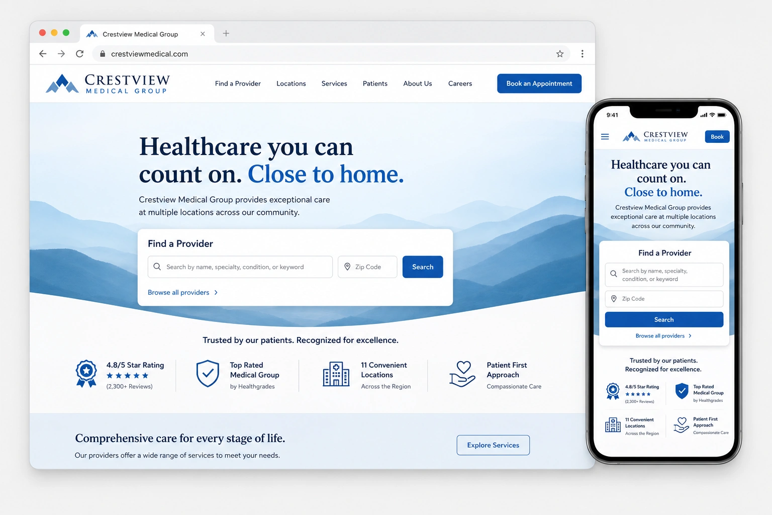
Redesigned homepage shown across desktop and mobile devices
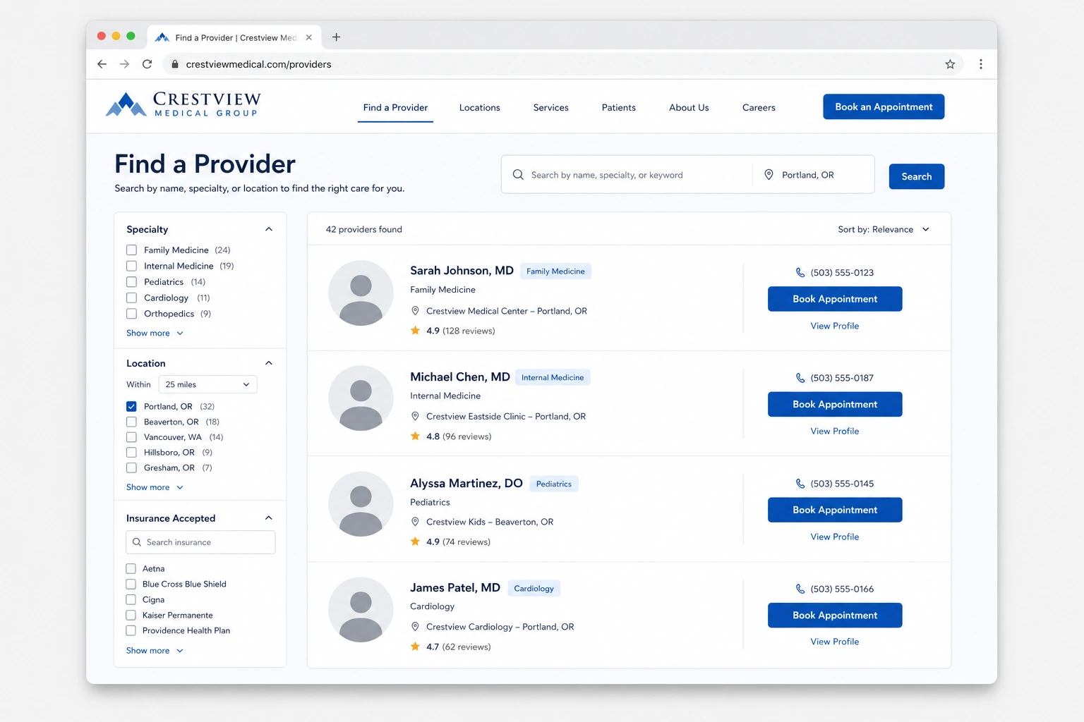
Healthcare providers reviewing the redesigned provider-finder experience
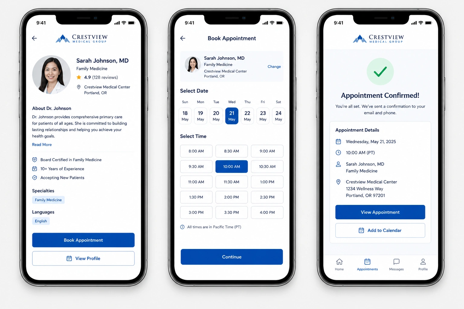
Streamlined appointment request flow with a confirmed booking screen
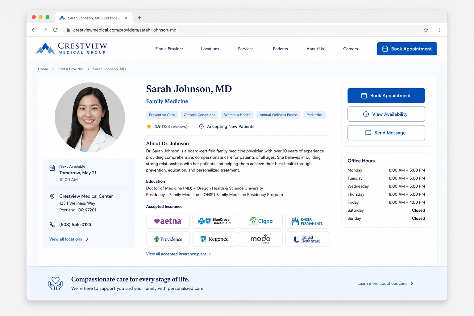
Provider profile page from the redesigned provider directory

The Results

Measured against the same window a year prior.

Metric Before After Change
Online appointment requestsfirst-visit bookings baseline +58% +58%
New patient inquiriescontact form + scheduling combined baseline +46% +46%
Homepage bounce ratevisitors leaving without exploring 55% 36% −35%
Clicks to book an appointmenthomepage to confirmed booking 5 clicks 2 clicks −60%
Provider profile viewsvisitors viewing a specific provider baseline 2.4x +140%
Average page load timeacross all devices 4.5s 1.8s −60%
Mobile session lengthtime spent on site, mobile only baseline ~1.8x +80%

Built to reflect the scale and trust patients expect from a growing network

WCAG 2.1 AA Accessible
HIPAA-Aware Contact & Intake
Mobile-First, Every Page
One Consistent Brand, 12 Locations

In Their Words

“Patients used to call just to ask which locations took their insurance. Now the website answers before they ever pick up the phone.”
Marketing Director, Crestview Medical Group

What's Included

What a Website Redesign & UX Overhaul engagement typically covers.

Full visual identity & design system
Searchable provider directory with specialty & location filters
Online appointment scheduling integration
Mobile-first responsive rebuild
Accessible, WCAG-conscious components
Unified templates across every location page

Considering Website Redesign & UX Overhaul for your own site?

Tell us where patients are dropping off before they ever book, we'll tell you honestly whether a redesign is what fixes it.

  • Free homepage & provider-directory review
  • We’ll show you exactly where patients are dropping off before booking
  • Built for multi-location practices juggling consistency across sites
  • Reply within one business day
Book a Strategy Call

Want more detail on this project?

Leave your details and we'll send over the full breakdown.

Talk to Marketing Expert!

Get Your Free Website Audit