

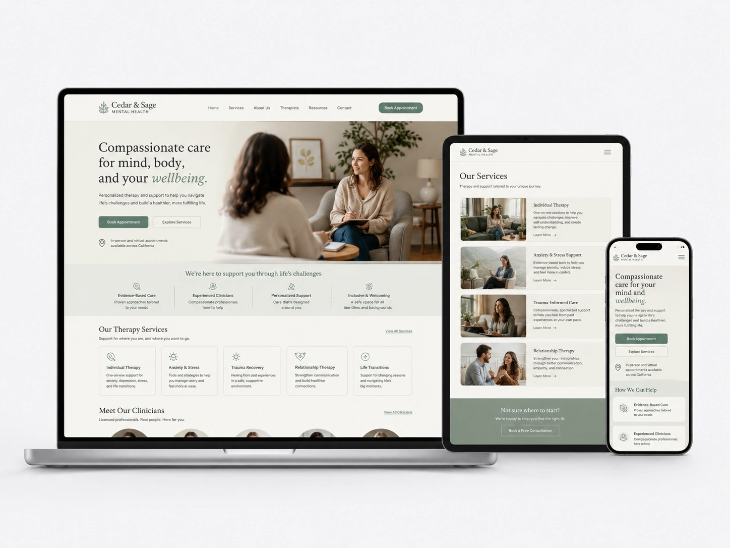
Mental Health Website Redesign | +64% Consultation Requests
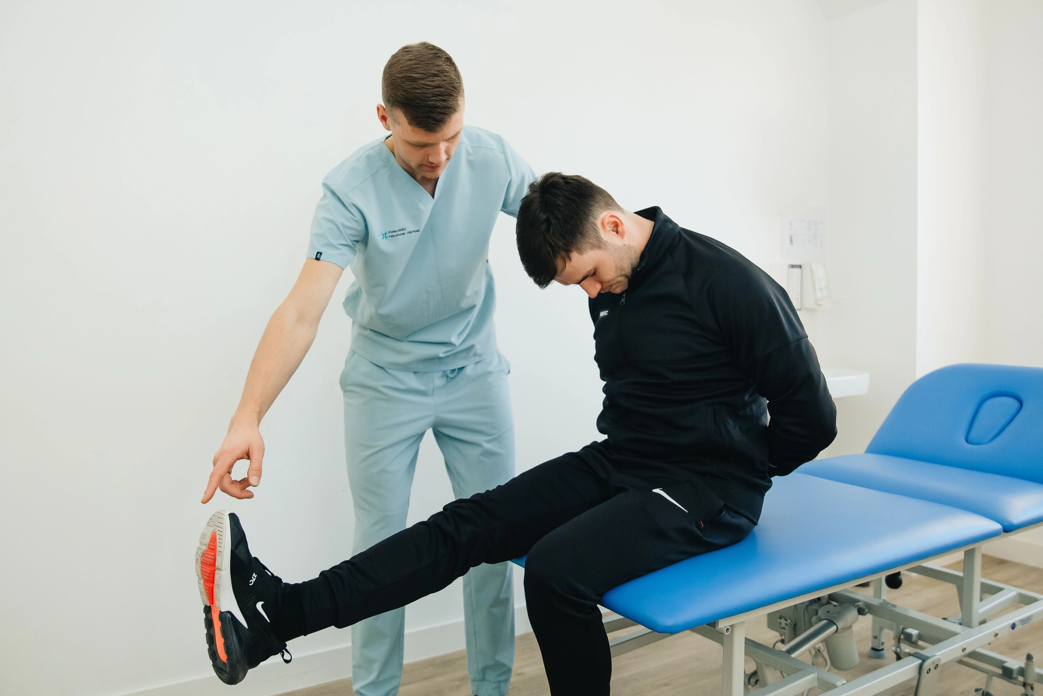
Therapist taking notes during a counseling session
Case Study • Mental Health Website Redesign

The website felt like a waiting room. The practice never did.

Cedar & Sage Counseling’s in-person sessions were warm and unhurried. Their website was neither a templated, clinical-looking site that made people second-guess a decision that’s already hard to make. Here’s what changed when we redesigned it around the person visiting, not the org chart.

+64%
consultation requests since launch
+58%
new client inquiries
-38%
homepage bounce rate

Sound familiar?

If two or more of these are true, this case study is written for you.
!Your website looks like a template because it is one.
!The site feels clinical, not like somewhere people want to open up.
!Visitors can’t tell what makes your practice different from the next one.
!Therapist bios are buried three clicks deep, if people find them at all.
!Booking a first session takes more clicks than it should.
!The photos feel more waiting room than welcome.
!It looks fine on desktop and falls apart on a phone.
!You wince a little every time someone mentions visiting your own site.

The Challenge

The site was doing the opposite of what therapy does.

Cedar & Sage had built a practice people trusted in person but the website undercut it before anyone walked through the door. It ran on a shared template used by hundreds of other practices, filled with generic stock photography and clinical language. Therapist bios, the one thing people actually wanted to see before reaching out, were buried behind menus. And for someone already unsure about seeking help, every extra click was one more chance to close the tab. The redesign wasn’t about looking prettier it was about removing every reason to leave before booking.

ProblemWhat we didResult
Problem

Generic template shared with hundreds of other practices.

What we did

Built a custom visual identity around the practice’s actual tone not a shared theme.

Result

Site finally looks like nobody else’s.

Problem

Clinical, sterile visuals that didn’t match the warmth of a session.

What we did

Replaced stock photography and cold color palette with warm, real environment imagery.

Result

Visitors described the site as “finally feeling like us.”

Problem

Therapist bios buried three clicks deep, hard to compare.

What we did

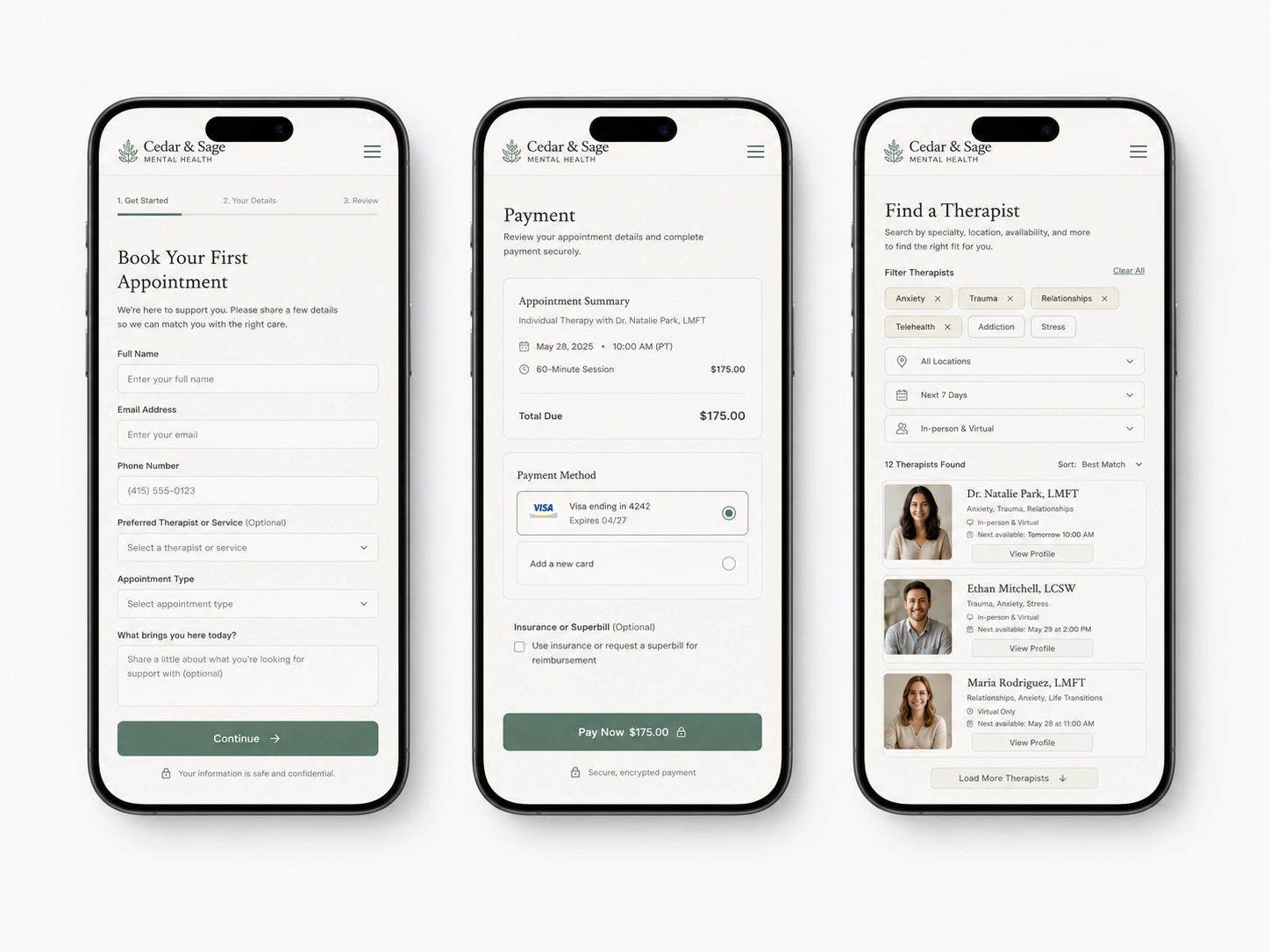
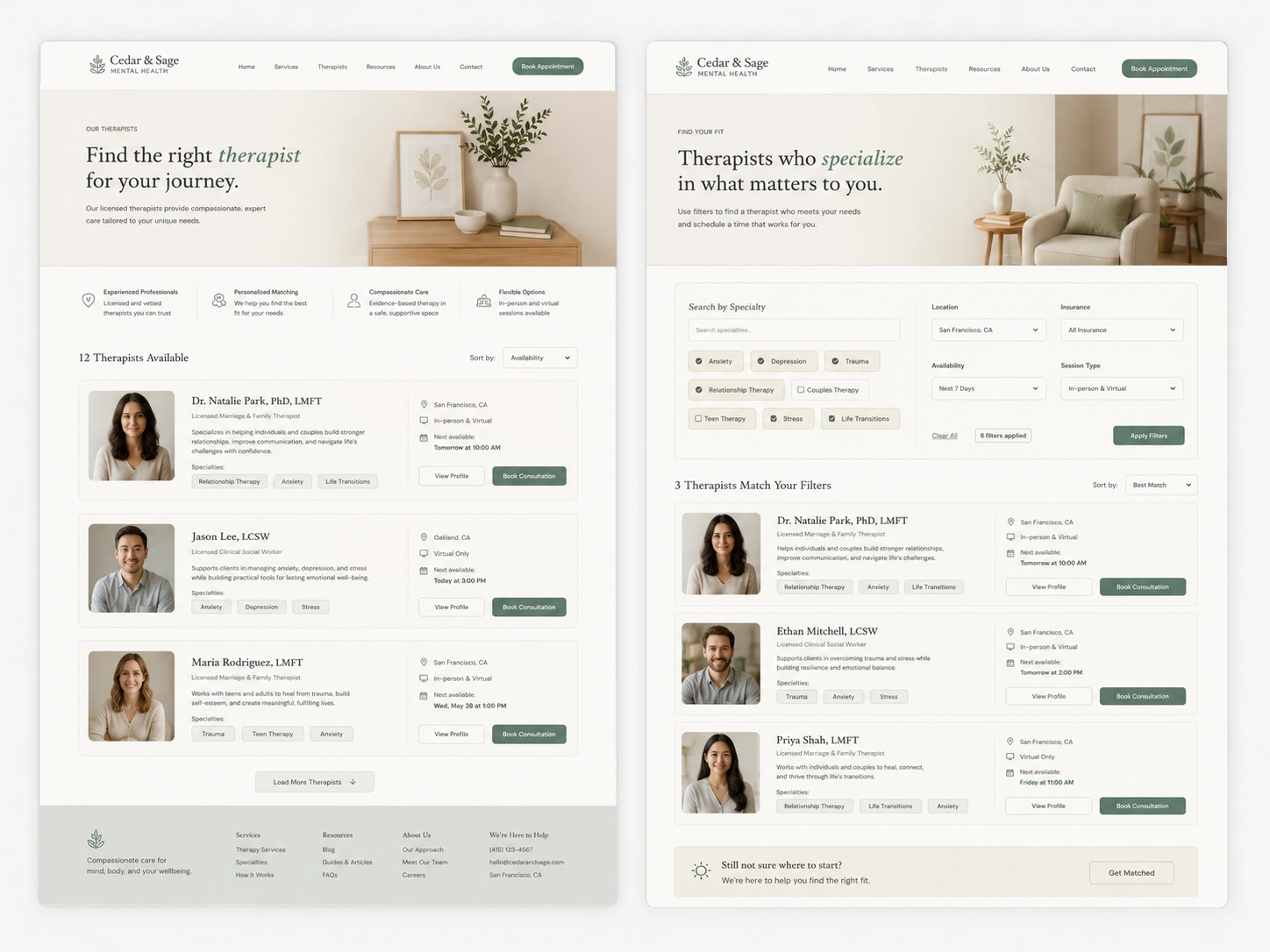
Built a browsable therapist directory with specialties and photos up front.

Result

Bio page views up 3x.

Problem

No clear starting point for someone new to therapy.

What we did

Added a simple “not sure where to start?” path into the right specialty.

Result

Homepage bounce rate down 38%.

Problem

Booking a first session took six clicks across three pages.

What we did

Reduced booking to one clear path from every page on the site.

Result

Consultation requests up 64%.

Problem

Site looked fine on desktop, broke down on mobile.

What we did

Rebuilt every page mobile-first, since most visits happen quietly, at night, on a phone.

Result

Mobile session length roughly doubled.

Problem

Small text and low contrast made the site harder to use under stress.

What we did

Redesigned with WCAG-conscious contrast, spacing, and type.

Result

Fewer pages abandoned mid-scroll.

“We spent years building a practice people trust in person. Then they’d visit the website and second-guess it.”

The Approach

Five phases, redesigned around how someone actually decides to reach out.

  1. Phase 01

    Discovery & content audit

    Reviewed every existing page and drop-off point, and talked to the therapists about what made the in-person experience different from the templated site.

  2. Phase 02

    Visual identity

    Built a warm, distinct visual language photography, color, and type instead of the shared template look.

  3. Phase 03

    UX & information architecture

    Restructured navigation and content around “which therapist is right for me,” not the practice’s internal org chart.

  4. Phase 04

    Mobile-first rebuild

    Rebuilt every page mobile-first, since most visits happen quietly, at night, on a phone.

  5. Phase 05

    Launch & handoff

    Trained staff to update bios and content themselves no developer needed for the day-to-day.

The Work

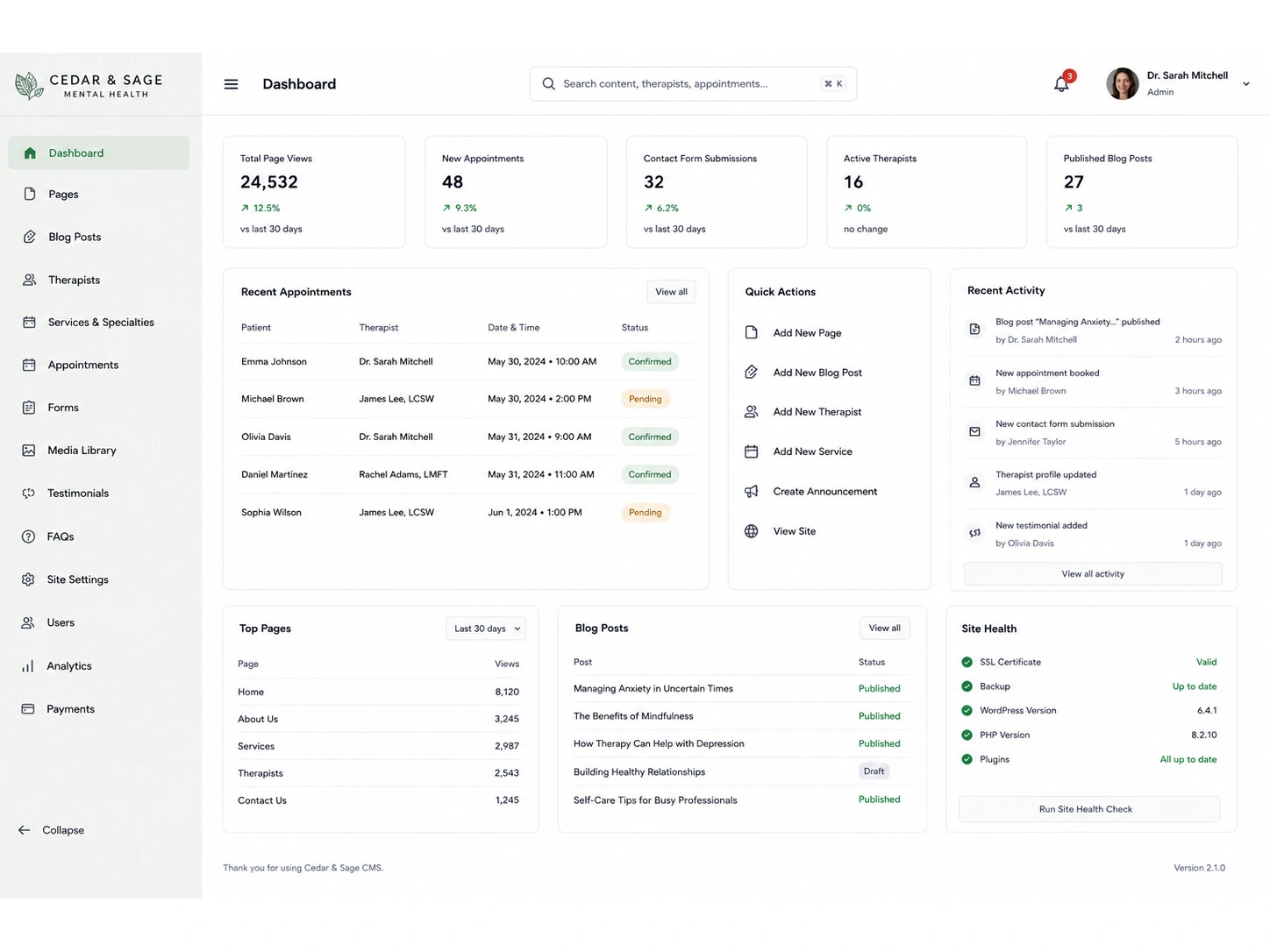
Visual proof of the improvements we delivered.

Redesigned homepage in a browser mockup, warm color palette with a clear 'Book a Free Consultation' button
Therapist directory page in a browser mockup, showing profile cards with photos and specialty tags
Mobile phone mockup of the simplified booking flow with a calendar picker and single call-to-action
Side-by-side before and after comparison of the homepage, from generic template to custom redesign

The Results

Measured against the same window a year prior.

Metric Before After Change
Consultation requestsfirst-session bookings baseline +64% +64%
New client inquiriescontact form + booking combined baseline +58% +58%
Homepage bounce ratevisitors leaving without exploring 61% 38% −38%
Clicks to book a first sessionhomepage to confirmed booking 6 clicks 2 clicks −67%
Therapist bio page viewsvisitors viewing a specific therapist baseline 3x +200%
Average page load timeacross all devices 4.2s 1.6s −62%
Mobile session lengthtime spent on site, mobile only baseline ~2x +100%

Built to reflect the same care as the practice itself

WCAG 2.1 AA Accessible
Mobile-First, Every Page
HIPAA-Aware Contact & Intake
Designed With Therapist Input

In Their Words

“For years our website felt like someone else’s waiting room. Now it feels like walking into our actual practice before you’ve even booked.”
Practice Director, Cedar & Sage Counseling

What's Included

What a Website Redesign & UX Overhaul engagement typically covers.

Full visual identity & design system
Custom homepage & specialty pages
Therapist directory with bios & filtering
Mobile-first responsive rebuild
Accessible, WCAG-conscious components
Streamlined booking & contact flow

Considering Website Redesign & UX Overhaul for your own site?

Tell us where visitors are hesitating before they ever reach out and we'll tell you honestly whether a redesign is what fixes it.

  • Free homepage design review
  • We’ll show you exactly where visitors are dropping off
  • Built for practices where trust has to happen before the first session
  • Reply within one business day
Book a Strategy Call

Want more detail on this project?

Leave your details and we'll send over the full breakdown.

Talk to Marketing Expert!

Get Your Free Website Audit