![e-Commerce Website Cost – Know How Much to Pay [Actual Prices]](https://www.janbaskdigitaldesign.com/blogs/wp-content/uploads/2021/03/feature-banner-2024-05-21T152223.691-300x159.webp)
Responsive WordPress images are taking the world by storm, and it's impossible to overlook their growing popularity. But here's the thing: implementing this functionality in widely used CMS platforms like WordPress can be quite the challenge. It's a time-consuming task, even though users can include features within the theme. So, buckle up and get ready to dive into the exciting world of WordPress responsive images!
Ever since WordPress 4.4 was introduced, developers and administrators can embed responsive image functionality into their themes. The major highlight includes the availability of the Responsive Images plug-in within WordPress core . Users can now enjoy responsive image support, a default WordPress feature.
Let’s closely examine how this feature works and how it can be used carefully to harness the WordPress site's potential.

Elevate Your WordPress Journey with Responsive Images?
All content and images will comprise srcset and size attributes. This is mainly to ensure the availability of every image size. If the aspect ratio varies, the custom crops will be left out of the srcset attribute. Responsive images would be returned when an image is called through the wp-getattachment-image function.
Responsive images are a background feature in WordPress 4.4 due to their automatic functionality upon image upload. This automatic process displays srcset and size attributes whenever an image is utilized on a page. Consequently, the new responsive images feature lacks visible interfaces, such as forms for filling, checkboxes for selection, and toggling options.
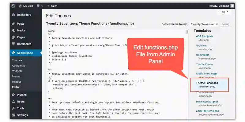
For WordPress theme developers, it is imperative to ensure the provision of accurate sizes attributes in images through editing the theme's functions.php file. It is essential to consider it because the srcset and size attributes in the image tag represent the responsive images in WordPress. Although sizes in the srcset attribute are available, the sizes attribute remains challenging to predict. Improving the writing quality, optimizing word choice, sentence structure, readability, and eloquence while retaining the original meaning. It is the duty of the sizes attribute to explain to n the browser how wide the image would be at every available viewport. However, the results can differ depending on styling available with the user’s theme, providing the reasonable default, namely ‘sizes=” (max-width: {{image-width}}) 100 vw, {{image-width}}”
With the sizes attribute, users can accomplish especially two things. Firstly, they can ensure the availability of a valid size attribute in the image, which has now become a prerequisite for the specifications. Secondly, they can prevent the browser from providing an image source that is more compared to the original width that has been requested. However, the default sizes attribute's benefit becomes less whenever any CSS manipulates the image size at viewport widths that are entirely different.
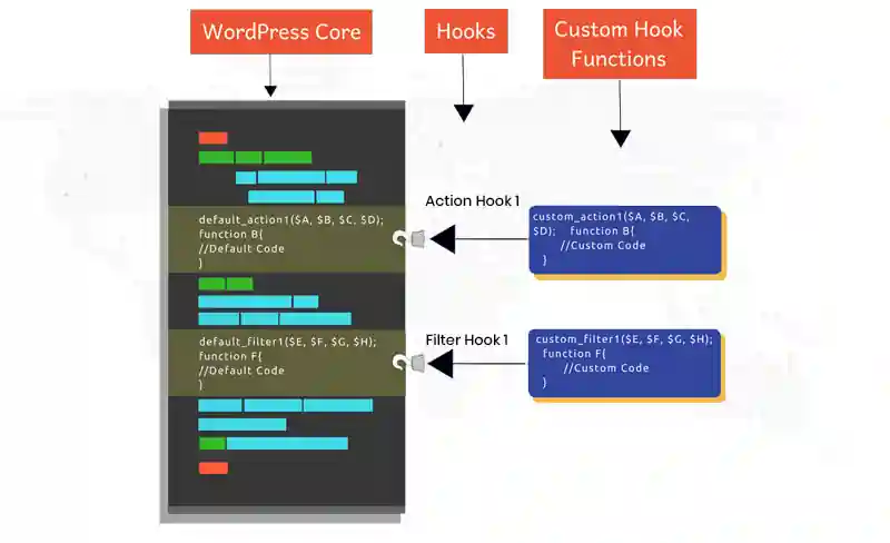
Theme developers can adjust the sizes attribute for each image using filter hooks. This ensures that perfect size attributes are delivered for every breakpoint. It's desirable for a theme to offer accurate and responsive image support without relying on the default sizes attribute.
The main reason for this is that browsers cannot modify the image source when the viewport size is smaller than the original requested image size. However, the source cannot be changed if the image has been altered with CSS at a breakpoint.
Suppose you have access to a WordPress Code Base or a theme developer. In that case, it is more necessary to filter the images in the themes to deliver accurate size attributes. It is the most important thing to be done after the new version is released.
If you are looking for WordPress Hosting Services, check the Best Hosting for WordPress posts.
Creating a website that looks great on any device is essential to providing an optimal user experience. Making images responsive in WordPress is one way to ensure that all users can view the content of your website properly, regardless of their device. In this section, we will walk you through the steps for making images responsive in WordPress so you can create beautiful, optimized websites for all types of devices.
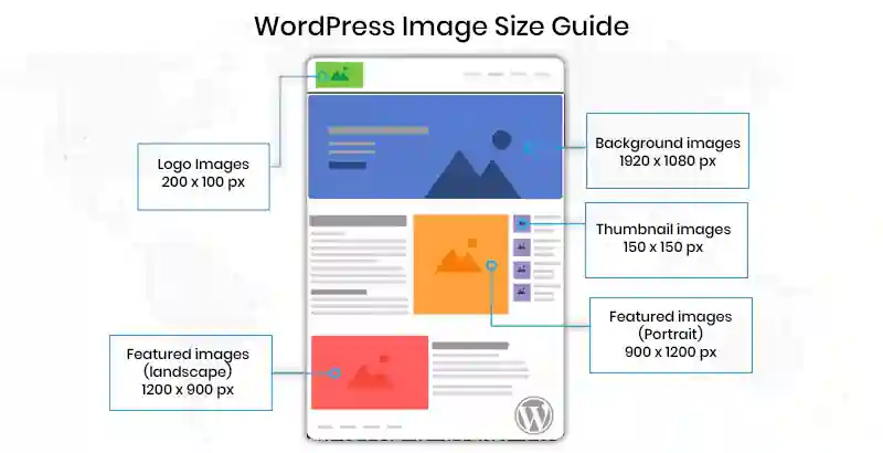
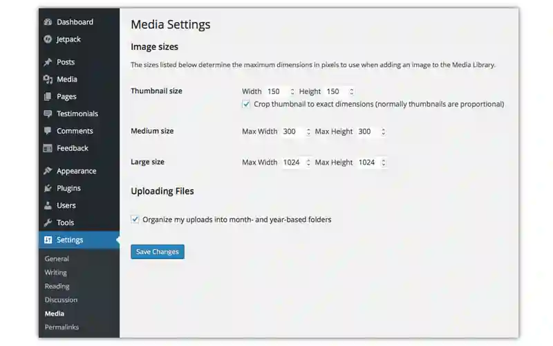
The time you upload images, WordPress saves them at their native size. At the same time, it automatically generates three resized copies in the standard sizes.
It is a powerful feature on how to make images responsive as it allows you to customize to make any image size. You do not need to make numerous choices of an image in different sizes. You only need to upload a single image, and WordPress creates the resized copies.
It can be done by changing the functions.php file. To add new image sizes, add calls to the add_image_size function. And this is how to make images responsive in WordPress.
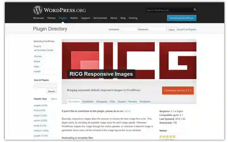
To make images responsive, you need to install a new RICG Responsive Images plugin- an all-in-one WordPress responsive images plugin solution. After the installation, all image sizes will be included in the image tag through the srcset attribute.

Another plugin is picturefill.js, a responsive image polyfill that adds support to both the picture elements and new responsive attributes for the image element and helps how to make images responsive. The tag makes your image responsive with the srcset attributes now included in the image.
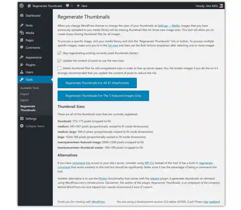
In re-generating large-size images, a plugin like the Regenerate Thumbnails plugin will take you through all the existing image attachments and re-generate the new image size depending on the new once created in function.php- this is a time-saving and only needs the click of a single button.
After installation, go to Tools > Regen. Thumbnails, then click the Regenerate All Thumbnails button. The state bar presents all the importation about how many images have been resized.
After you know how to make images responsive, check through some tips. Here is a list of some simple yet effective practices for responsive images in WordPress:
![]()
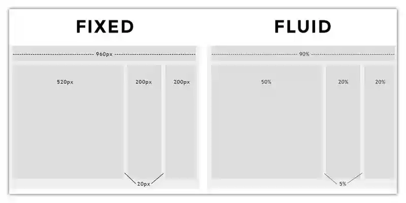
These are the best methods to learn how to make the image responsive.
To achieve responsive image support tailored to your theme, several new hooks and functions are available. Theme developers can use the max_srcset_image_width hook to filter the maximum width of the image included in the srcset attribute.
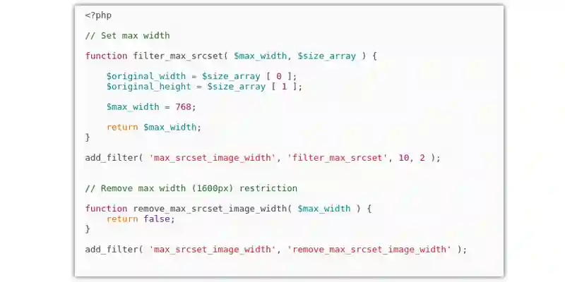
Additionally, the srcset attributes can be filtered using the wp_calculate_image_srcset hook. Furthermore, the sizes attribute can be customized by theme developers to fit the image breakpoints in their theme by filtering wp_calculate_image_sizes. These options empower developers to optimize their themes for improved image handling.
The filtering of content images can be achieved using the wp_calculate_image_sizes function, while the wp_get_attachment_image_attributes function can filter post thumbnails/featured images.
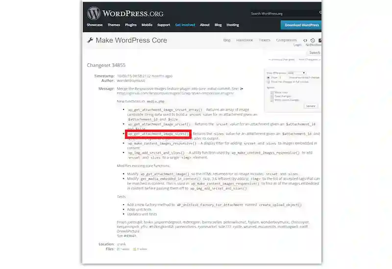
Using two separate functions is necessary due to theme variations in displaying featured images across breakpoints, which differs significantly from how content images are displayed in similar circumstances. Therefore, WordPress 4.4 facilitates image filtering for theme developers, enabling specific customization options.
This is excellent news for you and all the theme developers out there! With responsive image support in the WordPress 4.4 update, you'll experience instant benefits. Say goodbye to blurry images on different screens! Your website's performance will be top-notch as it avoids the hassle of loading larger images. Plus, as a user, it's all taken care of automatically. Theme developers still have a role in adjusting image sizes, but remember, it's a team effort! Let's make your website shine with crisp and optimized images!
Our WordPress web development company understands the significance of responsive images and is dedicated to helping clients optimize their websites for all devices. With our expertise, we can seamlessly integrate responsive image solutions into WordPress themes, ensuring that your website remains visually stunning and user-friendly, regardless of the device it is accessed on. Whether you need assistance in selecting the most suitable image format, optimizing image sizes, or implementing cutting-edge responsive image techniques, our team of skilled professionals is well-equipped to provide tailored solutions to meet your specific needs.
At our WordPress web development company, we prioritize delivering exceptional user experiences and maintaining high website performance standards. By partnering with us, you can rest assured that your WordPress website will leverage the power of responsive images to engage users effectively, improve conversion rates, and stay ahead in an ever-evolving digital landscape.
Investing in responsive images and availing the expertise of our WordPress web development company is a strategic move that will not only enhance your website's visual appeal but also contribute to its overall success in an increasingly mobile-driven world. Don't miss out on the opportunity to provide an optimal browsing experience for your audience; contact us today to see how we can transform your WordPress website with the power of responsive images.
1. How do you know if your WordPress theme has responsive images?
To know if you have Wordpress responsive image, check the image tag of the image in question that contain both scrcset and sizes attributes.
2. Why should you use responsive images?
Using responsive images is vital to help deliver optimal file sizes. The right image for the correct screen size enhances user experience and loading time.
3. How do responsive images work in WordPress?
Responsive images are a background feature, which means things process automatically whenever a user uploads an image in WordPress through the media uploader.
4. How to scale responsive images in WordPress?
Here is the step-wise process to scale WordPress responsive image:
Step 1: Right-click on the image and choose Open With and then choose Preview
Step 2: Click on tools and choose to Adjust Size
Step 3: Ensure scale proportionally is selected to maintain the aspect ratio of the image
Step 4: Put the width size you want your image to have
Step 5: Now, click on and save your newly resized image
5. Which is the best WordPress responsive images plugin?
There are various plugins to maintain responsive images, Just Responsive Images Plugin provides you control of responsive image properties, which WordPress inserts to all the post thumbnails by default.
In conclusion, the importance of responsive images in WordPress cannot be overstated. In today's digital landscape, where users access websites from a variety of devices with different screen sizes and resolutions, ensuring that images adapt seamlessly to each viewport is crucial for a positive user experience. Responsive images enhance website performance, reduce page loading times, and contribute to improved search engine rankings.
By employing best practices for creating responsive images in WordPress, website owners can cater to the diverse needs of their audience and create a visually appealing and accessible online presence. Implementing techniques like using the srcset attribute, specifying image sizes, and leveraging modern image formats like WebP can significantly enhance the responsiveness of images across various devices.
Interested in our Web Design & Development Services?

Leave a Reply