
What makes you trust a dental practice before you even walk through the door? Often, it starts with the website.
A good dental website helps you quickly understand the practice, explore its services, meet the team, and find your next step without making you search for it.
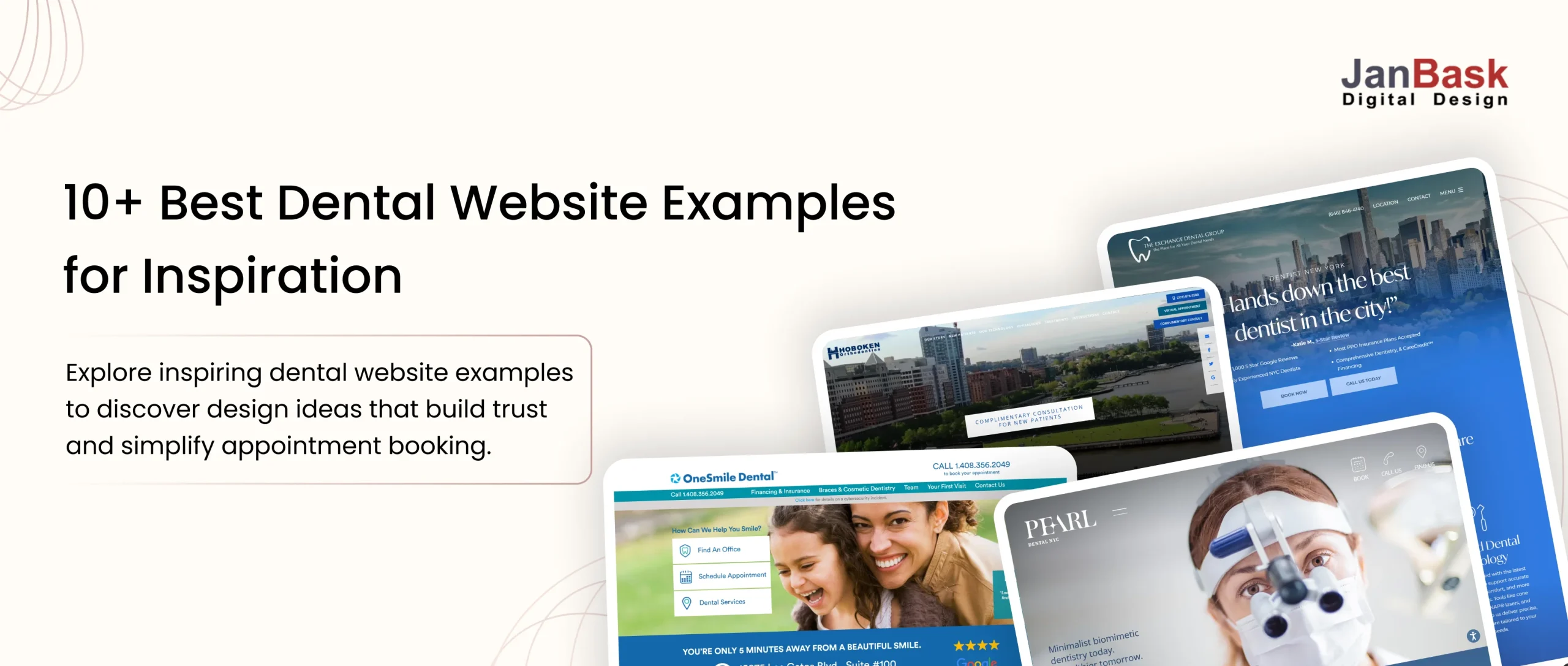
In this guide, you’ll explore 10+ dental website examples and see what makes each one stand out. From welcoming designs to clear information and easy appointment booking, you’ll find practical ideas you can take inspiration from for your own dental website. Whether you’re comparing modern dental website design trends or gathering dentist website examples for reference, these picks cover a wide range of approaches.
What Should a Best Dental Website Include?
A modern dental website needs to do more than simply display a logo, list services, and provide a phone number.
It should create confidence, answer questions, and make the patient’s next step obvious.
A strong dental website should:
- Build trust before the first conversation
- Clearly explain treatments and services
- Introduce the dentists and dental team
- Make contact and appointment booking simple
- Provide useful information about insurance and financing
- Answer common patient questions
- Communicate the practice’s personality and positioning
- Make important local information easy to find
Together, these dental website features build the foundation every dental practice website design should start from.
The goal isn’t to make the website look impressive for the sake of design. The goal is to make it easier for a potential patient to say, “This feels like the right dental practice for me.”
What Can You Learn From These Dental Website Examples?
A good dental website is not defined by one particular design style. Some practices use bold visuals and modern layouts, while others keep things simple and focused on information. What matters is how well the website serves the people visiting it. That’s true whether you’re looking at a modern dental website design or a more traditional dental practice website design-execution matters more than style.
As you explore the examples below, pay attention to the small details that can make a big difference: how quickly you understand what the practice offers, whether the doctors feel approachable, how easily you can find important information, and whether booking an appointment feels straightforward. Is the appointment button or call to action short, clear, and easy to spot? These examples show different ways dental practices can combine design, usability, trust, and patient-focused content to create a website that works beyond just looking good.
Here are the dental websites that stood out.
10+ Dental Website Examples Worth Exploring
1. Falls Church Family Dentistry
Overview
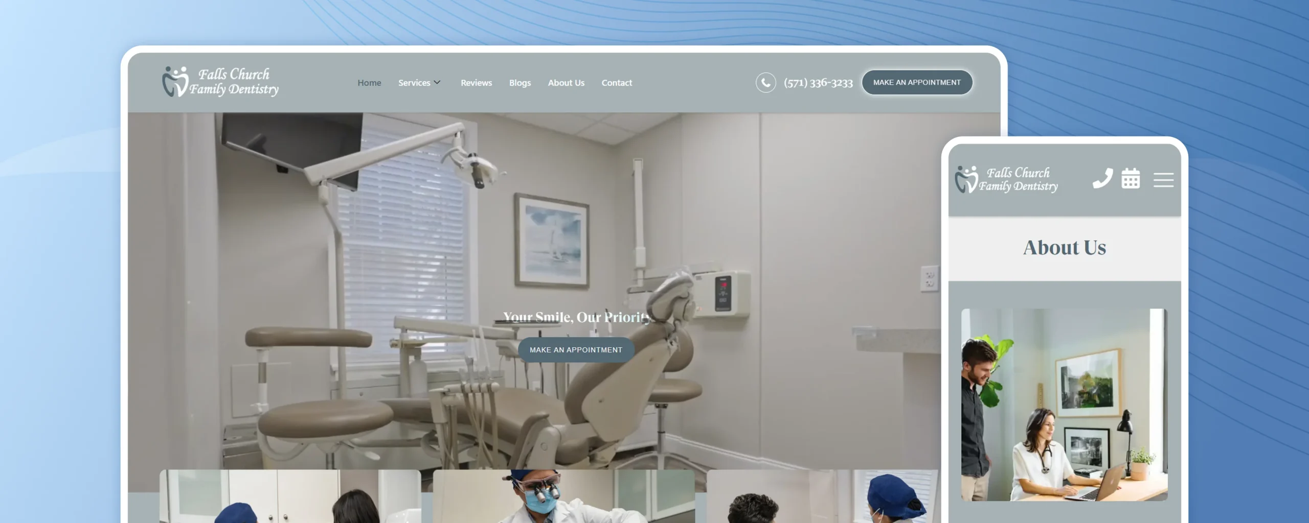
Falls Church Family Dentistry has to speak to a toddler’s parent and a retiree in the same breath, and its warm, unhurried design manages that balancing act without feeling generic or overly cute. It’s one of the more useful dentist website examples for practices juggling a wide age range.
What It Gets Right:
- Family-focused positioning: The website communicates that the practice is designed to care for different age groups.
- Approachable experience: The overall presentation can feel less intimidating for patients who may be nervous about dental treatment.
- Simple service navigation: Visitors can find basic treatment information without needing to call the office first.
- Local relevance: Important practice information helps visitors determine whether the location and services fit their needs.
2. Pearl Dental NYC
Overview
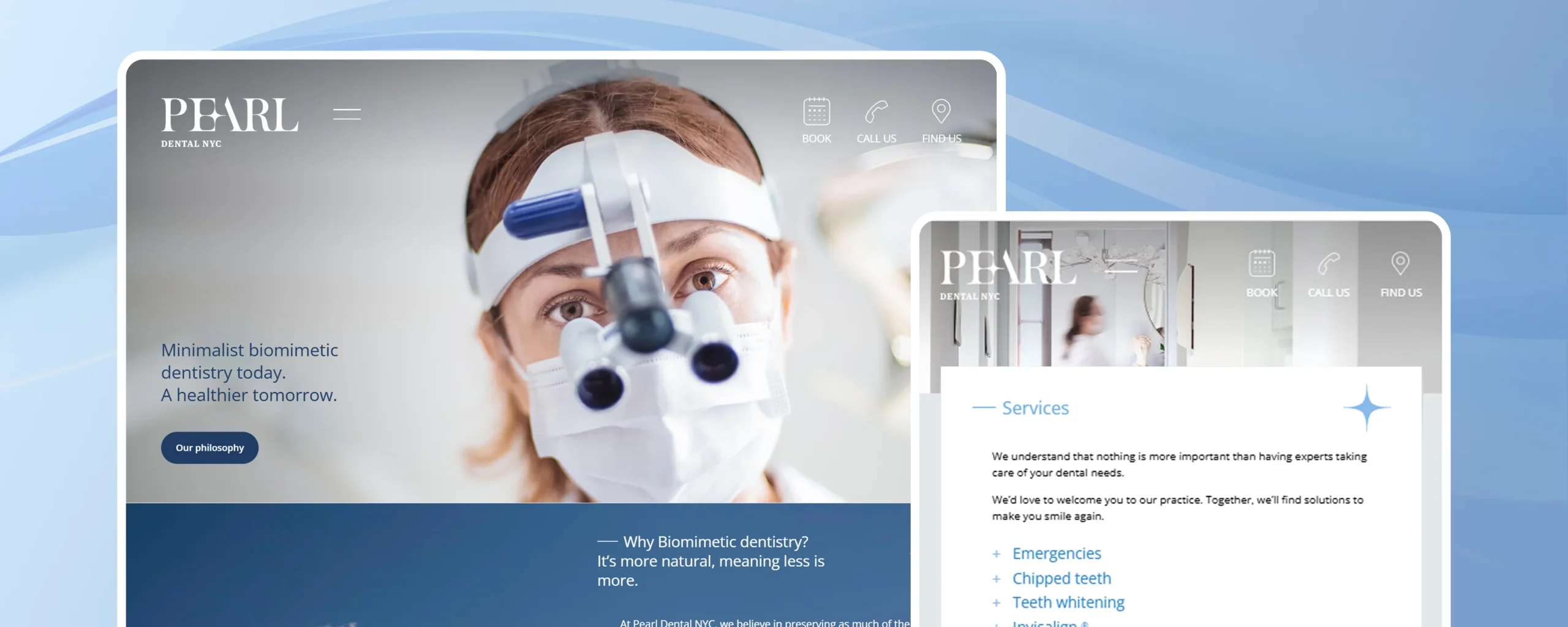
Pearl Dental NYC is built for the patient who wants to do their homework before dialing a number. Rather than pushing visitors toward a phone call in the first ten seconds, it gives them enough to actually evaluate the practice on their own terms.
What It Gets Right:
- Strong local positioning: The website immediately communicates its connection to the New York City market.
- Clear practice presentation: Visitors can understand who they may be trusting with their dental care.
- Accessible treatment information: Patients can research services before deciding to contact the practice.
- Low-friction contact options: Appointment and contact pathways are easy to locate.
3. The Exchange Dental Group
Overview
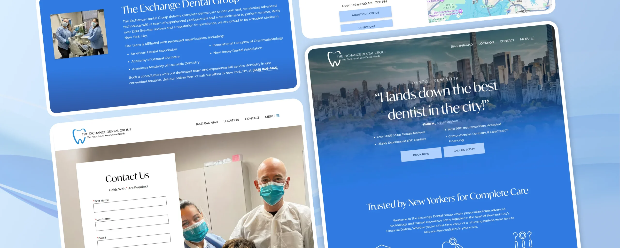
Specialized procedures are easy to bury in a generic services list, and The Exchange Dental Group refuses to let that happen. Complex treatments get room to be explained properly instead of being reduced to a single line item.
What It Gets Right:
- Dedicated treatment information: Specialized procedures receive focused attention instead of being buried under a generic services section.
- Educational content: Explaining unfamiliar treatments helps patients understand what they may need.
- Reassuring information: Providing information before an appointment can reduce uncertainty and anxiety.
- Clear treatment pathways: Visitors can more easily identify the procedure relevant to their situation.
4. Miami Cosmetic Dental Care
Overview
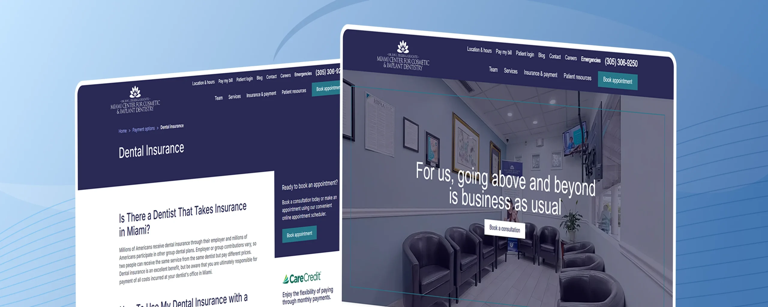
Cosmetic dentistry sells on outcome, not process, and Miami Cosmetic Dental Care‘s website is built around that truth – it’s less concerned with explaining procedures step by step and more focused on showing visitors what’s possible. This is one of the clearest dental website design examples of cosmetic-focused positioning done right.
What It Gets Right:
- Clear cosmetic positioning: The website focuses strongly on cosmetic dentistry instead of presenting an overly broad list of unrelated services.
- Visual storytelling: Images help communicate the treatment experience and potential outcomes.
- Easy treatment exploration: Visitors can research different treatments before deciding whether to request a consultation.
- Consistent brand message: The content and presentation remain connected to the central idea of smile improvement.
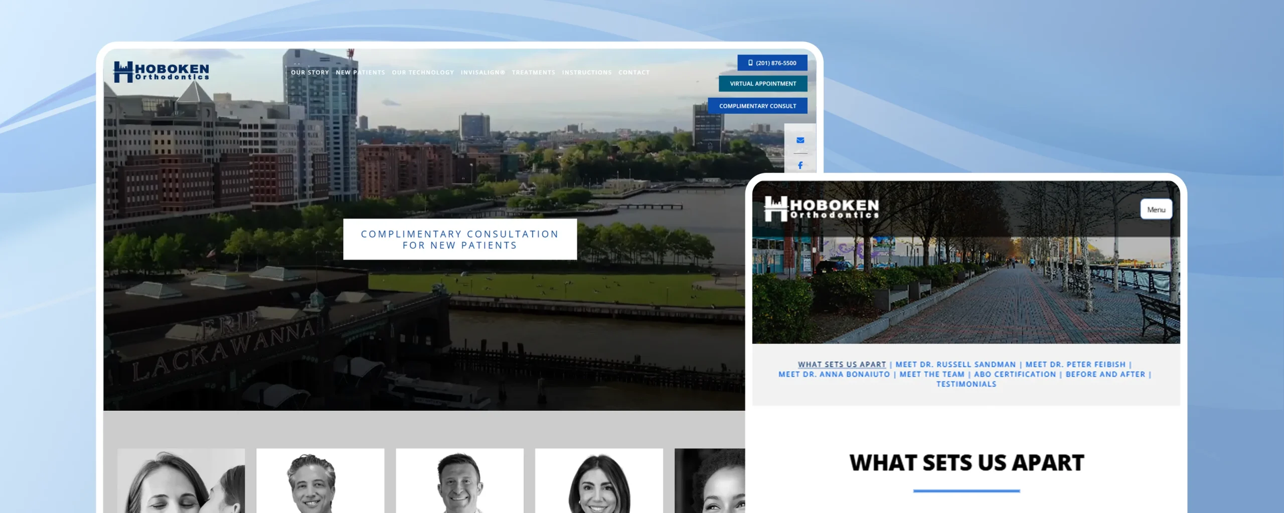
5. Hoboken Orthodontics
Overview
Orthodontic treatment can span years, not minutes, which means Hoboken Orthodontics‘ website has a harder sell than most – it needs to build confidence in a multi-year commitment before a single bracket goes on. It does this by treating education, not persuasion, as the priority.
What It Gets Right:
- Treatment education: The website helps visitors understand what orthodontic treatment involves.
- Resources for existing patients: Useful information isn’t limited to potential new patients.
- Clear treatment journey: Consultation, treatment, and follow-up stages are easier to understand.
- Focused specialty positioning: The website stays centered on orthodontics rather than trying to cover every possible dental service.
6. Sky Dental
Overview
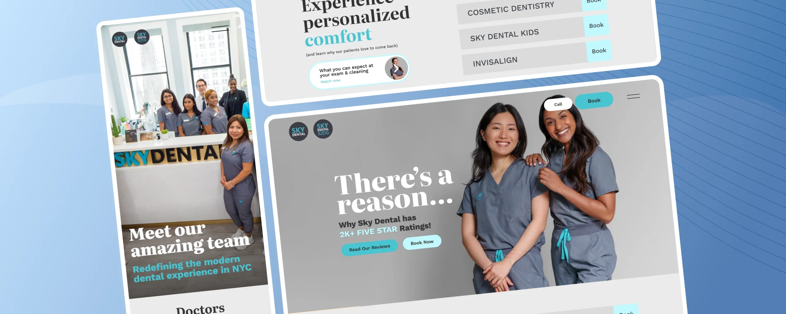
In a city with a dental office on nearly every block, blending in is the fastest way to lose a patient before they’ve even called. Sky Dental‘s website leans hard into a modern, almost boutique-hotel aesthetic to make sure it doesn’t read as just another Manhattan dental practice. Sky Dental stands out among modern dental website design approaches for big-city practices.
What It Gets Right:
- Contemporary design direction: The website moves away from the traditional clinical look often associated with healthcare websites.
- Easy service discovery: Visitors can quickly determine whether the practice offers the treatment they need.
- Strong location visibility: Location is particularly important when patients are comparing several practices in the same area.
- Clear conversion journey: The path from browsing to contacting the practice is straightforward.
7. Miami Bay Oral Health
Overview
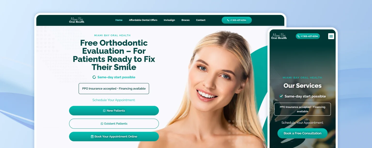
Miami Bay Oral Health understands that trust, not treatment lists, is often what closes the deal. Reviews and a visible smile gallery do more of the persuading here than any copywriting could.
What It Gets Right:
- Complete patient journey: Visitors can move from learning about treatment to requesting a consultation.
- Patient testimonials: Reviews and testimonials provide social proof from people who have already experienced the practice.
- Smile gallery: Visual examples can be particularly useful for cosmetic and restorative treatments.
- Simple consultation process: A straightforward consultation request gives visitors an alternative to making an immediate phone call.
8. One Smile Dental
Overview
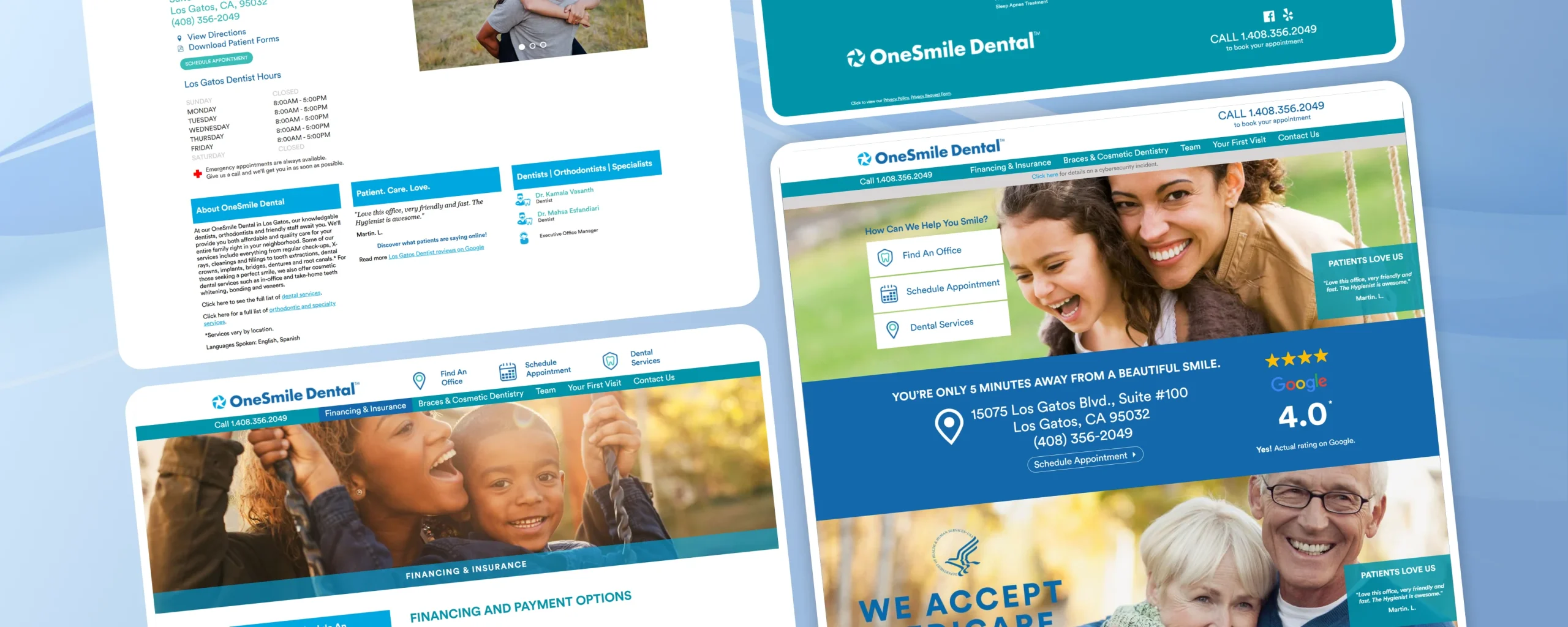
Most dental websites blur together after the third one you visit.One Smile Dental doesn’t – its branding is distinct enough that you’d recognize a screenshot of it without seeing the logo, which is rarer than it should be in this industry.
What It Gets Right:
- Distinct visual identity: The branding gives the practice a recognizable personality.
- Clear treatment pathways: Patients who already know what type of treatment they need can quickly find relevant information.
- Visible contact options: Important conversion points such as contacting the practice and scheduling are easy to identify.
- Professional presentation: The design creates a polished experience that supports the credibility of the practice.
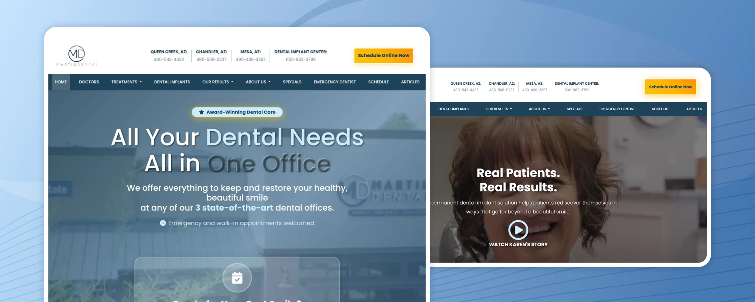
9. Martin Dental
Overview
Martin Dental resists the temptation to over-design. It answers the three questions every new patient actually has – what do you treat, where are you, how do I reach you – before trying to impress anyone, and that restraint is the point.
What It Gets Right:
- Strong local identity: The website clearly communicates that visitors are looking at a specific dental practice.
- Easy service discovery: Patients can quickly determine whether the practice provides the treatment they need.
- Useful practice information: Visitors have enough information to evaluate the practice before making contact.
- Clear next step: People who are ready to contact the practice aren’t left wondering what to do next.
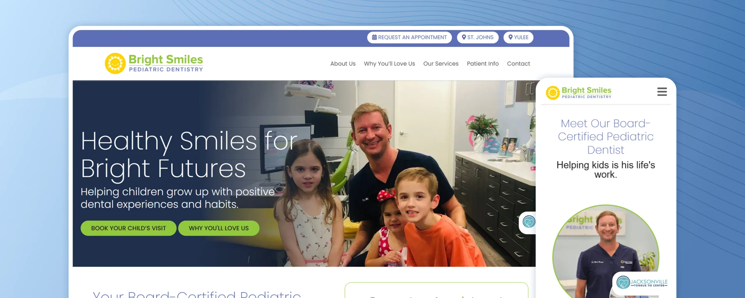
10. Bright Smiles Pediatric Dentistry
Overview
Every pediatric dental website has to solve the same puzzle: reassure a nervous six-year-old and inform a skeptical parent, often on the same page.Bright Smiles Pediatric Dentistry leans into color and playfulness for the child while quietly keeping the practical information easy for the parent to find.
What It Gets Right:
- Child-friendly presentation: The visual approach helps make the dental experience feel less intimidating.
- Useful information for parents: Clear information can reduce uncertainty before the child’s appointment.
- Friendly brand personality: The website avoids an overly clinical appearance and creates a softer experience.
- A simple route to booking: Parents can move naturally from learning about the practice to scheduling care.
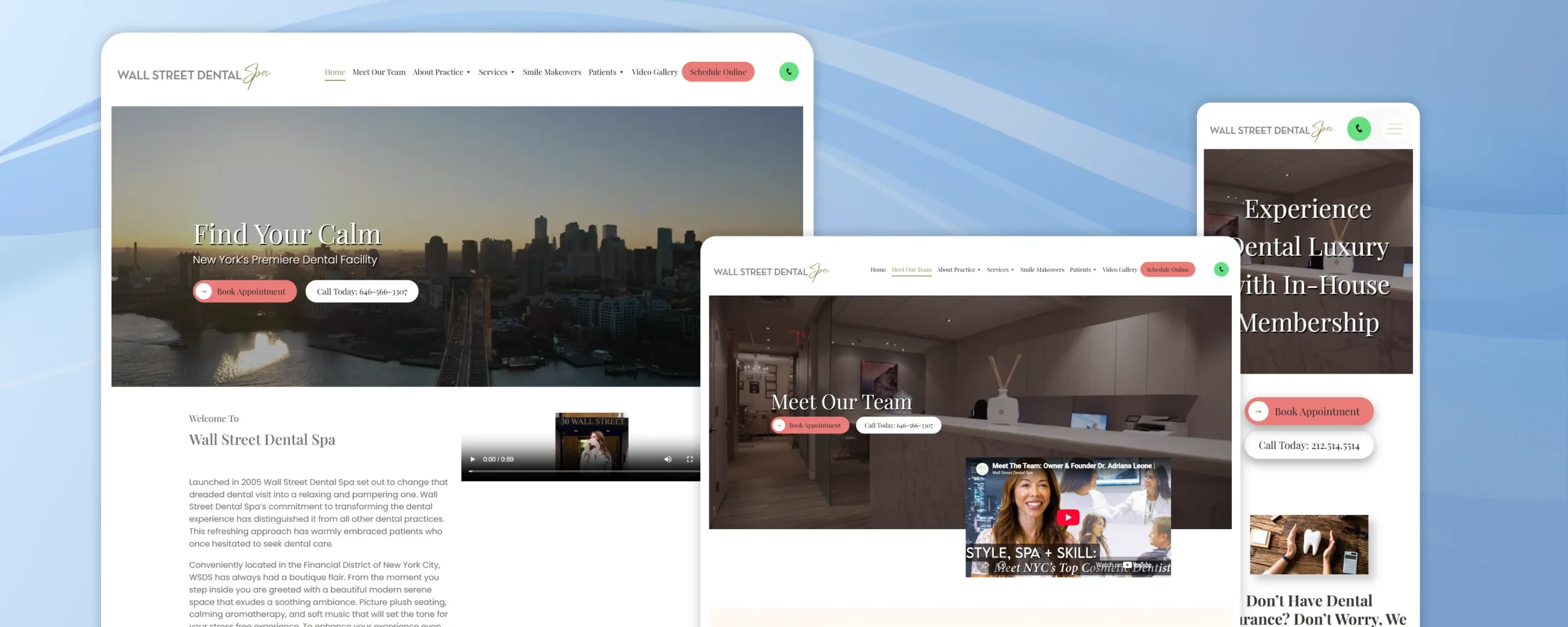
11. Wall Street Dental Spa NYC
Overview
Calling itself a “Dental Spa” is a bold move, and Wall Street Dental Spa NYC‘s website has to back that positioning up. It largely succeeds – the site reads less like a clinic and more like a boutique wellness brand that happens to do dentistry.
What It Gets Right:
- Distinct positioning: The “Dental Spa” concept immediately separates the practice from traditional dental offices.
- Experience-led messaging: The website focuses not only on procedures but also on the overall patient experience.
- Premium visual presentation: A polished design can support a premium positioning, particularly for cosmetic-focused services.
- Memorable branding: A distinctive identity makes the practice easier to remember when patients compare several options.
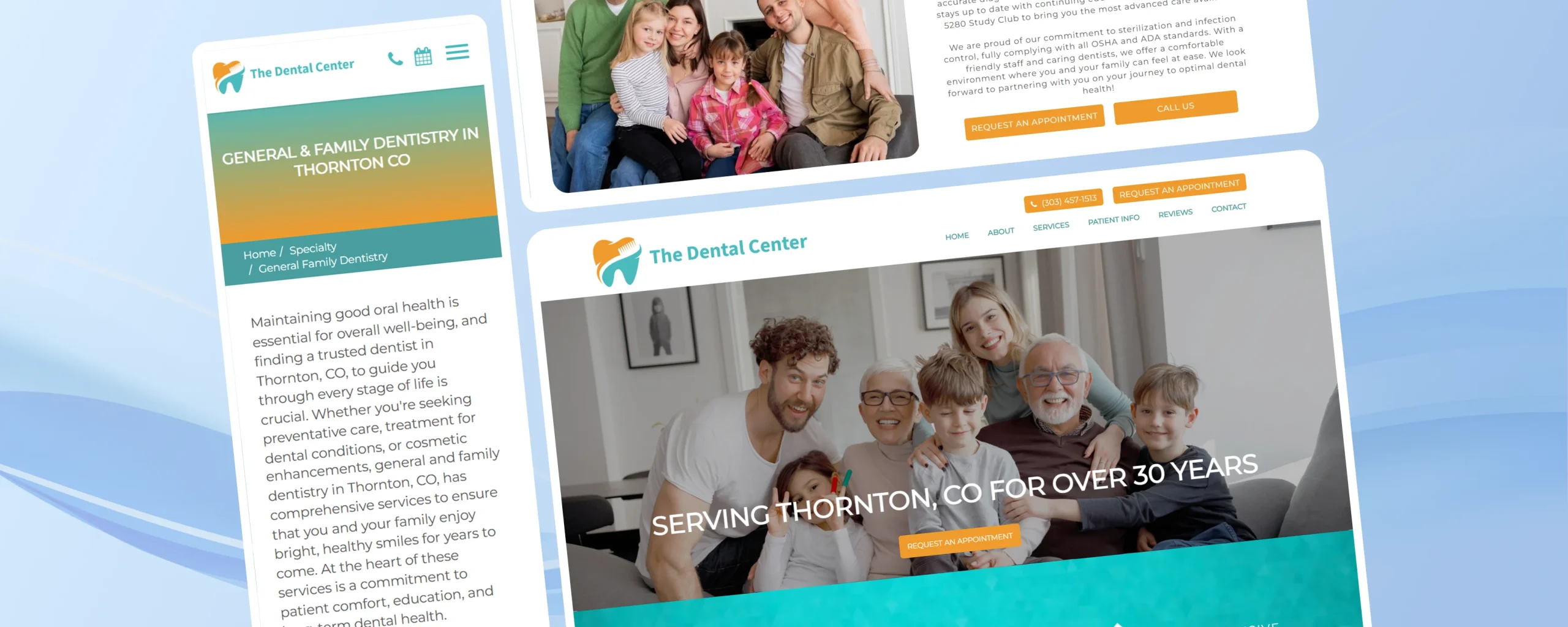
12. The Dental Center
Overview
The Dental Center is proof that a dental website doesn’t need a design agency’s full toolkit to work well. It strips things back to clear information and simple navigation, and that simplicity ends up being its strongest feature.
What It Gets Right:
- Straightforward practice information: Visitors can quickly understand who the practice is and what it offers.
- Accessible service details: Patients can determine whether their dental needs are covered.
- Local focus: Important local information helps patients compare the practice with other nearby options.
- Simple user journey: Visitors can move from researching the practice to making contact without unnecessary steps.
These dental website features keep the experience simple without sacrificing usefulness.
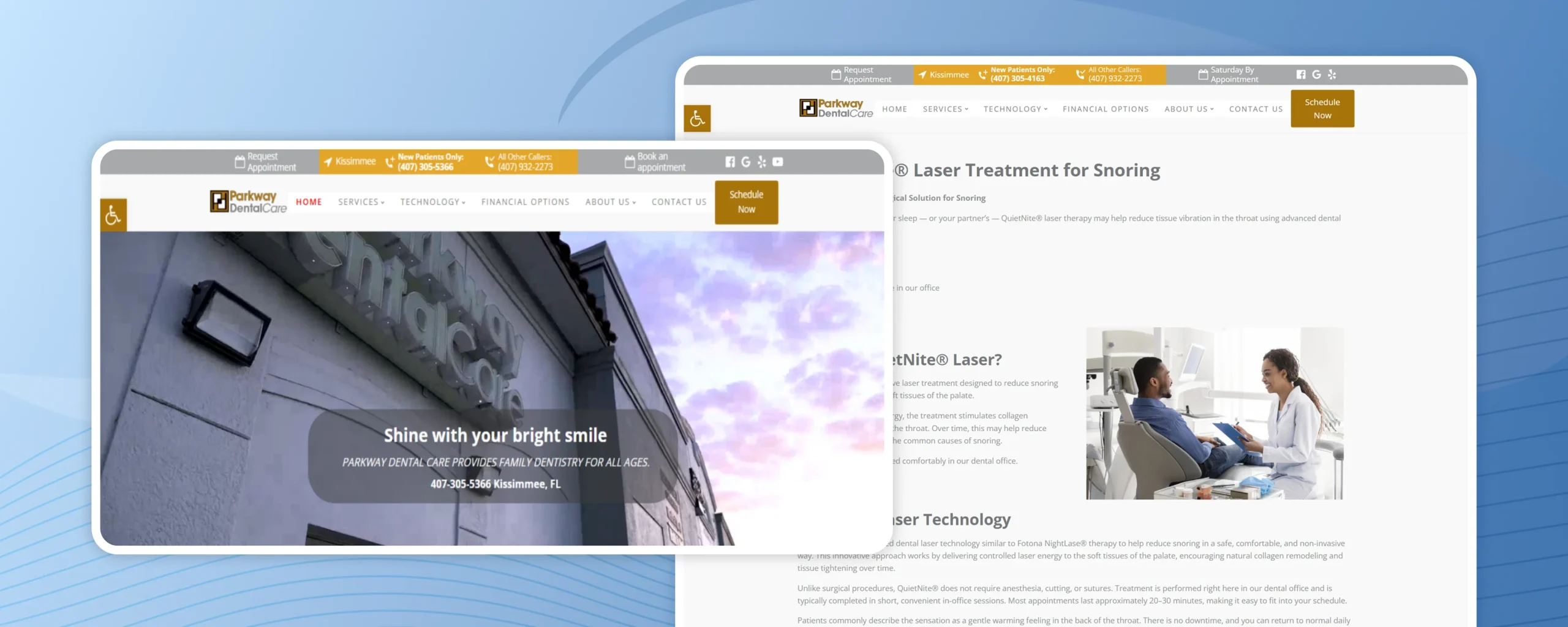
13. Parkway Dental Care
Overview
Parkway Dental Care isn’t designed around a single type of patient – it’s designed around a household, with a toddler, a teenager, and a grandparent all needing something different from the same practice. The website’s real skill is making that variety feel unified rather than scattered.
What It Gets Right:
- Broad service coverage: General, family, children’s, and orthodontic care are represented.
- Treatment education: Visitors can learn more about what different procedures involve.
- Family-oriented positioning: The website makes it easier for households to consider one practice for multiple dental needs.
- Information before booking: Patients can research the practice and its services before being asked to schedule.
What Do These Dental Websites Have in Common?
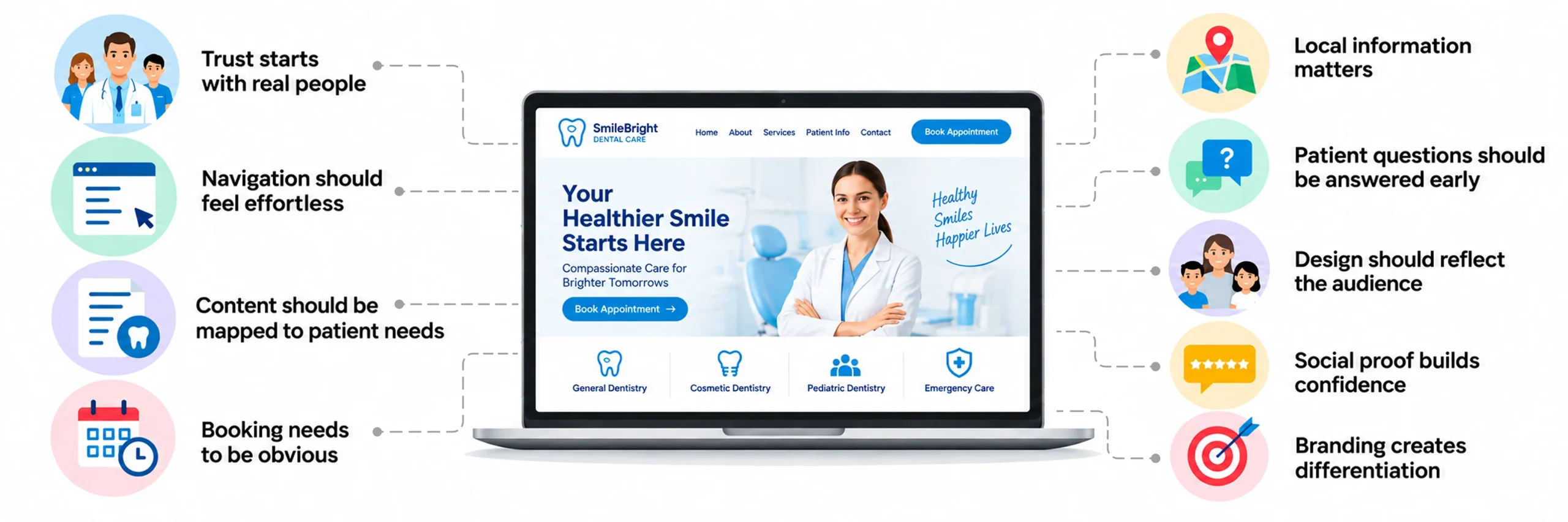
Although these dental practices serve different audiences and specialize in different areas, several patterns appear repeatedly. These patterns show up again and again across the best dental website designs we reviewed here.
- Trust starts with real people: Dentist and team profiles make a practice feel more personal and transparent.
- Navigation should feel effortless: Patients shouldn’t have to search through multiple pages to find a treatment or important practice information.
- Content should be mapped to patient needs: Good content mapping helps patients quickly find the information they need.
- Booking needs to be obvious: A visible appointment or contact option helps turn website visitors into potential patients.
- Local information matters: Location, hours, phone numbers, and directions should be easy to access.
- Patient questions should be answered early: Insurance, financing, FAQs, and new-patient information can remove hesitation.
- Design should reflect the audience: A pediatric practice, cosmetic dentist, and oral surgery practice may need different user experience design based on their patients’ needs..
- Social proof builds confidence: Reviews, testimonials, and smile galleries can help patients feel more comfortable choosing a practice.
- Branding creates differentiation: A website should communicate what makes the practice different instead of looking like another generic dental template.
These design choices also influence what happens after a visitor lands on the site. Small conversion-focused improvements, such as reducing unnecessary form fields, making key actions easier to understand, using mobile-friendly layouts, and placing trust signals where patients need them, can reduce friction throughout the patient journey. Applying CRO best practices can help dental practices improve these interactions without necessarily requiring a complete website redesign.
Together, these habits separate the best dental website designs from the merely average ones.
The Best Dental Website Example: From Problems to Better Patient Experiences
The design of a dental website is only one part of the patient experience. Booking systems, reviews, security, performance, and the connection between the website and front-desk workflow can also affect how patients interact with a practice.
Want to see how these improvements work in a real dental website? Take a look at this dental website maintenance case study, which highlights how security vulnerabilities, booking-system issues, review management, and front-desk workflow challenges were addressed together to create a smoother website experience.
The project reported 47 security vulnerabilities patched, a 31% increase in tracked booked appointments, a 33% reduction in no-shows, and three times more new patient reviews collected each month. It’s a reminder that dental website features only pay off when the technical side works too.
The example shows that a successful dental website isn’t just about how the homepage looks. The experience behind the pages matters too.
From Inspiration to a Website Patients Want to Use
The best dental website isn’t necessarily the one with the most animations, the biggest images, or the most features. It’s the one that helps a new patient quickly understand who you are, what you offer, and how to take the next step. That’s the real test behind every one of these dental website examples.
The 10+ examples in this guide show that there isn’t one formula for great dental website design. A family practice may focus on warmth and trust, a pediatric dentist may create a more playful experience, while a cosmetic or specialty practice may highlight treatments, results, and expertise. These are the qualities to look for in any dental practice website design you’re evaluating.
If you’re considering a website redesign,start by looking at your current website from a patient’s perspective. Can visitors quickly find your services? Is it easy to learn about your dentists? Can they book an appointment without confusion? Does your website give them a reason to choose your practice?
Take the ideas that fit your practice and build around the people who will actually use your website – your patients.
If you’re ready to turn these ideas into a dental website, JanBask Digital Design can help you create a patient-focused online experience. From dental service pages and dentist profiles to appointment booking, mobile-friendly design, and clear navigation, the goal is to make your practice easier for patients to understand and connect with. These are the dental website features that consistently turn visitors into booked patients.
If you’re exploring website design, redesign, and digital solutions beyond this dental website inspiration guide, you can also learn more about JanBask Digital Design.
For practices moving from inspiration to implementation,thoughtful healthcare website design can bring together clear navigation, treatment information, appointment paths, accessibility, and trust signals in one patient-focused experience.