
You wouldn’t hand a new patient an old, faded brochure and call it a good first impression. But that’s what an outdated, slow, hard-to-use website does every day – to everyone who finds you online before they ever sit in your chair.
Here’s the uncomfortable part: you’ll never get a complaint about it. No one emails to say the booking button didn’t work, or that the site took too long to load on their phone, or that they gave up trying to find your services page. They just quietly leave, and you never know why bookings feel slower than they should.
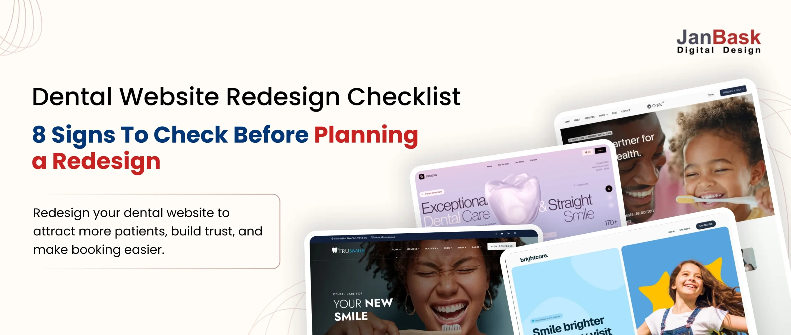
A dental website redesign fixes exactly that gap – the space between how good your care actually is and how good your website makes it look. Whether you’re calling it a dental website redesign checklist or a dental practice website redesign checklist, what follows is the same: the patterns worth checking your own site against.
Let’s walk through what that actually looks like.
8 Signs It’s Time for Your Dental Website Redesign
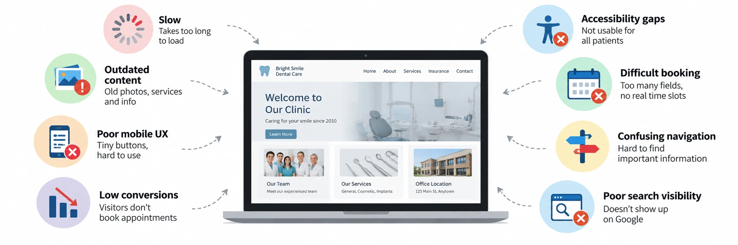
Here’s the honest list – the stuff that quietly costs practice for new patients every week, even when nobody complains about it directly. Good dental website redesign planning usually starts right here, by noticing which of these already sound familiar.
- Slow. A spinner, a half-loaded page, images that crawl in one at a time. If your site takes more than three seconds to load, patients are gone before they even see what you offer.
- Outdated content. Old team photos, services you no longer provide, insurance plans you dropped two years ago – still sitting live on the site, quietly telling patients nobody’s paying attention.
- Poor mobile UX. Tiny buttons, text that needs zooming, forms that glitch on a mobile keyboard. Most patients are searching from a phone – if the site wasn’t built mobile-first, they’re fighting it the whole way through.
- Low conversions. Traffic shows up, but it isn’t turning into booked appointments. People are finding you; the site just isn’t closing the loop.
- Accessibility gaps. Poor contrast, no text resizing, no screen-reader support – beyond the legal risk, website accessibility gaps like these quietly shut out patients who can’t use the site at all.
- Difficult booking. Ten form fields before you even see a calendar. A “Book Now” button that opens a blank contact form instead of actual time slots. Scheduling that only works if you call during office hours. Each one is a reason someone closes the tab.
- Confusing navigation. Vague menu labels, no search bar, insurance info buried three pages deep. If finding an answer feels like guesswork, most people won’t keep guessing.
- Poor search visibility. A gorgeous site that is not showing up on Google for “dentist in your city” might as well not exist. Design doesn’t matter if nobody finds the page.
None of this means your practice is behind. It just means your website hasn’t caught up to it yet. Good news: that’s a very fixable problem, and fixing it tends to pay for itself fast.
What a Well-Designed Dental Website Can Do for Your Practice
Here’s the part that’s easy to lose sight of when you’re staring at outdated navigation menus: a redesign isn’t a cosmetic project. Done well, it’s one of the highest-leverage things you can do for new patient growth – and understanding that shift is really the first step in any dental website redesign process.
Think about what actually changes when your site works the way it should:
- A visitor can find your services, check if you take their insurance, and land on a booking screen in three clicks or fewer – not a maze of submenus.
- The “Book Appointment” button actually opens a live calendar, not a contact form that disappears into someone’s inbox.
- Pages load fast enough that people stick around instead of bailing on a spinning wheel.
- You start showing up for the searches that actually bring in patients – not just your practice name, but “dentist near me” and similar local searches.
- Your reviews, credentials, and real patient stories are front and center, doing the trust-building work before a patient even picks up the phone.
- The site looks and feels the same whether someone lands on a service page, a provider bio, or the homepage – nothing feels bolted on or out of place.
In other words: the site stops being something patients tolerate and starts being something that actively brings more of them through your door.
What Patients Notice First on a Dental Website
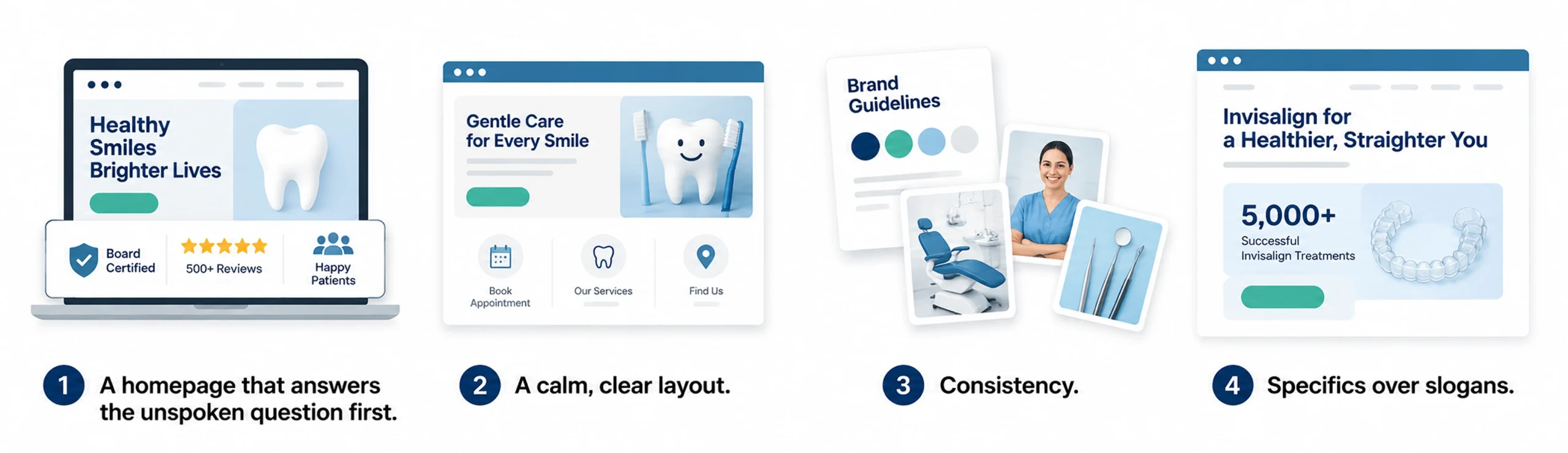
Picture someone landing on your homepage for the first time. They’re not reading every word – they’re scanning, deciding in about three seconds whether to stay or bounce back to Google. What are they actually noticing?
- A homepage that answers the unspoken question first. Every new visitor is silently asking, “can I trust this practice?” before they read a single word of copy. Sites that answer that fast – with a credential, an outcome, a visible review count – get the benefit of the doubt. Sites that make people dig for it lose them before the page even finishes loading.
- A calm, clear layout. Someone booking a dental visit might be anxious, in pain, or scheduling for a nervous kid. A cluttered page with ten competing calls-to-action adds stress at exactly the wrong moment. Clean layouts and generous white space aren’t just aesthetic choices – they lower the emotional temperature.
- Consistency. Same colors, same tone, same photography style across every page. It’s a small thing that signals a big thing: this is a well-run, careful practice. It’s the digital version of walking into a spotless, organized waiting room.
- Specifics over slogans. “Gentle, compassionate care” could be copy-pasted onto any dental site in the country. A specific number, outcome, or credential does more work in fewer words.
These are, in short, the dental website redesign best practices that consistently earn trust in the first glance – before a patient even reads a service page.
How Can Your Dental Website Build Patient Trust?
Here’s a question worth sitting with: if someone put your homepage next to three competitors’, would they be able to tell which one was yours without seeing the logo?
If the honest answer is no, that’s the gap a redesign closes. A few things that genuinely move the needle:
- Clear, mobile-first navigation – booking and key info within a tap or two, not buried in a dropdown.
- Action-oriented CTAs – “Book Your Visit” instead of a vague “Learn More.”
- A real online booking system tied to your actual calendar, not just a contact form that goes into a black hole.
- Reviews and testimonials, visible – not hidden on a separate page nobody clicks. Consumer research from BrightLocal found that 97% of people read reviews before choosing a local business, and 41% now say they “always” check reviews before browsing further – which makes review visibility one of the simplest trust-builders a redesign can add.
None of this is complicated. It’s just usually missing, and putting these dental website redesign best practices in place is often the fastest way to stand out.
How Can a Dental Website Help You Get More New Patients?

Short answer: yes – but only if it’s built to. Most practice websites just sit there, unchanged, while the searches patients actually run keep evolving. A redesign is your chance to fix that. Three things make the biggest difference:
You show up for the right searches. That means showing up for local SEO terms not just your practice name, but “dentist in [your city],” “emergency dentist near me,” “Invisalign near me” the actual terms patients type when they need you.
Your site loads fast. Page speed affects both search visibility and a potential patient’s willingness to stay. Google’s Core Web Vitals recommend that the main content on a page loads within 2.5 seconds, interactions respond in under 200 milliseconds, and the layout remains visually stable as the page loads. For a dental practice, that means a visitor should be able to see your services, tap “Book an Appointment,” and use the page without waiting or fighting shifting buttons. A slow or unresponsive site can turn an interested patient into a lost booking before they learn what your practice offers
Your content stays current. New patients, new pages, updated hours – a site that keeps getting small updates stays relevant instead of going stale the moment it launches.
Get these right, and your website stops being a cost you maintain and starts being a source of new patients you can count on.
Modern Dental Website Features That Help Attract More Patients
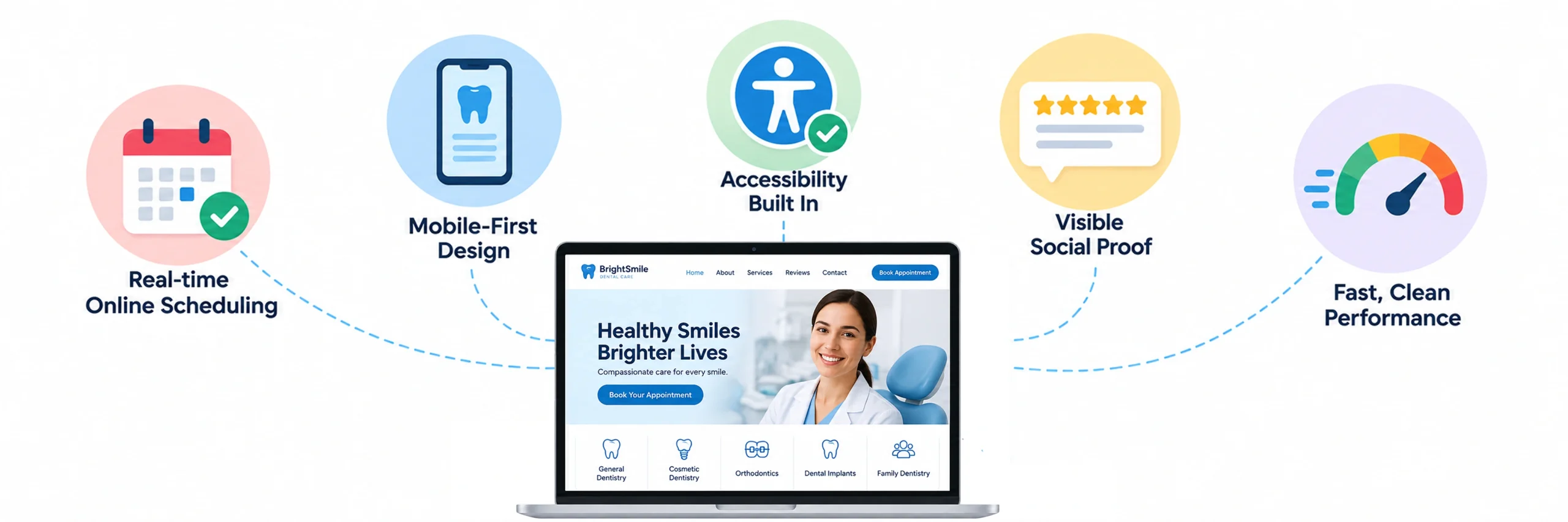
If you’re picturing “modern” as just a sleeker font, it’s worth widening that picture a bit. Today’s best modern dental website builds tend to share a few things in common:
- Real-time online scheduling, not a form that gets checked once a day.
- Mobile-first design built for the phone first, desktop second.
- Accessibility built in – adjustable text size, good contrast, screen-reader-friendly structure – which is both the right thing to do and a smart one, since ADA compliance increasingly matters for healthcare-adjacent sites.
- Visible social proof – reviews, before-and-afters, real patient stories.
- Fast, clean performance on a phone on average WiFi, not just a developer’s laptop on office broadband.
None of this is aspirational or futuristic – it’s simply what patients now expect by default, the same way they expect a restaurant to have a menu online.
When Should a Dental Practice Update Its Website?
It’s a fair question, and a healthy one to ask before committing a budget to anything. The honest answer: a redesign pays off when it’s treated as a growth project, not a paint job.
Practices that go into a redesign focused on booking flow, mobile experience, and local search tend to see real movement – more online bookings, fewer abandoned visits, better visibility for the searches that actually matter. The practices that see less return are usually the ones that are redesigned for looks alone and skip the parts patients actually interact with: speed, navigation, and booking.
If your current site is already showing some of the warning signs – slow load times, high bounce rates, or a design that hasn’t been touched in years – a redesign isn’t really optional at that point. It’s closer to catching up on maintenance you’ve been putting off, except this maintenance actively brings in revenue instead of just avoiding a breakdown. If you want to work through each of these areas as part of a full dental website redesign process, the sections above are a solid place to start.
Dental Website Mistakes That Can Cost You Patients
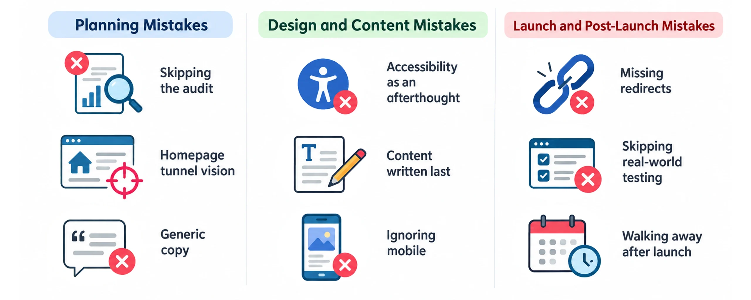
A few patterns show up again and again in redesigns that don’t deliver what they should:
Planning Mistakes
- Skipping the audit. Redesigning before looking at what’s already working – losing traffic and rankings that didn’t need to be touched.
- Homepage tunnel vision. Treating the homepage as the whole project and leaving service pages, bios, and booking flow untouched.
- Generic copy. Leaning on phrases like “gentle care” or “state-of-the-art technology” that any competitor’s site could say just as easily.
Design and Content Mistakes
- Accessibility as an afterthought. Bolting it on at the end instead of building it in from the first wireframe.
- Content written last. Writing copy after the design is already locked, forcing rushed content into templates that weren’t built for it.
- Ignoring mobile. Not checking how the site performs on mobile until after it’s already live.
Launch and Post-Launch Mistakes
- Missing redirects. Skipping a proper website redesign SEO checklist and forgetting redirects, which quietly tanks the rankings you already earned.
- Skipping real-world testing. Launching without testing real patient tasks – booking, finding insurance info, finding the phone number – end to end.
- Walking away after launch. A site nobody owns starts going stale the moment it goes live.
Most of these come down to one thing: treating the redesign as a one-time design project instead of an ongoing part of how the practice runs.
How to Maintain Your Dental Website After Launch
The redesign isn’t really finished at launch – that’s just the starting line. What actually determines whether it holds up a year or two from now is whether anyone keeps an eye on it.
A few habits worth building in from day one:
- Assign someone to own the site – checking forms, updating content, watching analytics – rather than leaving it to whoever remembers.
- Watch your rankings and traffic closely for the first 30 days after launch. This is when a missed redirect or a broken form shows up first, and it’s the easiest window to catch and fix it in.
- Set a simple review cadence: a quick monthly check, a fuller quarterly review, and a full audit once a year.
- Watch for the small things that quietly go stale: old team photos, outdated hours, insurance plans you no longer accept.
- Keep an eye on booking and contact forms specifically – they’re the pages most likely to silently break after an update.
A redesign that gets maintained keeps paying off. One that gets launched and forgotten slowly turns back into the same problem you started with.
How to Choose a Dental Website Design Partner
You don’t have to figure all of this out alone, and honestly, you shouldn’t have to. A good redesign partner isn’t just someone who makes things look nice – they understand the patient journey, know what actually converts on a dental site, and build with your growth in mind from the first wireframe, not as an afterthought.
A few things worth checking for before you commit to anyone:
- A track record with dental or healthcare-adjacent sites, not just general small-business templates.
- A clear process, not just a portfolio – ask what happens after the first conversation, and how content, design, and SEO come together instead of being handled separately.
- A plan for what happens after launch, not just a handoff. Redesigns that get supported tend to hold up; ones that get shipped and abandoned rarely do.
Lets Bring Your Dental Website an Update
A successful dental website redesign is about more than giving your site a fresh look. It starts with understanding what is and isn’t working, then improving the patient experience through clear navigation, mobile-friendly design, easy booking, helpful content, accessibility, local SEO, and strong trust signals. From avoiding common redesign mistakes to protecting your rankings and maintaining the site after launch, each step helps create a website that better supports your practice and the patients you want to reach.
You don’t have to figure out every part of the process on your own. If you’re considering an update or a complete redesign, JanBask Digital Design can help you evaluate your current website and improve its design, user experience, and functionality based on how patients search and make decisions today. If you’re not sure where to begin, let’s talk and explore what could make your dental website work better for your practice.