
Did you know that a website's lifecycle is only two years and seven months long? Because of the rapid evolution of new web design trends driven by user behavior and collective taste adjustments, technological advancements on the internet, and ease of use, websites are only around for a short period of time.
There has been a substantial rise in the amount of time spent online since COVID began, which has pushed many of these changes into overdrive. User experience and design are at the top of the list when it comes to designing an education website. According to industry reports:
A website design should be ever-evolving, but education web design appears to be falling behind. As a result, their visitors frequently complain about difficulties such as muddled navigation, a high number of 404 errors owing to poor upkeep, and an out-of-date look.
But things have changed in recent times. There has been an explosion in the number of online courses and institutions offering them as a result of the rapid growth of online education. The appeal of educational institutions' websites is fast becoming a component in students' decision-making process as the competition grows more intense.
The best approach to showcase your educational brand, whether you're an established educational institution or just getting started, is with a well-designed education website.
Make sure to remember that you're delivering a service that is both precious and priceless: knowledge. This knowledge will be supported by a clear layout, appealing visuals, and engaging features for the greatest education website design.
This type of website serves as an extension of the university's or college's overall identity. There is a lot of useful information on a university's website for students, faculty, and staff. For prospective students, it's a way to get a sense of what life is like on campus. Even if your website is nearing the end of its estimated lifespan or only needs some minor modifications, here are the top educational website design trends for 2024:

The chances are that if your school is contemplating a redesigned website, you've already discovered a number of issues with the current version. Some users have expressed concerns about the look and feel, navigation, or ease with which particular information can be accessed on the site.
Whatever the case may be, it's critical that you and your team document your thoughts and feelings at this stage. Defining exactly what you want to enhance helps guarantee that all of the key stakeholders are on the same page when it comes to creating the site you desire.
A deeper audit of the site's performance should be conducted after a more general evaluation, such as focusing on the site's performance in categories such as:
Look at your current website in terms of how easy it is for web users to find their way around. They should be able to locate the information they need quickly.
Your school's reputation can be greatly enhanced by establishing a clear identity for your organization. Beyond a basic logo or slogan, your branding plan provides your institution with a distinct identity. It communicates to prospective students precisely what your beliefs are and what they may anticipate earning a degree from you.
If you want your new website to be a success, you need to make sure that it's designed with your branding strategy in mind at all times, both on an aesthetic and content level. When it comes to design, creating a style guide that outlines how vital aspects like your logo, color scheme, fonts, and other elements should be used so that they are consistent and readily recognizable is a key part of this.
The website of Unity College, a liberal arts college specializing in environmental studies, serves as an excellent example of a well-executed branding approach. In keeping with the school's distinct identity, the logo, color palette, and utilization of visuals are all in sync.

There are numerous elements to consider while designing an educational website's visuals. It's possible that visitors to your website will use it to make a judgment about whether or not they want to learn from your institution or work there to pass on their expertise.
Aim for a broad audience appeal. For example, the broad appeal of the Skillshare website can be seen in its design. The use of muted colors, a simple style, and a wide range of information make it a user-friendly experience.
An educational institution's website should have "universal appeal," which means that it should appeal to both the energetic, curious student audience and the professional, seasoned professor or staff audience. Make it clear that everyone is welcome at your institution and that everyone contributes to the overall success of the institution. This can be conveyed through a variety of images and a usually ageless appearance.
You can also demonstrate your competitive advantage by displaying this on your website. Do you have a curriculum that has won accolades? It's a great feeling when you've achieved something. Share that on your education website’s landing page.
If you have an attractive college or university campus, show it off! It allows visitors to see the advantages and appeals from the very first click.
A website’s identity is defined by its colors and shapes, which is no different for educational institutions. Regardless of the target, whether it's a university, a primary or secondary school, or an online learning platform, branding is essential. Your personality can be revealed through the use of visual signals. When it comes to branding, it's a great complement to your website's design.
40 % said photos, 39 % said color, and 21% said video when asked what visual components a consumer values on a company website. It's evident that the way your education brand is portrayed online has never had more of an impact on enrollment than it does now.
University of Michigan's stunning blue and gold letter M is an example of a prominent education color scheme that complements a characteristic shape. The colors and shapes have become almost inseparable from the university as a whole. There is a consistent color scheme throughout their website.
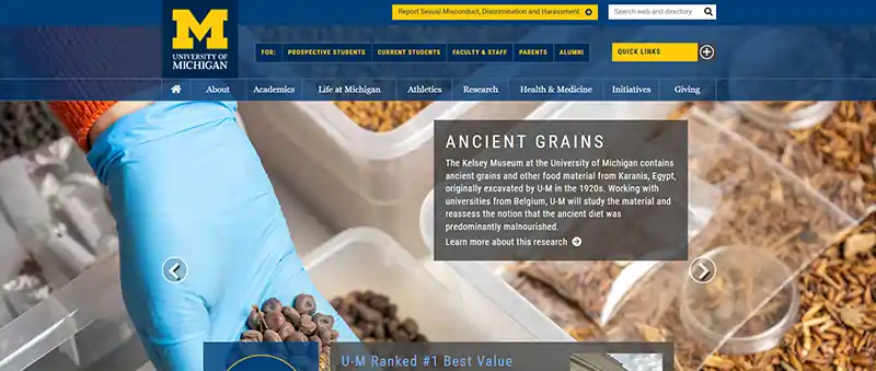
The university benefits from its well-thought-out, instantly recognizable identity. Regardless of whether or not you've traveled to Michigan or followed college athletics, you're probably familiar with the state's distinctive colors and shapes.
When it comes to education branding, simple shapes are often the most effective. For instance, the Harvard University coat of arms is one of the best educational website design examples. In addition, the university's rich crimson color and powerful shield shape constitute a significant part of the university's identity and website design.
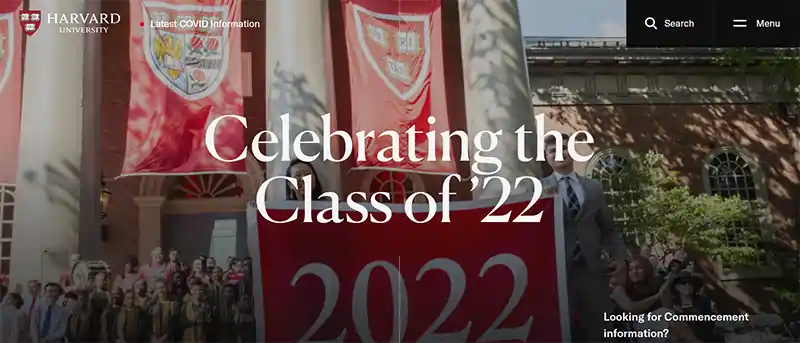
Basically, don't go over the top. Instead, let your brand speak for itself by using the colors and shapes that support your overall identity to communicate what you need to say.
The most successful websites are driven by great design, which is meaningful and solves issues. As an educational institute, it is important for you to convey your purpose to the audience. Your website should be explicitly followed to do so:
The overall design, navigation, media, testimonials, layouts, content, calls-to-action, and more can all be influenced by this purpose. For example, let us look at the Richfield Public Schools website.
Richfield Public Schools' website makes it easier for parents and students to locate important information on their new website. They have kept everything on one page. To begin with, this was accomplished by avoiding long scrolling pages, which are a common source of website disorientation.

However, the site's well-thought-out mega-navigation makes the decision a cinch. Accordions, tabs, and section dividers are used to visually organize text on each page to make it easier to scan. Users don't have to use the back button to return to previous sections because of a static toolbar.
According to 73% of web designers, a non-responsive design is one of the most common reasons people quit a website. Furthermore, website visitors want their mobile experience to be even better than their desktop experience because of the increasing amount of time spent on mobile devices each year.

Almost 50% of the world's internet users avoid downloading apps while browsing the web, according to a recent study. Therefore, responsive web design is becoming more and more significant. As a result, websites that cater to both mobile and desktop users will see a rise in traffic and interaction on their sites.
The following best practices will guide you as you develop the best web design for education website and bring traffic to your website:
The following is a good illustration of the same.
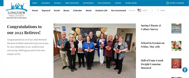
When it comes to website design, Longview Public Schools in Washington opted for an unconventional approach. Instead of focusing on large images or videos, the school's story was told through news articles. It's easy to click, find, and explore the material on both the desktop and mobile versions.
There is a tendency for schools and districts to spend a lot of time focusing on the homepage's curb appeal but then forget about the interior.
On each and every page of your website, you have the opportunity to tell a distinct chapter of your story, reinforce essential ideas and motivate site visitors to take action. In the year 2024, this will be much more critical than it is today, as search engines may bring up pages like tuition, faculty directories, careers, and even your school's calendar before your homepage.
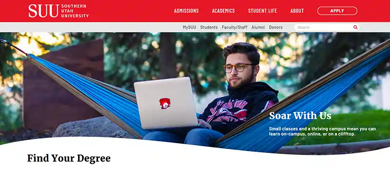
Let’s talk about Southern Utah University. Because of how it handled the subject, this one is particularly intriguing: it examines the effect of web design on student recruitment.
Here are a few more things to remember:
Online attention spans are getting shorter and shorter. Prioritize content and make it available to everyone, regardless of device or language, at all times. When it comes to 2024, it's no longer enough to just follow the rules. Different content can be served to different audiences depending on their language or region.
Additionally, subheadings and easy-to-read sections make it easier for readers to digest the information presented.
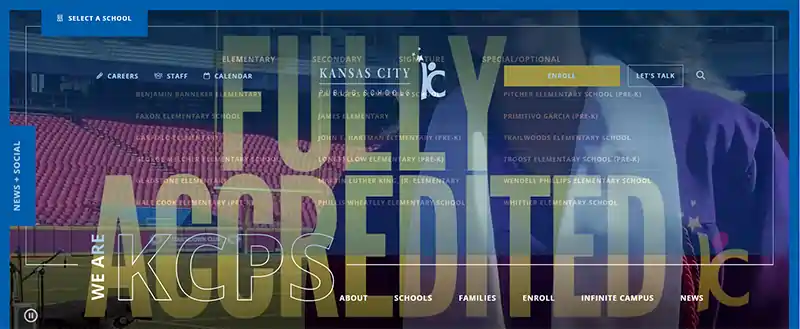
One of Missouri's largest school districts, Kansas City Public Schools' website attracts a vast and diverse audience every day and is the benchmark for accessible, mobile-friendly, and multilingual content. The KCPS team uses built-in accessibility features to ensure that all of the content on their website is accessible.
A complete translation of the website is available in the most often used languages by using the language translator at the bottom of the main page.
We're all visual learners; therefore, videos tend to resonate with us. That's why, according to 78% of internet marketers, video is the most engaging content type that yields a strong return on investment.
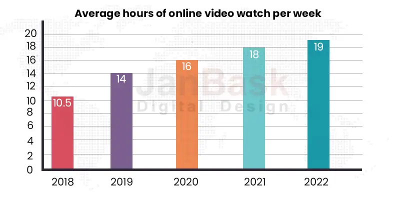
And for this reason, it's become a popular web design trend to creatively incorporate videos into educational websites. Additionally, video is an excellent tool for achieving such goals as:
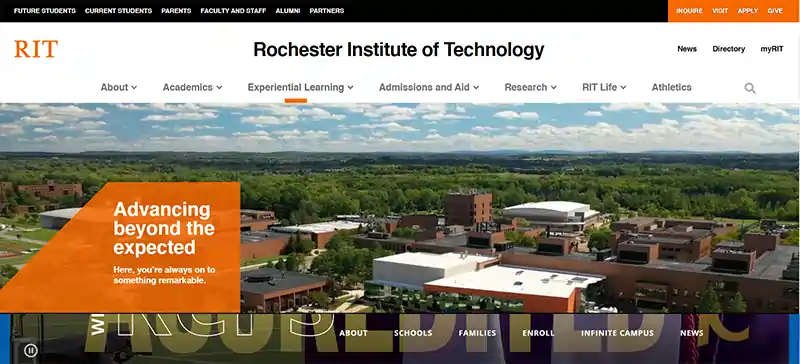
Rochester Institute of Technology's website is a superb illustration of how well video can be utilized. It all begins on the homepage, where a widescreen film depicts a variety of student projects and other activities.
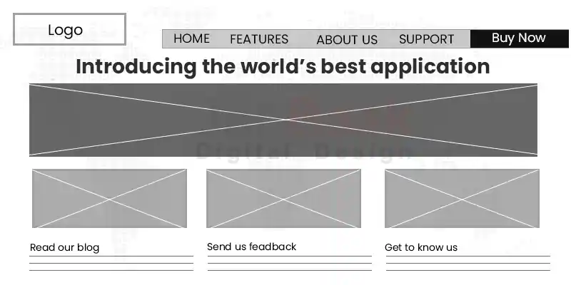
By the time you get to the actual design phase, your team should already have a good sense of what your site should look like if you follow these procedures. These wireframes will be used to generate a variety of pages that will be included on the site, according to the brief given to the web designers.
All the numerous elements that each page will need to have, such as headers and footers, body content, graphics, menus, and any in-page navigation buttons, are laid out in these blueprints of the pages. These are sometimes developed into mock-up templates that indicate how a finished page might appear.
For today's web users, a responsive web design for education website and mobile and desktop templates are essential. While focusing on content is a good idea, you should also be open to new ideas. Even if you have to write new material for some pages, it may be ideal to do so after you have developed your templates so that the person writing it can work with the agreed-upon page structure and generate something that fits.
Creating an SEO-friendly design that enables the incorporation of page names, header tags, and CTAs is also recommended. Additionally, if you aim to reach students in areas where internet speeds aren't ideal, you'll want to pay attention to how quickly your pages load. Your target audience may become frustrated and leave your site if your design is overly complicated and includes a lot of photos and videos.
If you're considering an educational website design project, keep in mind that it could take a long time to complete, and this should be taken into consideration. In addition, it may take more than expected to get a website up and running; therefore it's important to create a realistic timetable for the project.
Before going live, the website should be thoroughly tested for bugs and issues that could detract from the user experience. Relaunched or brand new sites must also be correctly integrated with your other digital tools, including Google Analytics or other CRM system your school may be using.
Moreover, to attract new students, your website is the most important digital channel you have; thus it's critical that you get the design just right. Even though it takes time and effort, the results are well worth the effort.
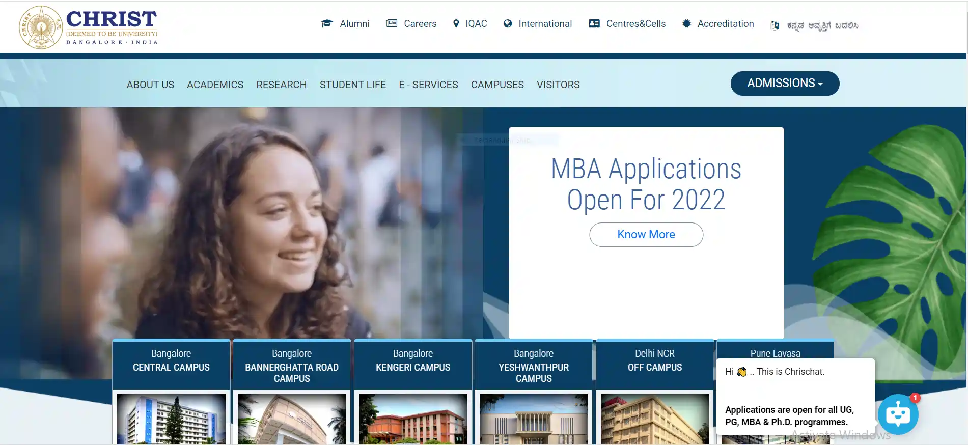
When you visit Christ University's website, the first thing you'll notice is the homepage's featured photographs. Bright colors are used across the website, which works nicely with the photographs. The website also makes fantastic use of scroll animations. Simplistic design with a single font style and concise, relevant material lends credibility to this website's appearance. There is a drop-down menu at the top of the page where you can find answers to all your questions.
There are two key points of emphasis in the footer: their vision and their mission. The top menu has all the information you need. The website also features a floating sidebar for easy navigation!
The Christ University's Ovation Section is a notable component of the institution, highlighting and praising students for their accomplishments. The virtual tour of the university is a standout element of this website.
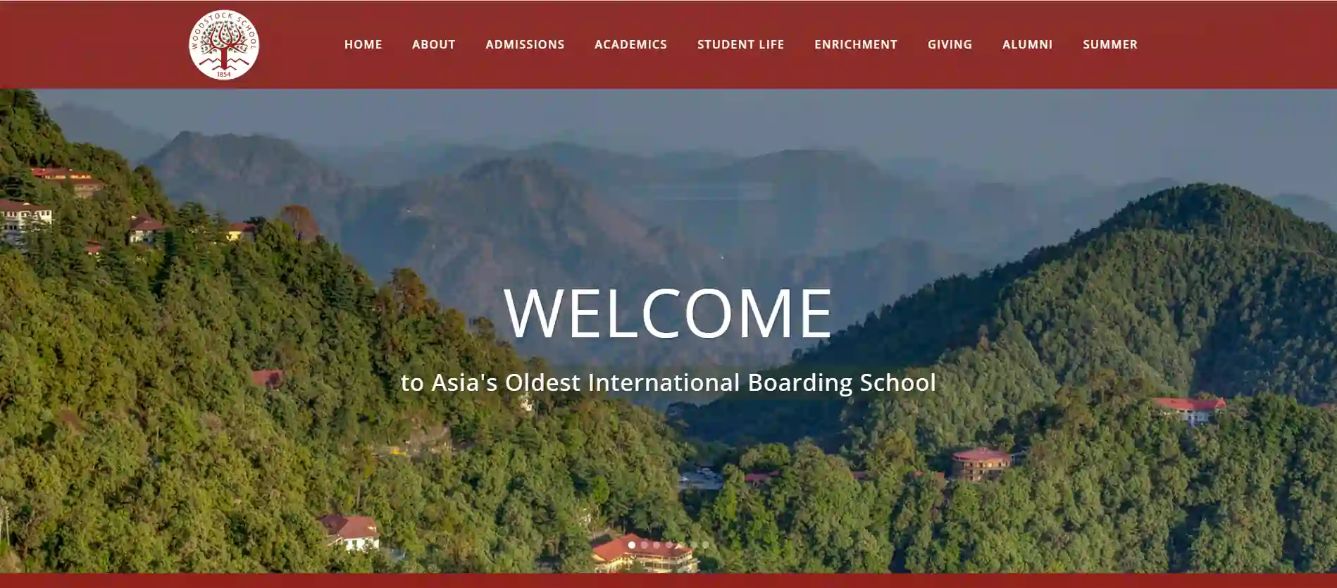
The look and feel of this school's website are both distinctive and polished. Each component of the header menu has a drop-down menu that can be accessed by hovering over it. The photographs speak for themselves on the website, which does not offer a lot of content. Different and intriguing are the footer menus.
Professionality is enhanced by the constant use of font style throughout the website. Flat colors are used throughout the site. In each section, you'll find links to further resources in the main menu. Admissions, Academics, Student Life, Enrichment, and more may all be found under the header menu.
Videos and tweets were also available on the website! It also does a good job of showcasing the school's various assets across the entire website. On the homepage, social networking links are also included.
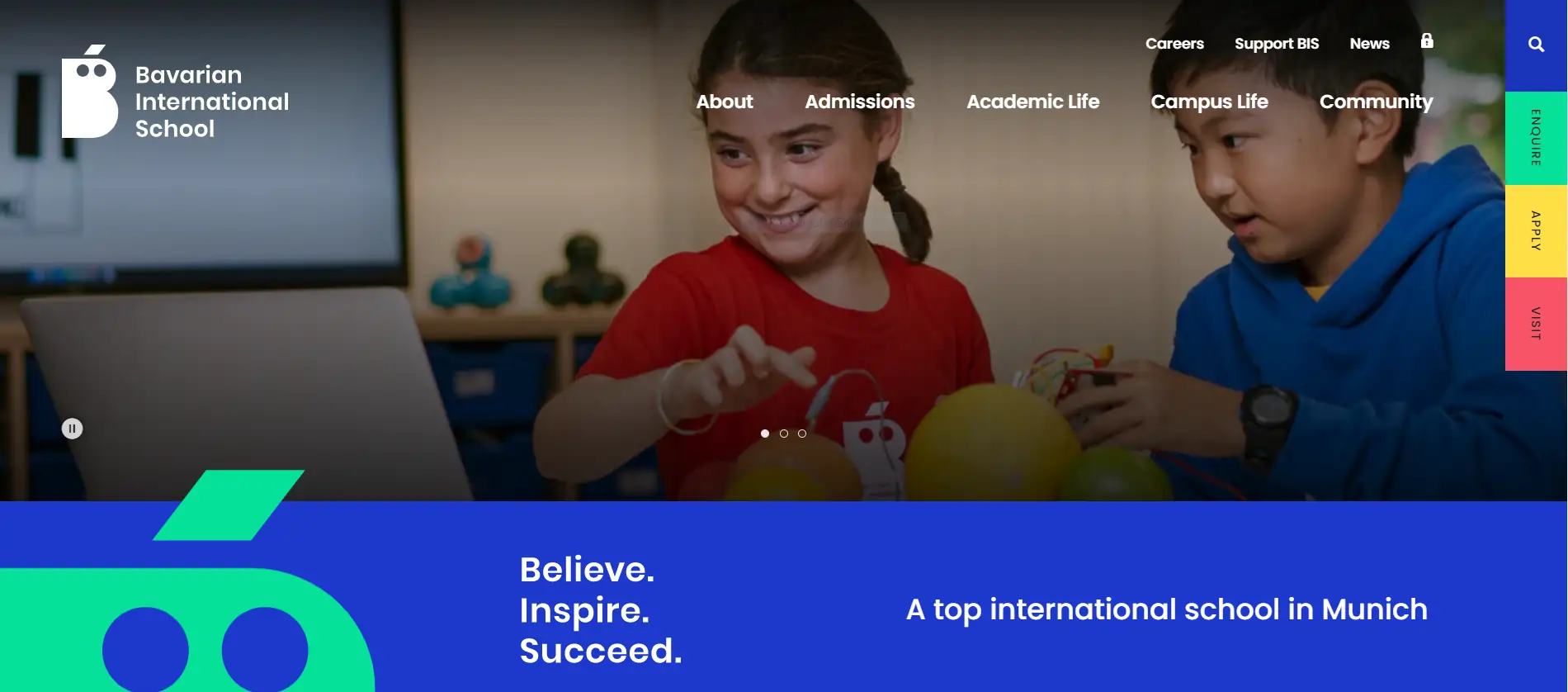
As part of their new branding, Bavarian International School in Germany has launched a website that focuses on the positive aspects of their community. A lot has to be accomplished, but they've done it in a beautiful way.
The first thing you'll notice when you arrive at BIS's website is a vivid color scheme that represents the community's enthusiasm. You'll want to keep scrolling to discover more about the school's academics because the colors and imagery are attractive. The site's content, navigation, and calls-to-action are designed to entice and convert potential families.
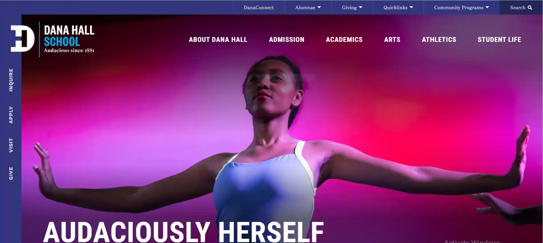
There is nothing short of stunning in the website for Dana Hall School. An all-girls college preparatory school in Massachusetts is academically ambitious, rich in opportunity, and fiercely empowering.
As a result, the school's color scheme is so vibrant that it's almost intimidating. Bright gold, purple, and green stand out nicely against the school's typical blues. The colors aren't just thrown together haphazardly though; they're purposefully employed to showcase the school's unique selling points and value proposition.
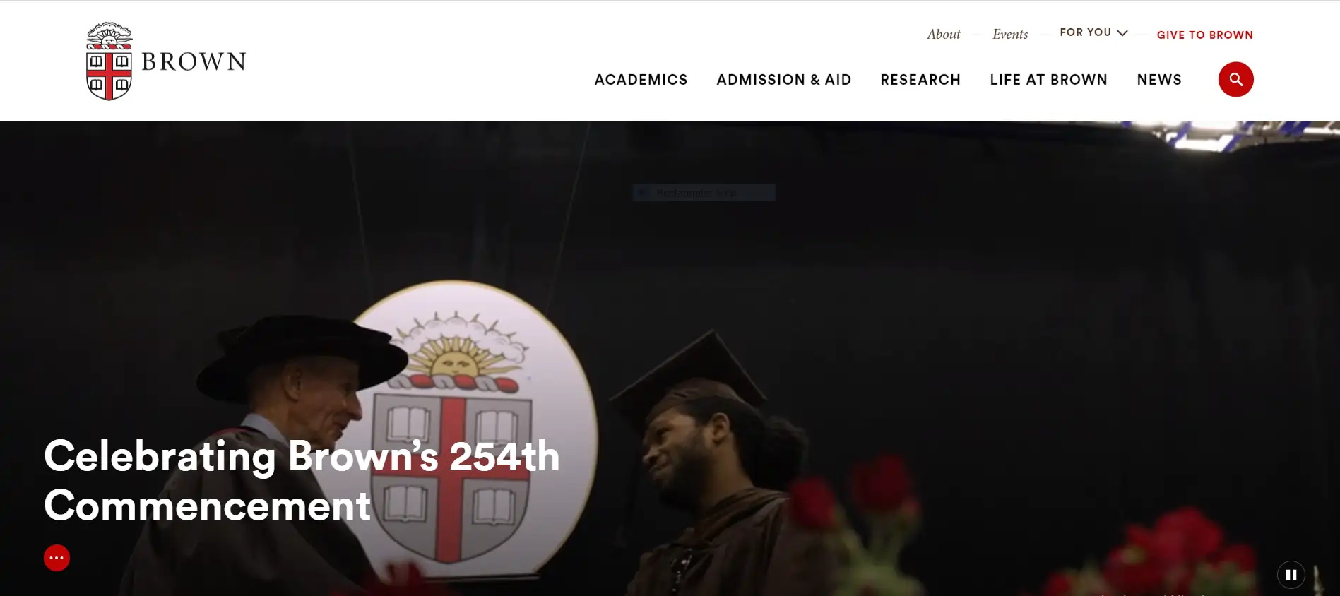
One of the first things you notice about Brown University's website is how many images and videos it has, depicting the New England school's campus in all seasons, as well as scenes from genuine classrooms and extracurricular events.
An innovative technique employed by the university reduces the burden on viewers and computer performance by turning off video automation until you navigate to the relevant part. In order to ensure that clients see what you want them to and that technical loads don't overwhelm mobile devices, this organizing of when items load and what all is shown at once is fantastic.
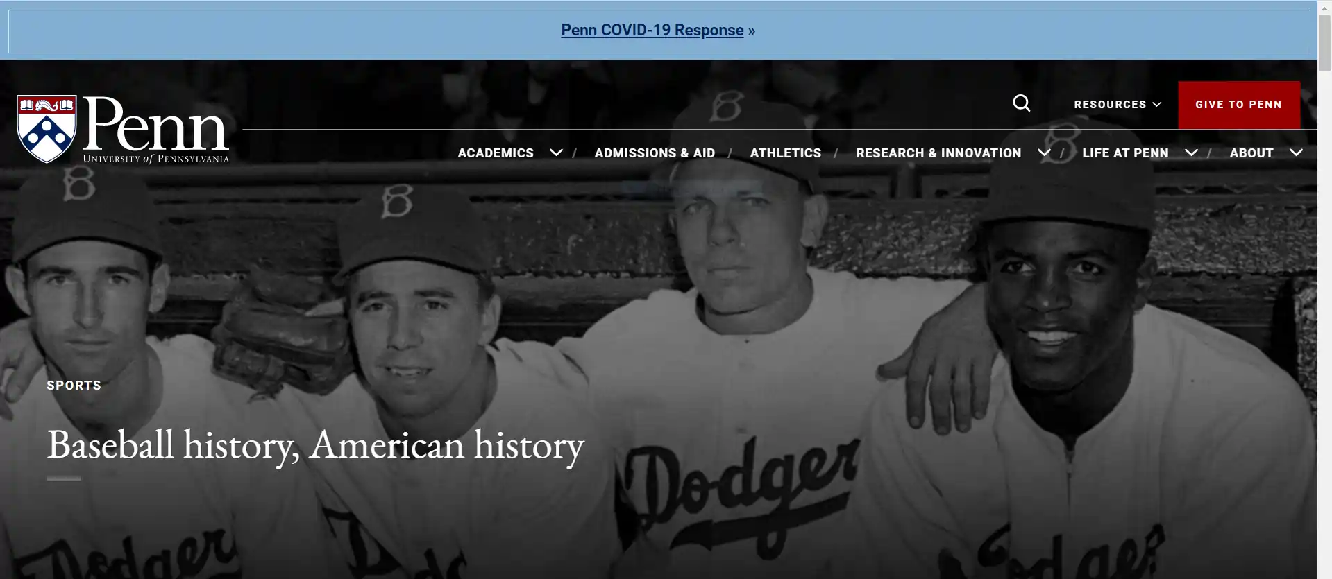
Student organizations, such as clubs and projects, have a prominent place on the Penn homepage thanks to the university's efforts. A couple cradling their newborn baby at home for the university's nursing program are just some of the examples used to promote various degree programs.
From recent entrepreneurs to outstanding artists, there's a wide range of accomplishments on the site's homepage image gallery.
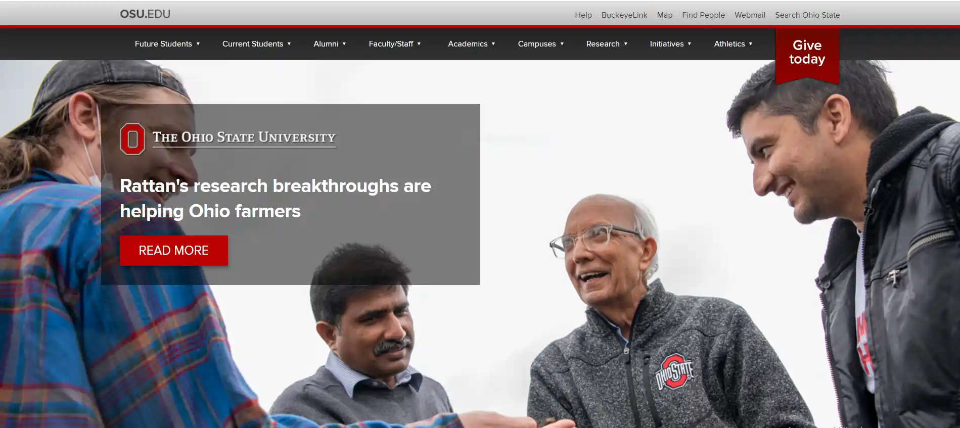
Visitors can obtain a greater sense of the general campus layout by clicking on a link to a page that describes the university's facilities, which is linked to from the site's call to action. "Popular for Current Students" is a list of the most frequently searched terms by logged-in students, including information on how to pay your tuition and how to get a job. A state-wide graphic that can be clicked on from any page of their interactive map covers all of their schools.
Your website should help you achieve your ultimate goals in education. Your brand's appeal can be boosted by making wise design decisions, both for prospective students and current employees. Take inspiration from some of the best website designs for education included in this article.
Regardless of the type of knowledge you're trying to impart or the audience you're trying to reach, a well-designed website is crucial for any educational endeavor. A professional web designer can help you realize your vision.

O
Interesting examples and very well explained.
Z
I totally agree, it is very necessary to keep updating your website as per new technologies.
E
Google Analytics is very important for any website owner to understand what the audience needs.
K
Very interesting blog. I loved it.
A
As someone who has recently got his website redesigned, I would really suggest that you should hire a website designer who understands your brand deeply.