
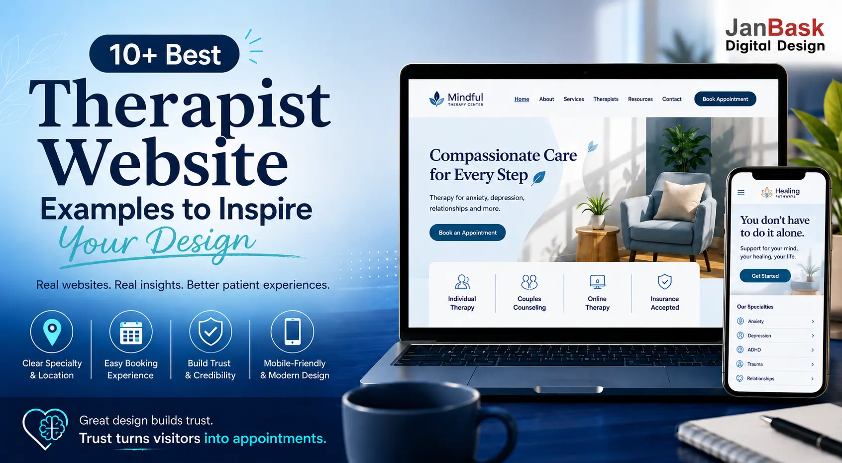
Choosing the right design for a therapist website is about more than picking a clean layout or attractive colors. The best therapy websites make it easy for potential patients to understand what you offer, feel comfortable reaching out, and take the next step toward booking an appointment.
But what does that actually look like in practice?
From calming visual design and clear messaging to intuitive navigation, mobile-friendly experiences, and strategically placed calls to action, the strongest therapist websites combine aesthetics with usability. Looking at real examples can help you see which design choices build trust-and which ones can make a website harder to use.
In this guide, we’ve rounded up 10+ of the best therapist website examples to show you what works, why it works, and what you can take away when designing or redesigning your own therapy website.
If you’re planning to design a therapy website or thinking about giving your current one a much-needed refresh, these details matter. Your website is often the first experience a potential patient has with your practice, and the right design can turn uncertainty into trust and interest into an appointment.
To show what separates a strong therapist website from a forgettable one, we pulled up 11 real behavioral health, psychologist, and counselling websites and reviewed each one the way a first-time visitor would. Across these therapy website examples, we asked the same questions every time: Can I tell what this practice treats? Can I tell where it is? Can I book without friction? Do I trust what I’m reading?
We’ve selected them and broken down exactly what each one gets right – so if you’re building a new site or improving the one you have, you can borrow the right ideas and avoid the mistakes that quietly cost practices new patients.
Why Therapist Website Design Matters
For many potential patients, your website is their first impression of your practice. A well-designed therapist website can build trust, communicate your approach clearly, answer important questions, and make it easy to take the next step-whether that means learning more, getting in touch, or booking an appointment. Good design isn’t just about looking professional; it’s about creating a comfortable, accessible experience for people who may already feel hesitant about seeking support.
How We Selected These Sites
Every site below was scored against the same patient-first checklist:
- Does the homepage answer specialty + patient need + location + next step within seconds?
- Is the appointment or Call to Action short and obvious?
- Is trust established with real credentials, not just claims?
- Is the language written for a patient, not a clinician?
- Does the site feel current, mobile-friendly, and easy to navigate?
Example 1: Thriving Center of Psychology
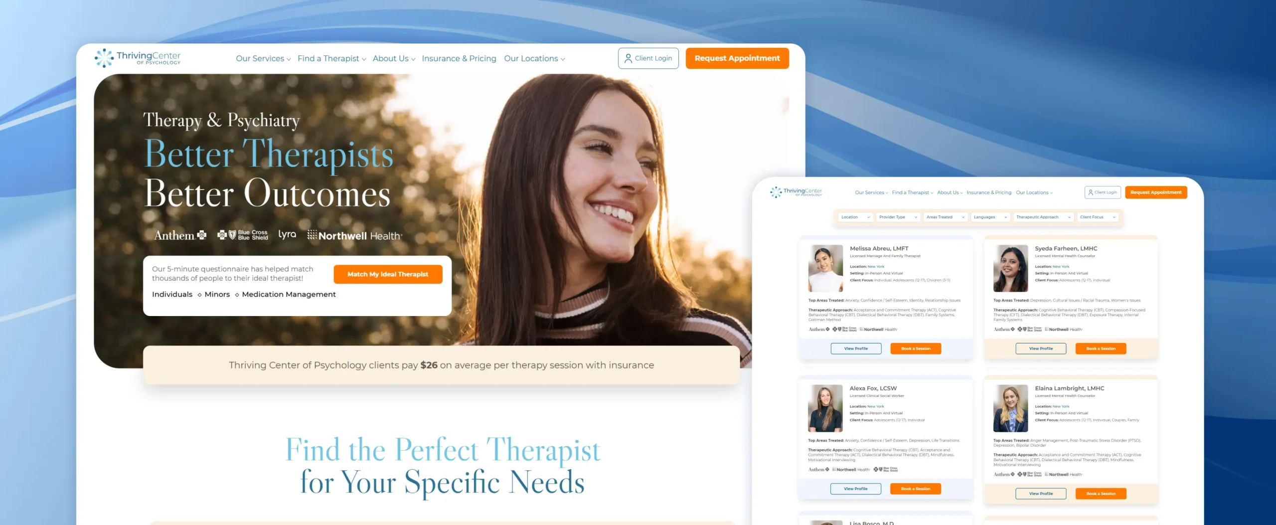
Organization Overview: Thriving Center of Psychology operates across 14 states, and it earns its place near the top by being unusually transparent about the two things patients worry about most before they even inquire: fit and cost. It’s also one of the stronger psychologist website examples on this list, since it makes therapist fit, specialties, costs, locations, and care options easy for prospective patients to understand.
What It Gets Right:
- Matchmaker Quiz: A five-minute questionnaire filters therapists by state, specialty, modality, language, and setting, then a real coordinator follows up – blending self-service search with a human touch.
- Upfront Pricing: Average session costs (with and without insurance) are stated in plain numbers on the homepage and FAQ, instead of “contact us for pricing.”
- Individual Provider Cards: Each therapist’s card shows credentials, location, setting (in-person/virtual), top specialties, and accepted insurance.
- Switch-Therapist Policy: An explicit, friction-free answer to “what if this therapist isn’t the right fit,” which lowers the risk of a patient’s first booking.
Example 2: DC Talk Therapy
Organization Overview: DC Talk Therapy is a single-city group practice, and it’s the best example on this list of the specialty-plus-location formula working at a small-practice scale rather than a national one.
What It Gets Right:
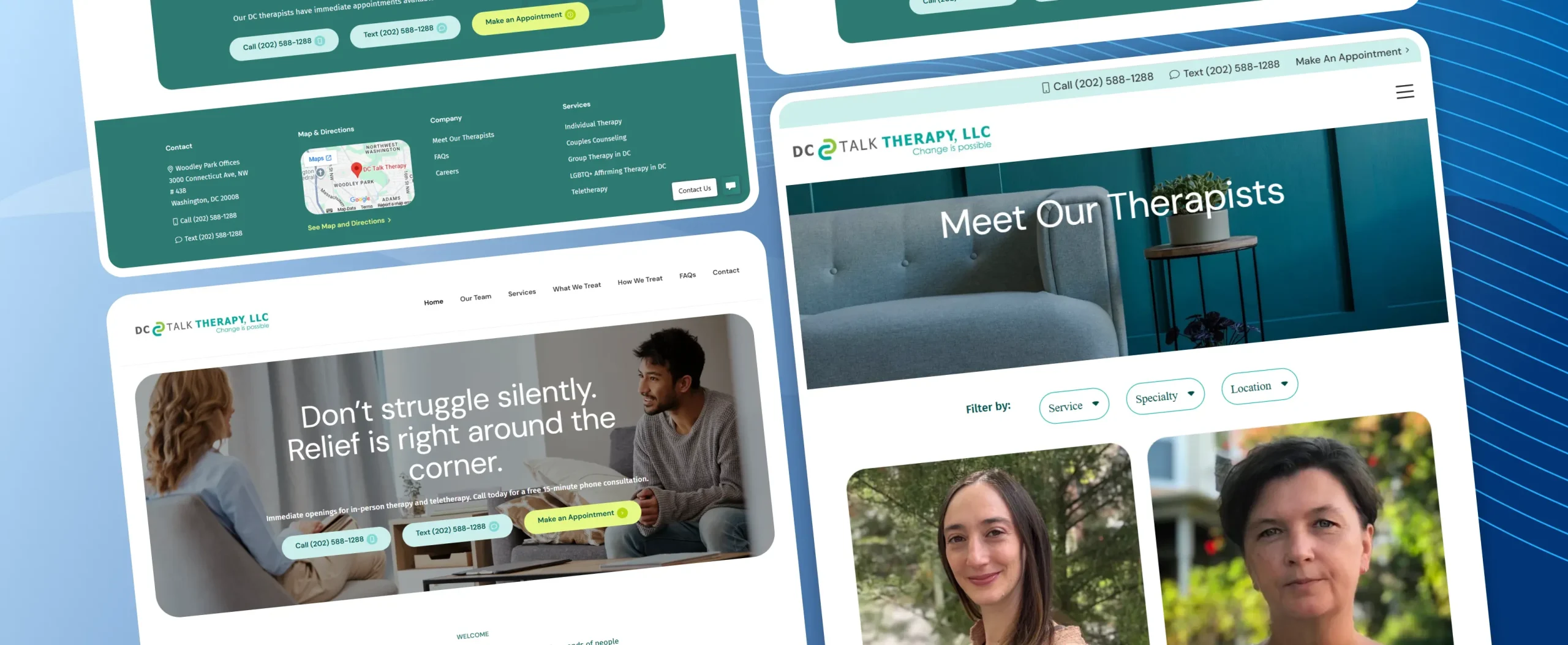
- Immediate Local Framing: “DC Therapists Near Me” and the specific neighborhood (Woodley Park) are established before a visitor scrolls, satisfying the location half of the five-second test instantly.
- Multi-Channel Contact: Call, text, and a booking link are all present in the header and repeated in every major section – removing the “which button do I click” hesitation.
- Named Provider Photos: Real headshots and names for each therapist are visible on the homepage itself, not buried behind a “Meet the Team” click.
- Press & Award Badges: “Featured in” logos (Washington Post, Good Morning America) and multi-year “Best Therapists in Washington” badges build third-party credibility without the practice describing itself.
Example 3: Lifebulb
Organization Overview: Lifebulb is a multi-state therapy and psychiatry network, and it’s the strongest example on this list for turning the specialty-plus-location-plus-next-step formula into an actual working website rather than just a homepage headline.
What Lifebulb Gets Right
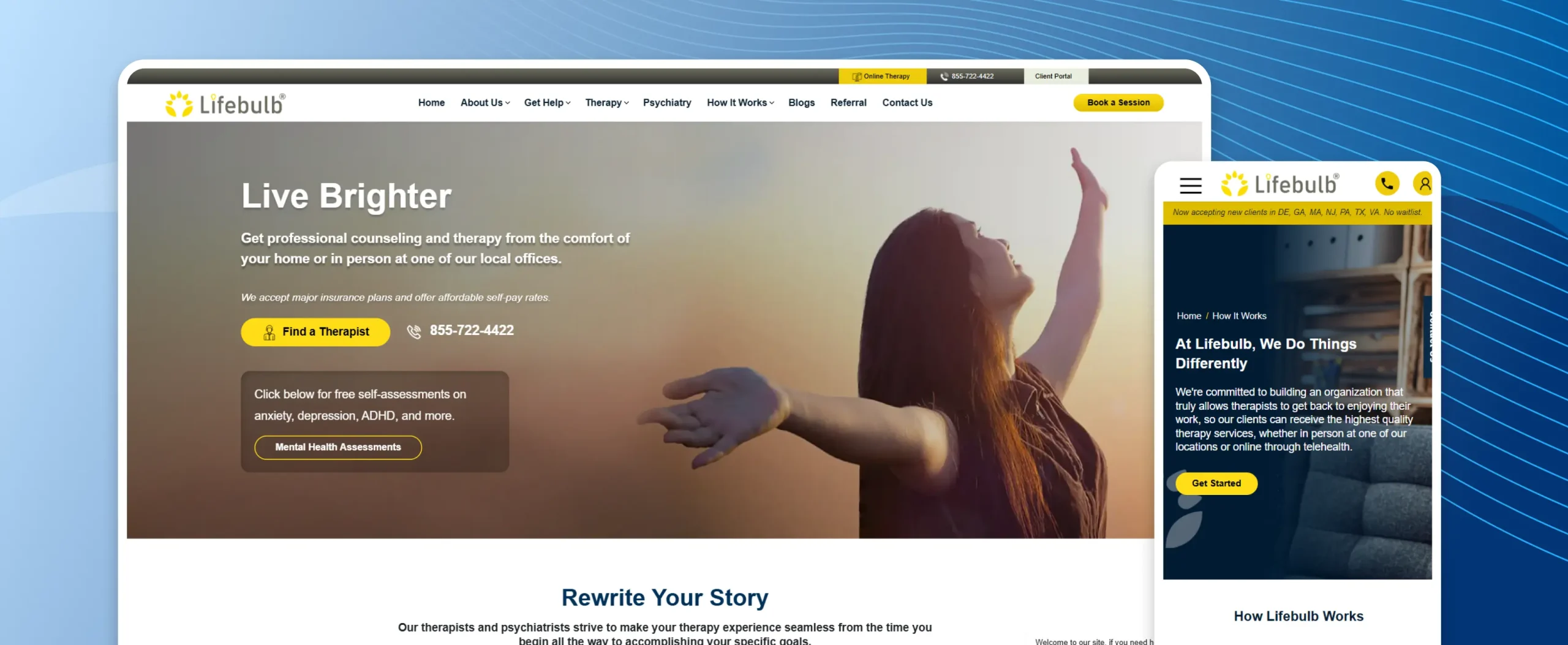
- Instant State & Insurance Filtering: The homepage lets a visitor pick their state and condition (anxiety, depression, ADHD, and more) before they’ve scrolled past the hero section.
- Insurance Pricing Calculator: A visitor can select their state and insurance plan and see an estimated session cost before ever picking up the phone – removing one of the biggest sources of pre-booking anxiety.
- Dual Care Paths: In-person and online therapy are presented as equally supported options, each with its own plain-language benefits list.
- Self-Assessment Tools: Free assessments for anxiety, depression, and ADHD give hesitant visitors a low-pressure first step before committing to a consultation.
- Deep FAQ Section: Answers to HIPAA, confidentiality, and “what does a first session look like” questions are handled in plain language, right on the homepage – proof that clear communication and a properly built HIPAA-compliant website go hand in hand.
Example 4: Psychiatric Wellness Center
Organization Overview: Psychiatric Wellness Center is a Bakersfield-based psychiatric and medication-management practice, and it demonstrates how a medically-oriented behavioral health site can still lead with location and next steps.
What It Gets Right:
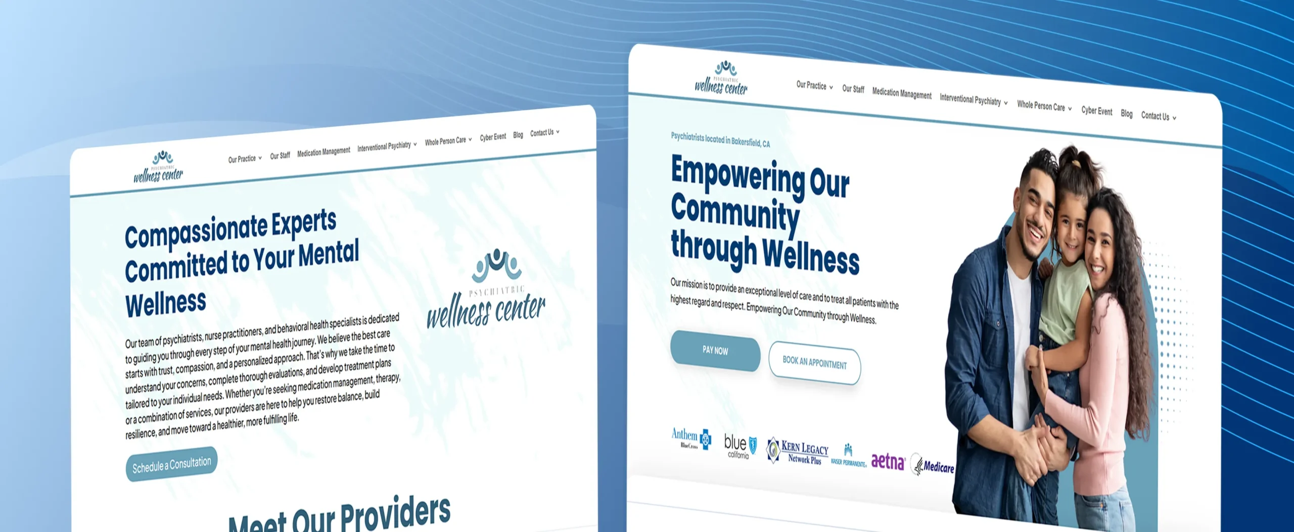
- Immediate Geographic Identity: “Psychiatrists located in Bakersfield, CA” appears as the very first line on the page – no guessing required.
- Service Breadth Made Scannable: Medication management, TMS, ketamine/Spravato, and enhanced care management are each summarized in a sentence with a “Learn More” link, avoiding a wall of clinical jargon.
- Referring-Clinician Section: A dedicated path for other providers to refer patients, with a direct phone line and turnaround expectations, shows operational maturity.
- Multiple Locations Clearly Addressed: Three offices (two in Bakersfield, one in San Diego) are each listed with separate phone numbers, avoiding the “which office do I call” confusion.
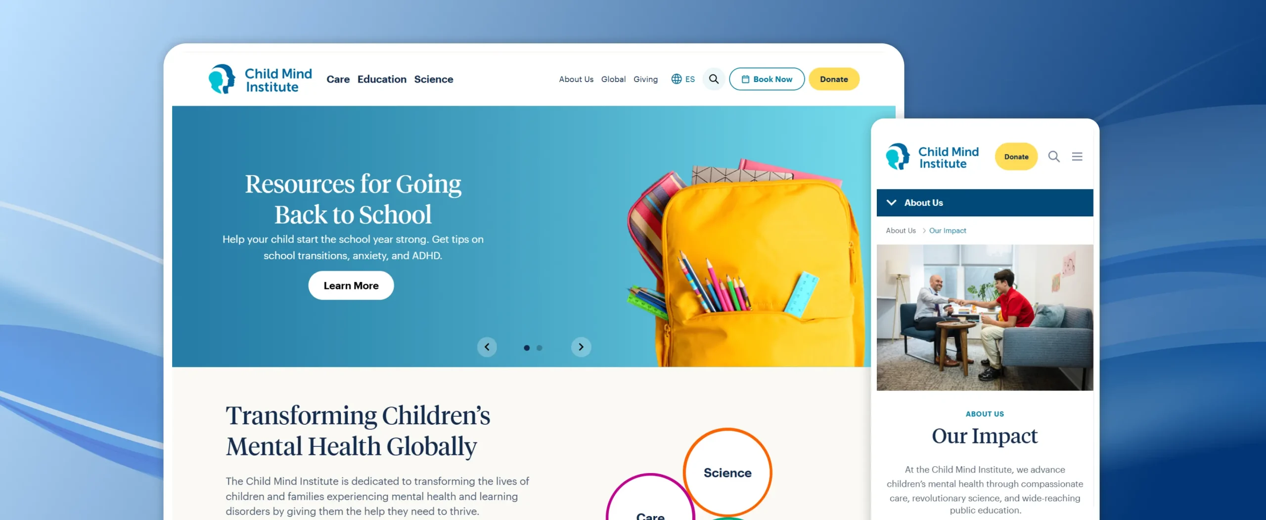
Example 5: Child Mind Institute
Organization Overview: Child Mind Institute is a nonprofit clinical, research, and education organization, and it’s the strongest example on this list of trust-building through transparency and depth of content – even though its structure is closer to an institution than a private practice.
What It Gets Right:
- Editorial Authority: A large, dated, credentialed article library (written and reviewed by named clinicians) models exactly the kind of accountable health content the YMYL standard calls for.
- Free Symptom-Checker Tools: “Ask Kai” and condition-specific screeners (ADHD, autism, depression, OCD) give visitors something actionable before they ever request care.
- Radical Financial Transparency: The footer states plainly that the organization is financially accountable, transparent, and doesn’t accept pharmaceutical funding – an unusually direct trust signal.
- Clear Care Entry Point: “Request an Appointment” is a persistent, unambiguous CTA even inside a site that also serves research and donor audiences.
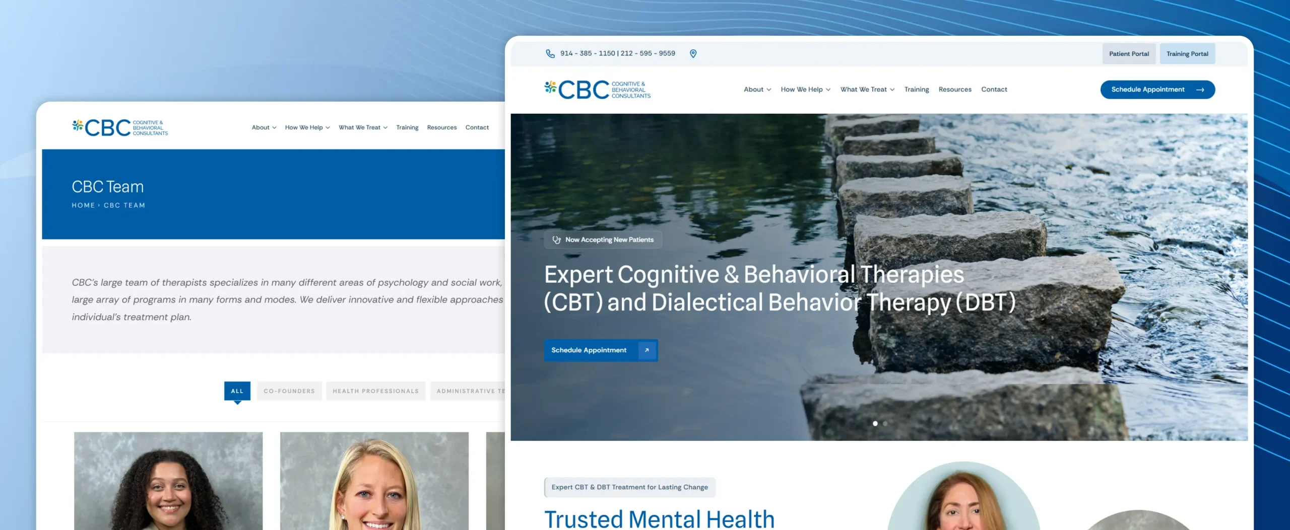
Example 6: Cognitive and Behavioral Consultants (CBC)
Organization Overview: CBC is a Manhattan- and Westchester-based CBT/DBT specialty practice founded by two nationally recognized clinical researchers, and it shows how deep clinical credibility can be communicated without turning a bio into a résumé.
What It Gets Right:
- Named Clinical Leadership: Founders are identified by name, title, and academic affiliation on the homepage, giving visitors an immediately verifiable credibility anchor.
- Condition-Specific Navigation: A browsable list of specific disorders treated (GAD, OCD, PTSD, school refusal, selective mutism, and more) helps a visitor self-identify quickly.
- Full Lifespan Coverage Stated Upfront: Preschool through adult care is spelled out in one line, saving parents and adult patients alike a guessing game.
- Continuing-Education Credibility: Sections for professional training and consulting reinforce that the practice is a recognized authority, not just a service provider.
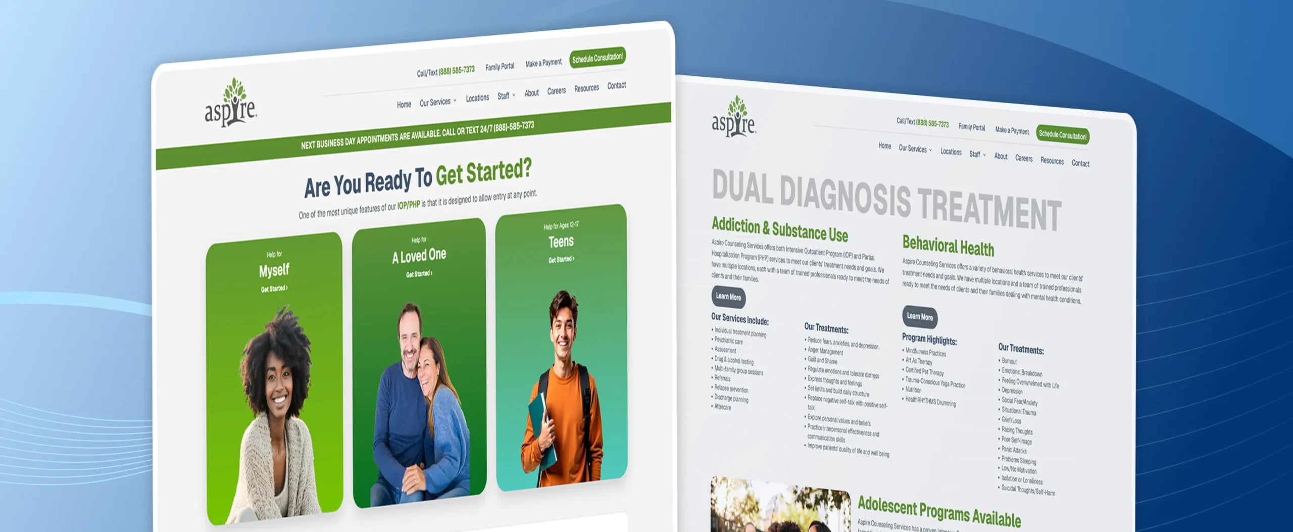
Example 7: Aspire Counseling Services
Organization Overview: Aspire Counseling Services operates IOP/PHP behavioral health and substance-use programs across seven California locations, and it’s a useful example of a booking journey built for urgency – with some trade-offs in warmth. It also stands out as one of the more instructive counselling website examples on this list for organizations handling higher-acuity, time-sensitive inquiries.
What It Gets Right:
- Audience-Specific Entry Points: “Help for Myself,” “Help for a Loved One,” and “Help for a Teen” split the homepage into three clear paths the moment it loads.
- 24/7 Live Response: Live phone and text support, with next-business-day appointments advertised directly on the homepage, signals real accessibility for people in crisis-adjacent situations. A well-designed healthcare website can make these support options easier to find when they matter most.
- Visualized Program Journey: A four-step “Gather Info → Intake → Begin Program → Graduation” graphic sets expectations before a patient ever calls.
- Insurance Verification Tool: A dedicated “Am I Covered?” flow lets visitors check benefits without a phone call.
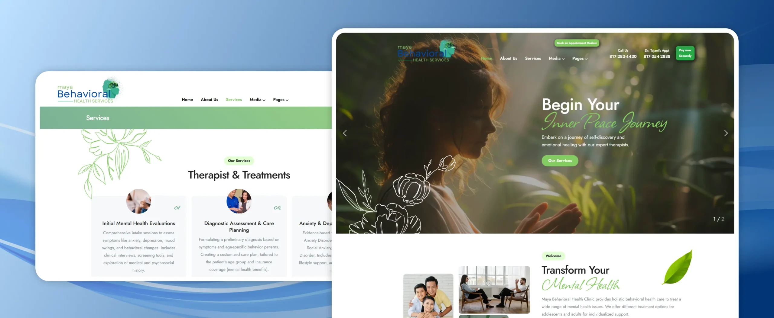
Example 8: Maya Behavioral Health
Organization Overview: Maya Behavioral Health is a nurse-practitioner-led psychiatric clinic in Texas, and it illustrates a common mid-tier problem: real credentials and real services, presented through a generic template that undercuts them. It’s a useful cautionary case among counselling website examples – strong services and provider credentials still need a clear, professional website experience to convert.
What It Gets Right:
- Clear Service List: Initial evaluations, diagnostic assessment, anxiety/depression management, and age-specific care (child, adolescent, adult, geriatric) are each given their own short, plain-language card.
- Credentialed Provider Identity: The lead provider’s full credential string (DNP, MSN, APRN, FNP-BC, PMHNP-BC) and a supervising MD are both named on the homepage.
- Multiple Booking Paths: A Healow booking link and a separate payment portal are both available directly from the header.
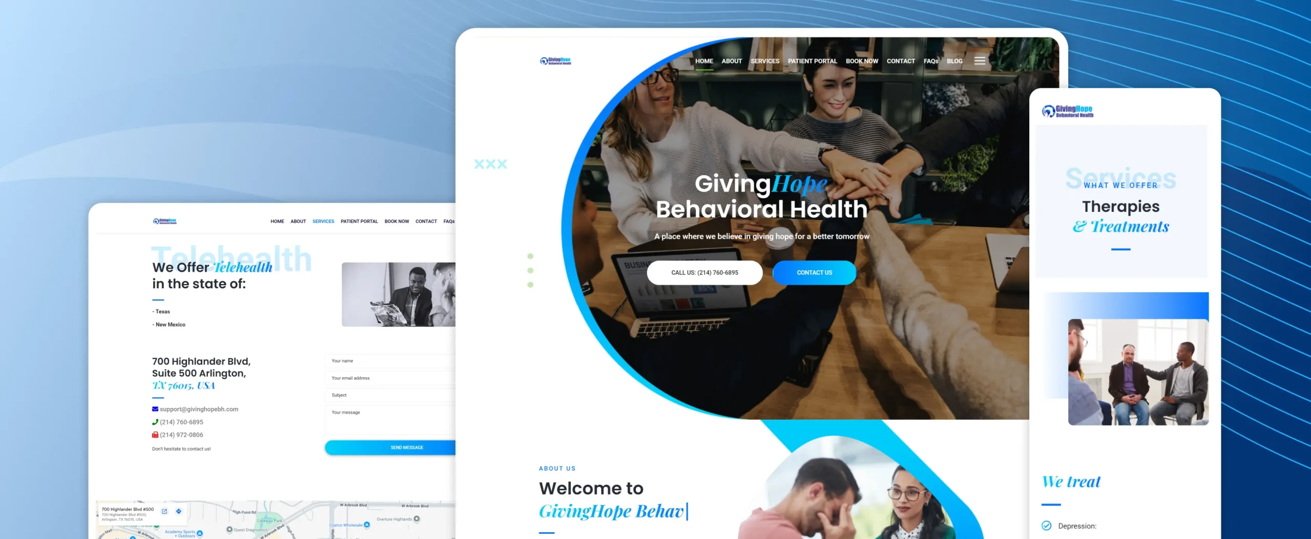
Example 9: GivingHope Behavioral Health
Organization Overview: GivingHope Behavioral Health is a Texas telehealth and in-person behavioral health provider, and it shows how a thin, dated build can undersell a practice’s actual services.
What It Gets Right:
- Crisis Resources Present: National hotlines (NAMI, Crisis Text Line, SAMHSA) are listed directly on the homepage, a genuinely useful safety-first touch.
- Insurance List Visible: A dozen-plus accepted insurers are named without requiring a click-through.
- City Service Area Named: The About section lists the specific DFW-area cities served, Arlington.
Example 10: Eastern Shore Community Services Board
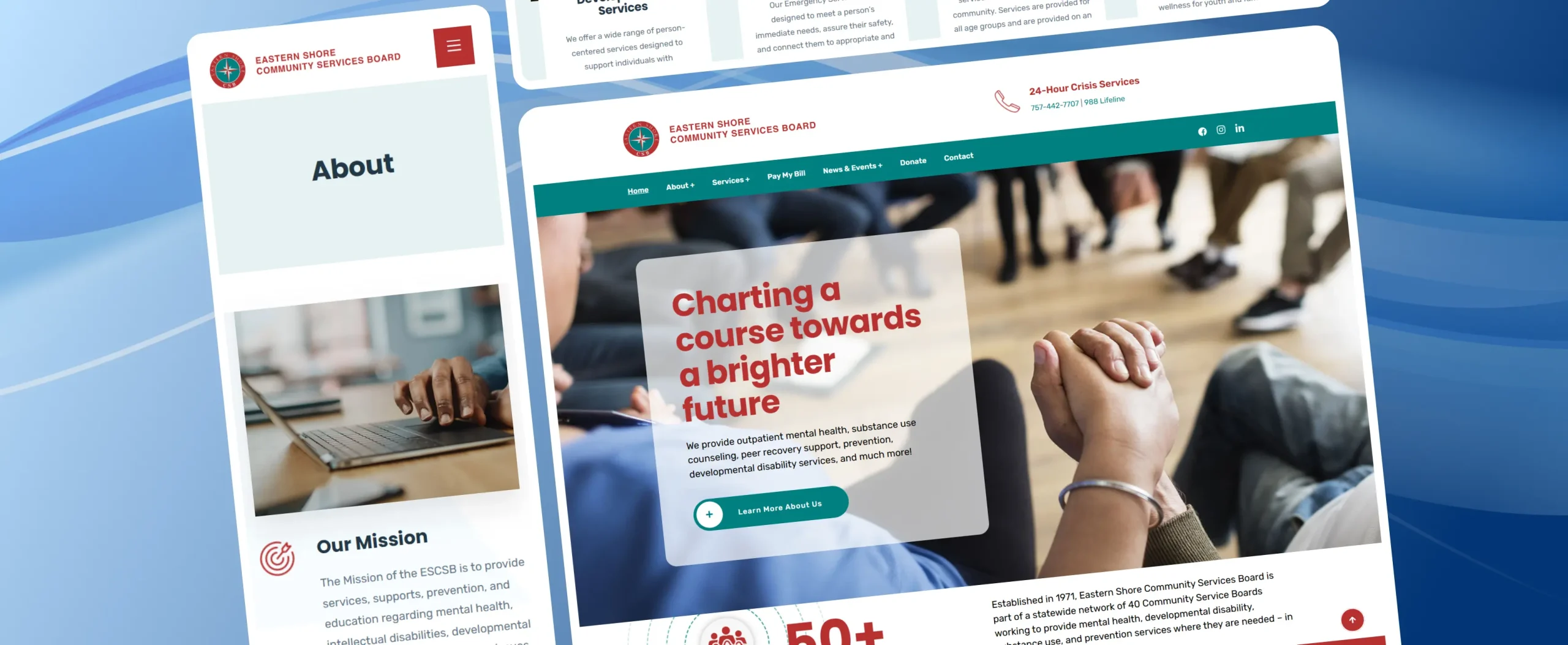
Organization Overview: Eastern Shore CSB is a Virginia public community services board, and it’s a reminder that government mental health agencies serve a different (and broader) mission than a private therapy practice – which shows up clearly in the website’s priorities.
What It Gets Right:
- 50+ Years of Institutional Trust: The homepage states the organization’s founding year and statewide network membership plainly, establishing legitimacy fast.
- 24-Hour Crisis Line Front and Center: The crisis phone number and 988 are pinned in the header on every page – an important safety standard other sites on this list could learn from.
- Four Clear Service Categories: Developmental, emergency, outpatient, and prevention services are each summarized in a sentence with its own photo and link.
Example 11: Conscious World Changers
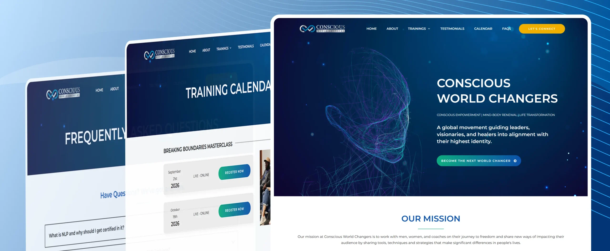
Organization Overview: Conscious World Changers is included here as a cautionary example: it is an NLP-based life-coaching and coach-certification business, not a licensed mental health practice – and comparing it against the other ten sites shows exactly why that distinction matters on a website.
What It Gets Right:
- Consistent Brand Voice: The “conscious empowerment” messaging is delivered consistently across the homepage, video testimonials, and program pages.
- Video Testimonials: A large bank of short video reviews adds a personal, human element to the sales narrative.
The Pattern Behind Trust and Conversions
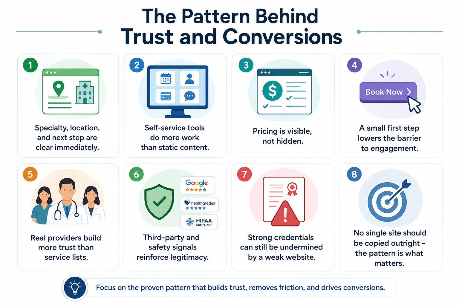
- Specialty, location, and next step are clear immediately. Sites like Lifebulb, DC Talk Therapy, and Psychiatric Wellness Center make it obvious within seconds who they treat, where they’re located, and what a visitor should do next.
- Self-service tools do more work than static content. Insurance and pricing calculators, matchmaker quizzes, and symptom-checkers – as seen on Lifebulb, Thriving Center of Psychology, and Child Mind Institute – let visitors evaluate their options before ever making a call.
- Pricing is visible, not hidden. Several of the strongest sites list estimated costs directly on the homepage, addressing one of the most common hesitations before booking, rather than routing everyone through a “contact us” form.
- A small first step lowers the barrier to engagement. Free assessments and screeners give hesitant visitors a way to interact with the site before committing to a full consultation.
- Small conversion-focused improvements can turn more visitors into patients. Clear calls to action, shorter contact forms, simpler appointment scheduling, mobile-friendly layouts, modern UI/UX, and strategically placed trust signals can reduce friction and encourage more visitors to take the next step. Applying CRO best practices and quick hacks can help improve conversions without requiring a complete website redesign.
- Real providers build more trust than service lists. Named clinicians, visible credentials, and actual headshots – as on DC Talk Therapy and CBC – tend to establish credibility faster than a generic description of services.
- Third-party and safety signals reinforce legitimacy. Press mentions, awards, and visible crisis-line numbers, as seen on Eastern Shore CSB and Aspire, carry particular weight in behavioral health, where trust is harder-won than in most other industries.
- Strong credentials can still be undermined by a weak website. Maya Behavioral Health and GivingHope both offer real services and qualified providers, yet a generic, dated site design limits how effectively that credibility comes through.
- No single site should be copied outright – the pattern is what matters. Clear specialty and location, transparent pricing and fit, an easy first step, and visible proof through real people and real information are the consistent threads across the strongest examples.
Make It Easier for Patients to Choose You
The strongest therapist websites on this list aren’t memorable because of flashy designs or clever animations. They work because they make things easier for the person on the other side of the screen. A potential patient should be able to quickly understand whether you’re the right fit, where you’re located, why they should trust you, and how to get started.
If your website feels difficult to navigate or doesn’t make booking easy, it may be time to rethink the experience. At JanBask, we create healthcare websites that combine clear messaging, intuitive design, and patient-focused experiences.
Explore our healthcare website design services or request a free website audit to see where your site could improve.