

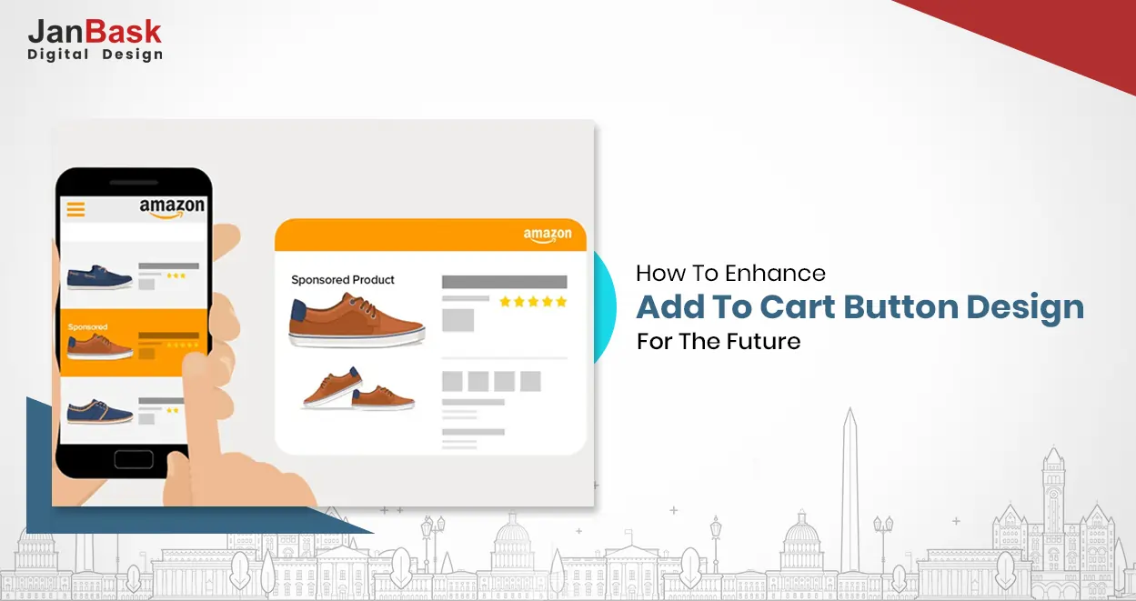
In the world of e-commerce, the "add to cart" button is one of the most essential elements of any product page. This button is crucial in converting website visitors into paying customers, making it a key focus of many e-commerce businesses. According to Baymard Institute, the average "Add to Cart" conversion rate for e-commerce websites is 9%.
The "Add to Cart" button is the primary call-to-action for users to purchase products on e-commerce websites. It's a small button but it can impact a website's conversion rate and revenue. This blog post will discuss tips for optimizing it to increase conversions. You can choose an e-commerce web design agency or start research with this article.

Looking for an e-commerce Web Design Agency?
The "add to cart" button is the gateway to the checkout process. Customers who click this button signal their intent to purchase the product. This action represents a critical milestone in the customer journey, and the importance of getting it right cannot be overstated.
The "add to cart" button also serves as a visual cue that the product is available for purchase. It creates a sense of urgency and encourages customers to act quickly before the product sells out.
Optimizing the "add to cart" button is critical to e-commerce conversion rate optimization. The "add to cart" button is the gateway to making a sale on an e-commerce website, and it is essential to ensure that the button is optimized for conversions. A study by BigCommerce found that adding a prominent and clear "add to cart" button increased conversions by 17%. In this context, we have compiled a list of tips to help you optimize your "add to cart" button for conversions. Following these steps can improve the user experience, encourage more users to add items to their carts, and ultimately increase your conversion rate.
The "add to cart" button should be prominently displayed on the product page and easy to find. It should be located above the fold and stand out visually from other elements on the page. Consider using a contrasting color, bold font, or a prominent placement to draw attention to the button.
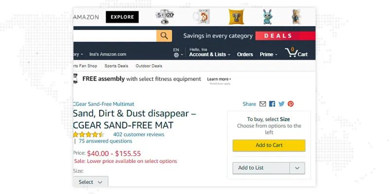
One example of a website that does an excellent job of making the "add to cart" button prominent is Amazon. When you visit a product page on Amazon, the "add to cart" button is located above the fold and is prominently displayed in a bright yellow color, making it easy to find and click. This is demonstrated in the image below:
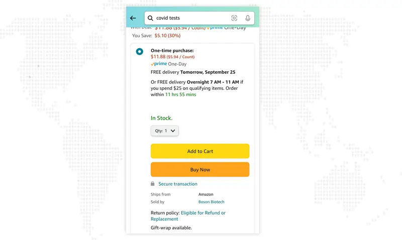
Amazon also uses a prominent placement for the "add to cart" button on mobile devices. The "add to cart" button is located at the bottom of the screen and is easily accessible with one hand, as shown in the adjoining image. This makes it easy for customers to add products to their cart and continue browsing the site.
The language used on the "add to cart" button should be clear and concise. Use a short phrase like "Add to Cart" or "Buy Now" to make it easy for customers to understand what action they are taking. Avoid using ambiguous or confusing language that may cause customers to hesitate or abandon their purchase.
It is essential to use the best add-to-cart button color and keep the clear and concise language. It helps eliminate any confusion or uncertainty on the user's part. If the text on the button needs to be more specific or clear, the user may need clarification on what will happen when they click it and may hesitate or even abandon their purchase.
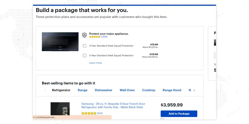
When you visit www.bestbuy.com and browse their product pages, you'll notice how they use clear and concise language on their "Add to Cart" or "Add to Cart & Checkout" buttons. On Best Buy's product pages, you'll typically find a button labeled "Add to Cart" or a variation such as "Add to Cart & Checkout" prominently displayed near the product price and description. These buttons are designed to stand out and capture the user's attention.
The phrase "Add to Cart" clearly communicates that clicking the button will add the selected item to the user's shopping cart. It is concise and straightforward, leaving no room for confusion or ambiguity. This language choice ensures that customers understand their actions and helps streamline the purchasing process.
In some cases, Best Buy may include additional text such as "Add to Package" on their buttons. This variation emphasizes that by clicking the button, users will add the item to their cart and proceed to the checkout process directly. It implies a one-step action that combines adding the item to the cart and initiating the checkout process.
In addition to clear and concise language, it's also essential to consider the tone and wording of the text on the button. For example, urgent language like "Limited Time Offer" or "Only X Left in Stock" can create a sense of urgency and encourage the user to act.
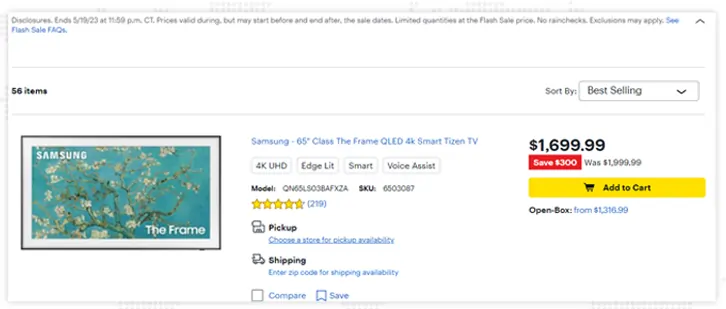
Customers want to know what they are buying and how much it costs before they purchase. Including product details and pricing on the product page can help increase confidence in the product and reduce friction in the buying process. Ensure the "add to cart" button is located near the product details and pricing information to make it easy for customers to add the product to their cart. Some examples of product details that could be included on the "add to cart" button design include the product name, SKU number, size, color, and any special features or benefits.
To keep a clear idea of it, you can see that Best Buy is one of the best examples, as mentioned above. On Best Buy's product pages, the "add to cart" button includes information about the product's price, any available financing options, and a summary of the product's features. Additionally, users can view detailed information about the product's specifications and read customer reviews before purchasing. You can also see it on Amazon’s page.
In addition to product details, pricing information on the "add to cart" button is essential. This can include the product's regular price, any discounts or promotions that are currently available, and any taxes or fees that may apply. Including pricing information helps the user to understand the cost of the product and can help to reduce any confusion or hesitation they may feel.
Creating a sense of urgency and scarcity can be an effective way to encourage customers to act quickly. Consider using phrases like "Limited Time Offer" or "Only a few left in stock" to create a sense of urgency and scarcity. Adding a countdown timer or displaying the number of items left in stock can also help develop a sense of urgency and encourage customers to act quickly.
Using urgency and scarcity on the "add to cart" button is a powerful way to drive conversions and encourage users to take action. Speed creates a sense of immediacy, while scarcity establishes a sense of exclusivity, making users feel they need to act quickly to secure the product. This can be especially effective for limited-time promotions, flash sales, and high-demand items.
In fact, according to a study by Invesp, 72% of consumers have purchased because of urgency created by a marketing message.
One way to use urgency on the "add to cart" button is to include phrases like "Limited Time Offer" or "Hurry, Only X Left in Stock" on the button. These phrases create a sense of urgency and encourage users to act quickly. For example, if a user sees only a few items left in stock, they may need to act soon to purchase the product before it's sold out. Scarcity can be used by indicating that a product is rare or exclusive, such as using phrases like "Limited Edition" or "Exclusive Item." This can create a sense of exclusivity and make users feel they are getting an exceptional product that not everyone can access.
An example of a company that uses urgency and scarcity on their "add to cart" button is H&M. On their product pages, the "add to bag" button includes phrases like "Limited Time Offer" and "Hurry, Only a Few Left!" to create a sense of urgency and encourage users to act quickly. Some of their products are also labeled as "Online Exclusive," making sense of exclusivity and scarcity.
E-commerce businesses can encourage users to act quickly and purchase by creating a sense of urgency and exclusivity. However, it's essential to use these tactics ethically and not to mislead users. For example, indicating that a product is a "Limited Time Offer" when it's always available may harm the trust and loyalty of the customers.
Optimizing the "add to cart" button is an ongoing process. Test different placements, colors, and language to see what works best for your audience. Use A/B testing to compare different button versions and track conversion rates to ensure you have the best add-to-cart button color. Continuously monitor and optimize the "add to cart" button to improve conversions over time.
Testing and optimizing the "add to cart" button is essential to any e-commerce business. A/B testing is a method that can be used to test variations of the "add to cart" button to see which one performs the best. By running A/B tests, businesses can gain insights into what works and doesn't work for their audience and make data-driven decisions about improving the button to increase conversions.
Here are some critical steps to testing and optimizing the "Add to cart" button:
How to add the “Add To Cart” Button?
A/B testing can be a powerful tool for improving the "add to cart" button and increasing conversions. By testing and optimizing, businesses can gain insights into what works for their audience and make data-driven decisions about improving the button. E-commerce web design can improve significantly because of this!
The "add to cart" button is critical to any e-commerce product page. By making it prominent, using clear and concise language, including product details and pricing, and creating urgency and scarcity, you can optimize the button design for conversions and drive more sales. Remember to test and optimize continuously to ensure you provide your customers with the best possible experience.
If you are looking for one of the best ways to handle your web design for e-commerce, you can check out the best service switch JanBask Digital Design. Now that you know the importance of e-commerce web design and how it can impact your sales, the only way to make it best is to get an e-commerce web design company now!
Interested in our eCommerce Web Design Services?

1. What does it mean to add to the cart?
The add-to-cart button is a feature of an e-commerce website that allows customers to choose items to purchase and add to a different section. They can keep track of things added for buying without completing the payment. Add to cart, actually being the shopping cart for you!
2. What is add to cart on Amazon?
The "Add to Cart" button under every product page lets you add many items to a customer's shopping cart. You can send the customer to the Amazon retail website to complete the purchase.
3. How to add items to a cart using HTML and JavaScript?
If you’re unaware of the details, you can have a web design service company handle the same for you. JanBask Digital is the best service company to handle your e-commerce website design.
4. What is add to cart in Shopify?
You can make your customers' shopping experience effortless by adding Add to Cart button where you can add things from each item page. It eventually directs you to the cart page where you can complete your payment.
5. What is add to cart in digital marketing?
The add-to-cart metric tracks part of this customer experience. Add to cart rate also helps you track the conversion rate.


A Specialized Team for custom web solutions for your business through Web Design, Web Development, Digital Marketing Services such as SEO, Social Media Marketing.


C
It looks like the best way to easily handle the design of an “Add to cart” button.
M
It is easier to get the best web design services with JanBask Digital.
H
Great article with insights on different apps and websites and their Add to Cart buttons.
P
Great article!