It takes a lot more than just a few lines of code to create a website and it takes a lot more to make it functional. There are almost infinite elements that can be used to make a website. Not to mention the scope to adding new elements are endless depending on the needs of your business and the features you want to add to your website.
An important component of the design, most organizations often forget is how useful good website navigation design actually is.
How some may ask? Well no matter how good the content you have on your website, or great offers you are providing. It is all pointless if visitors cannot find them. Effective navigation helps guide the visitors to what they are looking for or potentially like. Improving the browsing experience and getting a positive response. Let us be honest for a second, who amongst us like to browse a business website for information. Practically no one, it is not a social media site or has anything of particular entertainment to engage the audience. So a good website navigation design helps your visitors to get to point A to Point B easily.
There are many more reasons to invest more time and effort towards good navigation such as
However, most organizations still get it wrong. So, here are some tips to create good functional navigation for your website. But first, let’s discuss the various types of navigations most commonly used by successful businesses, to help you understand how they work and how you can implement them on your website.
To create functional navigation you need to understand what are the different types of navigations. Thanks to the creativity of the designers you can get almost any kind of navigation. However, these are the most commonly used navigation used by most websites you will find.
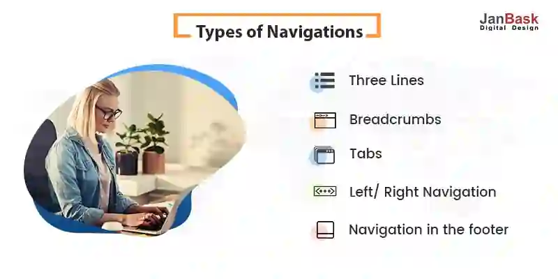
Simple drop-down navigation on the top of the website that may remain static as you scroll along for better assistance.
Small tags that can be added to posts and lead you back to the pool where you can see other similar posts.
Simple options that are available mostly on mobile devices. This helps in easier navigation on a relatively smaller screen.
You can add vertical website navigation design to the left or right of your website. Or even on both sides depending on what kind of layout you are using, single, double or three-sided.
Generally used by websites that do not have static navigation to help visitors find their way back when they have scrolled too far down. It helps the visitors to skip the hassle of scrolling right back up to get to some other page.
These are the most commonly used navigation styles. You might see many variations of these but the basic idea and layout remain the same. These are the most used layouts because of the functionality and flexibility they provide to the website when it comes to finding your way around the website.
Now that you know the most commonly used navigation on websites. It is time to discuss how you can improve upon the ideas and create a unique looking navigation that is functional at the same time. We don’t want you to reinvent the wheel but to add your own touch to pre existent structure so that it fits the design and looks different at the same time.
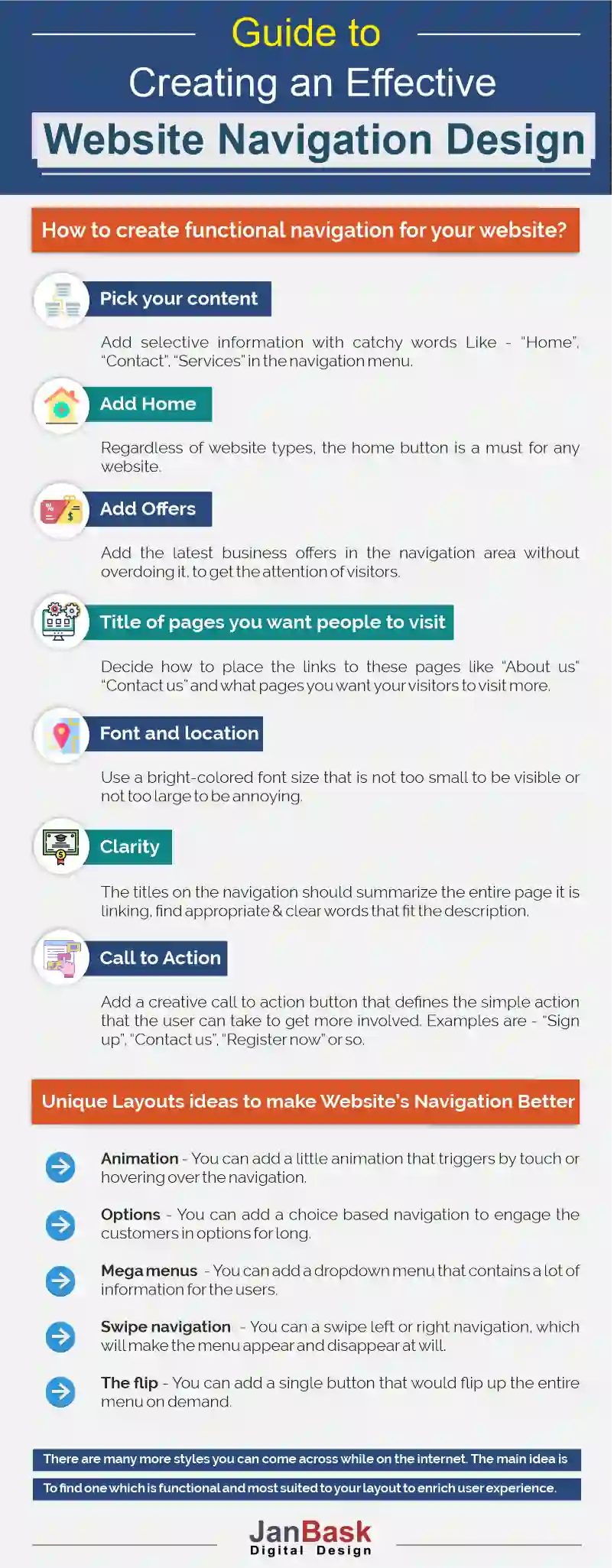
Visit any website, and you will notice that the navigation menu is not a very lengthy one. Generally, you will want to add selected information to optimize what little space you have. No one likes to read a paragraph in the navigation. Just the title of the page will do. It is also important to have catchy one-liners there. Here are some other recommendations to add to your navigation.
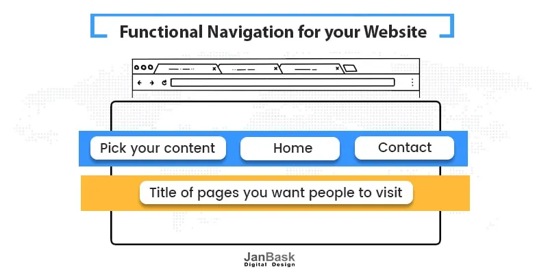
It is a default one. Regardless of what you want the website to represent. A home button is a must for any website. It is like the reset button which gets the visitor right back where they started.
You may add a marquee effect advertising your latest offer in the navigation. It will help you get the attention of the visitor. However, keep in mind not to overdo it and bug the visitor. Unattractive ads can be quite annoying.
A website is a collection of webpages. Surely you will have many pages on your website, like contact us, about or payment. You need to decide how to place the links to these pages and what pages you want your visitors to visit more. Like a specific page that is open for a limited period of time to the visitors that offers exclusive deals.
There are a lot of things that you can add to the navigation, but that is the problem. There are far too many things that can be added to the website navigation design but shouldn’t. It is where the website design agency comes in to create a solution that is both informative and functional.
With the technology we have today, a website can be anything you want. You may have any type of font and can place it anywhere on the website, even keep it floating. But here is the thing, it is not functional. Navigation is used to help visitors navigate the website better. This means it should be easily visible and accessible. Make your font size is not too small to be visible or not too large to be annoying. Similarly, try and place navigation in familiar places, somewhere people will think of looking. Placing it to fit your design may render it useless. Use bright colors to help grab the attention of the visitor.
The titles on the navigation should be clear. They should not be links but titles linking the pages. You don’t want to mislead the visitors, so try to find out what the customers are looking for and change titles accordingly. It is also very important to be as direct as possible. Your titles on the navigation should be a summary of the entire page it is linking, try to find appropriate words that fit the description.
You create a stunning website and the visitors like it. It is a dream come true for any organization but what next? Your customer likes the website but how are you making sure they keep returning? You create a call to action button.

A call to action button is a simple action that the user can take to get more involved. These are buttons such as register here, subscribe to our newsletter, sign up or create a free account. The call to action button helps users get more involved in the website and creates a sense of belongingness for the customer. It makes the customer feel that you value them and they have a role to play in your organization. If they like the website they too can contribute and help it even better or be updated about new developments on the website. It is a very important button to have in order to improve engagement.
In a very literal sense breadcrumbs are your way back on a website. It helps you find a path. There are small pieces of information and tags that help visitors navigate the website in depth without the fear of getting lost. So it is important to add breadcrumbs to your website navigation design.
Navigation should be simple and easy to understand for the visitors but it does not mean it cannot be unique. There are tons of ways you can create navigation that fits your design and lets you create a one of the kind navigation. Some of such ideas can be:
You can add a simple animation to the navigation. The animation may be triggered by touch or hovering over the navigation. It is not very hard to add simple animations to the website these days and just like that you can add some flair to your layout.
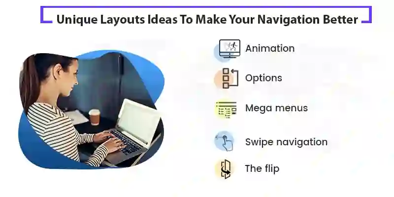
Yes, navigation is important but you don’t need it all the time. Sometimes it can be a hindrance while navigating and use up space making the design look flawed. Instead of having static navigation, you can add an optional navigation menu that appears and disappears as and when the users want. This will help your website look artistic and futuristic at the same time.
Another addition can be a choice based navigation. The users get an open choice where they can choose from the options. Based on those options the users would be moved on to the next page. It is a very interactive web design idea focused on engaging the customer and make navigation fun.
Navigation should have as little information on them as possible. But what if there is a lot of information you need the customers to know. Most commonly used in online shopping websites. A mega menu is what it says, a dropdown menu that contains a lot of information for the users. These types of menus generally make sense only if you have too much information and want users to quickly find their way around. Such as in the case of an online store that has millions of products for sale.
A relatively newer concept that originated from mobile access to websites. The swipe option just means that the navigation will not be present on the website but can show up when you swipe left or right. This helps the users to make the menu appear and disappear at will. A very functional and adaptive layout that helps your visitors to enjoy their navigation.
Navigation should be concise so that it does not take up too much space. But is also should project everything you want your visitors to see. So why not have a single button that would flip up the entire menu on demand. You can add as much information as you like and hide it under the button which will not take much space. Then when the visitor needs assistance can click the button and bam the entire menu just flips right up on the screen. It sounds similar to the three-lined menu option but while it is similar to the three-lined menus which are always on the top of the website. The flip button can be placed anywhere on the website.
There are many more styles you can come across while on the internet. The main idea is to find one which is functional and most suited to your layout to enrich user experience.
You must understand why you need navigation on your website? If it is a simple one-page website then there is no point in creating a navigation menu. Navigation is needed to make the browsing experience better for the user on a multi-page website. It allows the users to reach every page on the website and accessing the depths of the website. The whole point of creating a website is to put it on display for the users and good navigation helps you to access each aspect of it.

So to put it simply, you need navigation so that you can display every part of the website to the visitors and help them to access everything available for them on your website for a better and enjoyable experience.
Did I miss anything? Questions? Or May be any feedback? I’d love to hear from you, even if you wish to discuss some of the challenges you face while designing your website after all we are the best website design company in your locality.