
![]()

There are many websites out there that may aesthetically look pleasing. Still, they are not creating a good impression on the audience.
When any visitor is landing on your website, the first thing they notice the appearance and look of your website. Is it easy for them where to click? Is CTA loud and clear to them? A proficient website not only looks good but it also provides meaningful content, easy navigation, and great performance.
Finally, a minor detail can make a huge difference on your website. But you need to carefully examine all the details and make changes where needed if you want to build a reliable website. Then here are some tips that can help you to build a website of your dream
Keep Your Design Simple
It is crystal clear that a web designer loves to show their creative ideas and abilities. But try not to overdo it. Some designers end up with designs that are messy with all borders, colors they have placed.
You must avoid these extensive uses of visual effects as the audience does not like flashy kind of forms. Your audience will face difficulty in reading the content and will turn down your website.
At the present time, the audience is much more attracted to the website which has a minimal design. A web designer can add whitespaces which will make easier for the audience to read the page and will give a lot of room for other web design elements.
So, keep your design organized and free from any clutter to impart a sense of professionalism. It will also attract the audience to visit your website.
Use Typography Correctly
Typography is a visual component of written words. It includes aspects as kerning, letter design.
Fonts are not just letters in website design. Like with the use of font color, the look of your website changes.
If you want to add uncommon ingredients to your website to make your website look more professional, then opt fonts that are appropriate for your business.
A common problem with the web designs is that there is little contrast between the heading and body fonts. Just executing some size variation to the website will not solve the problem. Use bigger fonts for your headings, subheadings, and titles. It is important to note that use those fonts that are eye-catchy.
Consistency
Consistency is usually forgotten by the designers when designing the website. Consistent work allows the audience to focus on your message.
The layout of the website should be consistent as it shows the overall look of the website. Website layout means that text content, images, navigation, videos should be placed correctly. Because the audience should not feel that they have landed on a different website.
Consistency is a very important part of website designing as it makes the audience do less thinking and want to find information as quickly as they can. If your website is inconsistent, it will slow down your browsing speed and will tend to lose your audience.
Benefits of consistency are:
- It gives your audience a great experience.
- Improves the usability and learnability of your website.
- Save money and time.
- Provide easy navigation and eliminates pain points.
So, consistency in your website builds trust because it means that you are not disorganized.
Easy Navigation
One of the most important objectives of your website should be to offer an amazing user experience. Design a website in a way that is easy to navigate.
We are living in a fast-moving world where everyone is in a hurry and they want the stuff as quickly as possible. You do not want to lose your audience and go to your opponent’s website because of mess up pages.

When all of the components and elements are systematically organized, your audience is more engaged with the website. This will help you in boosting your website traffic and provide a higher conversion rate.
It hardly matters if your website is appealing and beautifully designed if your audience is facing difficulty in navigating the website then they will see it as an unprofessional website. On the other hand, if your website is simple and plain but if the audience is able to navigate easily then they will see it as professional
Choose Color and Design Wisely
Color is one of the most important tools in website designing. It can attract the audience, express meaning, drive conversion and can earn a loyal audience. The color will help you to process and store the images well-organized than the colorless pictures, this will increase your brand recognition and will help the audience to visit your website.
Find out what works well for your website. Immerse as many website designs as you can, such as you can take help from featured design of any CSS showcase design, to get an idea of how colors interconnect with each other. You can pick any 2 or 3 base colors for your website and then use a variety of shades.
Pick a right and nice colors for your website is just like picking the right job. For example, if you are choosing colors for a comfortable and comfy restaurant, you will choose shades of red, brown, black, red, grey, etc. Ever color for a website tells some message. So, you need to find out which color palette will fit your website.
Use Proper Pictures and Graphics
When you are designing your website, you should always keep in mind that images and visual effects should be apt and relevant to the content.
Another reason why images are desirable and important because it builds trust between your audience and the organization. If you are able to woo your audience with visual effects and images it will boost your sale.
Below are some traits that you should always follow while using images and visual graphics.
- Your images and graphics should be original
- Show a little product detail.
- Your graphics and images should often include text.
- Avoid using graphics and images with large size.
Large, high-quality images may affect your website speed, but it is a great move to stand out of the rest. Adding images and graphics will not only make your website look professional and will potentially increase your conversion.
One CTA Button is Enough
A call-to-action (CTA) is an interactive element of any user interface both web and mobile. The basic motive of CTA is to make the audience take action that can increase their conversion rate.
Traditionally CTA is easy to notice, but the designer designed them so that the audience could not resist themselves to click.
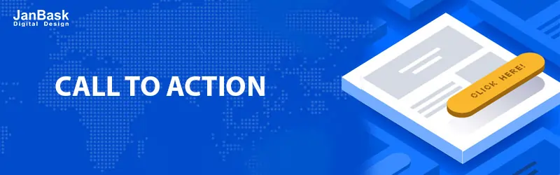
But many a time website have multiple CTA which make your website look a little unprofessional. It may confuse your audience and can result in not taking any action.
Make sure to put one CTA button so, that the audience can take action. It will not create buzz and confusion between the audience. Get the attention of the audience and make your website look more professional with CTA placed at the right place.
Conclusion
Good website design is not restricted to the above mention point. It also depends on the usability, readability also.
Sometimes a small change can on your website create a great impact on your image and reputation.
So, here you are: the above are some issues that I came across by analysing what are the difficulties companies are facing. Now, it’s your turn to review your website and see what are the problems you are facing.
I hope, you liked my blog and if any issue feels free to ask me in the comment section provided below.

Leave a Reply