


Nowadays, it's pretty common for everyone to shop online using smartphones, as mobile eCommerce design plays a vital role in it. But if your eCommerce store isn’t compatible with mobile-friendly eCommerce design, it’ll fall behind.
It's not at all surprising that mobile devices are taking over desktops and laptops. Several surveys have shown this transition. Buyers are shifting from desktops and laptops to mobiles and tablets.
And several businesses aren’t aware of the benefits of optimizing their websites for mobile-friendly eCommerce as these are the top solutions that help to seamlessly get in touch with the shoppers and increase revenue.
So, are you wondering where to start and how to build a mobile-friendly eCommerce website?
This blog will help you with the following:
So, let’s get started by quickly looking over.

Looking to Create Transformative E-commerce Website Designs?
Unarguably, if you’re obliged to ask the above question, you might likewise be living under a rock for the past few years or so. As you know, presently, everyone prefers to access the web using smartphones.
It lets them perform various activities like sending emails, reading articles and blogs, etc., at any time and from any location. Thus having mobile-ready e-commerce websites will help your business reach this prospective demographic.
Additionally, the revenue from mobile eCommerce sales is expected to grow to 511.8 billion in 2023, 604.5 billion in 2024, and 710.42 billion in 2025. It signifies that mobile-optimized websites can help grow your business to another level.
So having said that, if your eCommerce business isn’t mobile friendly, search engines will rank it lower on the search engine result page, which can lead to a significant traffic loss.
There are multiple benefits of mobile-friendly eCommerce design for your business such as:
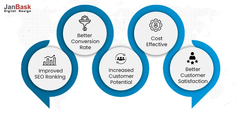
In 2018, Google released a statement explaining that “Google’s recommended design pattern preferred the sites that are configured for mobile and had a responsive design.” Meaning the rankings for SEO would be better if a site passes their mobile-friendly tests. Not just Google, other search engines rate the websites with a better mobile experience as higher on their rankings when people are searching.
Having an optimized mobile site ensures that the users can still purchase from the site even if they are viewing from their handheld device. However, the conversion rate for mobile-first eCommerce is lower than for desktop. But considering, the E-commerce share will take 20.8% of all retail market, and its sales are expected to surpass $6.5 trillion by 2023. Also, E-commerce websites will take up almost 22.3% of total retail sales. It’s a wise decision for your business to give your customer the ability to purchase from their smartphone if they wish. While nearly 75% of users prefer a mobile-friendly site, it means you are more likely to get a better conversion rate if you give them exactly that.
With 79% of smartphone users have made a purchase online using their mobile devices, having a mobile-friendly website opens a world for your customer potential. Not only will it help you retain your current customers, but it will also compel your potential visitors to turn into buyers. Thus, more sales as an eCommerce business.
If customers enjoy shopping and browsing on your website, then they may come back or rate you as a good business to buy from. Statistics from GoDaddy show that one of the best ways to retain customers with mobile is to have a responsive and mobile-friendly website. Nothing works better than a satisfied customer, no marketing or SEO technique can grab you potential customers than them. Thus, satisfied customers=more sales as an eCommerce business.
keeping your eCommerce website responsive helps cut down costs. Thus, you save money by reducing the amount of data transferred between the server and buyers’ browsers. You also prevent the cost of developing duplicate versions of your website for different types of technologies.
The eCommerce sales are forecasted to increase by 10.4% in 2023, and almost 20.8% of online retail purchases are predicted to occur in 2023. Since there has been a rapid increase in smartphone users for the last few years, not having a mobile eCommerce store will lead to a significant loss in traffic.
Along with that, you might come across the following drawbacks for sure, if you don’t have a mobile-friendly eCommerce website-
At this point, it's important to strategize mobile eCommerce design and get the business back on the right track as early as possible! The more you wait, the fewer chances you have to succeed because of the growing competition at each moment.
As rightly said,” You still have a chance; it's never too late to mend,” and it's all regarding your efforts, marketing strategies, approach, etc. You have several approaches to recovering your eCommerce website and converting it into mobile friendly eCommerce website.
First of all, ensure that your website is usually mobile-friendly other factors you have to look after are responsive web design, fast page load times, use of HTTPS, etc. Website visitors better not have to zoom anything other than zooming the product image to see details.
The next important factor to consider in mobile eCommerce websites is usability. Most people use their thumbs to browse their mobile phone’s screen, which helps make some parts of the screen highly accessible as compared to others.
Therefore, it's a best practice to place essential controls that visitors will interact with, and they should be put in thumb-friendly positions so they can easily reach out to them, like a menu, CTA, or other necessary buttons.
Despite that, it’s not mandatory to think about the thumb reach, but you must also consider their sizes. As you know, the thumb is typically bigger than other fingers, and the fingers are more significant than the mouse cursor, which might make mobile users misclick or tap unnecessary buttons.
Isn’t it annoying? Thereby ensuring that those elements are big enough.
Another critical thing to know is those smartphone users are accustomed to scrolling instead of tapping or clicking. Hence, you are fortunate to provide information on a single long web page, which they can scroll up and down instead of navigating through several pages to find what they are looking for.
But having said that, as scrolling is more convenient, that does not mean visitors like it and would like to do it as often as possible. In reality, most visitors don’t make it past the start of a page.

Because of this reason, you must try to reduce the amount of scrolling the visitors need to do and place the most essential elements close to the top of the page. You can consider the following pointers
One thing users do a lot is - research! And the importance of handheld devices is to weigh products, gather information and make informed decisions. And you also know where the buyers complete their purchase at the end?? That is totally correct, on the desktop!
So, ensure that the products that buyers add to their shopping carts on their mobile phones are still in their shopping cart when they log in from their desktop or laptop. This is known as the omni channel selling or retail or commerce.
A sticky header is nothing but the header that stays on top of the screen when visitors scroll down, and because of that, users get steady access to it. Why is it important? Because on smartphones, a header is an element that consists of some of the most significant information, such as
If you think it creates a hindrance, you can make it turn invisible but reappear when visitors scroll back up. What’s crucial is to give users access to commonly used features without requiring them to scroll to and fro.

Talking of navigation, on mobile devices, it's quite the opposite compared to its desktop counterpart. At first, because of the space constraints, it's essential to keep it away but accessible.
You can design mobile-friendly navigation menus in several ways, and the most popular solution nowadays is the reputed hamburger menu.

You can make it move in from the side, pop up or expand, and much more.
When doing this, keep the main and subcategories in the menu so buyers can quickly get to the products they’re searching for.

Additionally, you can add filter options to your mobile eCommerce design by making them visible. This feature is oftentimes used by visitors especially if you’re providing several types of products.
A universal rule for online product pages on mobile eCommerce designs is to give the most significant information at once. You can take help from different things that people do with their smartphones constantly - swipe, pinch, or double tap
How will you do that?
For example, you can use
Besides that, it’s the same as a desktop product page:
You already know how overly complex forms on mobile eCommerce design can drop conversions. Also, filling out such forms on smartphones is all the more annoying, so you need to ensure that it's easy by
Even though it's necessary to provide a guest checkout on mobile eCommerce websites, the visitor must be able to register and log in to their account to access already-used payment methods. You can also think about providing a sign-in option via social media accounts.
Popups are irritating, and on desktops, they’re fairly simple to close. Just click outside it or click the close button.

But those popups on mobile eCommerce design can be more irritating on smartphones, making it difficult to click the right point. Because of that, if you still want to use popups,

Most companies are considering adopting a sort of middle ground between a standalone application and a website, which is known as a progressive web application, which has become a kind of trend.
The progressive web applications provide quite similar functionalities as a native mobile application but are entirely browser-based and developed using native technologies. As a result, they load quickly and provide a better UX.
The easier it is to pay, the more your sales will be. Therefore the best mobile eCommerce websites should add various payment options like GooglePay, Amazon Pay, Apple Pay, Stripe, etc.
Just as images are essential for an eCommerce store, the text is also an important part of product descriptions, FAQs, About Us page, Contact Us page, etc.
The screen size of the smartphone is smaller, so the text ought to be larger, easily readable, and doesn’t coincide with other page elements.
A search function is a valuable feature for any mobile e-commerce design. We recommend you follow the below best practices
When creating mobile websites, companies can choose between two significant approaches with different benefits, challenges, and costs. These are:
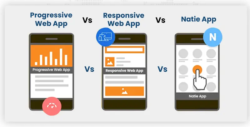
Using adaptable layouts in your web designs, you can have a website that appears almost the same across devices and screens such as desktop, mobile, and tablet devices. Your content and mobile eCommerce design adapt themselves to a user’s device automatically.
Using unique layouts for devices, your website displays different designs or versions for different devices. Meaning you deliver different experiences to users based on whether they’re consuming your content on desktop, mobile, or tablet. Though, you may even have to maintain three separate websites to accomplish this task.
PWA is basically a website that looks and feels like a mobile app. Meaning PWAs run in the browser itself, so there's no need to download the app from the Google Play Store or iOS App Store. Example: Flipkart, Amazon, or Alibaba. PWAs reduce the risk of slow networks, data limitation, or complete lack of connectivity to provide a reliable, fast, and engaging user experience.
Look for a hosted e-commerce platform with a responsive design. If you're already using a popular blog platform such as WordPress, choose a theme and shopping cart that employ responsive design. This will make securely processing credit card payments on your WordPress site as easy as cutting and pasting a snippet of code for the hosted shopping cart.
You can also prefer some tools to build a successful e-commerce website for your business such as Wix, Shopify, Magento, Squarespace, etc.
Are you looking for the best e-commerce platforms for your website? Pick the one that suits your business goals.
Double-check that your website design and navigation work well on smartphones. For example, try keeping input forms to a minimum in your website's design. And especially make sure that the checkout process for your customers is simple, easy to understand, straightforward to use, and quick to complete on a smartphone.
Whether you run your website on desktop or mobile phones, don’t forget the basics of what makes an e-commerce site a great experience for the user: good-quality images and descriptions of the products that you're selling are essential. Clearly communicate your shipping costs, delivery times and any warranties.
Businesses often lose sales if their e-commerce site (either mobile or nonmobile version) doesn't load fast enough, or if the checkout process takes too long. Look for a web host or e-commerce provider that advertises its service as optimized for speed. You may have to pay more for this, but it can be worth it; your website may get even more traffic after you make it mobile-friendly.
Social media apps are the most popular way people spend time on their smartphones. Leverage these social networks (mainly Facebook and Instagram) as additional channels to drive traffic to your e-commerce site. Assume that most of the traffic your website will get through social media networks will be from people on their smartphones. Your e-commerce site must respond accordingly and be mobile-friendly.
There are different ecommerce testing tools available for you to test the responsive design of your website. Google’s Mobile-Friendly Test Tool is one of the most popular tools to test the performance of your eCommerce on mobile. There you can check out other tools like Rankwatch, Browser Stack, among others.
Google emphasizes how you can make search engines understand your content by stating, “If you use structured data on the desktop versions of your pages, you should have the same structured data on the mobile versions of the pages. This is important because, with mobile-first indexing, we'll only use the mobile version of your page for indexing and will otherwise miss the structured data.”
Mobile-friendly content, as the name suggests, refers to the content that appears on your other devices like laptops or PC, similar to the content that you see on your mobile devices, big or small. Meaning text is easy to read, links are clickable, and intuitive navigations, and overall the content is easy and quick to consume.
When was the last time you bought something on the Internet? Was it last week? And how many of you did it through your phone? You might be wondering if both are the same, right? Wrong.
Purchasing online using your electronic devices like a laptop or PC is different from buying products or services using the internet via your phone or any other wireless handheld devices like tablets. The latter is called mCommerce, while the other as well all know is known as eCommerce. Do you know, according to LinkedIn, the share of mCommerce in all e-commerce is expected to reach $3.5 trillion by the end of 2023? So it’s pretty obvious that your focus should be on optimizing your eCommerce website for mobile devices.
Here are some more reasons to consider mobile-friendly website design:
61 % of online users have a higher conviction about businesses with mobile-friendly website design
More than 50% report they are less probably to engage with websites with bad mobile-friendly website designs
Around ¾th of users are most probably to return to a website that is mobile-friendly
67% users say they’re most probably to make a purchase if it is a mobile-friendly eCommerce website
32% of small businesses already have a mobile applicationdeveloped by the mobile app development company
Majority of smartphone users expect a site to load in 3 secs or less
Those are big numbers indicating that online purchasing on mobile phones has since become an essential experience in everyone’s everyday life. And that’s a number you’ll miss out on targeting if you don’t offer your visitors a seamless experience via a Mobile Friendly Ecommerce Design.
There are other reasons you should consider before having a mobile-friendly eCommerce website other than the above reasons. Reasons that directly impact your conversion rates and sales.
It’s not enough to have a great e-commerce site: your site must also be optimized for mobile shopping. A mobile-optimized site can help your SEO rankings and capture more sales from shoppers on the go. Here’s what the best mobile eCommerce websites look like. In other words, this is how you make sure your e-commerce site is ready for mobile shoppers:
The mobile experience is different from a user browsing on a desktop computer or laptop. Data speeds and internet connections tend to be slower, and users can get impatient. An estimated 40% of shoppers abandon a site that takes more than three seconds to load. You can test your page’s load speed on Google’s mobile-friendly test tool.
A desktop website differs from a mobile version. You shouldn’t try to fit everything in that tiny space like you can with a desktop website. You have to be very particular about what your visitors are looking for in your website, what you want to show them, and what you are really showing them. Arrangement of content is the key to increasing results from marketing efforts.
Social selling is a new trend in the online market via social media platforms considering there are 4.20 billion social media users around the world at the start of 2021. Simply integrate your e-commerce site with channels like Instagram, Facebook or Pinterest to capture more sales from mobile app users. Allowing users to complete their purchase immediately if they like your product, rather than having them visit a separate web page to check out.
The user experience on a mobile-optimized e-commerce site should not be the same as the experience with your desktop website. Your mobile page must be lighter, faster, and more intuitive. You can use a top navigation menu to improve your UX, offer intuitive menu options and a visibly appealing, easy-to-access products catalog, and smooth checkout process.
Lots of users enter websites through an interior page and bypass the homepage entirely. Easy access to the homepage is a must since it provides a new starting point for those who are on the wrong page or want to explore other parts of the site. So make sure users can go back to the homepage without going through other unwanted pages because they become frustrated when they can’t access it quickly and might leave your site without completing the purchase.
On a mobile device, your e-commerce site is competing with many distractions: other apps, texts, games, and phone calls can all divert a user’s attention from completing a purchase. So, keep calls to action (CTAs) short and sweet without it hindering your user’s buying experience.
Remember these key best practices for mobile sites:
In this blog, we gave you an insight into how to tap into the minds of your current and potential users who use mobile to shop and let them have a greater user experience. There are a lot of other ways to not only reduce the bounce rate on your website but also boost your sales. But remember that we’re not dealing with algorithms here; one set of rules will work on them. All you need to focus on is that we’re dealing with real people using mobile devices in their everyday life. So when you give them exactly what they are looking for, want, and expect in a very simplified and visually appealing manner, this is the way to succeed.
However, if you’ve more questions regarding the intricacies behind building the best mobile e-commerce sites? If or want to know strategies for optimizing your existing e-commerce website design for mobile devices? We’re here to help.
Drop us your query or question regarding the e-commerce website design and development process for mobile users. Or if you want to share your own experience with developing a mobile-friendly e-commerce website from scratch. Whatever it is, we’d love to hear!
Looking to Create Transformative E-commerce Website Designs?
1. Why is a mobile-first design essential to your eCommerce website?
A Mobile-first design is vital in promoting a design that best complies with being easily readable on smaller screens, like mobile phones and tablets. This helps to make your website highly accessible to users through the use of their mobile devices.
2. How do I make an eCommerce website mobile-friendly?
Are you an eCommerce website owner? You must grasp this opportunity to optimize your eCommerce website for mobile devices using the following strategies -
3. What are the benefits of mobile eCommerce websites?
If a company doesn’t have a mobile-friendly eCommerce website, you might miss out on prospective customers who use mobile phones to access online information. Here are some of the benefits of mobile-friendly e-commerce websites


A Specialized Team for custom web solutions for your business through Web Design, Web Development, Digital Marketing Services such as SEO, Social Media Marketing.


K
I am planning to start an ecommerce business and need a good ecommerce website.
A
Thank you for sharing such a well thought, well planned, step-by-step article on mobile friendly eCommerce design tips.
Z
Even though I don’t have an eCommerce website, I still learned a lot from this article. I can implement these strategies on my blog.
E
We just started with our mobile e-commerce website for fashion and found your post. Thank you again
K
Can you suggest to me how to rank an ecommerce website on Google?
A
Can you please share some valuable tips on increasing user engagement rates on mobile eCommerce websites?