UI / UX Designing
SEO Services
CMS & Apps Development
Marketing Services
Talk to Expert
Dive into our blogs pool and splash some knowledge
May 22, 2026
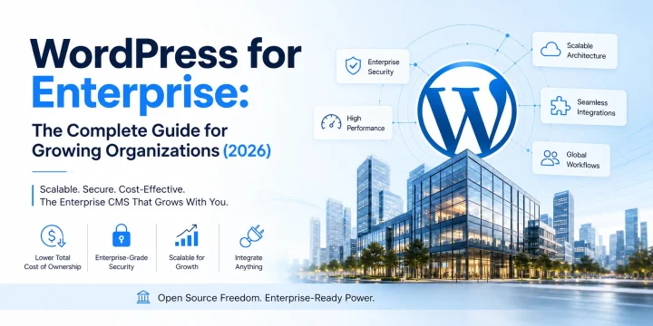
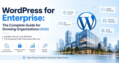
WordPress for Enterprise: The Complete Guide for Growing Organizations (2026)
May 14, 2026
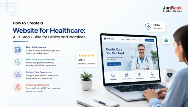
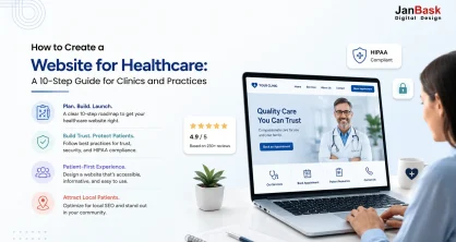
How to Create a Website for Healthcare: A 10-Step Guide for Clinics and Practices
May 13, 2026
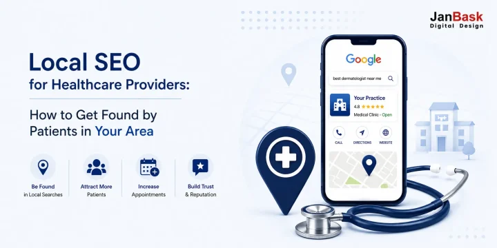
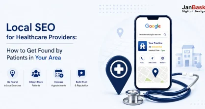
Local SEO for Healthcare Providers: How to Get Found by Patients in Your Area
May 8, 2026
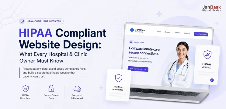
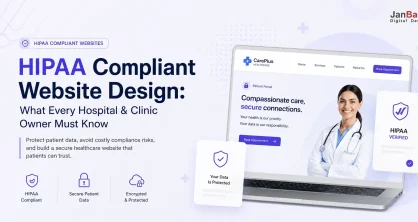
HIPAA Compliant Website Design: What Every Hospital & Clinic Owner Must Know (2026 Guide)
Oct 10, 2025
Sep 18, 2025
Sep 11, 2025
Sep 5, 2025
Aug 29, 2025
Aug 28, 2025
Aug 22, 2025
Aug 21, 2025
Aug 20, 2025
Aug 12, 2025
Aug 11, 2025
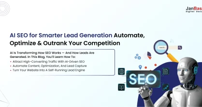
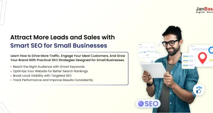
How to Use AI for SEO to Generate High-Quality Business Leads Automatically!
What Is Digital Marketing Strategy: How To Structure A Plan?
5 Winning Steps To Build A Robust Sales Funnel
What Is Page Authority – Know 10 Ways To Increase It Tremendously!
Importance Of Website: Why Every Business Needs A Website?
How Is WordPress better than other CMS?
Get the Latest on Digital Trends!
Get Free Consultation
