Your website is the center of your digital ecosystem, like a brick-and-mortar location. The experience matters once a customer enters, just as much as the perception, they have of you before they walk through the door.” - Leland Dieno, Entrepreneur
That’s true, you know. First impressions of your website can truly make or break the visitor traffic on your pages. That being said, how you sell is as important as what you sell. The design of your website is a critical element in attracting and retaining visitors on your website. But, when you think about all the essential elements of website design, do you also include white space?
I bet you don’t.
But isn’t white space just the empty space on my website? On the contrary, white space is one of the most creative elements in web design. Unfortunately, it is also the most underutilized and overlooked element in website design. In this article, we will be using the 5Ws to learn more about white space in web design. We will also tell you how to ask your professional website design service team to incorporate it into your website.
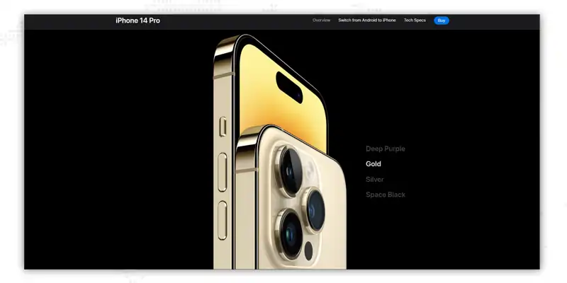 This is a webpage from the Apple website. Do you see the empty space all around the image and text? This ‘emptiness’ is known as white space - and yes, white space need not be white. White space covers all the spaces on a webpage, from letter and line spacing to the area around images and text, as well as gutters and margins. Since it’s part of the page that’s left empty, sometimes white space is also called ‘negative space’.
The primary role of white space is to help your web design breathe by limiting the amount of text and visual elements that users can see at once. Think of white space as an adhesive. Just as the glue holds things together, white space shapes the overall flow of your webpage. It is an active element and a fundamental block of good web practices.
The negative space gained popularity in the first half of the 20th century; since then, web designers and artists have recognized its versatility and significance.
Despite the best intentions, negative space can be crowded out of a design. Knowing where to add white space can prevent this. You can incorporate white space into nearly every nook and cranny of your website, but this doesn’t mean that you should. Add white space mindfully and ensure that your client and development team are in sync with your vision. Here are a few tips that you can follow.
Your web design services team has created a wonderful page layout. However, when the developer hands the layout back to the team, it looks completely different. This is such a common but unfortunate scenario. Before beginning work on the development, it’s important to convey the design intention to developers. Talk about wireframes, plan line heights, and margins and highlight padding - this will avoid any misunderstanding and save countless development hours.
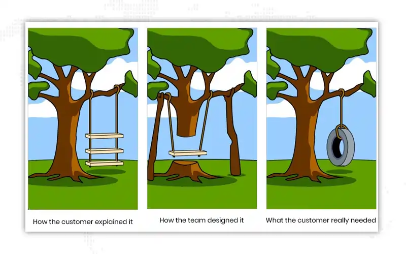
Do you remember this meme? It’s funny but true. Often, what the client wants is drastically different from how they explain it. This creates a gap between the design team and the developer, ultimately causing wasted efforts. When it comes to web design, the client may request a lot of content on the first page itself or decide to keep things minimalistic to the point of making the site barren. It is the responsibility of the website designing services team to help them realize and achieve the balance among white space, text, images, and other elements on the website.
Use white space to apply correct margins and line and paragraph spacing. This will improve the presentation of the text. You can also leverage white space to increase the space among letters for drawing attention to headlines and sub-headings.
Micro white space is essential if you want to keep your site’s content legible. Factor in the white space when deciding the typography elements like font, color, size, style, kerning, and tracking. Altering the white space layout impacts content legibility, and as we all know, happy visitors are far more likely to stay on your site.
Let’s explore some of the examples of white space used in various media
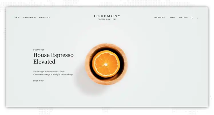
The clever use of white space on the Ceremony Coffee Roasters website can be taken as a classic example of the usage of white space in favor of branding. The website is bright, less clustered, and has a sophisticated design that puts the brand- coffee- on full display.
This is an example of a clean and colorful design, which is not only easy on the eyes and brings out the brand’s USP i.e., its coffee. The reader doesn’t get distracted by the extra elements but can focus entirely on the flavors of coffee and how to get their hand on them.

It is always a good idea to steer away from all the distractions from the landing pages. A landing page must be clean and minimalistic and must not contain many visual elements. It’s a common misconception that you need to include a lot of social proof or texts or images to convince the readers to take the desired action, but in reality, clever use of white space allows readers to focus on your call-to-action.
This doesn’t imply that you shouldn’t add text or images, but make sure to leave some breathing space between texts, bullet points, or any content added. Sometimes, adding a few elements is actually advisable.

Billboards offer great opportunities to display your brand as they are huge and grab attention from a distance.
Billboards give you ample opportunity to be creative and play with the white space provided. Especially when the brand is already well-established and dominates the market.

Simple design doesn’t necessarily mean boring design. On the contrary, minimalism is an effective way of capturing the reader’s attention. The below ad doesn’t have a lot of details, it includes a headline, the main picture, and followed by more details about the product, along with the logo.
The practical use of white space draws attention to the brand’s product, proving that simplicity can be effectively used in brand promotion.
A website layout should be easy on the eyes. It should make people want to continue scrolling. When you’re putting together a blog or website, cramming as much content on the page can be tempting. There’s a lot that you want to share with your audience, and that’s understandable. Let’s try this approach.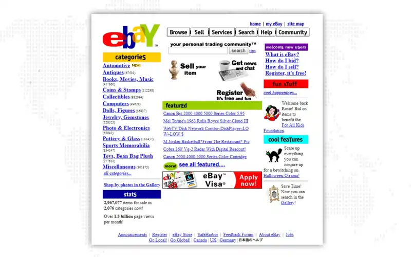
How do you feel about this page? Are you overwhelmed? Do you have trouble focusing on a single area? Can you actually find what you’re looking for?
No.
Now, let’s look at the present-day eBay homepage.

Much better, isn’t it?
That’s the power of web design white space. When used correctly, white space transforms your web design, delivering a great navigational and user experience to your site visitors and potential customers. Here are some more benefits of using negative space in web design.
Tightly spaced text that feels cluttered and is difficult to read. On the other hand, if you space it too far, the content appears jarring to readers. Using white space correctly between paragraphs and margins can increase comprehension by up to 20%, as a Wichita State University study indicates.

Have you heard of the Law of Proximity? It describes how our eyes perceive connections between visual elements. Elements near one another are perceived to be related as compared to elements positioned away from each other. So, what role does white space come into play here?
Well, it acts as a visual cue between your content and other elements on your page, showing their relationship to your page’s visitors. This helps gain more clarity and add a flow to your page's text, images, and other elements.
Just like Fashion, web design principles may come and go, but white space is a timeless classic. It’s been around since the 20th century and has made its way to the web, but the relevance of white space hasn’t diminished. So, if you want your website to stand the test of time, white space has to be an essential part of your web design.
A cluttered website interface overwhelms your audience, dumping too much information on them and thus losing your core message in all that noise. white space removes these distractions, allowing users to focus on the places where you want their attention to be. The more white space around an object or text, the more the eye is drawn to it.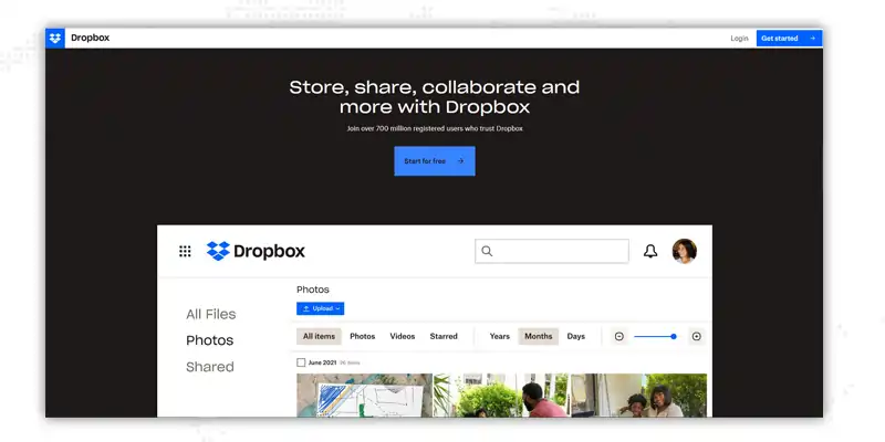
Take a look at Dropbox’s homepage. Thanks to the mindful use of negative space, notice how the CTA pops up at first glance.
"Design is not just what it looks like and feels like. Design is how it works." - Steve Jobs
With white space in web design, designers can create a general flow that allows users to follow when they scroll a page. This is known as a visual hierarchy and facilitates users to process information easily. There are two ways to establish visual hierarchy on the web design grid - symmetrical and asymmetrical.
Symmetrical layouts have built-in stability and order; such designs are, thus, easier on the eyes. An asymmetrical layout, on the other hand, does not have symmetry. These layouts are typically used to bring attention to specific elements or a particular section on the page.
White space doesn’t improve the overall functionality of a website; it also accentuates the site’s aesthetics. Think how those glossy fashion magazines make use of white space to give an impression of sophistication, luxury, and elegance.
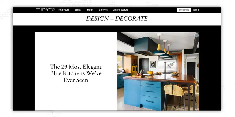
Take a look at Elle Decor’s webpage. Notice the choice of font, image, and white space that creates a refined layout, making it nearly impossible not to click on the article.
If not utilizing the white space in web design is an issue, using too much empty space is also an issue. So, is there a way to achieve the perfect balance? Yes, by aligning the white space on your page with the elements and content.
Let’s dive deeper into the kinds of web design white space.
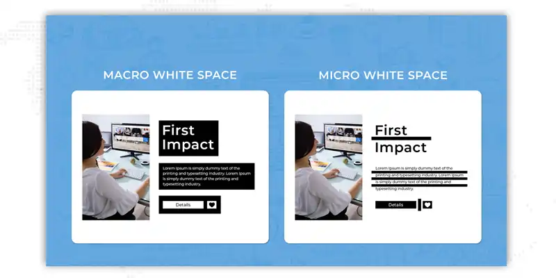
This type of white space is the space between images, lines of text, menu links, and other such elements. Micro white space is directly responsible for content legibility. It ensures that viewers can read the text on your page and distinguish among elements.
The macro white space comprises the large empty areas on a webpage separating discrete elements, around content blocks, for instance. Macro white space in web design points to where one section ends and another begins. It also facilitates the distinction among key elements on the page. The more distinct an element is from another, the white space should be present between them.
In the image below, you can see the difference between micro and macro white spaces.
|
Examples of micro white space |
Examples of macro white space |
|
Letters & words |
Within hero images |
|
Content or images in a grid |
In the margins of website |
|
Paragraphs |
Around the logo |
|
Navigation links |
Separating the sidebar and main content |
|
Form fields |
Around CTAs |
Another way to judge the usefulness of white space is by determining whether it’s going to be passive or active. Active white space web design comprises empty areas deliberately added to improve the page structure. The intention is to guide the viewers through a process until they reach the intended conclusion.
Passive web design white space layout refers to the naturally occurring gaps in typography and design. While you can control how small or wide these spaces should be, they occur regardless. The space between paragraph lines is a good example of passive white space.
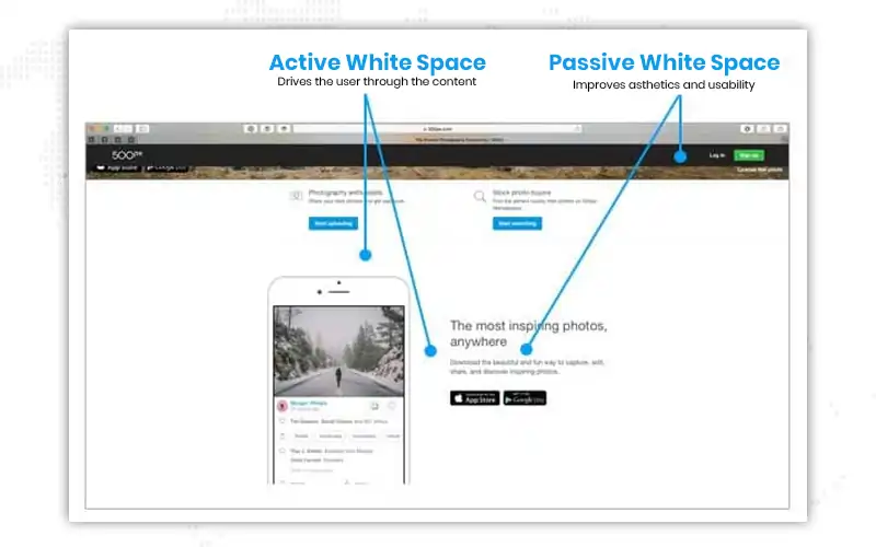
You can’t really single out one individual who “discovered” white space. Throughout the years, you can attribute it to several parties, though.
20th-century Chinese calligraphers and artists did not treat the empty white rice paper spaces as wasted. They believed that it contributed to the understanding of the whole picture and referred to it as “designing the white.”
The philosophical tradition of Taoism advocates “attaining the limit of empty space, retaining extreme stillness,” making it foundational. In her blog on empty space, Carol Douglas explains the importance of white space in Chinese art. “Empty space is expected to convey information through its very lack of imagery. The sizes and contours of the empty shapes create rhythm and unity. The solid shapes give meaning to the empty, and vice-versa.”
Another reason why white space is referred to as such is because of the white paper or white canvases that Modernist artists used to write or paint on. However, in the present context, the term ‘white space’ need not be just white. As illustrated in the example above, it refers to empty space and can be of any color.
Web designers picked white space from all the spaces they could’ve chosen. And as if that wasn’t enough, they left us, the commoners, to figure out what it meant, when to use it, and of course, how much was too much! We hope this article made sense to you and helped you understand the importance of white space in web design in detail. Other essential elements make up an effective web design. Our website design services team would be happy to walk you through all of these for your next project. Get in touch right away!

Looking for Website Design Services?
1. Can I add white space to my existing web page layout?
If you already have a website, chances are white space exists to some extent within your pages. Take the spaces between the menu options or the spaces between images and content, for example. However, our experts can certainly do an audit of your site to figure out how to make the most of the negative space on your site.
2. How much will a new website cost?
Since the site design and development quote depends on the nature of your requirement, there’s no single, correct answer to this question. Why don’t we schedule some time together to discuss and assess the scope of your idea and then take it further?
3. Will you maintain my website for me?
Yes, we can! We offer ongoing support for many of the sites we’ve built. Just let us know; we’d be happy to create a tailored support package for your website.
4. Will my website be mobile responsive?
Absolutely! Mobiles account for more than 50% of website visits, so having a mobile-friendly website is more important than ever. All our website design services packages include the development of mobile responsive sites.
5. Who will write the content and provide images for my website?
Usually, that is you. You are the expert in your industry and business, so it’s best that the content comes from you. However, if you’re not that proficient in writing or want to hire skilled copywriters, we’d be happy to help. The same goes for graphic designers.
6. Have you ever built a website for my industry?
Over the years, we’ve worked with clients from a lot of industries. Some of them include Real Estate, Travel & Hospitality, Legal & Judicial, E-commerce & IT, Healthcare, Financial Services, Non-Profit, Manufacturing, Government, and the Energy & Utilities industries. If you don’t belong to any of these industries, we can set up a consultation call free of cost to understand your requirements.
7. Can you share some of the past websites that you’ve built?
Of course. Look at our Portfolio and the clients we’ve worked with so far here.
8. I have more questions. What do I do?
We’re just an email or a phone call away! Drop us a line at info@janbaskdigitaldesign.com or call us at +1 434 879 4367. But we love to have in-person discussions. So, if you want to drop by our office and discuss your idea over a cup of coffee, reach out to us from our Contact Us page, and we’ll set up a meeting.
C
Clever conclusion. Loved the blog!
M
Can you please share your quote for a single-page website? I need a site designed for my small food business.