
What if a prospective customer is looking for your services and wants to get in touch with you? What would be the first thing the person would look for on your website?
Your Contact Us page and the easy-to-fill-in contact form!
Almost all websites allow at least one method to contact visitors. The most typical options they choose are to provide a physical address, telephone numbers, social media links (Facebook, Twitter, Instagram, etc), online chat with the salesperson, email addresses, or a contact form.
Marketers have many different options available at their disposal to contact people behind the website or the website design services. Sometimes, a phone number is the best option if you want to get in touch and need real-time assistance, or social media if they want to interact in public. Other times, they want to visit the physical store or the business place. However, what if other communication methods are not possible, appropriate, or available?
Then again, what is the purpose of the contact form?
Is it just a communication channel for your visitors?
Contact forms essentially have two main purposes: lead generation and communication channels for existing clients.
Also, in the case of contact form UX is crucial. Website contact form design helps generate leads from potential customers who may be interested in your product or services and looking to explore more to know more about you. The customer must input information such as their name and email address to submit a contact form. They may enter more particular information about what they require or why they are using the contact form, depending on the form.
Contact form designs assist you in growing leads by building your email list and obtaining this information. If you need further information from the customer, it might assist you in filtering and sorting those leads. It's important to know the difference between a contact form and an opt-in form; the latter one exists solely to allow customers to join your email list. However, depending on your contact form UX design, it can do much more.
You would also want your existing consumers to contact you. Contact forms make it simple for customers to contact you if they require assistance or additional information about your services. But for that, you need to follow some contact form best practices and strategies which we will be talking about at length below.
Your customers, for example, may need to speak with you if they have a technical or customer support issue. Alternatively, they may have a sales or marketing inquiry. They may want to schedule a consultation but have a question beforehand. Perhaps there may be another business owner looking to collaborate with you. In any case, they can use your contact form design to proceed.
Also read, How To Design Sign Up Form That Helps In Increasing Leads & Conversions
Transform Leads into Conversions: Optimize Your Contact Form Now!

Obtaining your users' contact information allows you to reach out to them and eventually convert them. However, your contact forms will only be valuable if consumers submit their information. And, in order to have a high contact form conversion rate - the number of people that convert from your forms — you must optimize your forms precisely.

As a marketer, before you get into the details of what must be included in the contact form design, you need to research some contact form inspiration and figure out what would compel your users to fill it out. Why should they opt to share their information with you? What they will gain from it? You can start by clearly stating the key benefit of the contact form, a way to enhance the contact form UX.
If you're offering them exclusive discounts via email, start by highlighting that in your contact form UX design. Make it clear whether you're giving them access to exclusive content on your site. Whatever it is, make it visible and apparent on your contact form. Users will only provide you with their information if they are sure of the benefit that they are going to receive.
One negative attribute that can affect your contact form UX or prevent people from using your contact form is to have too many fields. Nobody wants to waste five or ten minutes trying to get through it, and if they see 20 different boxes lined up in a row, they'll surely close the tab. Marketers should try to use the fewest number of fields possible for each given form. Don't bother your customers by asking for their mobile numbers in your form. You can add mobile numbers to your form, but you shouldn't make it mandatory.
And if you can keep a form to just one field, that will help your contact form conversion rates.


According to a QuickSprout study, a form with only three fields resulted in a 25% conversion rate. With up to 5 fields, that proportion was decreased to 20%, and with more than 6 fields, it was cut to 15%. Hence, having minimal boxes is one of the most integral contact form best practices.
Limit the number of fields to no more than 5, and make sure the tab order is correct. Consider creating a form conversation that walks your users through the survey that contains pertinent questions one at a time. This reduces distractions and limits the number of form fields to one per page so users don't get overwhelmed. If a form has only one or two fields, consider utilizing it as an inline form.

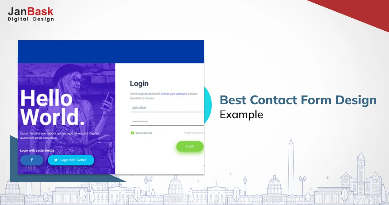
Another factor to consider if you’re grappling for answers on how to design a contact form effectively is that they should have a user-friendly layout, which means they should be well-designed in terms of both functionality and visual appeal. Your forms should include things like field labels, appropriately-sized boxes, and optimal page placement — ideally above the fold — to make them look inviting and easier to use, as well as an appealing visual design in terms of things like color schemes to draw in users.
A strong call to action (CTA) is essential for a strong contact form. The CTA informs the marketers of what you want them to accomplish and encourages them to do it. Sometimes, it's as simple as "Contact us," but other times, you might want to go a little deeper.

Your CTAs should be clear, prominent, and compelling on all your contact forms so as to allow consumers to take action and close sales.
In other words, the CTA should be clear in what they want the users to do, they should be appealing, persuasive, and prominent on the website. Let's assume that you want users to join up for your weekly newsletter. You may implement a CTA such as, "Sign up for the best workout meal and get to know more about what supplement suits your body. Also, make sure that all your CTAs are accompanied by a visible “Click Here” button to let users click on it. This is another pivotal contact form best practices to remember.
The number of smartphone and tablet owners is increasing, and so is mobile web usage. Websites must adapt to this development in the sector. Responsive website design gives readers a more simplified experience when exploring pages, keeping them interested in your postings.
Contact forms are an integral part of these pages. Mobile responsive website design or simply mobile website design ensures that users on mobile devices have a pleasant experience. Users may not even consider visiting your desktop site to submit the form if your contact form design is not accessible on mobile devices, costing you significant conversions. So next time you hire a website design company, ensure that they are providing mobile responsive web design services.

Mobile forms are typically more limited in terms of screen width and text input than desktop versions. Mobile devices, on the other hand, provide a choice of integrations that may actually make your mobile form easier to use. Popular devices, such as iPhones, provide users with alternative keyboards to fill out email and website sections, as well as current location information.
Work on optimizing your fields for mobile use ensuring a seamless mobile website design, particularly if you are a part of the rising mobile-browsing business.
What would be the window if your customer wants to get in touch with you regarding your services? 24 hours? 48 working hours? Make a promise (and then follow it!) and let him/her know what you will do to precisely address his/her issue.
Let's imagine that a marketing executive calls you with some problems he/she might be facing with the email marketing tool.
The company contact form gives the following information on its contact form: Once you have provided ABC marketing automation company with your contact information, our fantastic email marketing expert, John, will email you within two business days to inquire about your problems so that we can create an unforgettable experience.
Essentially, a contact form asks the visitor to enter his/her personal information and submit it to you - someone they do not know. That's quite a bold thing to do.
Make your contact page as trustworthy as possible by accomplishing the following three things:
Visitors are easily distracted by the world outside of your website, thus leaving distractions on your page will only harm conversions. Removing non-essential conversion components such as site navigation and footer may increase the conversion rate.
Make it difficult for people to leave your page. Do you want to show a site-wide notification bar or a timed popup? Remove these components from the page so that the only method for a user to exit is via the submit button. To keep visitors engaged, utilize exit-intent popups as a last resort to prevent them from leaving the page. Find some good contact form inspiration to shortlist your design.

CAPTCHA is excellent for minimizing spam, but it also limits the quantity of lead form submissions. Moz investigated the impact of CAPTCHA on conversion rates. Spam was decreased by 88% throughout their three-month test period, yet they reported a 7.3% failed conversion rate.
Images and text can be difficult to read, and the additional steps of solving arithmetic calculations or answering questions can be off-putting to many users. Formidable Forms employs reCAPTCHA, which is normally invisible to visitors to your website.
Finally, test several versions of your contact forms to understand which works the best. If you can't decide between two color schemes, for example, you can build a form for each and compare them. Whoever performs the best will be chosen as the best contact form. A/B tests eventually identify the best format for each of your contact forms.
Using that format will allow you to produce more conversions and income in the long run, thus ensuring a spectacular contact form UX.
Now let’s learn about some crucial strategies that would help you design your Contact Us page effectively that would significantly aid in boosting your CTRs.
How much do you expect to be the conversion of a site that has been strategically built with multiple conversion touchpoints? You can expect 2-3% of visitors to convert to a site with several touch-points, pop-up forms, newsletter signups, landing pages, and an optimized contact page.
Now just imagine that you not only have the user experience website but more traffic as well.
This way, you can widen the funnel while also optimizing conversion rates. In the end, your hard-earned lead-generation efforts will yield a bigger return.

Just imagine this is a relatively common sight when you're looking to contact a company through its contact page. When a company does not take the time or thought to win you over, it is not a positive sign for the ordinary prospect. Consider the following scenario: Would you marry someone whom you meet the first time if he/she doesn't have the basic courtesy or etiquette?
So what do visitors want?
Let’s discuss the strategies to create a high-converting website’s contact form UX focused:
When it comes to your contact form design, there are two options:
Internal motives, past experiences, and needs determine the way your future audience will communicate with your company. This is why you must develop a great communication strategy based on your market research. A solid communication strategy lays out the methods and processes that would assist you in attracting the attention of people outside of your organization. Only then you provide various touch points options for your leads so they may choose how they want to reach you.

Like any strategic copywriting, it's your responsibility to engage and win over the customer, and it can be accomplished only by focusing on the reader before crafting your sales message.
Today's consumer is skeptical, knowledgeable, and conducts their own research. As a result, they straight away know when something is badly written, deceptive, or salesy. So go ahead, research and read a good amount of materials on how to design a contact form with the best possible content.
As a trusted brand, you must always make sure that your audience is properly listened to when they fill out the form. There is nothing worse than getting ignored. Always make sure to tell your audience what will happen after they hit the submit button.
People are more at ease when they know they are contacting a real person rather than a bot. Include it in your message. Use this chance to discuss how essential connection is to the company and how you take pride in communication. Users may feel more at ease filling out the form to send you a message as a result of this.
Talk about what they can expect if they contact you, including how long it may take for someone to respond. You don't need to provide much information; a basic ticketing system or an automated phone call, text, or email would suffice. Mark these contact form best practices in your todo list before you start designing yours.
We've all been on the receiving end of too many sales calls, which makes us wary of giving out our phone information or calling a company. So, on your contact page, explain how you intend to use their contact information.
Some consumers avoid filling out contact forms or do not want to share their contact numbers as they don't want their data to be stored or misused.
You must not share any information that you get once your audience fills the form. Communicate this to your audience, and if they feel that your brand reinforces loyalty to their words, then surely they will fill out the form.
If you include your phone number and email address in your contact form design instead of a form and they elect to call you directly, you can use skill-based routing (SBR) to lessen the likelihood of them becoming irritated. Incoming calls are routed to an operator with extensive experience rather than a live operator. As a result, the customer will not have to deal with representatives who lack the necessary knowledge to assist them.
If your site visitor has already filled in a form to download a paywall or a gated piece of content then in that case you can add personalization to the contact page.
Adding the least amount of effort, such as a personalized message, will capture their attention and provide them with a tailored experience, distinguishing you from your competitors.
Instead of requiring potential customers to contact you to plan a meeting, which involves a lot of back-and-forth, eliminate a step and include a booking widget or alternative booking form in the contact form design.
A simple button below the form, on the other hand, would separate the bottom of the funnel (BOFU) visitors who are ready to commit from those who wish to ask a few questions. This will also enhance contact form UX.
Keep the contact form visible on the page.
The contact form is something that is mostly overlooked by businesses or added at the last minute or something as an extra that you feel obligated to add. Unfortunately, that approach is not likely going to give you conversions.
If a user is uninterested in a website or cannot find what they are looking for, it will negatively impact the contact form UX and they will depart in 10-20 seconds.
Assume someone is attempting to contact your company but is unable to locate the appropriate contact information. In that instance, your lead may leave your site without ever contacting you and instead start looking at your competitors. Hence it’s imperative to follow all the contact form best practices before you finally approve your design.
Your contact page should not be a last-minute addition. Instead, it should be simple for visitors to find your website. Keep in mind that you may just have a few seconds to create an impact!
You want to inspire potential customers to interact with you and provide them with a better experience. Experts predict that strategic customer journeys will soon outweigh other buying influences such as price. 86% of customers believe they would pay more for a product or service if they had a better experience.
Hiding your content page at the bottom of one portion of your website can be frustrating for users and sets a bad tone. Even if they ultimately find the form, the difficulties in finding it may leave an unfavorable impression before they even contact you.
Don't make it a treasure hunt for someone who wants to contact you with a question or comment.
Here are some pointers for making your contact page easier to find:
For a strong user experience or contact form UX, the page must be visually appealing, which makes sense given that you only have 50 milliseconds to capture their attention. It's not enough to utilize a generic template that users can easily disregard. Fortunately, it is not difficult to create a contact page that will stand out and capture people's attention with a single click.

Word-of-mouth from satisfied consumers is the most valuable kind of marketing. One sure-fire approach is to incorporate customer reviews to break the trend of poor contact pages.

People are naturally skeptical of companies they have never heard of before. However, 85% of people trust internet reviews as much as personal recommendations, your audience surely trust your brand if they find positive reviews and feedback.
You can also offer examples of your previous work or projects that you are proud of so that users know what they are getting before they begin working with you.
A carefully designed contact page will improve user experience and develop a close bond with your leads. Although no two businesses are alike and each buyer persona has different needs, let’s take some contact form inspiration from the following contact form examples and include (or exclude) certain components in your contact page.

Zendesk is a customer service software that is hosted in the cloud and focuses on engagement. Zendesk's help desks and customer care divisions are its preferred method of support, with over 300 million users globally.
The Zendesk website features a minimalist, orderly, and color-coordinated design throughout its page. The contact page is straightforward and efficient and maintains the aesthetic. The reason Zendesk is on our list is that companies who keep their web forms as simple as possible see higher conversion rates.
What makes this "Contact Us" page unique:
The Contact Us page has two primary CTAs:
The first one, marked "Contact Sales," takes you to a simple and easy-to-fill form.

The second call to action, "Go to the help center," directs users to a knowledge base and a community of users who may respond to their queries.
Visitors can view Zendesk office locations and browse product support choices in the section at the bottom of the Contact Us page. It's obvious that the business spent time carefully developing this website with its buyer personas in mind. It added such items as extra resources after taking into account what users on the contact page could be looking for. Hence, this could be one of the most interesting contact form examples that you could draw inspiration from.

Moz is a Seattle-based SEO software provider that has a big and obvious CTA on its Contact Us page. This takes users to a more in-depth 'Help Hub,' where they may get the support they require for a particular piece of software or service that Moz provides.
It's a smart concept to avoid overwhelming someone who needs assistance straight away, especially with Moz's extensive and diverse services.
Instead, Moz gives the essential contact information on its main Contact Us page, with extra, more in-depth resources accessible once consumers click 'Contact the Help Team.' Also, it has a cool Seattle map for those people who want to come and see the location, a cool contact form inspiration indeed.

Atlassian is an enterprise software company that offers different solutions to large companies to stay organized. However, despite this, its Contact Us page is remarkably well-structured, transparent, and well organized allowing users to navigate its website with ease and locate the assistance they require.
What makes this "Contact Us" page unique:
It's quite clear that the headshots are not stock images. Behind the emails and phone calls, some people are willing to assist you till the end. Additionally, there is also an opportunity for you to submit the feedback to the Atlassian founders.
Along with releasing a range of support papers, FAQs, and ways to contact the organization, each of these components demonstrates a dedication to transparency and a refreshing openness to criticism. Hence, this design gives us some real ideas on contact form best practices.

"Burger King understands that its customers may want to contact them for a variety of reasons." That is why its Contact Us page attempts to address a variety of problems.
What makes this "Contact Us" page stand out:
Customers looking for digital or restaurant help will find it on Burger King's contact page. Customers can also use the shop locator to discover the nearest Burger King location.
1. Why do large businesses use “Contact Form” pages on their websites?
Large corporations employ "Contact Us" forms on their websites, for a variety of reasons. The primary reasons are:
Ease of use: A contact form makes it simple for clients to contact the company without having to search for the company's contact information or open their email program.
Efficiency: A contact form helps the company collect all of the essential information from the client in one place, which can speed up the process of responding to the customer's query.
Data collection: A contact form can capture valuable consumer data such as name, email address, and other demographic information. This information can be utilized for marketing and client relationship management.
Improved Customer Service: Contact forms can be used to direct client enquiries to the proper department or person inside the organization, ensuring that the customer's inquiry is handled swiftly and efficiently.
Automation: Certain functions, such as sending an automated response to the customer or creating a ticket to track the enquiry, are available in some forms.
Document management: Some forms allow users to add attachments, making it simple for them to supply required documents or evidence to support their inquiry.
Overall, "Contact Us" forms are a terrific approach for businesses to deliver exceptional customer service and increase overall consumer communication.
2. How do you add a contact page to your website?
A Contact Us page can be added to your website in a variety of ways. One method is to simply add a new page to your website with your contact information. Another option is to use a contact form plugin, which allows users to fill out and submit a form to you.
3. Is a contact page necessary? Should I have a contact page on my website?
A contact page is required for any business website. It not only allows people to contact you, but it also represents your brand's personality and your will to the best customer service. A well-designed contact page can also improve the user experience of your website and help you create trust with your audience.
4. What should a contact page say?
A contact page should give visitors detailed instructions on how to contact your company. A contact form, further contact information (e.g., phone number, email address), and a brief introduction or message emphasizing your devotion to customer service are all included.
That brings us to the end of our list of recommended contact form best practices. Contact forms are one of the most significant opportunities for businesses to boost both the quality and number of leads, therefore never overlook optimizing them.
Pay close attention to contact forms as an essential component of any web development endeavor, and keep these three conversion tactics in mind at all times and discuss them with the website design company that you are collaborating with:
Every business, regardless of industry or buyer personas, should strive for a great Contact Us page. Remember that a beautiful contact form is one that gives a nice user experience, which you won't get with bulky fields or extensive pages. Janbask Digital Design is a website design services company that strives to offer the best support possible to create a well-thought-out contact page. This allows you to keep a professional appearance while also making it simple to communicate with your audience to develop a positive, long-term relationship.
We hope this article has given you some great ideas for improving your contact forms and increasing conversions for your business.
Interested in our Web Design & Development Services?


A Specialized Team for custom web solutions for your business through Web Design, Web Development, Digital Marketing Services such as SEO, Social Media Marketing.


Leave a Reply