
Nonprofit organizations play a vital societal role by addressing social, cultural, and environmental issues. To achieve their objectives, nonprofits rely heavily on their websites to communicate their mission, generate donations, and recruit volunteers. In this digital age, a website is often an organization's first point of contact. However, designing an effective nonprofit website can be challenging.
This is where non-profit organizations should know that avoiding common website mistakes is essential to ensure their message is delivered clearly and effectively. These mistakes can prevent visitors from finding the information they need, understanding the organization's goals, and engaging with it.
This article will discuss these common nonprofit website mistakes in detail and provide practical nonprofit web design solutions for avoiding them. We will also offer tips and best practices for designing a functional and engaging nonprofit website.

Looking for Nonprofit Web Design Solutions?
A well-designed non-profit website can attract more donors, volunteers, and supporters to the organization, leading to a more significant impact on the community. However, many nonprofit organizations make common mistakes when designing their websites, which can hinder their ability to connect with their audience effectively. Some of those mistakes are listed below:
Many nonprofit organizations look at other websites and follow their design and content structure. While it's essential to research and gather inspiration from other websites, creating a unique design that reflects the organization's personality and values is crucial. Therefore, the website should extend the organization's brand and convey its special message and nature.
While a website should provide relevant and up-to-date information about the organization's mission, programs, and services, it should also engage visitors and create a sense of connection with the organization. Visitors should feel inspired and motivated to act, whether donating, volunteering, or spreading the word about the organization's work.
Visitors want to know how their donations will be used and the impact they will have. Nonprofit organizations should provide clear and transparent financial information, including how donations are used and how much goes toward administrative costs. Through transparency, organizations can build trust with their supporters and inspire confidence in their work.
Nonprofits should highlight success stories and their work's positive impact on the community, inspiring visitors to become part of the organization's mission. Many websites make the mistake of assuming visitors already know why they should donate. However, it's essential to provide compelling reasons to contribute and communicate the impact donations can have.
A website should be accessible to all visitors, regardless of background, abilities, or preferences. Websites should be designed with inclusivity, with features like alternative text for images, accessible fonts, and color contrasts that make the site easy to read and navigate for everyone. Nonprofit organizations should also strive to represent diversity in their content, showcasing the diverse communities they serve and the people who support their work.
Mobile devices account for over half of all website traffic, and failing to design a website optimized for mobile can significantly lose visitors. A mobile-friendly website should have responsive nonprofit web design elements that adjust to fit the user's screen size, making it easy to navigate and read the content. Therefore, such organizations should reach out to an agency specializing in creating mobile-responsive designs (such as JanBask).
Nonprofit organizations must showcase their work and impact on the community through compelling visuals. Visual content, such as images and videos, can create an emotional connection with the audience, making them more likely to support the organization. In addition, keeping the website updated with fresh content can attract repeat visitors and keep them engaged with the organization's work.
A domain name is the website's address; choosing a memorable and relevant domain name that reflects the organization's mission is essential. Organizations should also ensure that they own the domain name and that it's registered to the organization, as this can prevent potential legal issues in the future.
While nonprofits are not businesses, they still need to "sell" their mission and impact to potential donors and volunteers. The website should highlight the organization's work and make it easy for visitors to donate, sign up for newsletters, and participate in its activities.
A website should have a clear and intuitive navigation structure allowing visitors to find the information they need quickly. Visitors should be able to easily access information about the organization's mission, programs, and events. A search function can also be helpful for visitors looking for specific information.
Nonprofits must have a clear and prominent call to action on their website to inspire visitors to get involved with their mission. A call to action is a specific instruction that encourages visitors to do a particular activity, such as donating or signing up for a newsletter. The call to action should be visually striking and placed in an easily accessible location on the website.
Nonprofits need to communicate their mission and values clearly and effectively to visitors. The website should have a concise message explaining the organization's purpose, programs, and impact. The messaging should be tailored to the target audience and reflect the organization's values and mission. Visitors should be able to understand the organization's work and impact within a few seconds of visiting the website.
A support case is a persuasive statement that explains why visitors should support the organization. The support case should highlight the organization's impact, goals, and achievements. The website should clarify why the organization's work is essential and how donations and support can make a difference in the community.
Forms are essential for collecting visitor information and donations. Nonprofits should design structures that are user-friendly and easy to navigate. Nonprofits should also provide clear instructions on completing the forms with all the necessary details, which should be optimized for mobile devices.
The website should be designed with the organization's target audience, including their needs, interests, and preferences. To avoid this mistake, nonprofits should ensure that their website includes a blog to keep visitors engaged and up-to-date with the organization's activities. Additionally, a nonprofit About Us page that highlights the nonprofit's mission, values, and programs can help build trust and credibility with potential supporters.
Nonprofits should also focus on lead capture, encouraging visitors to sign up for their newsletter or join their mailing list. Lack of diversity and transparency can also detract from a nonprofit's message and appeal. Including images and messaging that reflect diversity and openness can help build trust and connection with a broader audience. Moreover, a mobile-friendly nonprofit web design can improve the user experience and make it easier for visitors to navigate the website.
Another mistake to avoid when designing a nonprofit website is overwhelming the reader. This can happen when there needs to be a more content strategy, resulting in an inconsistent tone of voice or excessive content. Nonprofits should have a clear content strategy, focusing on the most critical messages and ensuring they are delivered concisely and engagingly across all devices. By doing so, nonprofits can create a website that engages and inspires visitors, leading to increased support and impact.
Poor navigation and a non-responsive website can make it difficult for visitors to find the information they need, leading to frustration and a higher bounce rate. Additionally, overcrowding images and excessive content can create a website feel cluttered and unprofessional. Outdated content can make a nonprofit organization seem irrelevant and uninvolved.
An ideal web design for non-profits should prioritize the organization's mission and goals while providing an engaging user experience for visitors. Here are some examples of critical elements that can contribute to an effective web design for non-profits:
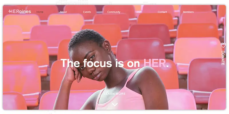
The website for HERoines Inc. is designed with a striking aesthetic that captivates visitors through high-quality media features such as photographs, icons, and animations. The website includes testimonials from satisfied community members, a blog with empowering lifestyle tips, and interviews with HERoines members.
The website strategically places call-to-action (CTA) buttons, encouraging visitors to donate or become members. Even if a visitor misses a CTA, a supplementary Donate button on the right-hand side of the website remains visible throughout all pages. The Donate button features a heart icon, adding a subtle emotional appeal to visitors. The website also includes a newsletter subscription form and social media links in the footer to keep visitors connected.
Girls' Empowerment Matters GEM, Inc. website features a well-defined color scheme of purple and teal. The purple color is the dominant color on the webpage, while the teal color serves as an accent. The nonprofit web design uses geometrical vector art and duotone photography to complement the color palette.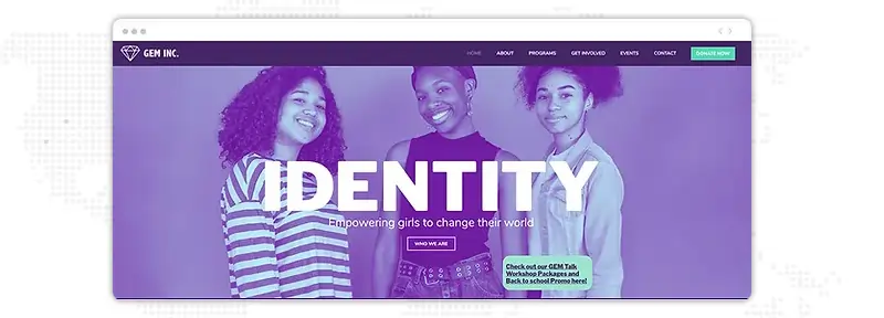
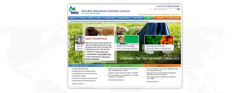
The Natural Resources Defense Council (NRDC) website employs color to differentiate various sections of the website. The links for "Donate" and "Take Action" are highlighted in orange, while the "Blogs" section is distinguished in green. The remaining sections, including the nonprofit about us page and Policy page links, are marked in blue. The website's homepage features effective multimedia content and highlights recent news.
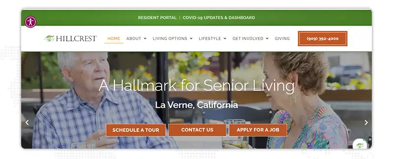
Hillcrest's website acknowledges that showcasing its campus is the primary interest of website visitors. To address this, they have included a beautifully executed video banner on their website highlighting the grounds and available homes in the community. This feature enables prospective residents to envision themselves living in the Hillcrest community. The website also includes a campus map, photo galleries, and sample floor plans, providing visitors with further insights into Hillcrest's offerings.
The website's prominently displayed yellow "Contact Us" button helps potential residents take the first step in kickstarting their life at Hillcrest. Additionally, Hillcrest's "Giving" page provides donors information on multiple contributing ways, including planned giving and a general support fund. Donors can make a one-time donation and break it into monthly payments or give it every month.
But where do you start? Here are the tips to help you create and optimize your nonprofit website to its fullest potential. These web design for non-profits tips cover everything from nonprofit web design and layout to content and functionality.
While designing a nonprofit website, it's essential to keep the audience in mind and avoid common mistakes. Your website can effectively communicate your message and increase engagement by prioritizing mobile-friendliness, visual content, clear calls to action, and user-friendly navigation. Additionally, avoiding overwhelming the reader, losing focus on the target audience, and neglecting essential features like lead capture and transparency can make a big difference.
If you're looking for trusted nonprofit website design services to help you design a powerful nonprofit website, Janbask is an agency you can count on. With a team of expert designers and developers, we specialize in creating custom websites tailored to meet nonprofit organizations' unique needs.
Don't settle for a mediocre website that fails to make an impact - partner with our nonprofit web design agency today and take your nonprofit to the next level.
Interested in our Nonprofit Web Design Services?

1. What are some common mistakes nonprofits make when designing their website?
Some common mistakes nonprofits make include having an unfriendly or non-mobile-friendly web design for non-profits, needing a clear call to action, unclear messaging, not providing reasons to donate, and overwhelming the reader with too much content.
2. How can nonprofits ensure their website is mobile-friendly?
Nonprofits can ensure their website is mobile-friendly by using a responsive web design for non-profits that automatically adjusts to different screen sizes, limiting the use of large images or videos, and optimizing loading speeds.
3. Why is it essential to have a clear call to action on a nonprofit website?
A clear call to action on a nonprofit website is essential because it encourages visitors to act, such as donating or signing up for a newsletter. Without a clear call to action, visitors may leave the website without engaging with the organization without a clear call to action.
4. How can nonprofits handle overwhelming their website visitors with enough content?
Nonprofits can avoid overwhelming website visitors by having a content strategy that prioritizes relevant and engaging content, a consistent tone of voice, and a clear and easy-to-use navigation system.
5. Why is it important for nonprofit websites to be transparent?
Nonprofit websites should be transparent to build visitors' trust and demonstrate the organization's commitment to accountability and ethical practices. Nonprofits can be evident by providing clear information about their mission, finances, and impact.


A Specialized Team for custom web solutions for your business through Web Design, Web Development, Digital Marketing Services such as SEO, Social Media Marketing.

B
I had no idea that no clear call-to-action could hurt our website’s success. Thank you for these tips!
C
As someone interested in donating to nonprofit organizations, I appreciate their website being easy to navigate and mobile-friendly.
F
The tip about having a clear case for support hit home for me. I’ll make sure to include that in our nonprofit’s website redesign.
Z
I’ve seen some nonprofit websites with too much content, which can be overwhelming. These tips on how to streamline our website are helpful.
E
It’s important to remember that our website should be focused on our target audience. Thanks for the reminder and great tips on how to do that effectively.