
“Is adopting dark theme UI worth it for my website?”
Well, that's quite the dilemma in the minds of business owners looking to enhance their online visibility. The user interface of an app or a site is critical in catching a customer's attention. How you design the site with the help of website designing services, choose the theme, color scheme play a crucial role in delivering a unique customer experience.
Quite recently, dark theme UI has seen a surge in popularity. Mobile apps and websites with dark theme user interfaces appear well-designed, sophisticated, and attention-grabbing. Rather than using some light colors, usually, a black and gray combination works well for a site.
Are you curious to learn more about dark UI and UX dark patterns? This blog will help you learn about dark UI’s significance, benefits, design principles, and tips.
In 2018, MacOS Mojave released the dark mode UI, which is being discussed extensively now. But, if you remember, dark UI patterns appeared in the 1980's. Recall then available computers had monitors with a green-on-back UI effect. It was all because of the luminescent coating inside that produced the dark effect.
Coming to the dark side of the screen is all about calling for a night mode or a lights-out mode on the website or an apt. It's apt for the eyes to relieve much strain compared to the concentration required on the light time.

Have you ever noticed that everything is in dark mode when you go to the movie hall for a theatrical experience? From the cinema hall, dim lighting, a black screen at the front, and utterly dark mode while watching a movie.
Dark mode UI also plays it to showcase the colorful content that stands out dramatically. It aims to give viewers a relaxing dark mode UX effect and bring their concentration to the screen.
Similarly, a black or gray website or mobile application background can make sense in the following ways.
Such a contrasting user interface effect resembles negativity in photography. Professional UI/UX designers choose dark colors for the backgrounds and light shades for the foreground elements.
Looking for a Better UI Experience?

There are undoubtedly manifold advantages to creating a dark user interface design.

Consider numerous design principles when availing the assistance of a professional web design service company and creating a dark mode UI effect.
The background color is essential when designing dark theme UI. As already mentioned, a dark website or mobile app theme does not resonate only with black color. Anything which is light in the shade is exempted from the theme colors.
So, you have left dark shades to be selected according to the color scheme you like to create in the background. It's better to think from the design point of using dim lights for the dark mode UI rather than relying on bright shades. It could be dark grey, dark blue, or even a different tone of black for the background.

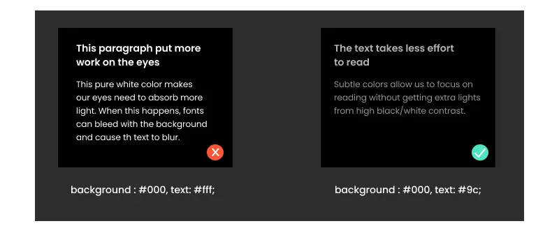
Also, note that you should not use black (#000000) for the background. It can be used for borders and small elements on the website.
Setting the contracts is one of the biggest hurdles for website designers to create an intuitive effect in the background. Sometimes, achieving the optimal contrasting effect and separating the visual elements from the text is difficult. To meet the purpose, follow the below-mentioned design tactics.

 As per the guidelines, you should pay particular concern to large-scale text contrasting ratio 3:1 and make sure the text does not cause any readability issues.
One significant dark mode UI design principle is wisely taking care of the negative space. A negative space is nothing but a space on the layout designed in light or dark mode. No objects are visible in the negative space and are created to provide some breathability factor.

An essential aspect of dark UI design is using minimalistic visuals and more text to draw the required attention. At the same time, negative space must be required to make them better readable and allow the users to stay for a while. Moreover, the right balance should be among visual elements, text, and blank space.
Typography adds the required style to the words, matching the dark user interface to ensure optimum user experience. Compared to light UI, a theme designed in the dark should match well with the text. Every content must be visible clearly in the background and allow the users to read and understand carefully.
To ensure a better readability factor, focus on typography based on the following tips & tricks:
Elevation is all about adding depth to your content in the dark UI, as an essential web design practice followed by professionals. Depth helps emphasize the visual hierarchy of the interface and allows the users to see things clearly and seamlessly.
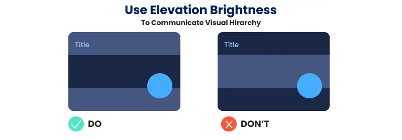
Adding depth to a light-themed website is simple by adding lighting effects or shadows. Comparatively, it's challenging to maintain a dark theme user interface. Still, there is scope for adding three to four levels of elevation in the text and letting things be visible clearly.
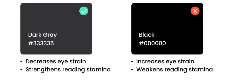
Get rid of the myth that dark theme UI is all about black. It does not always have to be. It cannot always be pure white text on a pure black background. Play safe by using the dark grey shade as your primary design component to catch the user's attention at first glance. Dark grey helps reduce eye strain, allows better screen focus and less contrasting effects, and can be used across various devices and applications. Moreover, it's simple to elevate the presence of dark grey color in the dark background.
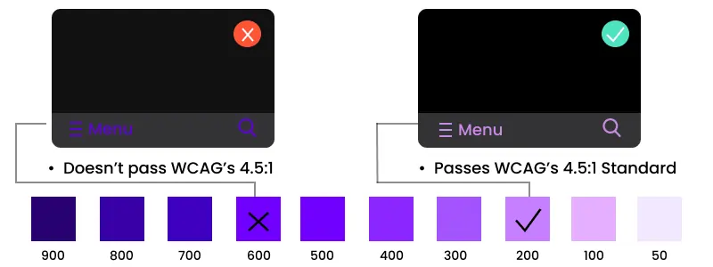
Saturated colors can look good on a lighter background, but offer a poor readability factor on a dark background. It is always advisable to use lighter tones for the text, which generally lies between the 200-50 range because of having a better readability factor.
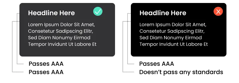
One of the considerations to follow when designing a dark-themed user interface is color accessibility. It implies that the text shade should be light enough on the dark background, which is clear to display. Use the contrasting level ratio of 15:8:1 between content and the website or app's background.
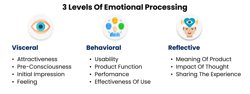
When designing your website or mobile application, a background theme can make or break the emotional connection between users and your platform. Indeed, users connect differently with the light-shade theme and the dark-themed user interface. Therefore, always try to choose colors to evoke certain emotions from users.
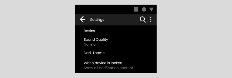
Do not use auto-enabled dark theme UI on the site. If you try this, you might control the users, leading to a bad user experience. Try to add the functionality of switching to dark mode at the user's discretion and allow them to choose the theme wisely.
Last but not least, after designing a dark theme user interface, text the UX level at your end to see the difference between light and dark. Consider testing your product before launching for users to experience in a real-time environment.
Here is the curated list of the five best dark design-themed websites with crucial design elements to consider for your platform.
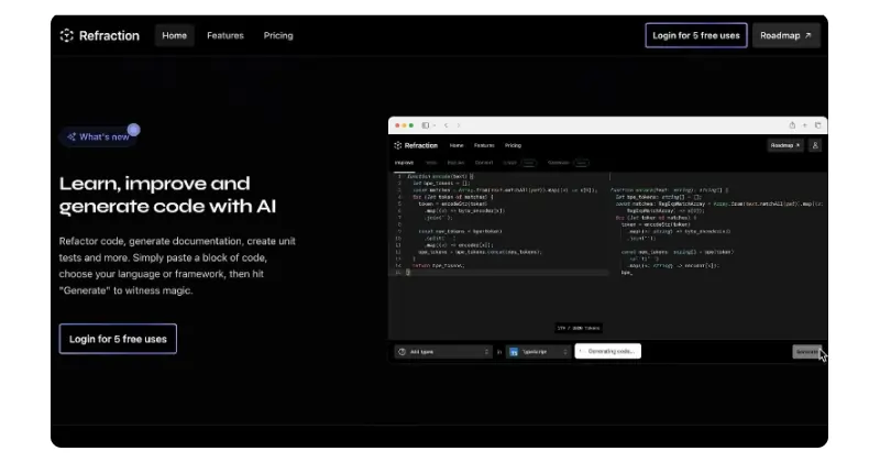
Refraction is an AI-based tool for technical professionals to generate code, create unit tests, and prepare documentation. The website is designed per the appealing dark theme UI standards with few key highlights.

One of the leading data integration and service agencies, Ventriloc designed its website with a dark theme. The background mix of brown and red shades ensures the text is easily readable.
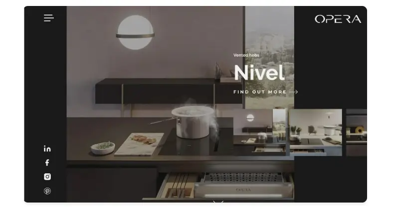
is A product-based brand offering premium quality kitchen equipment and hoods. The brand has intricately designed the website in a dark-shaded theme to clarify silver-shaded kitchen equipment.
1. What is the dark theme in UI?
A dark theme UI showcases the surface areas in the dark shade to users' eyes. It is designed to provide a contrasting effect to light mode and allows the users to switch to dark or night mode as required. Dark theme user interface reduces the illuminating effect on the screen and reduces eye strain.
2. How to make a website with a dark theme?
Specifically, you can create a dark-themed website with the help of a professional web design company and a team of creatively infused UI/UX designers. All they do is add elevation and design in such a way as to place light-shaded content in the foreground of the dark surface.
3. Is dark mode better for the eyes?
Yes, dark mode is better for your eyes by reducing the lighting strain. When users stick to a light-themed website, they tend to better focus on the screen. On the flip side, dark theme UI allows simple interaction with users without needing the eyes to work hard.
4. Why design dark mode?
Design your website or app in the dark mode to create a unique user experience and follow the rising trend. It further helps increase the retention rate and conversion factor.
5. Which color is better, light or dark?
It depends on your business requirements. Both themes have different user experience effects and are required to design your website.
This blog sheds light on the dark mode user interface for websites and mobile apps. It helps you understand the relevance of implementing dark themes on the website and witness a major difference in enhancing the user experience.
Adding a dark theme to a new or existing website is a profitable way to capture widespread attention and stay unique. So, to get started, stay in touch with website designing experts available at JanBask without going anywhere else.
Interested in our Web Design & Development Services?

Z
Dark-themed website design is getting immense popularity and acceptance these days. More users prefer to use a dark theme on the device to grab information for a long and that too without experiencing much strain.
E
Concerning smartphone and laptop addiction among users, implementing a dark theme UI is a beneficial way to protect their eyes. It is a more sophisticated and elegant website user experience.
K
I see the difference in increased web traffic after implementing dark UX patterns. Many users like to stay on the site for a long time and perform specific actions.
A
This blog highlights the trend of adding a dark mode user interface and its manifold benefits. To go with the trend, adding a dark theme is an essential way to stay ahead of the competition.
A
Great sort of information! I like adding a dark user interface to offer something different. It is certainly unique and ongoing these days.