Would you care to read a website’s message (shaped as – headings, slogans or texts) that is unclear to you — because either the font is too meager or the color splash is quite polluting to eyes? No right? Selecting the right type of typography in a website designing gig is always important. Because typography not only conveys a message, rather reflects a conviction behind that message.
So what is typography?
To simply put, typography is a visual style or type that we decide for a written text.
Whatever you read over hoardings, banners or on web pages, the text styled creatively is typography.
Choosing the right typography for any graphic gig is paramount. As it emotes feelings, brand story and sets up an atmosphere where the reader feels connected with those words composed by brands.
Must have seen the logos of brands like – Coca-Cola, Cadbury, Canon, Amazon. The typography these brands have shaped in their logos is quite explicit & lets users relate with it. The appeal of these logo texts is quite visually impactful as the font & color used are spot on.
But if the art of typography is not wisely decided, chances are, it may encourage to unreadability, loss of traction or confusion with that text.
How does typography matter in the website designs?
Typography has a deep digging impact on website designing grind. As it greatly adds to the user experience and highlights the brand identity.
Let’s roll over to understand how typography has a great influence on any web surface.
1. It defines the mood of the text
There are certain fonts that are quirky & fun to read, while there are some that look dead serious. If we use typography infused with serious fonts with achromatic colors like white, grey or black, don’t you feel the whole mood of the text would come out as “serious” or “attentive”?
When we see signs with words like “Emergency” at hospital gateway, we automatically infer that this word is intended to sound as serious. Because of the color red & certain typeface used that looks serious. But if we try to change the typography of the word “Emergency” to “script typography” with some peachy color, do you think its seriousness will remain intact?
- Similarly, if you plan a smarter selection of typeface within your website porch, you are better able to set the mood of your message.
So choose type or style wisely according to your brand notions!
2. Uplifts your branding
Typography splendidly adds to the branding funnel of any online business. As it teams up in your branding elements like logos, headlines or surplus marketing campaigns. A typeface with any splash of color can make or break the woven brand.
Thus, it’s intense to choose typeface in & around website logos that are best-fit as it will help in:
- Creating unique and selling experiences for users.
- Will distinguish the brand from prevailing contemporaries.
3. Makes people keep on reading
Good or well-planned fonts or typeface makes pace with the users reading capacity. Smooth and well-crafted typography goes a long way as it lets the user read the text is a more clear yet creative manner.
Though plain and simple fonts do inculcate the clarity of the text but it won’t bring out that creative side. So it’s best to get hands-on font style that’s more than simple and quite artsy to look at.
Thus, a well-conceptualized typeface is immense to let users not feel disconcerting with whatever text they are trying to read.
“All in all, the purpose of bonzer typography is to attract users towards the “message” and not to the font or typeface used to craft that message.”
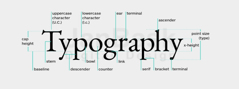
Key terminologies that revolve around typography
Though we have understood what is typography, there are certain terminologies related to this word which are confusing if not grasped right. They are utilized during the typological work of any website design. Let’s venture around those terms:
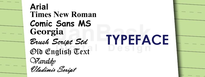
- Typeface
A typeface is a group of certain characters that are similar in design. Must have heard or even used these designs “Helvetica, Georgia, Arial” – they are some commonly used typeface.
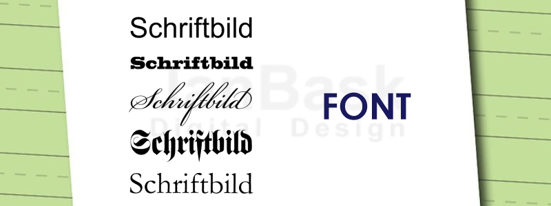
- Font
Many people believe that font & typeface are replaceable but that’s not the truth. In actuality, fonts are part of typefaces. Fonts rather define the size, width, weight and other styling elements (bold, italic or so) of a typeface.
For example – Arial is a typeface while Arial bold will be its font.
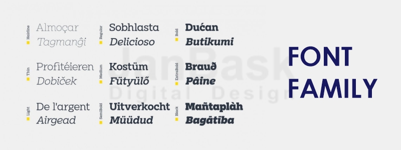
- Font family
A font family is an assembly of different types of fonts. If you will look at the “Montserrat font-family”, you will see all its characters have weight, style, width & more.
- Weight
While weight is the thickness to be carried within the character. Whether it should be thin, bold, normal, black or more – all depending upon the font.
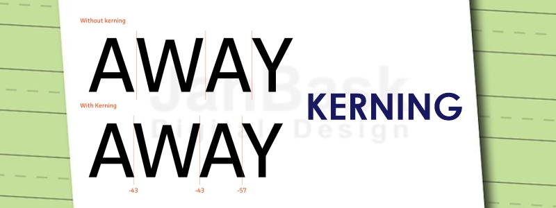
- Kerning
Kerning is a method of putting horizontal spacing between the two characters of the typeface. Based on the given font & word, one can easily do the manual spacing between the characters.
- Tracking
Tracking is used to do the letter spacing. It helps in maintaining spaces between the whole block of text than just between the alphabets of text.
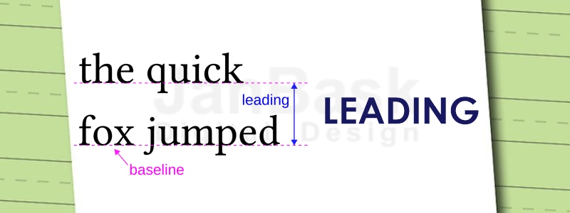
- Leading
Leading helps in creating a gap between letters and the line they are to be placed upon. If the correct space is not maintained, chances are users will find a difficult time reading it.
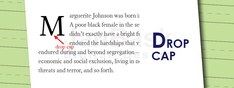
- Drop cap
A drop cap is a very interesting element that is used in the start section of any writing or copy. It is a large capital letter at the beginning of the text block. It usually takes the depth of the two or three lines in the copy.
Must have seen usually in the newspapers. Where the first alphabet of the text in a sentence is quite massive to see.
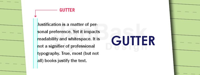
- Gutter
In typography, gutters are the vertical whitespaces/rules that help in separating the vertical blocks of the content.
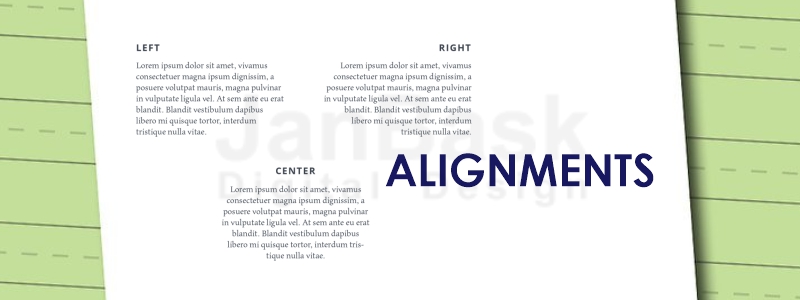
- Alignments
- Left-aligned – Here the block of text is aligned at the left margin and is ragged towards the right.
- Right-aligned – Here the block of text is aligned at the right margin and is ragged towards the left.
- Centered – Here the block of text is aligned neither on right margin nor or left margin. The text starts from the center. And has a distance from left & right margins.
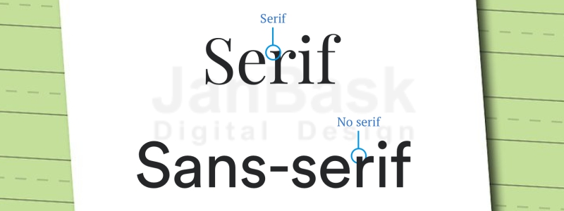
- Serif vs Sans Serif
- In Serif, there is a taper or decorative line, protruding out from the letter’s stem.
- While in Sans serif, such an extending line is absent.
Now you have clearly understood what is typography & its related terminologies, let’s venture you around elements to keep in mind while drafting typography.
3 Key elements behind composing a good typography
1. Alignment
Alignment makes the typeface look unified and composed.
As long as the font is of flush left, center or flush right alignment, the text will come out as readable & appealing. But if there is no uniformity in the alignment of the font, the text would inflict as hard to read.
2. Consistency
Any typographical work in designing gig requires consistency while adding typefaces, adjusting spaces between characters or formatting.
A typographical work that’s consistent will make the written piece read aloud, look more professional, and avoid readers from distracting.
3. Hierarchy
Planning a visual hierarchy of typographical work is important.
Planning a hierarchy of typeface throughout web pages will allow users to flow with it. They will be sure of what they need to expect during their course of reading.
For instance – If you read books, you will know that book name is often printed at the top in heavy font type & size, while the author’s name with a smaller font style & size is printed at the bottom.
Suppose if the author’s name is printed loud at the top of the book, while the book’s name is printed at the bottom of the cover – would you still read it with the same intensity? Maybe not!
Visual hierarchy helps in intentionally guiding the reader’s journey through the text.
Even if the typeface in typography is good but it’s messed up in terms of visual hierarchy, readers will find it abrupt & sweep away.
Thus, maintaining the hierarchy of font style is equally important as selecting the font style.
10 typefaces graphic designers can’t keep their hands off from using in their typographical work
1. Garamond
- Garamond typeface is bold, stylish & subtle that matches the needs of designing websites, books, magazines or other educational copies.
- This style is popular in the design industry and is constantly used in the websites to glorify its boldness and style.
2. Helvetica
- Helvetica typeface is loved among the designers as it’s simple, unique and has a bit tight display.
3. Trajan
- This typeface is believed symbolic to platforms that explain topics like – law, religion, marriage or society.
- So when the designs are required to cover such topics, this style is put in the designing gig.
4. Bodoni
- The Bodoni typeface is hyped highly in the fashion industry and is often cling inside creative logos, headlines, or decorative texts.
- The style helps the designers turn any art into a masterpiece. This style has a perfect combination of thick and thin strokes — that helps in making the words look aesthetically appealing and ravishing.
- The style is infused with geometrical touches that magnifies the charm of the written text.
5. Rockwell
- This typeface style is categorized under Serif slab and is derived from the geometric shapes.
- The style adds charm to any end product due to its small size or display designs.
All in all, this type is quite luxurious and keeps the quality of any text or information intact.
6. Caslon
- Caslon naturally fits right for designing the body content of any website.
- You will commonly find it in designing corporate typefaces, books, magazines, journals online.
7. Gotham
- This type of design has been designers favorite & is ruling the industry for 13 long years. All in all looks clean, modern & professional.
- The style is appealing as its design is broad with high height.
8. Frutiger
- This typeface is categorized as “humanist” because it’s been designed using the key terms like “readability” & “clarity” in focus.
- Designers adore this style as no matter if it’s written in a smaller font or viewed from a distance, it would still be readable.
- This style type is making a way in the crowd and is often infused in designing displays, signage or logo for 2.0 supported platforms.
9. Bickham script pro
- This type exemplifies any writing into master art. As its output is often creative & readable.
- It’s been used in designing visual or printables for formal occasions.
- The style has a cursive script that gives a powerful output at the end.
10. Futura
- The style is suitable for that typography where maximum impact in a limited space is required.
- The type fits perfectly well where the requirements are to design logos, slogans, typing books or creating corporate typefaces.
- The style is weaved on a geometric foundation and has touches of shapes layered in the text as – circle, triangle, square.
- Due to its clear and clean design, many designers prefer it while designing their creative gig.
Conclusion!
With the above, we have resolved users’ common query “what is typography?”, and keenly discussed some terminologies attached to it. While we also figured out how fonts, typography, and typeface are different from each other.
Followed by keep 3 elements that every typography should be woven around. And a strong list of 10 typefaces that website designers love and can’t resist to use them in their designing gig.
All in all, typography should emote emotions, feelings or ideas that any brand is trying to express. If any website’s typography is poorly designed, users won’t find it worth engaging.
Designing typography is a serious business. In a big way, it can influence the visitors on how to feel about a particular website. Alone it can make or break the moment for site users.
Need a website that breathes with right typographic elements? The web designing connoisseur at JanBask Digital Design has the right grasp on what works best in the eyes of the audience. Let’s form a synergy where we design your identity and you get amazing results.



Leave a Reply