


You're an entrepreneur with a groundbreaking idea, a passion for your product or service, and a vision for success. You've put in countless hours developing your website, creating compelling content, and crafting an online presence that truly represents your brand. But here's the critical question: Is your digital storefront optimized for mobile visitors?
In a world where smartphones have become an extension of ourselves, we need to pause and ask ourselves some essential questions: What opportunities are you missing by neglecting Mobile SEO? Are you aware of the impact of Mobile SEO on your online visibility? Is your website's mobile experience seamless and user-friendly? Have you implemented the right mobile SEO services? Check out this blog to get all the answers you have been looking for!

Unlock the Power of Mobile-Friendly SEO Today!
Mobile SEO, or Mobile Search Engine Optimization, refers to the practice of optimizing a website specifically for mobile devices such as smartphones and tablets. It is a subset of traditional SEO (Search Engine Optimization) that focuses on ensuring a website's content, design, and performance are tailored to provide the best possible user experience on mobile devices.
In recent years, mobile devices have taken over as the primary means of accessing the internet. According to the latest data, mobile devices account for the majority of web traffic. In 2021, mobile devices were responsible for over 55% of global internet traffic, surpassing desktop usage. This trend is expected to continue, making it crucial for businesses to cater to mobile users effectively.
Furthermore, research indicates that mobile users are more inclined to engage with search engines. A significant portion of internet searches, whether it's for information, products, or services, originates from mobile devices. Google, the leading search engine, has recognized this shift and adjusted its algorithms accordingly to prioritize mobile-friendly websites.
Google, being the dominant search engine, places significant emphasis on user experience. To reflect the increasing importance of mobile, Google implemented mobile-first indexing in 2019. This means that Google predominantly uses the mobile version of a website's content for ranking and indexing. Websites that are not mobile-friendly risk losing visibility in search results, which can have a detrimental impact on their online presence.
Google's commitment to mobile optimization is further emphasized by its Page Experience update, which assesses elements like loading speed, mobile-friendliness, and interactivity. Websites that meet these criteria are more likely to rank higher in search results. To stay competitive in the online space, businesses must prioritize Mobile SEO to align with Google's preferences.
Voice search is a rapidly growing trend, thanks to the proliferation of virtual assistants like Siri, Google Assistant, and Alexa. Mobile devices are the primary conduits for voice search queries. As of 2023, over 27% of the global online population was using voice search on mobile. This percentage is expected to continue its upward trajectory, making it essential for businesses to optimize their content for voice search.

Mobile SEO plays a pivotal role in ensuring your website is voice-search-friendly. Structured data, featured snippets, and natural language optimization are some of the Mobile SEO techniques that can enhance your website's visibility in voice search results. Ignoring this aspect could result in missed opportunities to connect with users who prefer voice search.
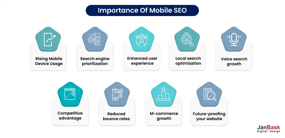
Search Engine Prioritization: Search engines like Google have prioritized mobile-friendly websites in their ranking algorithms. Google uses mobile-first indexing, which means it primarily uses the mobile version of a site to determine its ranking in search results. If your site isn't optimized for mobile, it may suffer in search engine rankings.
User Experience: Mobile users have unique needs and expectations. They want fast-loading, responsive websites that provide a seamless browsing experience. Mobile SEO focuses on delivering a positive user experience, which can lead to higher user engagement, longer on-page time, and increased conversions.
Local Search: Many mobile searches are location-based, with users seeking nearby businesses or services. Optimizing for local search is a critical aspect of mobile SEO. If your website isn't mobile-friendly and doesn't rank well in local search results, you may lose potential customers to competitors who are more mobile-savvy.
Voice Search: The growth of voice-activated assistants like Siri, Google Assistant, and Alexa has led to an increase in voice searches. These searches often have distinct patterns and keywords compared to text-based searches. Mobile SEO includes optimizing for voice search, which can help you capture this expanding market.
Let's align Mobile SEO tips and best practices with the AIDA model, which stands for Attention, Interest, Desire, and Action. This framework helps guide users through the stages of making a decision or taking an action on your website.
Attention (A):
Interest (I):
Desire (D):
Action (A):
By aligning your Mobile SEO efforts with the AIDA model, you can guide users through a well-defined journey that leads to desired actions on your mobile website. This approach helps you capture and retain the attention of mobile users, spark their interest, create the desire for your offerings, and ultimately drive them to take action.
Site speed is a critical factor for mobile SEO. Mobile users often have limited patience, and if your site takes too long to load, they are more likely to bounce and visit a faster-loading competitor's website. Google also considers page speed as a ranking factor in its search algorithm.
You should focus on compressing images and videos without compromising quality. Use next-gen image formats like WebP and lazy loading techniques to load media content only when it's visible on the screen. Configure your server to instruct browsers to cache static resources, reducing the need to download them on subsequent visits.
Reducing the number of requests needed to load a page can significantly improve page load times. Combine CSS and JavaScript files and eliminate unnecessary scripts. Use a CDN to distribute your content across multiple servers worldwide. This reduces latency and speeds up content delivery to users in different geographic locations. Optimize your server infrastructure, use efficient code, and leverage server-side caching to ensure quick responses to user requests.
Design your website for mobile-first to ensure that it loads efficiently on smaller screens and slower connections. Regularly test your site's load time using tools like Google PageSpeed Insights or GTmetrix. Monitor performance and address any issues promptly.
Responsive design is essential for providing a seamless user experience across various devices, including mobile. It ensures that your website adapts to different screen sizes and orientations. Here's how to effectively integrate responsive design into your mobile SEO strategy.
Use fluid grids in your design to create layouts that can adapt to different screen widths. This prevents content from getting cut off or distorted on smaller screens. Make sure images and media elements are flexible and can scale down to fit smaller screens without losing quality or breaking the layout. Use CSS media queries to apply different styles and layouts based on screen size. This allows you to tailor the user experience for mobile devices.
Create a mobile-friendly navigation menu that is easy to use on touchscreens. Consider using a hamburger menu or other mobile navigation patterns. Don't rely solely on emulators. Test your website on real mobile devices to ensure that it functions as expected and looks good on different screens. Also, ensure that responsive design doesn't compromise page speed. Optimize your responsive code to maintain fast load times on mobile devices.
The user experience (UX) is paramount in mobile SEO, as search engines aim to deliver the most relevant and user-friendly results to mobile users. Here are some key strategies to enhance the mobile user experience.
Ensure your website is designed with mobile users in mind. Use responsive design principles to adapt your site's layout and content to various screen sizes and orientations. A mobile-friendly design helps users navigate your site effortlessly and find the information they need. As with desktop SEO, mobile page speed is crucial. Optimize your website to load quickly on mobile devices. Compress images, minimize code, and leverage browser caching to reduce load times. A faster site not only pleases users but also gets a boost in search rankings.
Use legible fonts and maintain a reasonable font size for mobile screens. Ensure that links and buttons are large enough and spaced adequately for easy tapping without accidental clicks. Implement structured data markup (Schema.org) to provide search engines with additional context about your content. This can enhance the visibility of your site in mobile search results, especially in rich snippets or featured snippets.
Create concise, scannable content that's easy to digest on smaller screens. Use subheadings, bullet points, and short paragraphs to improve readability. Mobile users tend to consume content in bite-sized chunks. If your site includes forms or interactive elements, ensure they are mobile-friendly. Keep forms short and use input elements optimized for touchscreens. Autofill and input validation can enhance the user experience.
While pop-ups can be effective for capturing leads or promoting offers, they must be used judiciously on mobile devices to avoid disrupting the user experience and potentially harming your SEO efforts. Google penalizes websites that use intrusive pop-ups that cover the main content or appear immediately after a page loads. These can frustrate users and lead to higher bounce rates.
If you must use pop-ups, consider delaying them until the user has engaged with your content or reached a certain point on the page. This ensures that pop-ups are less disruptive and more relevant to the user's context.
Pop-ups should be responsive and easy to close on mobile devices. Users should be able to dismiss them easily without difficulty, ensuring a positive user experience. Ensure that the content or offer in the pop-up is genuinely valuable to the user. This can help mitigate any negative impact on user satisfaction. Regularly monitor user behavior and feedback to determine the impact of pop-ups on your mobile site. A/B testing can help you optimize the timing and content of pop-ups for better user engagement.
Local SEO is instrumental for businesses with physical locations or those targeting a local customer base. It helps you appear prominently in local search results when users are looking for products or services nearby. Here's how to optimize for local search on mobile.
Claim and optimize your Google My Business listing. Ensure that your business name, address, phone number (NAP), and hours of operation are accurate and consistent across all online platforms. Incorporate location-specific keywords naturally into your content, meta descriptions, and title tags. This helps search engines understand the geographic relevance of your content.
Ensure your website is mobile-responsive, as Google prioritizes mobile-friendly sites in mobile search results. A responsive design ensures that users on various devices have a positive experience. Implement local structured data markup (Schema.org) on your site to provide search engines with clear information about your location, products, and services.
Encourage satisfied customers to leave positive reviews on platforms like Google, Yelp, and TripAdvisor. Positive reviews can improve your local search rankings and attract more local customers. Ensure your business information (NAP) is consistent across all online directories, review sites, and social media profiles. Inconsistent information can confuse search engines and users. Also, make sure your website integrates smoothly with mobile mapping apps like Google Maps. Include a "Get Directions" button on your site to help users find your physical location easily.
Navigation is a critical aspect of the user experience, and it plays a significant role in mobile SEO. A clean, user-friendly navigation bar ensures that visitors can quickly find the information they need. Keep your mobile navigation menu concise. Prioritize the most important pages and content, and avoid overcrowding the menu with too many options. Use clear and descriptive labels for menu items. Avoid jargon or ambiguous terms that may confuse users.
Consider using a hamburger menu (three horizontal lines) for your mobile navigation. It's a common and recognizable mobile navigation pattern that saves screen space. Ensure that your navigation is accessible to all users, including those with disabilities. Use semantic HTML, provide alt text for images, and ensure keyboard navigation is smooth. Place your navigation bar in a consistent location, typically at the top or bottom of the screen, so users know where to find it on different pages.
Include a search bar within your mobile navigation to allow users to quickly search for specific content or products. Regularly test your navigation on various mobile devices and screen sizes. Gather user feedback to identify and address any usability issues.
Title tags and meta descriptions play a significant role in SEO, including mobile SEO. They serve as the first impression for search engine users and can significantly impact click-through rates and rankings. Keep your title tags concise, ideally under 60 characters, and meta descriptions under 155 characters. This ensures that they display properly on mobile search results pages without being truncated. Include relevant keywords in your title tags and meta descriptions naturally. Place the most important keywords near the beginning to capture user attention quickly.
Ensure that each page on your mobile site has a unique title tag and meta description that accurately reflects the content of that page. Avoid duplicate content issues.
Engaging and Informative: Craft compelling and informative titles and descriptions that entice users to click. Use action-oriented language and highlight the value of your content or products. Consider using mobile-specific language or phrases if they are relevant to your content. For example, "On-the-Go Tips" or "Mobile-Friendly Solutions" can resonate with mobile users.
If your business has a local presence, incorporate location-based keywords in your title tags and meta descriptions to attract nearby mobile users. Regularly review and update your title tags and meta descriptions based on performance data and evolving SEO trends. A/B testing can help you refine your messaging.
One approach to mobile optimization is creating a separate mobile URL, often denoted with an "m." prefix (e.g., m.example.com). This method involves maintaining two versions of your website, one for desktop and one for mobile. Ensure that your mobile version of the site offers a streamlined, user-friendly experience with content optimized for smaller screens and touch interfaces. Implement mobile-specific SEO techniques, such as optimizing for mobile keywords, improving site speed, and prioritizing user experience.
Use canonical tags to indicate the relationship between your desktop and mobile pages. This helps search engines understand which version to prioritize in search results. While a separate mobile URL can be effective, many businesses today opt for responsive web design, where a single website adapts to different screen sizes and devices. Responsive design simplifies maintenance and reduces the risk of SEO issues related to duplicate content.
Implement user agent detection to automatically redirect mobile users to the mobile version of your site. Ensure that the redirection is seamless and user-friendly. Managing two separate versions of your website can be more complex and time-consuming. Ensure both versions receive regular updates and security patches.
Mobile-friendly content is crucial for engaging and retaining mobile users. It not only improves the user experience but also aligns with search engine algorithms that favor mobile-responsive websites. Here are key considerations for mobile-friendly content.
When creating content, adopt a mobile-first mindset. Think about how it will appear and function on smaller screens with touch interfaces. Ensure that fonts are legible, images are appropriately sized, and navigation is intuitive. Mobile users tend to skim rather than read long blocks of text. Use shorter paragraphs, bullet points, and subheadings to break up content and make it easier to consume.
Incorporate visuals like images, videos, and infographics to enhance your content. Ensure that media elements are responsive and load quickly on mobile devices. Optimize your content and media assets to load quickly on mobile devices. Compress images, minify code, and enable browser caching to reduce load times. Include clear and easily clickable CTAs within your content. Ensure that they are large enough and well-spaced for users to tap without difficulty.
If your content includes forms or interactive elements, make sure they are mobile-friendly. Use input fields optimized for touchscreen use and minimize the number of required fields. If your content includes tables, ensure they are responsive and can be viewed and interacted with on small screens without horizontal scrolling.
Also, encourage user-generated content like comments, reviews, and social media shares. Engaging mobile users can improve your site's mobile SEO and social signals. Conduct keyword research specifically for mobile users. Consider mobile search intent and incorporate relevant keywords into your content.
Structured data, often implemented using Schema.org markup, provides search engines with valuable information about the content and structure of your website. Implementing structured data on your mobile site can enhance your visibility in mobile search results and help search engines display rich snippets. Incorporate structured data that is relevant to mobile users. For example, use markup for mobile apps development, mobile breadcrumbs, and click-to-call buttons.
If your business has a physical presence, use structured data to provide detailed information about your location, opening hours, reviews, and contact details. This is essential for local SEO and attracting mobile users seeking nearby businesses. If you sell products online, use structured data to highlight product details, prices, availability, and customer reviews. This can enhance your visibility in mobile shopping-related searches. If you publish articles or blog posts, use structured data to mark up the content, including headline, author, publication date, and featured images. This can lead to improved presentation in mobile search results. If your website promotes events, use structured data to provide event details such as dates, times, locations, and ticket information. This helps mobile users find and engage with your events.
After implementing structured data, use Google's Structured Data Testing Tool (or a similar tool) to validate your markup and ensure it is error-free. Implementing structured data not only improves your site's appearance in mobile search results but also increases the likelihood of being featured in rich snippets, knowledge panels, and other mobile-specific search features.
Voice search is on the rise, thanks to the proliferation of voice-activated virtual assistants like Siri, Google Assistant, and Alexa. Optimizing your mobile site for voice search is a smart move to capture this growing audience.
Voice searches are often more conversational and natural in tone. Optimize your content for long-tail keywords and phrases that people are likely to speak when using voice search. Focus on questions and queries that start with "who," "what," "where," "when," "why," and "how." Many voice searches have a local intent, such as "near me" queries. Ensure your site is optimized for local SEO and includes location-specific keywords. Claim and optimize your Google My Business listing to enhance your local visibility in voice searches.
Aim to have your content featured in Google's featured snippets, as they often get pulled as voice search answers. Structure your content in a way that answers common questions concisely and informative. Since voice searches are predominantly performed on mobile devices, ensure your content is mobile-friendly and loads quickly. Mobile optimization is essential for providing a seamless voice search experience.
Understand the intent behind voice search queries. Users often seek quick, direct answers. Your content should be structured to provide concise and valuable information that directly addresses user queries. Regularly test your site with voice search queries to see how it performs. This can help you identify opportunities for improvement and fine-tune your content.
Analyzing and comparing the performance of your desktop and mobile sites is crucial for ensuring a consistent and optimal user experience across all devices. Assess the page speed of your desktop and mobile sites using tools like Google PageSpeed Insights. Identify areas where mobile performance can be improved, such as image compression, code minification, and server response time.
Use Google's Mobile-Friendly Test to check if your site meets mobile usability standards. Address any issues related to mobile-friendliness, including responsive design, touch-friendly buttons, and viewport settings. Ensure that your mobile site offers the same content as the desktop version. Avoid hiding or omitting important information on mobile to maintain content parity and avoid duplicate content issues. Implement structured data consistently across both versions of your site. This helps search engines understand and rank your content correctly in both desktop and mobile search results. Conduct user experience testing on both desktop and mobile devices to identify any usability issues specific to each platform. Gather feedback and make necessary improvements.
Monitor how your site appears in mobile search engine results pages (SERPs). Ensure that title tags and meta descriptions are optimized for mobile, and featured snippets are displayed correctly. Track mobile-specific performance metrics such as bounce rate, mobile traffic, conversion rate, and mobile search rankings. Use this data to inform your optimization efforts.
Google's Mobile-First Index is a fundamental shift in the way Google indexes and ranks websites in its search results. Traditionally, Google's indexing and ranking system primarily used the desktop version of a website's content to determine its relevance and position in search results. However, as the usage of mobile devices has surged, Google recognized the need to prioritize mobile-friendly content and user experiences.
The Mobile-First Index, introduced by Google, means that Google predominantly uses the mobile version of a website's content for indexing and ranking, regardless of whether a user is searching on a desktop or a mobile device. In other words, the mobile version of your website becomes the starting point for how Google evaluates its relevance to search queries.
Here's how the Mobile-First Index works:
Ensuring your website is optimized for mobile is crucial for delivering a seamless user experience and maintaining a solid online presence. One effective way to check your site's mobile-friendliness is using Google's Mobile-Friendly Test. Here's a concise guide with steps to help you get started:

Once the analysis is complete, you'll receive a detailed report indicating whether your webpage is mobile-friendly or not. If your site is mobile-friendly, you'll see a green message that confirms it. If there are issues, you'll receive suggestions and areas that need improvement.
To provide inspiration for potential adjustments to your mobile website design, here is a compilation of companies that have effectively mastered their mobile web experiences.
Typeform streamlines its mobile website to enhance loading times and deliver a more straightforward user experience.
Hailing from Barcelona, Typeform is a tech company with a clear mission: to elevate the quality of forms. Their desktop website boasts an elegant design, welcoming visitors with concise text, pertinent animations, and other intricate design elements.

However, Typeform acknowledged that these intricate designs could significantly impact page load times and create other challenges when catering to mobile users. Consequently, they removed many such elements, decluttering the site and simplifying the overall mobile encounter. The result is a more straightforward iteration of the desktop website, maintaining its aesthetic appeal. Notably, the menu page features generously sized buttons, ideal for easy tapping on mobile screens.
Etsy's mobile site efficiently highlights its pivotal features — site search, item categories, and trending products — directly on the homepage, all while avoiding visual clutter. Etsy, an e-commerce platform for buying and selling vintage or handmade items, has a diverse audience with two main objectives: specific item searches or category-based item browsing.

From the outset, the mobile website caters to both types of users. Upon landing on their mobile site, visitors can search for specific items, explore various shops, or navigate through different categories.
BuzzFeed optimizes its mobile website design and development to effectively cater to its audience's interests. Renowned for its viral content and engaging quizzes, BuzzFeed has become a favorite source of entertainment during commutes. And where do many access BuzzFeed during these commutes? You guessed it: their phones. Recognizing that a substantial portion of its users access the site on mobile devices, BuzzFeed has meticulously crafted a seamless experience for those on the move.

Upon entering BuzzFeed's mobile site, users are greeted with a simple, collage-like arrangement of their most popular content, featuring large images that are easy to tap for effortless browsing.
Despite its extensive offerings, SAP efficiently streamlines its mobile website by simplifying its CTAs (calls-to-action) and menus.

SAP, a global enterprise software company specializing in business operations and customer relations, strategically enhances its mobile experience. By consolidating information and employing sliders for CTAs, SAP ensures that mobile visitors can access crucial functions without overwhelming them. This approach maintains usability without compromising the user experience, even with the considerable scope of their offerings.
Searching for the best SEO company? Look no further! Our proven track record and client satisfaction make us a top choice for all your SEO needs.
1. Why is Mobile SEO important?
Mobile SEO is crucial because most internet users access websites through mobile devices. It impacts search rankings, user experience, and overall online visibility.
2. Is responsive design enough for Mobile SEO?
Responsive design is essential, but mobile search engine optimization involves more, such as optimizing page speed, content, and navigation for mobile users.
3. How does Mobile Marketing SEO affect local businesses?
Search engine optimization mobile marketing SEO helps local businesses appear in local search results, driving foot traffic and conversions from nearby customers.
4. Do I need separate content for mobile and desktop?
Content parity is crucial, but the content presentation may differ. Mobile content should be concise, readable, and relevant for on-the-go users.
5. Is voice search essential for Mobile SEO?
Yes, voice search is growing rapidly. Optimizing for voice queries with natural language content and structured data can give you an edge.
Navigating the dynamic world of Mobile SEO has never been more crucial, and armed with the insights from this guide, you're well on your way to ensuring a mobile-friendly online presence that shines in today's digital landscape.
As you embark on your Mobile SEO journey, consider the invaluable assistance offered by JanBask's expertise. JanBask is here to support you every step of the way. Our innovative strategies and knowledge empower businesses and individuals to excel in the mobile-centric realm. With JanBask as an SEO company by your side, you're not just optimizing for mobile-friendly SEO; you're setting the stage for a digital presence that thrives on the screens of mobile users worldwide.
Interested in our Mobile Friendly SEO Services?


A Specialized Team for custom web solutions for your business through Web Design, Web Development, Digital Marketing Services such as SEO, Social Media Marketing.


K
Wow, this guide opened my eyes to the mobile search engine optimization world! The tips on responsive design and optimizing page speed are pure gold. Can’t wait to implement these strategies and boost my website’s mobile performance.
R
As someone who is always on the move, Mobile SEO has become my new best friend. These insights on local SEO and voice search optimization are game-changers. Now I can stay connected with my audience wherever I roam.
K
Thank you for demystifying SEO for mobile phones! I was worried about my local bakery’s online presence, but now I see the power of mobile optimization. The FAQs section answered some of my burning questions too.
A
I’m in awe of how comprehensive this guide is! The section on mobile-friendly content has given me a fresh perspective on crafting engaging articles that resonate with mobile readers. Kudos!
G
SEO for mobile devices is the future, and this guide is an absolute treasure trove. The tips on structured data and rich snippets are brilliant additions. I’ve bookmarked this for my ongoing SEO efforts.
E
Wow, this guide opened my eyes to the mobile search engine optimization world! The tips on responsive design and optimizing page speed are pure gold. Can’t wait to implement these strategies and boost my website’s mobile performance.
K
As someone who is always on the move, Mobile SEO has become my new best friend. These insights on local SEO and voice search optimization are game-changers. Now I can stay connected with my audience wherever I roam.
A
Thank you for demystifying SEO for mobile phones! I was worried about my local bakery’s online presence, but now I see the power of mobile optimization. The FAQs section answered some of my burning questions too.
A
I’m in awe of how comprehensive this guide is! The section on mobile-friendly content has given me a fresh perspective on crafting engaging articles that resonate with mobile readers. Kudos!
K
SEO for mobile devices is the future, and this guide is an absolute treasure trove. The tips on structured data and rich snippets are brilliant additions. I’ve bookmarked this for my ongoing SEO efforts.