


These days, almost every new client wants a responsive web design for their website. After all, one design for Samsung, another for the iPhone, iPad, netbook, and Kindle — and all screen resolutions must be compatible.
We're quickly approaching a point in Web design and development where we can't keep up with the never-ending new resolutions and devices. Creating a website version for each resolution and new device is impractical and impossible. Should we simply accept the consequences of losing visitors from one device to gain visitors from another? Is there another choice?
Yes, The answer to this problem is - “Responsive Design.”
And a responsive website design company can help you provide the smoothest gliding experience to your visitors together with fluid graphics and images.
Responsive web design allows people to access content across various device resolutions. Users now expect websites to be responsive as more people interact with them via mobile devices. As we move forward, let's take a closer look at the key components of responsive design. In later stages we’ll discuss benefits of responsive website design.

Looking to Create Responsive Web Design ?
When mobile devices gained access to actual web pages, users had to put extra effort into navigating through webpages, panning, zooming, and scrolling the pages designed for larger screens. Users were required to pan, zoom, and scroll. They had to wait extremely long for webpages to load whenever they did anything. Worse, the users would accidentally press the wrong button, forcing them to return to the previous page and try again. At that time, mobile web browsing was not always worth the effort. Carrying a laptop everywhere, on the other hand, was not worth the effort either. So users faced a lot of difficulties while browsing at inconvenient times. Overall, the advantages of responsive web design include enhanced user experience, enhanced usability, faster page loading, enhanced brand awareness, and reduced user frustration.
Responsive website design has become increasingly important due to the rise in mobile browsing. By utilizing responsive design, websites can adapt to any screen size, providing users with a seamless and consistent experience across all devices. One of the major benefits of responsive design is its positive impact on search engine optimization (SEO) and conversion rates. According to Google, one of the best SEO benefits for business websites with responsive design is that, it provides a higher chance of ranking in search results. Additionally, the responsive design reduces maintenance costs and ensures website content remains up-to-date and relevant on all devices.
Let’s explore some of the best benefits of responsive design:
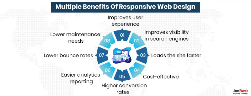
Google is primarily concerned with keeping users satisfied by displaying the content that they are most interested in. Create a user-centered experience, and Google will most likely reward you with higher rankings in search results.
Responsive web design is critical for providing a positive user experience. Users who are satisfied are more likely to become subscribers, leads, and paying customers. One of many ways to ensure users have a positive experience on your site is to have a responsive website.
Google never discloses the secret to remaining at the top of the Search Engine Results Page (SERP) listing.
One thing is certain: Google strongly recommends to have a responsive website because it has openly stated that an unadaptable design negatively impacts their mobile search experience and that websites who do not offer responsiveness will be penalised.
Page speed is another factor that has a significant impact on your SEO and, as a result, your search rankings. The speed with which your website loads can make or break a user's experience. It's no surprise that your website should be optimized to load quickly and smoothly, in order to improve website performance and one of the best benefits of a responsive websites is that, they load faster on both mobile and desktop devices. Improve your website's page speed to increase traffic and conversions.
Cost-effectiveness is one of the major advantages of responsive web design. A single responsive website takes much less time to create a standalone mobile application than a regular desktop website. Because time is money, responsive design naturally costs less than the alternative.
Even if the initial investment in a responsively designed website is more expensive than creating two separate websites, you will save money in the long run due to the maintenance costs, special configuration costs, and so on of a website that uses two separate versions.
Lowering your bounce rate down is only half the battle. Converting new customers requires a consistent user experience design across all devices. Users want to avoid being redirected to device-specific websites when deciding whether or not to subscribe to a service because the process often takes longer.
Having a single secure website that looks professional on all platforms reduces the likelihood of users becoming frustrated and switching to a competitor.
To make informed improvements, you must first understand where your traffic is coming from and how users interact with your website. Managing multiple versions of a website necessitates tracking users' journeys through various conversion paths, funnels, and redirects.
Therefore, another important responsive website advantages is greatly simplifying the monitoring process. Google Analytics and similar website visitor tracking softwares now cater to responsive designs by condensing, tracking, and analytics into a single report, allowing you to see how your content performs across multiple devices.
A mobile site that is responsive and optimised provides a much better user experience for the visitor. As a result, they are much more likely to stay for a longer period of time and explore different areas of your site.
Alternatively, if your site is not responsive, it is much more difficult to keep the visitor engaged and, as a result, they are more likely to bounce.
Keeping a separate mobile site necessitates additional testing and support. In contrast, the responsive design process employs standardized testing methodologies to ensure optimal layout on all screens. Separating desktop and mobile sites necessitates two content strategies, two administrative interfaces, and possibly two design teams.
The "one size fits all" responsive design approach means fewer headaches for developers, business owners, and consumers. Spending less time on maintenance also allows you to devote more time to more critical tasks such as digital marketing and content creation.
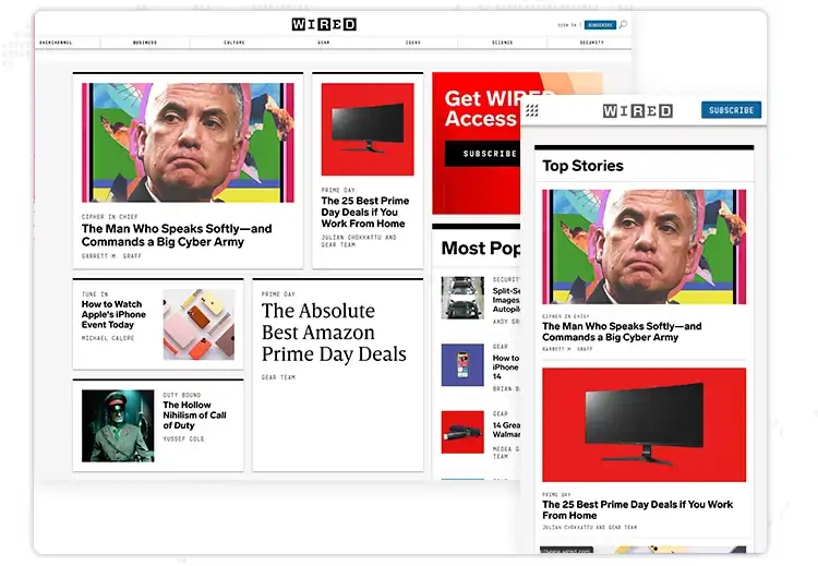
Wired prioritizes content across all platforms, ensuring that users can quickly access the information and articles they seek.
An excellent example of the best responsive website would be comparing the mobile version to the desktop and tablet versions. The former is drastically simplified not to overwhelm the user and takes advantage of the limited space to present the "Top Stories" first.
When it comes to business and conversion goals, GitHub demonstrates what is important to show the user. For example, one of the first things you notice when you land on their desktop and tablet versions is a description of what GitHub offers.
Even though there is another signup call to action examples on the menu bar, there is a form beside the description where the user can sign up to GitHub. This gives the user plenty of time to complete the action even if they are slightly distracted by the extra content and elements on display at higher resolutions.

The signup form, however, is removed when the page is scaled down to mobile resolution. The signup button is visible on the top bar next to the hamburger menu icon which wraps up all different menu options to make the look more compact and neat. Here’s an comprehensive guide on how to design sign up form that helps in increasing leads conversions.
We can see two groups of options on the Shopify menu bar. They group the main menu options to the left, which revolve around Shopify's basic operation and navigation. To the right is another group that has less to do with site navigation and functionality, such as logging in, signing up for a free trial, and learning about pricing.
However, at tablet and mobile resolutions, these options are hidden behind a hamburger menu icon to declutter the screen. The fact that they still managed to highlight that the menu options form two distinct cognitive groups by separating them with a dividing line is intriguing.
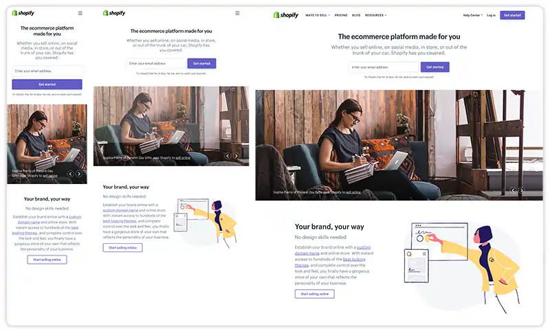
Surprisingly, they also add a third group of navigation options at the bottom, in case consumers are less likely to scroll down to see them on a mobile device.
SmartPhone View
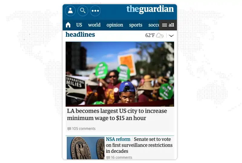
The smartphone display is cohesive and appealing, with all of the necessary elements presented in a clear web design principles and visual hierarchy.
In the smartphone edition, no space is wasted and even the whitespace opposite the headlines contains the weather information giving extra value to mobile users.
The Desktop View
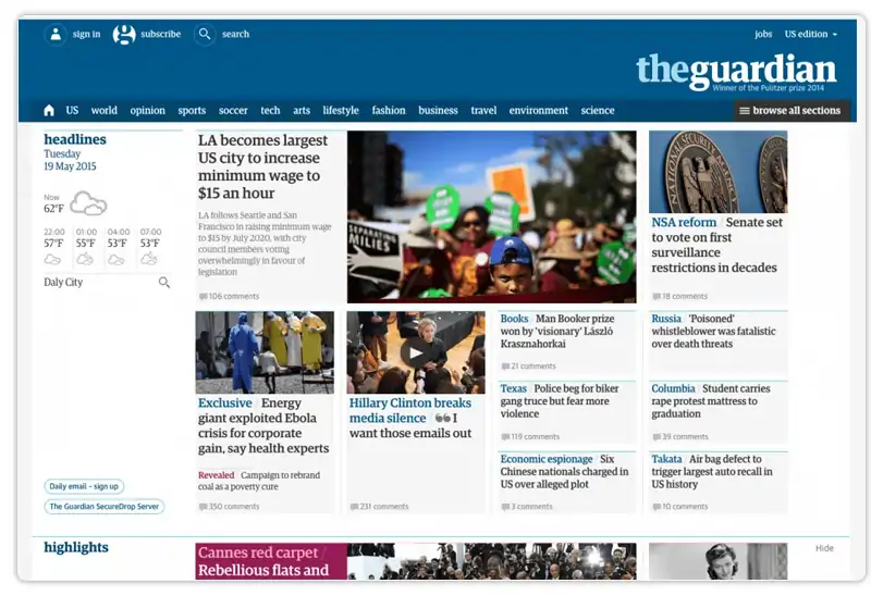
The desktop view exposes the Guardian's genuine mastery of its website. The site is consistent across all three screen sizes, providing readers with a similar user experience regardless of device. You can see top notch UX design ideas.
Each version is scroll-based, employs the same card components, and features comparable header navigation and branding. The only real distinction is the number of stories per screen size.
With a fully responsive design, Smashing Magazine does well following its advice on building better mobile experiences.
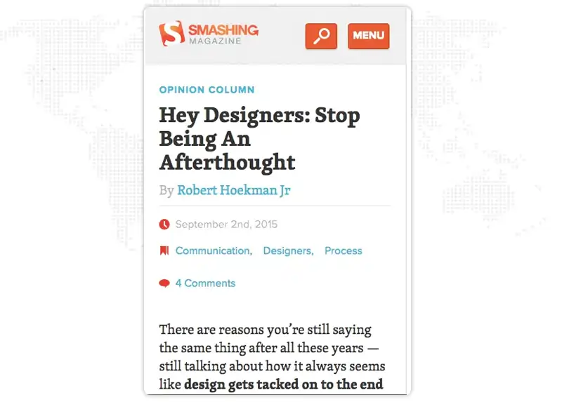
Desktop Version

The desktop view of Smashing magazine is similar to the tablet view, just the major navigation and content categories have moved to the left.
The material is one thing that remains consistent across all devices. Smashing Magazine, as a top blog, wants its content to be the hero, no matter what device the visitor is using.
Overwhelmed?
Here are the best practices and considerations for responsive design!
Responsive web design is crucial for modern businesses, as over half of website traffic comes from mobile devices. There are numerous responsive website advantages, few of them are: to ensure a positive user experience, following best practices such as using a mobile-first approach, optimizing images and videos for faster loading times, and implementing a flexible grid layout. Additionally, incorporating accessibility features and regularly testing and refining the website design can impact engagement and conversions.
Flexibility is essential for a best responsive web design, Layouts, pictures, text blocks, and components must all be responsive.
Responsive pictures, including sizing and cropping, are vital for mobile-friendly design. Certain photos may need to be cropped to keep their effect on smaller displays. Creating square copies of landscape photographs for mobile devices, for example.
Mozilla offers a good post on responsive photos, which includes design and development issues.
Use lightning SVGs instead of raster graphics, especially for icons and logos. SVGs, unlike raster graphics, change their resolution depending on image pathways rather than pixels. Thus they remain consistent at any size.
Each web page should have at least three different breakpoints (mobile, tablet, and desktop). As previously stated, five breakpoints are recommended for optimum device versatility. In rare cases, designers may be required to examine how websites run on iOS versus Android devices.
Card UI patterns serve as content containers that are easy to move around, saving you a significant amount of time. You may use UXPin's Auto Layout to scale, fit, and fill designs to make cards and other components more responsive. The auto-layout in UXPin is based on flexbox principles, making it simple for developers to copy/paste CSS during design handoffs.
Here are three reasons why minimalism is such an important best practise for responsive web design.
Starting with the smallest screen size and scaling to the greatest viewport is what mobile-first design entails. Designers who begin with the largest screen are frequently forced to eliminate aspects or make compromises as they go down.
With limited space on smaller screen sizes, designers must determine which content should always be visible and which can be hidden. On mobile devices, the most popular example is employing a navigational drawer for primary navigation.
Progressive disclosure can also be used by designers to hide non-critical content and information for a cleaner, more minimalist user interface across all devices and screen sizes.
Most eCommerce websites, for example, hide size guidelines using modals, tabs, or accordions to limit visible content and produce cleaner layouts. These guides are still available to shoppers by clicking a link.
According to Fitts' Law, buttons with large clickable regions facilitate user involvement. Designers must also leave enough space between links and buttons so that consumers do not mistakenly click the wrong one--a painful experience!
Researching competitors and industry leaders offers numerous benefits of responsive website design. Consider how prominent worldwide brands like Nike, Asos, H&M, and others design their storefronts if you build an eCommerce website. Use their R&D to your advantage as these companies spend millions of dollars researching and testing best practices.
1. Can responsive web design slow down website loading time?
Yes, responsive web design can impact website loading speed. Because flexible websites must adapt and modify their layout according to the device, additional CSS and JavaScript code is required to manage these changes. This extra code might increase file size and slow page loading times. However, the impact on loading time may be reduced using code compression and optimizing graphics and resources.
2. Is it possible to apply responsive web design to an existing website?
Yes, adding responsive design to an existing website is achievable. However, the present site's structure and coding determine the difficulty and viability. In certain circumstances, it may be more feasible to rebuild the website from the ground up with flexible design principles. In others, gradual alterations and modifications may be done to adapt the site's layout to multiple devices. Before deciding on the optimal solution, examining the unique requirements and limits of the present website is critical. Responsive web designing company specializes in implementing responsive design and can help evaluate and address the specific needs of your website.
3. How does responsive web design deal with varied device orientations (portrait versus landscape)?
Responsive design may change the layout and aesthetics of a website dependent on the orientation of the device. Media queries may be used to identify the orientation and apply relevant styles to guarantee optimal presentation in both portrait and landscape modes. Learning responsive web design or by hiring responsive web designing companies, enables you to create flexible and visually appealing websites that cater to the diverse needs of your audience
4. Can sophisticated web design benefit from learning responsive web design?
Yes, complicated web applications may benefit from learning responsive web design. However, to create a smooth and seamless experience across devices, the design and development process may need more careful planning and consideration of various interactive features, user routines, and performance optimization. Engaging a responsive website designing company can be advantageous in this scenario, as they specialize in creating websites that adapt effectively to different devices.
5. Is responsive web design useful for increasing conversion rates and user engagement?
Yes, responsive design can potentially improve conversion rates and user engagement. It enhances usability and accessibility, lowers bounce rates, and increases the likelihood of visitors staying on the website longer and doing desired activities by offering a cohesive experience across devices.
We are indeed in a new era of Web design and development. There are far too many alternatives now, and there will be far too many in the future as well, to continue adapting and building individual solutions for each screen size, device, and technological breakthrough. We should instead usher in a new age by constructing future-ready websites. Understanding how to make a design user-responsive doesn't take much time or effort. It can be much less stressful and more productive than learning how to design and code appropriately for every device available.
The strategies outlined above for responsive Web design are only some of the answers to this ever-changing mobile world. The benefits of a responsive website enhance improvement in usability, accessibility, and consistent branding and message across devices. Responsive Web design is merely a notion that, when properly applied, can improve user experience but does not solve it for every user, device, and platform. As technology improves in the coming years, by working with responsive web designing companies like JanBask Digital Design, we can constantly work with new devices, resolutions, and technologies to optimize the user experience.
Interested in our Responsive Web Design & Development Services?


A Specialized Team for custom web solutions for your business through Web Design, Web Development, Digital Marketing Services such as SEO, Social Media Marketing.

F
Lots of good tips again. From a responsive web performance perspective, examples are very helpful. Any tips on how to find right responsive website designing company?
C
Thanks for the eye opening content!
K
Along with responsive website design company, creating mobile friendly content is also the most creative thing since the smartphone usage has increased compared to desktop.
R
Any guidance on formatting tricks for responsive design?? Thanks!
K
This guide about responsive web design is definitely a must-read for everyone.