
The user's journey across the internet is more complicated than ever. People use a variety of devices to access the internet, be it smartphones, tablets, desktops, laptops, and even smartwatches these days. To provide the best user experience, you must ensure that your website looks good on screens of all shapes and sizes. That is why it is important to have a responsive website.
Although mobile accounts for the majority of online traffic, desktop remains a close second, and a responsive design will help you get the greatest of both worlds. It keeps your website's content intact while adapting it to render properly according to the specifications of various devices, making it more user-friendly.
But what does responsive design actually mean?

Looking for Responsive Web Design Services?
Quintessentially, responsive design is an operation of developing a website that scales its content and elements to fit into the screen size on which it is viewed or displayed. It keeps images from getting larger than the width of the screen, saving mobile visitors from panning, scrolling, and zooming to read your content
The ultimate goal of responsive design is to eliminate unnecessary resizing, scrolling, zooming, or panning on websites that have not been optimized for different devices. These websites are frequently difficult to navigate, which may cost you potential customers, to leave your website and go to your competitor's one.
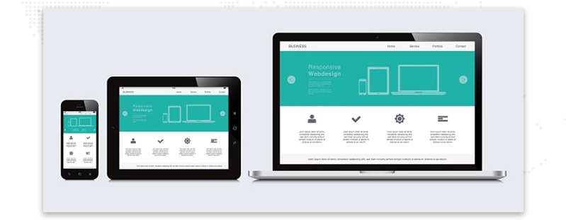
Additionally, responsive website design eliminates the need of creating a separate website for mobile users. Instead of creating a separate website, you can now scale up or down your existing website to fit all the devices.
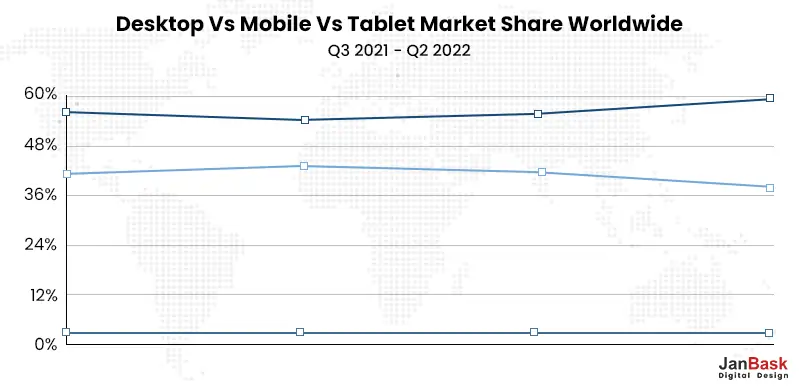
Over 60% of website visits now occur on mobile devices (versus 37% on desktop), a figure that is steadily increasing. With users having access to information virtually from anywhere, your website must provide a consistent experience across all devices.
What is the solution?
A responsive website design
Responsive web design goes beyond the outdated mobile-friendly approach, trying to deliver a website layout that alters and adjusts dynamically based on the device parameters of the user.
A responsive site provides a consistent user experience whether viewed on an iPhone 14 or any other Android phone.
Let’s look at some responsive website examples to understand what this web design services approach looks like in practice and gather some motivation in our life.
One of the best responsive website examples is Dribbble, which demonstrates the flexible grid principle and how it enhances the browsing experience.
Web designers can use the flexible grid layout to place content in columns that change depending on the viewing device.
Portfolio tile images are displayed in a 4x3 layout on a 13" laptop screen. This strikes the ideal balance between visibility (the ability to see what each portfolio has to offer) and presenting enough portfolio items to pique the interest of multiple audiences:
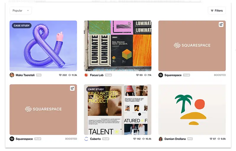
Instead of attempting to fit all four columns in and cluttering the display, Dribbble's grid adjusts on smaller devices.
In comparison, on an iPhone XS Max with a 6.5-inch screen, the grid is reduced to a single column as shown below.
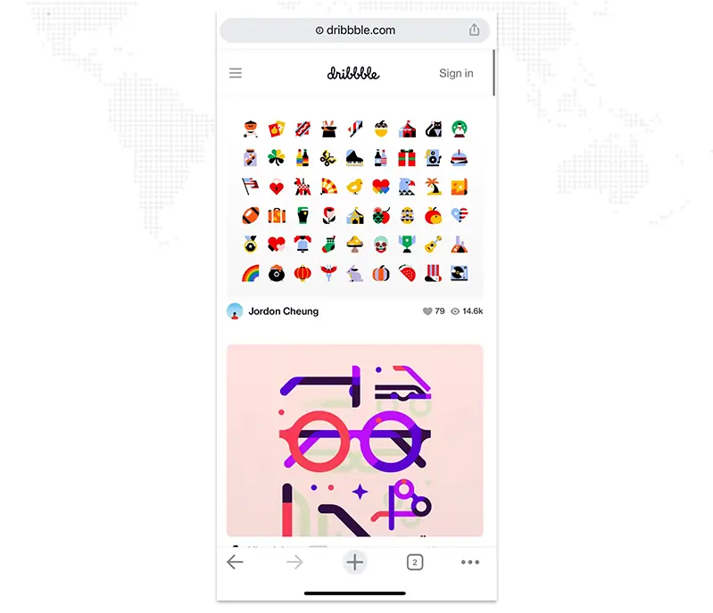
The mobile layout has two advantages:
Use responsive web design to accommodate different device behaviors. Consider accessibility when designing key elements, making them easier to click, navigate, and interact with.
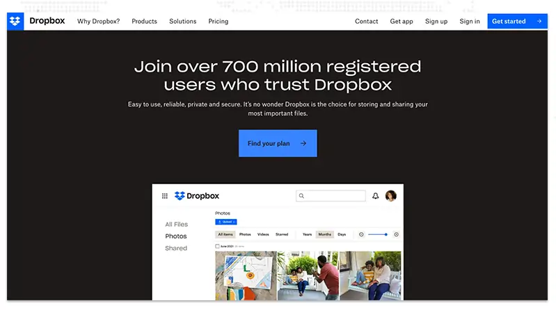
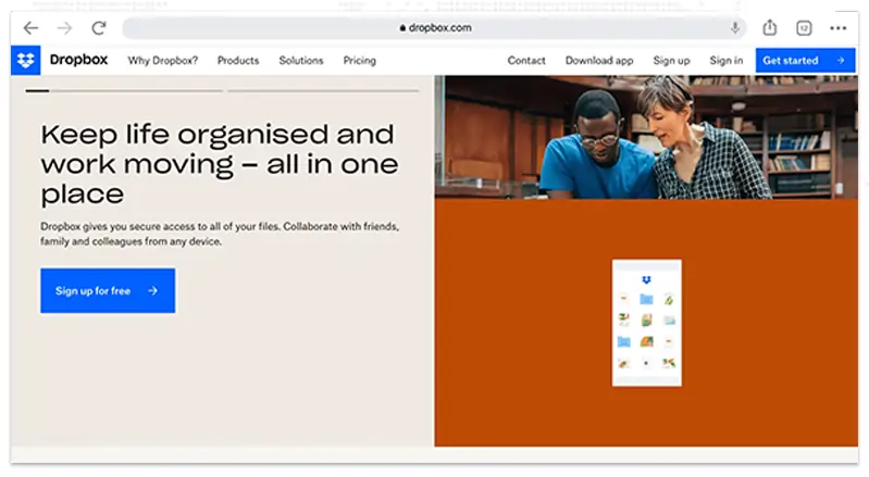
Dropbox's webpage is a fine example of how a responsive website design can alter the user's behavior when they visit your website on different screens. It elevates responsive design by displaying what appear to be completely different web pages depending on your device.
Here are three different versions of a landing page for smartphones, tablets, and desktop computers:
Desktop Version
Tablet Version
Mobile Version
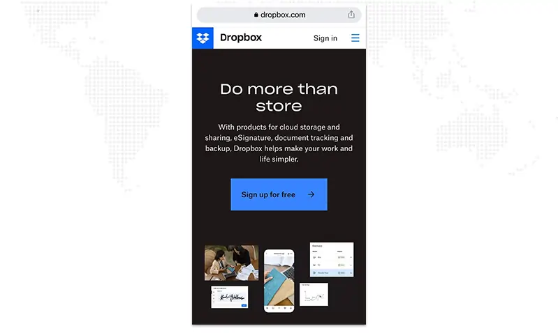
We can see the fluid grid in action with tablet and desktop versions expanding to include a full navigation bar. The mobile version uses the hamburger menu to be displayed in the vertical navigation.
The header in each of the three layouts is entirely different. The desktop CTA differs from the mobile and tablet CTAs: "Free sign-up" vs. "Find your plan." This suggests that Dropbox's research discovered different user intent for different devices.
The Dropbox example demonstrates how you can customize each device's display to the smallest detail. Assessing your users by device to determine their intent is the best way to decide what to exhibit in each version. You can personalize your design and copy to improve the user experience.
Magic Leap, an augmented reality platform, employs flexible imagery to strike a balance between impressive design and intuitive user experience.
Here are Magic Leap's desktop and mobile versions :
Desktop Version

Mobile Version

The desktop version shows the users an automatically playing video of the VR device. The video's background and border blend with the website's background, giving the impression that it is playing directly on the page.
However, the video does not play automatically on the mobile version. This implies that mobile users would prefer the option to play the video (particularly if the video includes sound, as in Magic Leap's video).
Magic Leap's responsive website example demonstrates the concern for the wants and needs of users on various devices. Understand how your users prefer to use your website depending on the device they are using to view it.
Another method for determining what works best for each version of your website is to hypothesize, test, and track which versions receive the highest engagement on each device.
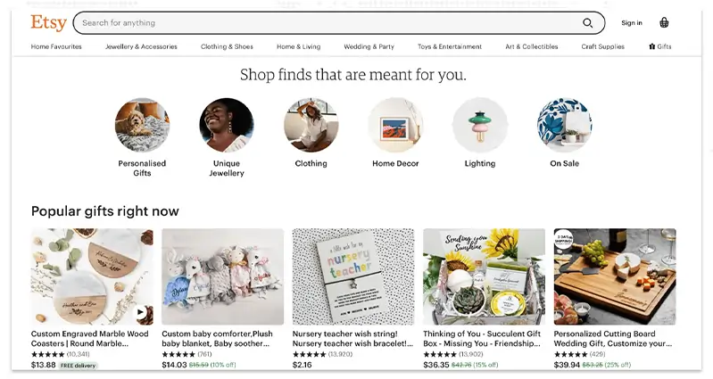
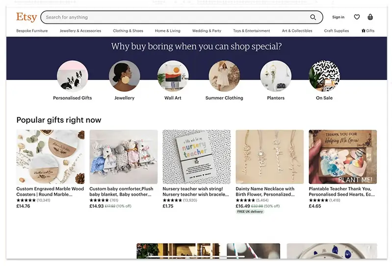
Etsy's website is another fine example of how the flexible grid approach is used to display your site differently on different devices.
Here is how Etsy’s website appears on three different devices:
Desktop Version
Tablet Version
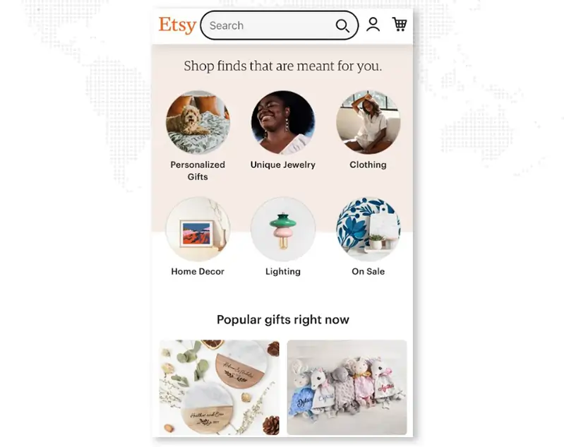
Mobile Version
The tablet and desktop versions are designed similarly. The only differences are the header options and a minor design tweak, indicating yet another device-based shift in user intent.
Compare these two versions to the final image, which depicts Etsy's site on a mobile device. To reduce clutter, the navigation bar is removed entirely, and the grids are scaled down to 3x2 and 2x2 displays.
On mobile devices, it's clear that Etsy prioritizes personalization while also assisting customers in quickly finding what they're looking for: the products.
The search bar is noticeable on all versions, mostly because Etsy understands that its users typically visit the site with a specific goal in mind.
Following in the footsteps of Etsy's responsive website, highlight your best benefits and then give them what they want instantly on smaller screens. If website navigation isn't how your site's visitors browse, consider replacing the hamburger menu with a prominent search bar.
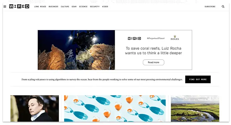
Wired's website is an outstanding example of how fluid grids can instantly adjust column layout based on device design parameters such as screen width.
The images below show two versions of their website:
Desktop Version
Mobile Version

Both the desktop and tablet versions are identical. On each page, Wired displays several results in a three-column display of large images, followed by several four-column displays further down the page.
The mobile version displays only one column for readability.
This online editorial generates revenue in the same way that many others do: through ads. Take note of the ads at the top of the desktop version as compared to the mobile version. Depending on the device, the ad is displayed differently, with the mobile version displays only the head copy, enticing a tap.
If your website includes ads, consider how they will appear on different devices. If Wired had kept the desktop version of their ad on mobile, a number of issues (such as readability) could have resulted in annoying the reader.
The concept of Website Responsive Design stems from the concept of responsive architectural design, in which a room or space automatically adjusts to the number and flow of people in it.
When we apply this discipline to web design, we get something similar but a completely new idea. Why should we create a unique Web design for each user group? After all, architects do not design a building to accommodate every size and type of group that passes through it. Like responsive architecture, web design should adapt automatically. It should not be necessary to create a plethora of custom-made solutions for each new user category.
A more abstract way of thinking is required to understand responsive web design. However, some concepts are already in use, such as fluid layouts, media queries, and scripts that can easily reformat Web pages and mark-up.
However, responsive Web design is more than just adjusting screen resolutions and automatically resizing images; it is a whole new way of thinking about design. Let's go over each of these features to understand them fully.
Screen resolutions, definitions, and orientations evolve in tandem with the proliferation of gadgets. Every day, new devices with new screen sizes are being introduced, and each of these devices are capable of accommodating variations in size, functionality, and even color with responsive web design. Some are in landscape, some in portrait, and some are completely square. Many new devices, as evidenced by the increasing popularity of the iPhone, iPad, and advanced smartphones, can switch from portrait to landscape mode at the user's discretion.
How does one design for these scenarios?

In addition to designing for both landscape and portrait orientations (and allowing those orientations to switch in an instant upon page load), we must consider hundreds of different screen sizes. Yes, they can be divided into major categories, design for each of them, and make each design as flexible as possible. But that could be too overwhelming and who knows what happens in the next coming years.
It's obvious that we can't keep coming up with unique solutions for each one. So, how do we deal with this situation?
Part of the Solution: Flexible Everything
When flexible layouts were almost a "luxury" for websites a few years ago, the only things that could be changed in a design were the layout columns (structural elements) and the text. Visuals could easily break layouts, and even versatile structural elements could break the form of a layout if pushed hard enough. Flexible designs weren't all that adaptable; they could give or take a few hundred pixels, but they couldn't always switch from a large computer screen to a portable device.
We can now make things more adaptable. Images can be automatically adjusted with the help of workarounds which ensures that the layout never breaks( they might get squished or become illegible in the process). While it is not a complete solution, it provides us with far more options. It's ideal for devices that instantly switch from portrait to landscape orientation, or for when users switch from a large computer screen to an iPad.
The entire design is a lovely mix of fluid grids, fluid images, and smart markup where necessary. Fluid grids are a fairly common practice, and there are several techniques for creating fluid images:
While it is technically possible to create flexible grids and layouts, it is not as simple as plugging these features in and being done.
Working with images is a major issue that must be addressed in responsive Web design. There are several methods for resizing images proportionally, many of which are simple. The most common solution is to use CSS's max-width for a quick fix.
Unless the viewing area becomes narrower than the image's original width, every image will load in its original size as long as no other width-based image styles override this rule. The image's maximum width is set to 100% of the screen or browser width, so as that 100% narrows, so does the image. The idea behind fluid images is to deliver images at their largest possible size. You do not declare the height and width in your code, instead allow the browser to resize the images as needed while using CSS to guide their relative size." It's a fantastic and simple method for resizing images beautifully.
Good use of width: 100% would solve the problem and is a great quick fix for a good start to responsive images, with image resolution and download times being the primary considerations. While resizing an image for mobile devices is simple, if the original image size is intended for large devices, it may significantly slow download times and take up unnecessary space.
We may want to change the layout entirely for extreme size changes, either through a separate stylesheet or, more effectively, through a CSS media query. This does not have to be difficult; most of the styles can be kept, while specific style sheets can take these styles and move elements around with floats, widths, and heights, among other things.
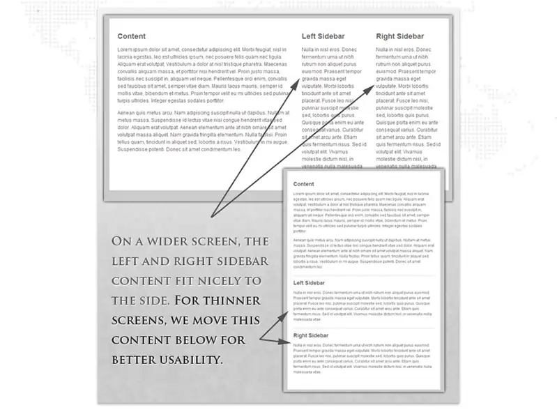
For example, we could have a single main style sheet (which can be the default) that defines major structural elements, such as #wrapper, #content, #sidebar, and #nav, as well as colors, backgrounds, and typography. Flexible widths and floats could also be set as defaults.
To support a specific screen size, you may need to make more extensive changes to your layout than the techniques shown above allow. This is where media queries become handy.
Simple filters that can be applied to CSS styles are media queries. They make it simple to change styles based on the type of device rendering the content or the device's features, such as width, height, orientation, hovering ability, and whether the device is used as a touchscreen. When it comes to responsive web design, we typically query the device's features in order to provide a different layout for smaller screens or when we detect that our visitor is using a touchscreen.
It is possible to shrink items proportionally and restructure elements as needed to make everything fit on a smaller screen (reasonably well). That's fantastic, but making every piece of content from a larger screen available on a smaller screen or mobile device isn't always the best solution. Best practices for mobile environments include simpler navigation, more focused content, and lists or rows rather than multiple columns.
Responsive Web design is more than just knowing how to create a flexible layout on a variety of platforms and screen sizes. It should also be possible for the user to select content. Fortunately, CSS has made it simple to show and hide content for years!
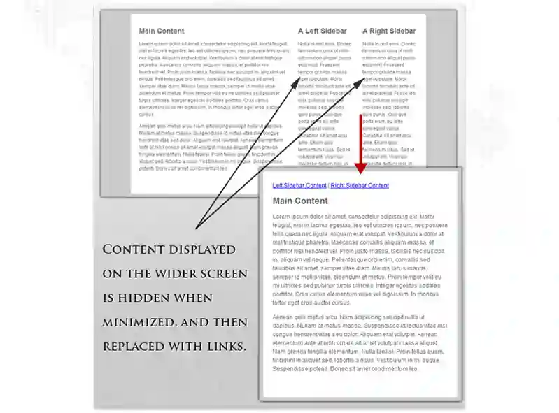
A design can be transformed to fit a wide range of screen sizes and device types by being able to easily show and hide content, rearrange layout elements, and automatically resize images, form elements, and other elements. Rearrange elements to fit mobile guidelines as the screen shrinks; for example, use a script or alternate style sheet to enhance white space or to substitute image navigation sources on mobile devices for better user experience (icons would be more beneficial on smaller screens).
Consider touchscreens when determining how to make a website responsive. Most mobile devices (phones and tablets) now have touch screens. Some laptops are also catching up, with touchscreens in addition to keyboards.
Naturally, a responsive website must be calibrated to be accessed via touchscreens. As an example, suppose the homepage has a drop-down menu.
To accomplish this use images, CTAs, or optimize these elements to render properly on multiple screens
Font sizes are typically defined by web developers in pixels. These are suitable for static websites, but responsive websites require a responsive font. The font size must change in relation to the width of the parent container. This is required in order for typography to adjust to screen size and be readable on a variety of devices.
Look for the unit rems in the CSS3 specification. It functions similarly to the em unit but is applied relative to the HTML element. As a result, the code must reset the HTML font-size:
html { font-size:100%; }
Now define the responsive font sizes
@media (min-width: 640px) { body {font-size:1rem;} }
@media (min-width:960px) { body {font-size:1.2rem;} }
@media (min-width:1100px) { body {font-size:1.5rem;} }
If developers and designers are curious how to build a responsive website on a tight deadline, they can use a theme or pre-designed layout with built-in responsive properties. WordPress offers numerous options in this regard (both free and paid). After deciding on a theme, designers must decide on colour, branding, and text.
When researching how to make a website mobile responsive design, it is easy to overlook the importance of testing on real devices. Developers can fiddle with the code all they want, but its functionality must be tested in real-world scenarios.
Once coded, run the website through a responsive design checker to see how it looks and if it is responsive enough on a variety of the latest real devices.
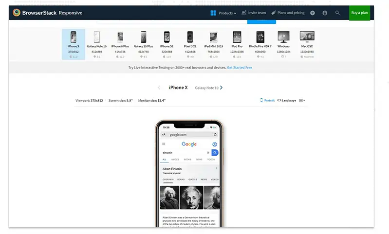
Simply enter the website URL, and the tool will display how the site appears on various devices (iPhone 11, iPhone 8 Plus, Galaxy Note 20, Galaxy S9 Plus, and more).
Choose a device-browser-OS combination, go to the website, and see how it looks on that device's resolution.
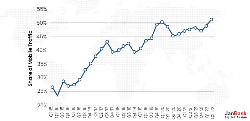
According to a Statista report, mobile devices accounted for more than half of all traffic to top websites in the United States in 2022. As a result, it is becoming increasingly important for businesses to have websites that render properly on smaller screens so that users do not encounter distorted images or a sub-optimal site layout. While some businesses still prefer to have a separate mobile version of their website, responsive design is becoming the standard because it provides greater flexibility at lower development costs.
It takes far less time to create a single responsive website than it does to create a separate mobile application and a standard desktop website. Because time is money, responsive design is naturally less expensive than the alternative. Even if the initial investment in a responsively designed website is higher than the cost of creating two separate websites, you save money in the long run as the maintenance costs, special configuration costs, etc of a website is far less than that of two separate versions.
Maintaining a separate mobile site necessitates additional testing and support. The responsive design process, on the other hand, employs standardized testing methodologies to ensure optimal layout on all screens.
Separate desktop and mobile sites necessitate two content strategies, two administrative interfaces, and possibly two design teams.
The "one size fits all" approach of responsive design means fewer headaches for developers, business owners, and consumers. Spending less time on maintenance also allows you to devote more time to more important tasks such as marketing and content creation.
Mobile device users, in particular, have short attention spans. According to research, mobile visitors abandon web pages that take more than three seconds to load.
If a site isn't optimized for smartphones and tablets, it will take longer to navigate, potentially driving customers away. Using modern performance techniques such as caching and responsive image display on your responsive website will help improve web page loading speed.
A mobile site that is responsive and optimized provides a much better user experience for the visitor. As a result, they are much more likely to stay for a longer period of time and explore different areas of your site.
Alternatively, if your site is not responsive, it is much more difficult to keep the visitor engaged and, as a result, they are more likely to bounce.
Minimizing your bounce rate down is only half the battle. Converting new customers requires a consistent user experience across all devices. Users do not want to be redirected to device-specific websites when deciding whether or not to subscribe to a service because the process often takes longer.
Having a single secure website that looks professional on all platforms reduces the likelihood of users becoming frustrated and switching to a competitor.
You must first understand where your traffic is coming from and how users interact with your website to make informed improvements. Managing multiple versions of a website necessitates tracking users' journeys through various conversion paths, funnels, and redirects.
The monitoring process is greatly simplified by having a single responsive site. Google Analytics and other similar tools now accommodate to responsive websites by condensing tracking and analytics into a single report that allows you to see how your content performs across multiple devices.
Responsive web design is becoming as important as quality content for search engine optimization. Stronger backlinks and lower bounce rates translate into higher search rankings, but mobile-optimized sites have an added SEO benefit as mentioned by Google.
Starting on April 21, 2015, Google Search expanded its use of mobile-friendliness as a ranking signal. - Google
The use of a single responsive website rather than separate desktop and mobile versions excludes the issue of duplicate content, which may harm your search ranking.
Creating first impression is very much important so if somebody is visiting a website for the first time on their desktop or smartphone, you would want them to have a consistently positive experience. If visitors have to do a lot of zooming, shrinking, and pinching on their screens during their first visit, they're likely to give up and try another website.
Now that many smartphones and tablets support HTML5, responsive web design benefits users by allowing them to continue viewing content within HTML5 web applications even when they are not connected to the internet.
Responsive design allows your website's content to flow freely across all screen resolutions and dimensions, resulting in a great look on all devices. It also eliminates the need to maintain separate versions of your website for mobile and desktop, saving you time, resources, and effort.
A modern-looking, mobile-friendly, and fast website is required for your business to grow and attract new customers. It strengthens your online presence and makes you appear more trustworthy to your customers.
Of course, having a visually appealing and well-optimized website is just the beginning. To make it worthwhile, you must still fill it with valuable content and offer first-rate products and services. However, your website is the digital face of your company, and making it friendly, accessible, and flexible is a foundation you should not overlook.
Looking to Create A Responsive Website Design?

1. Why should I switch my website to Responsive Design?
People use the internet in very different ways than they did a few years ago. Once the design has been made responsive, the website looks good on all screens of different sizes, not just desktops. You save time because you no longer have to manage separate websites for desktops and mobile phones. If done correctly, any changes you make will be reflected in all versions.
In your Google Analytics reports, you will also see unified data from mobile and desktop users. You get more focused on social sharing statistics now that all versions of your website have a single URL.
2. How will Responsive Website Design help me get more customers?
Just one word. Conversions! If your website is uninteresting and difficult to navigate across devices, you will get more bounces than conversions. Users have grown impatient. Show them a sloppy website with little thought put into user experience, and they will leave the page empty-handed. The user will retain more information if your design and function are integrated to create a concise goal that the user can easily follow.
3. How do I check if a website has a Responsive Design?
Resize any desktop browser after opening a website. The design is responsive if the layout changes as you resize it.
4. Does Responsive Design work well with Google?
According to Google, website user experience plays a significant role in page rankings. A few years back Google Google recently announced that their mobile search engine results pages will undergo an algorithm change that rewards mobile-optimized websites with a higher organic ranking, while websites that are difficult to navigate from a mobile device will receive a low organic ranking. Google's mobile device algorithms were updated in 2015, so join the bandwagon to make your website responsive and rank higher in SERP.
5. Will it affect my Search Engine Rankings?
Search engines consider many factors, including keywords, links, and structure. Responsive Design has a significant impact on your rankings, thanks to Google's new algorithm and conversion rates. The popularity of a website is directly affected by the user experience. Popularity is interpreted as a sign of increased quality. If the site encourages sharing, bookmarking, and returning visits, search engines boost your ranking.
Leave a Reply